Mosaic and Justified Photo Gallery Layouts: A Visual Guide

Open any event gallery with 200+ photos in a standard grid and you'll notice something immediately: every image is the same size. That wide-angle shot of the whole dance floor? Cropped to a square. The close-up of the rings? Same dimensions. The hilarious candid where someone's mid-sneeze? Identical box. The grid doesn't care what's in your photos. It just tiles them.
That works fine for browsing. But it doesn't do your photos justice.
Mosaic and justified layouts solve this differently. They adapt to the actual content of your images, giving horizontal shots room to breathe and letting vertical portraits stand tall. The result looks less like a spreadsheet and more like something a designer arranged by hand. This guide breaks down how each layout works, when to use them, and how they change the way guests experience your event gallery.
What Makes a Layout "Justified"
If you've ever used Pinterest, you've seen a version of this concept. A justified layout (sometimes called a masonry layout, though they're technically different) arranges photos in rows where each row spans the full width of the screen. Every image keeps its original aspect ratio. The layout algorithm adjusts the height of each row so that the photos fit edge-to-edge, with consistent gaps between them.
The core idea is simple: a standard grid forces all images into uniform boxes. A justified layout respects the photographer's original framing. A panoramic shot stays wide. A portrait stays tall. Nothing gets awkwardly cropped. As W3Schools demonstrates with responsive image grids, even basic CSS techniques can adapt to different screen sizes, but justified layouts take this a step further by adapting to each image's individual proportions.
For event galleries, this matters more than you'd think. Guests upload from all sorts of phones in all sorts of orientations. Some shoot vertical video, others take landscape photos, and a few somehow manage to upload screenshots. A justified layout handles all of it gracefully, without turning every image into the same rectangle.
If you've already explored the gallery layout options in Photogala, you know the platform offers Modern, Polaroid, Timeline, and Vintage as base styles. The justified layout builds on that foundation by prioritizing aspect-ratio preservation over uniformity.
Mosaic: The Layout That Plays Favorites
A mosaic layout does something a justified layout won't: it makes certain photos bigger than others.
Think of a magazine spread. The editor picks one hero shot that fills half the page. Smaller photos cluster around it. The visual hierarchy guides your eye. That's what a mosaic does, except algorithmically. Some images get featured at 2x or 3x the size of their neighbors, creating a dynamic, editorially curated feel without anyone having to manually arrange anything.
The technical trick is in the tiling algorithm. It optimizes both height and width placement so thumbnails fit into the available space with minimal gaps. Each row or block mixes large and small images to fill the container. The whole thing runs in milliseconds, but the output looks like someone spent an hour placing each photo by hand.
Picture a 150-guest wedding gallery. The algorithm might feature a wide shot of the first dance at double size, surround it with four close-ups of guests clapping, then drop in a large vertical of the couple's exit. Guests scrolling through the gallery get a sense of narrative flow, not just a dump of images.
Mosaic layouts work best when your gallery has a mix of orientations (landscape, portrait, square). If 90% of photos are the same aspect ratio, the layout has less to work with and the visual variety drops. Encourage guests to shoot both horizontal and vertical.
Justified vs. Mosaic: When to Use Each
Both layouts are better than a basic grid for event photos. But they serve different purposes.
Justified is the democratic option. Every photo gets equal treatment. Rows fill edge-to-edge, aspect ratios are preserved, and no single image dominates. This works well for events where every guest's contribution matters equally: family reunions, birthday parties, team outings. Nobody feels like their photo got buried.
Mosaic is the editorial option. It creates visual hierarchy, pulling attention to certain images. This works for weddings where you want the ceremony shots to stand out, or corporate events where a few key moments (the CEO's speech, the award ceremony) should anchor the gallery. It's also better for galleries that will be projected on a live photo wall, where visual variety keeps the screen interesting.
There's a practical consideration too. Justified layouts load slightly faster because the calculations are simpler. Mosaic layouts require more computation to determine which images get featured and how they tile together. On a modern phone, the difference is negligible. But if your gallery has 2,000+ photos and guests are on spotty venue Wi-Fi, justified might scroll more smoothly.
See it in action
Every guest photo in one album – no app.
How These Layouts Actually Look in Practice
Theory is nice. But layouts are visual by nature. Here's what these actually look like with real event photos loaded in.
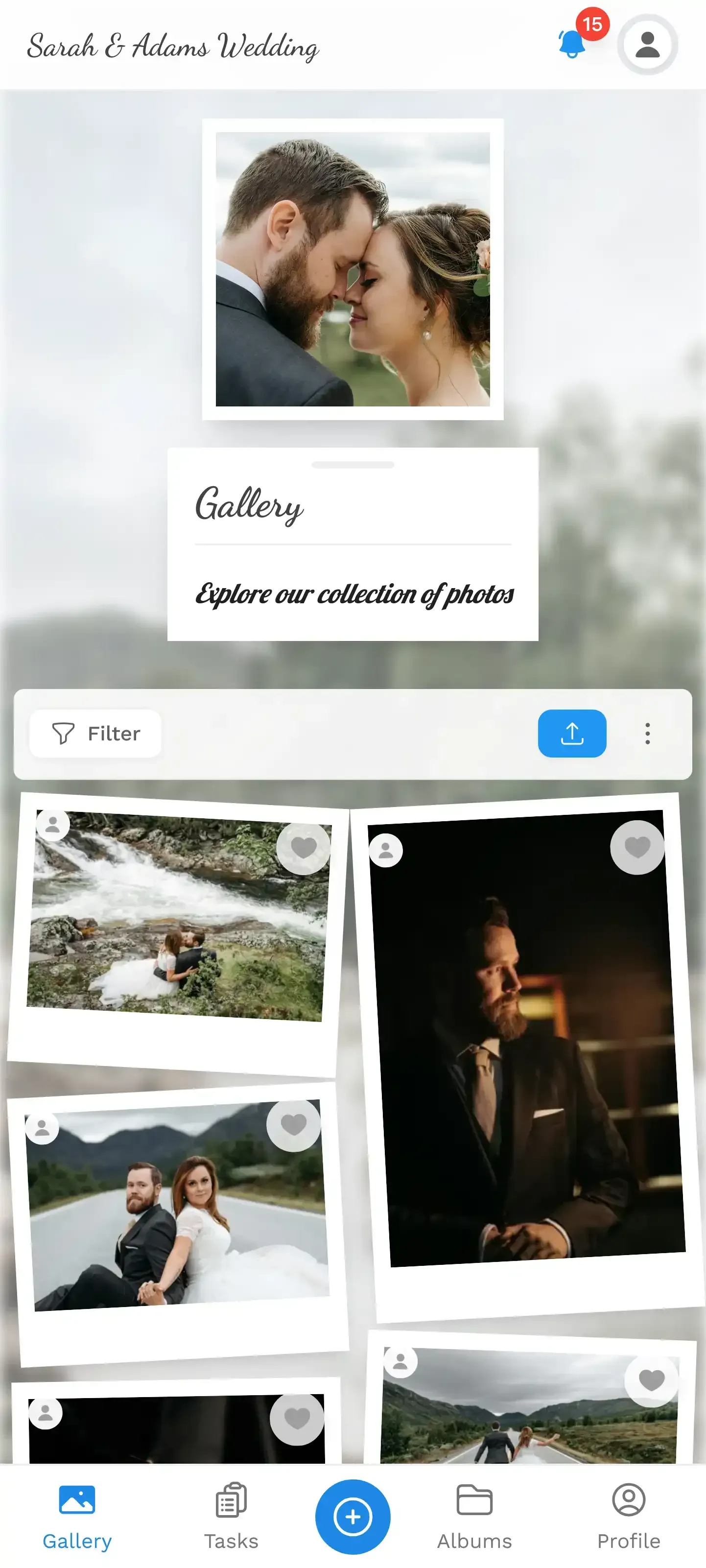
1.Gallery view on mobile with varied photo sizes and orientations
On mobile, the difference is especially noticeable. A standard grid typically shows 2-3 columns of identical squares. A justified or mosaic layout uses the full screen width, with photos flowing naturally in varied sizes. Guests instinctively scroll more because the visual rhythm keeps changing.
If you want to take the visual customization further, you can match your gallery colors to your event theme. The layout handles the structure; color customization handles the mood.
Beyond the Layout: What Else Shapes the Gallery Experience
A layout is one layer. But the gallery experience includes everything around it.
Headers set the tone before anyone sees a photo. Photogala offers six header styles (Elegant, Gradient, Minimalist, Modern, ModernCompact, Polaroid), and each pairs differently with justified and mosaic layouts. A Polaroid header with a mosaic layout creates a playful, scrapbook-like vibe. A Minimalist header with justified rows feels clean and professional. The event branding options let you fine-tune these combinations.
Per-variant styling goes deeper. On Premium and Deluxe plans, you can adjust columns, gap size, corner rounding, shadows, and even image filters for each layout variant independently. Want your mosaic to have rounded corners with a slight shadow? Done. Prefer your justified rows with zero gap for a seamless photo wall effect? That's a slider.
Smart albums organize what the layout displays. Instead of dumping every photo into one stream, smart albums automatically group photos by time window, uploader, or number of likes. Guests browse organized collections, each displayed in your chosen layout. For large events, this combination of smart sorting plus a good layout is what separates a chaotic photo dump from a gallery people actually enjoy browsing.
And if guests want to find their own photos without scrolling? The AI-powered selfie search lets them take a selfie and instantly find every photo they appear in. The layout makes browsing enjoyable; the AI makes finding specific photos instant.
The Technical Side (for the Curious)
Modern gallery layouts rely heavily on CSS Grid and Flexbox. As W3Schools documents, responsive image grids use flex-wrap with percentage-based widths that adapt to screen size. But that's the simple version.
Justified layouts calculate row heights dynamically. The algorithm takes a set of images, groups them into rows based on available width, then scales each row's height so the images fill the full width with consistent spacing. The math is straightforward: sum the aspect ratios of images in a row, divide the available width by that sum, and you get the row height.
Mosaic layouts are more complex. They need to decide which images get featured (larger) and how to tile the remaining images around them. Some implementations use the image's engagement data (likes, comments) to determine feature priority. Others rotate featured positions algorithmically. The best ones combine both: popular photos get featured, but the algorithm also ensures visual variety by never placing two featured images adjacent to each other.
One honest trade-off: browser-based galleries (like Photogala) handle these layouts differently than native apps. A native app can pre-calculate layouts during download. A browser does it on the fly as images load. Photogala compensates with lazy loading and progressive image rendering, but on very slow connections, you might see a brief layout shift as images populate. It's barely noticeable on modern phones, but it's there.
Picking the Right Layout for Your Event
Here's a practical decision framework.
Small, intimate event (under 50 photos)? Honestly, any layout works. With fewer images, the differences are subtle. Go with whatever matches your event's vibe. Polaroid or Vintage for casual, Modern grid for clean.
Medium event (50-500 photos)? Justified is the safe bet. It handles mixed orientations gracefully and keeps the gallery looking polished without any configuration. If you're running photo challenges and want the best submissions to stand out visually, mosaic gives you that editorial hierarchy.
Large event (500+ photos)? Mosaic really shines here. With hundreds of images, a justified layout can start to feel monotonous because every row looks similar. Mosaic breaks that pattern by featuring standout photos at larger sizes, giving the gallery visual anchors as guests scroll through. Pair it with smart albums so guests aren't overwhelmed by a single endless stream.
Photo wall or projector display? Mosaic. The varied image sizes create a more dynamic screen that keeps changing, which is exactly what you want on a live photo wall behind the dance floor. A grid of uniform squares on a 55-inch TV looks like a screensaver. A mosaic looks like a curated display.
1.Live photo wall with dynamic image sizes on a venue screen
What About the Other Layouts?
Photogala currently offers Modern, Polaroid, Timeline, Vintage, Mosaic, Justified, and Featured as gallery layout options. Each has a personality.
If you're choosing between all of them (not just mosaic and justified), the gallery layout comparison guide covers Modern, Polaroid, Timeline, and Vintage in detail. The short version: Modern is your clean all-rounder, Polaroid adds nostalgic flair, Timeline tells a chronological story, and Vintage adds warmth with muted tones.
Featured layout is worth a quick mention too. It's a hybrid: one large hero image at the top, with a grid or justified arrangement below. Think of it as "mosaic lite." You get one standout photo without the full algorithmic tiling. Good for events with a clear hero moment (the first kiss, the trophy presentation).
Switching between layouts takes about three taps in the gallery customization settings. You can try all of them with your actual photos loaded and see which one feels right before your event starts. Nothing is locked in.
The layout you pick shapes how guests remember your event gallery. A standard grid is functional. A justified layout shows you care about how photos were taken. And a mosaic turns a collection of images into something guests actually want to scroll through. The difference is subtle in a screenshot but obvious when you're browsing 300 wedding photos on your phone at midnight.
Try loading a few test photos into a gallery and switching between layouts. The right one usually announces itself within seconds.
All of this comes with your own event.
Setting it up takes five minutes. You can build and view everything before you decide.
Starting from €39 one-timeOne-time payment — No subscription
- No App Required
- Setup in 5 Minutes
- 30-Day Money Back
“We used the software at my mum's birthday party. It went down really well 😊”
Written by

I believe event photos should be more than static galleries. They should be live, playful, and unforgettable.
Categories
Related Posts

Bridal Shower Photo Sharing: Collect Every Sweet Moment in One Gallery
Bridal shower photos end up scattered across 15 phones. Here's how to get them all into one gallery before the mimosas wear off.

Maternity Photo Sharing: How to Keep Every Announcement, Bump Shot, and Memory in One Place
Pregnancy announcements land on 4 different apps. Maternity photos get lost in group chats. Here's how to keep every photo in one shared gallery your whole family can access.

Sales Kickoff Photo Sharing: How to Turn a Mandatory Meeting Into a Team Memory
Sales kickoffs are expensive. The photos from them usually disappear into 14 different camera rolls. Here's how to fix that.