Modern, Polaroid, Timeline, or Vintage: How to Pick the Right Gallery Layout

Picture a 200-guest wedding. The couple spent months on table settings, florals, the exact shade of dusty rose for the napkins. Then they set up a shared photo gallery and… left it on the default layout. White grid. Generic thumbnails. The visual equivalent of a spreadsheet.
The gallery collected 600+ photos that night. Beautiful candid moments. But the gallery itself looked like it belonged to a different event entirely.
This happens more often than you'd think. People obsess over the right photographer, the perfect venue lighting, the ideal playlist. But the digital gallery where all those guest photos actually live? It gets about 30 seconds of thought. That's a missed opportunity, because the layout you choose changes how every single photo feels when someone scrolls through it later.
Why the Layout Isn't Just Decoration
Gallery layout is one of those decisions that seems cosmetic but actually shapes the entire experience. A 2026 analysis from OneWebCare found that gallery design is often the first real interaction visitors have with visual work, and a poor layout creates friction that causes people to bounce. That applies to event galleries just as much as photography portfolios.
Think about it this way: if you're scrolling through wedding photos on your phone the morning after, the layout determines whether you see a polished magazine spread or a chaotic photo dump. Same photos. Completely different emotional response. And that emotional response determines whether someone keeps scrolling, downloads their favorites, or shares the gallery link with friends who couldn't make it.
Photogala offers four distinct gallery layouts: Modern, Polaroid, Timeline, and Vintage. Each one sets a different mood. None of them is objectively "best." The right choice depends on the type of event, the audience, and the vibe you're going for.
Modern: Clean Lines, Zero Clutter
The Modern layout is a uniform grid. Equal-sized thumbnails, consistent spacing, sharp edges. If your event has a contemporary aesthetic (think minimalist wedding venues, corporate conferences, product launches), this is the layout that matches.
Grid layouts are predictable, and that predictability is actually a strength. When a gallery has hundreds of photos, the uniform structure keeps things navigable. Nobody gets lost. Every photo gets equal visual weight. There's a reason portfolios and e-commerce sites default to grids: they let the content speak without the frame competing for attention.
The trade-off? Modern can feel a bit sterile if your event was warm and chaotic (in a good way). A wild birthday party with confetti and costume changes might feel oddly restrained in a strict grid. But for a sleek corporate event or a modern-minimalist wedding, it's hard to beat.
Quick test: Look at your venue photos. If the space has clean lines and neutral tones, Modern will feel like a natural extension. If the space is cozy, layered, or rustic, keep reading.
Polaroid: Nostalgia That Actually Works
The Polaroid layout frames every photo in a white border with that distinctive bottom margin, mimicking the look of instant camera prints. Some photos get a slight random rotation, which keeps things from looking too rigid.
This one surprised me. I expected it to feel gimmicky. Instead, it adds a warmth that's hard to achieve with other layouts. The white borders give each photo breathing room, and the slight tilts create an organic, scattered-on-a-table effect.
Photography in 2026 keeps leaning into raw, emotionally charged aesthetics where imperfection is a feature, not a flaw. Polaroid fits right into that. Missed focus, motion blur, slightly off-center compositions: photos that might look like mistakes in a clean grid feel intentional and charming in a Polaroid frame. The format practically tells the viewer "this moment was worth grabbing, polish be damned."
Weddings love this layout. So do birthday parties, baby showers, and celebration galleries where the goal is warmth over polish. If you're building a digital guest book, the Polaroid layout makes every guest contribution feel like a keepsake.
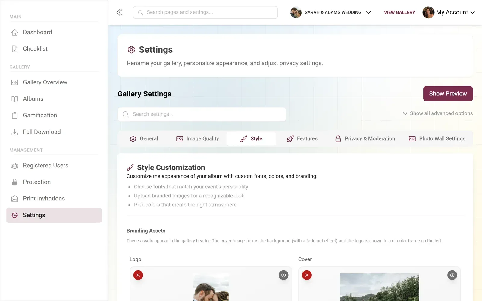
1.How the gallery looks on a guest's phone
Timeline: When Chronology Tells the Story
Timeline arranges photos along a vertical time axis. Early morning getting-ready shots at the top, late-night dance floor chaos at the bottom. For events with a clear narrative arc, this is the layout that turns a photo collection into a story.
The power of Timeline becomes obvious at weddings. Imagine scrolling from the bridal prep photos through the ceremony, cocktail hour, first dance, and ending with the sparkler exit at midnight. That's not just a gallery. That's a complete retelling of the day, assembled automatically from timestamps as guests upload.
Timeline also works well for multi-day events: a three-day company retreat, a weekend festival, or a vacation gallery where smart albums sort everything by time window. Guests can jump to the moment they care about without scrolling past 400 photos from day one.
One thing to know: Timeline relies on photo metadata (capture timestamps). Most smartphone photos have this built in, but photos edited through certain apps occasionally lose their timestamp data. In practice, this affects maybe 5% of uploads. The rest sort themselves perfectly.
See it in action
Every guest photo in one album – no app.
Vintage: Character with a Capital C
The Vintage layout adds warm-toned overlays, textured borders, and a slightly aged feel to the entire gallery. If Polaroid is a single instant photo on a table, Vintage is an entire photo album from the 1970s that you found in your grandparents' attic.
This is the most opinionated of the four layouts. It imposes a strong visual identity on every photo, which means it either fits your event perfectly or clashes hard. A rustic barn wedding with mason jars and string lights? Vintage feels like it was made for this. A sleek tech company holiday party? Probably not.
What Vintage does exceptionally well is hide the inconsistency of guest photos. When 50 different people shoot with 50 different phones in 50 different lighting conditions, the results can look jarring side by side. The Vintage overlay acts as a visual unifier, pulling everything into a warm color palette. Suddenly, the overexposed selfie and the perfectly lit candid shot feel like they belong together.
If you're pairing Vintage with custom event branding, warm earth tones and muted accent colors work best. Bright neon accents will fight the Vintage aesthetic.
How to Actually Choose
The decision tree is simpler than you'd expect. Start with two questions:
- What's the dominant aesthetic of the event itself (modern/clean vs. warm/textured)?
- Is chronological storytelling important, or is this a collection of moments without a strict timeline?
If the event is sleek and contemporary, start with Modern. If it's warm and personal, start with Polaroid or Vintage. If telling the story in order matters (weddings, multi-day events), Timeline is your answer. Simple as that.
The beauty of having multiple layout options is that you can switch. You're not locked in. Set up your gallery with one layout, preview it with a few test uploads, and swap to another if it doesn't feel right. You can even fine-tune individual layout settings: column count, spacing, corner rounding, shadows, and more (available on Premium and up). If you're planning a wedding, our invitation designer can help you carry the same aesthetic into your print materials too.
Invitation Designer
Design beautiful event invitations with elegant templates and custom styling.
Gallery Layout Quick Comparison
| Feature | Modern | Polaroid | Timeline | Vintage |
|---|---|---|---|---|
| Best for | Corporate, minimalist events | Weddings, celebrations | Multi-act events, weddings | Rustic, themed events |
| Photo arrangement | Uniform grid | Scattered with rotation | Chronological axis | Textured grid |
| Mood | Clean, professional | Warm, nostalgic | Narrative, story-like | Aged, characterful |
| Hides inconsistent quality | no | partial | no | yes |
| Needs photo timestamps | no | no | yes | no |
| Per-variant styling | yes | yes | yes | yes |
Beyond the Layout: What Else Shapes the Gallery
Layout is one piece of the puzzle. Photogala also lets you choose from six header styles (Elegant, Gradient, Minimalist, Modern, ModernCompact, Polaroid) and customize colors on the Deluxe plan. The header is the first thing guests see when they open the gallery link, so matching it to your layout creates a strong first impression.
If you're running a live photo wall on a screen at the venue, the wall has its own display modes (slideshow and collage) with styles like polaroid, vintage, and justified. You can match the wall style to your gallery layout for consistency, or deliberately contrast them. Some couples run a playful Polaroid collage on the venue screen while keeping the browsable gallery in clean Modern for easy scrolling.
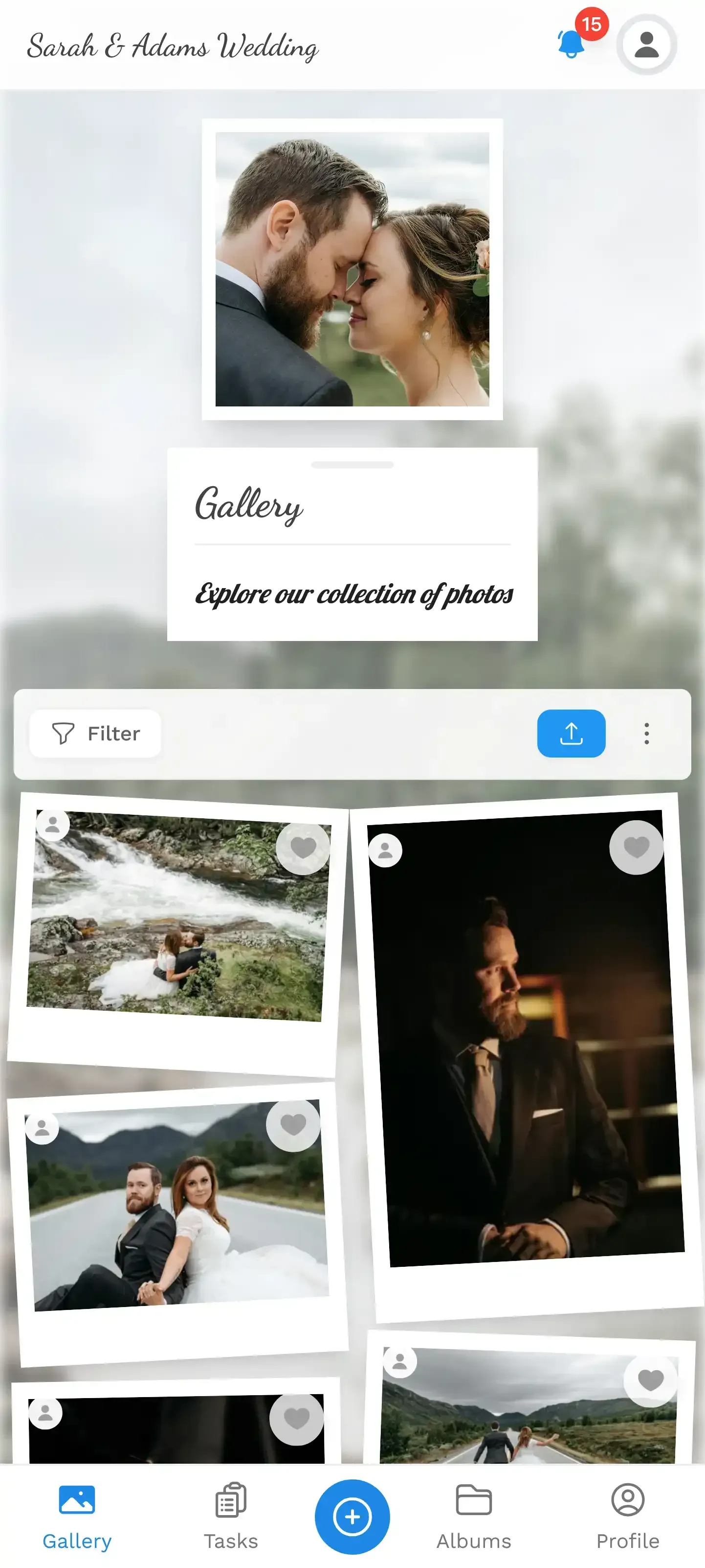
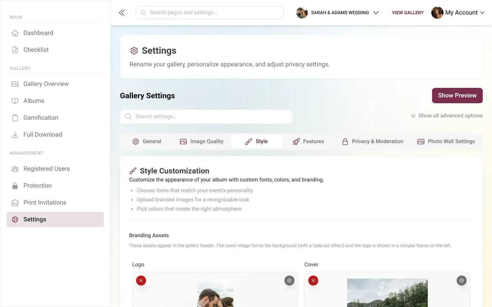
1.The photo wall runs independently with its own display style
For events with many contributors, smart albums add another layer of organization. Albums auto-fill by uploader, time window, or even by person (using AI face recognition on the Deluxe plan). The layout you choose applies within each album too, so the visual consistency carries through the entire gallery experience.
A Few Things I Didn't Expect
When I first looked at the four layouts, I assumed Modern would be the crowd favorite. It's the safe choice. Clean, readable, professional. But Polaroid turned out to be the one that makes people linger. Something about those white borders and slight rotations makes guests scroll slower, actually looking at each photo instead of speed-scanning.
I also underestimated how much the Vintage overlay helps with visual consistency. Guest photos are notoriously uneven. One person shoots in portrait, another in landscape. One has a phone from 2019, another has the latest flagship camera. Vintage smooths those differences in a way that feels intentional rather than filtered.
And Timeline? It's fantastic for the couple or host reviewing photos afterward, but it depends on guests uploading in real time. If half your guests upload their photos the next morning (which happens), the chronological order gets messy. Something to keep in mind if you want a perfect narrative flow.
If your event theme involves specific colors, check out our guide on matching your gallery to your event colors. The layout and color scheme working together is what makes a gallery feel custom-built rather than generic.
Honest trade-off: Gallery layout options beyond Modern require the Premium plan (€69) or higher. The Plus plan (€39) gives you one layout with full customization of that layout's settings. For most smaller events, one well-chosen layout is plenty. For weddings and larger celebrations where aesthetics matter, Premium unlocks all four plus per-variant styling.
The 30-Second Decision
Still not sure? Here's the fastest way to decide:
- Modern if you'd describe your event as "elegant" or "corporate"
- Polaroid if you'd describe it as "fun," "cozy," or "personal"
- Timeline if you want guests to relive the event in order
- Vintage if "rustic," "themed," or "character" are the vibe
Pick one. Upload five test photos. Look at them on your phone. You'll know in three seconds if it's right. And if it's not, swap it. The gallery is yours to shape.
The gallery layout is where the photos live after the event ends. Pick one that makes every guest want to come back and scroll through the whole thing. That's when a photo gallery stops being a storage folder and starts being a memory book.
All of this comes with your own event.
Setting it up takes five minutes. You can build and view everything before you decide.
Starting from €39 one-timeOne-time payment — No subscription
- No App Required
- Setup in 5 Minutes
- 30-Day Money Back
“We were really thrilled, and everything went so much more smoothly, from the seating plan all the way to the photo games! Simply great! Highly recommended!”
Written by

I believe event photos should be more than static galleries. They should be live, playful, and unforgettable.
Categories
Related Posts

Bridal Shower Photo Sharing: Collect Every Sweet Moment in One Gallery
Bridal shower photos end up scattered across 15 phones. Here's how to get them all into one gallery before the mimosas wear off.

Maternity Photo Sharing: How to Keep Every Announcement, Bump Shot, and Memory in One Place
Pregnancy announcements land on 4 different apps. Maternity photos get lost in group chats. Here's how to keep every photo in one shared gallery your whole family can access.

Sales Kickoff Photo Sharing: How to Turn a Mandatory Meeting Into a Team Memory
Sales kickoffs are expensive. The photos from them usually disappear into 14 different camera rolls. Here's how to fix that.