How to Match Your Photo Gallery to Your Event Colors

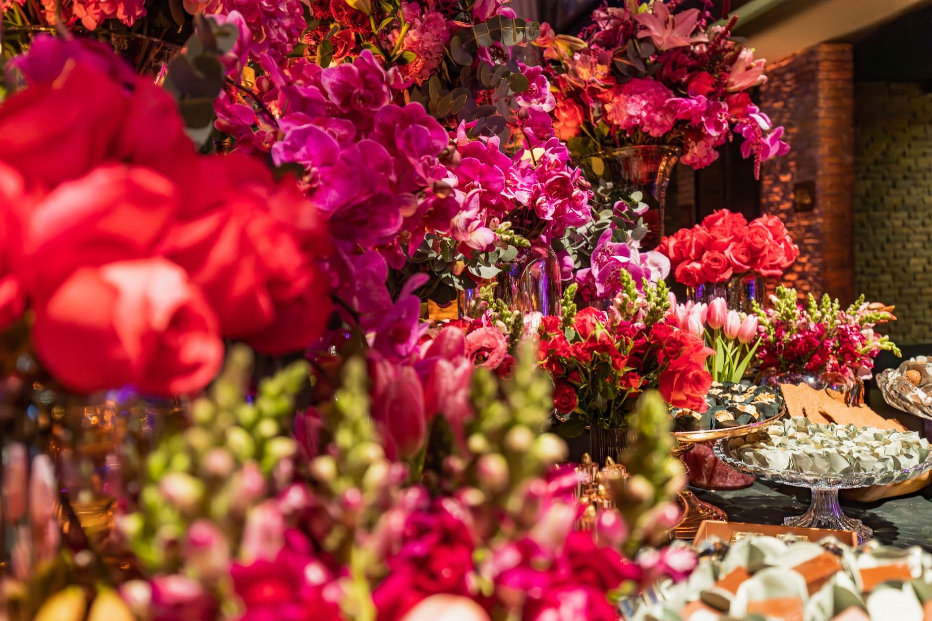
Picture a wedding reception where every detail has been color-coordinated down to the napkin rings. Dusty rose linens, sage greenery, gold accents on the place cards. Then a guest scans the QR code to upload photos, and the gallery that opens looks like a default software template. White background, stock blue buttons, zero personality. It's like wearing sneakers with a tuxedo.
Color consistency across an event isn't a nice-to-have. It's what separates a thoughtfully planned experience from one that feels cobbled together. As color consultant Lori Weitzner puts it, color impacts "our moods, energy levels, memories and associations". That applies to your digital touchpoints just as much as your table settings.
The good news: matching your photo gallery to your event colors takes about five minutes. No design degree required. Here's how to do it, whether you're planning a wedding, a corporate gala, or a milestone birthday.
Why Color Matching Your Gallery Actually Matters
This isn't just aesthetic perfectionism. When guests open a photo gallery that visually matches the event around them, it signals professionalism and attention to detail. It makes the digital experience feel like part of the event rather than an afterthought bolted on.
There's a practical benefit too. A branded gallery with your event colors and logo is immediately recognizable. Guests know they're in the right place. They don't hesitate. They start uploading. If your gallery looks generic, some people will second-guess whether they scanned the right code. That moment of doubt is where you lose uploads.
According to event design research, events need to look stunning both in person and through the lens. Guests want to share moments online, and a visually cohesive gallery becomes part of that shareability. Think of your photo gallery as an extension of your event branding, not a separate tool.
Start With Your Color Palette
Before touching any gallery settings, get clear on your actual event colors. Most events work with three to five colors: one or two dominant shades, a neutral, and an accent.
A formula that works well for most events: pick one or two main colors, add a secondary color (ideally something neutral like ivory or charcoal), and finish with one fun accent like metallic gold or blush pink. That's your palette. Write down the hex codes if you can. If your wedding planner or designer gave you a mood board, the hex values are usually somewhere on it.
No hex codes? No problem. Open your invitation or mood board on your phone, screenshot it, and use any free color picker tool to grab the exact shades. This takes 30 seconds and saves you from eyeballing it.
Quick hex code trick: Take a photo of your invitation or event decor swatch. Upload it to a free color picker tool online (search "image color picker"). It'll give you the exact hex codes to plug into your gallery settings.
Three Layers of Color Customization
Photogala gives you three distinct layers to match your gallery to your event. You don't need all three. Even layer one makes a noticeable difference.
Layer 1: Logo and Brand Colors (Plus Plan)
The simplest starting point. Upload your event logo (a wedding monogram, company logo, or party graphic) and set your primary brand color. This color tints buttons, links, and interactive elements across the entire gallery. One change, visible everywhere.
Say you're running a corporate team event with your company's signature blue. Upload the logo, set the brand color to match, and every guest who scans the QR code sees your brand from the first screen. It's the same principle behind branded event backdrops that turn every guest photo into a branding moment.
Layer 2: Gallery Layouts and Header Styles (Premium Plan)
This is where things get interesting. Photogala offers four gallery layout styles (Modern, Polaroid, Timeline, Vintage) and six header designs (Elegant, Gradient, Minimalist, Modern, ModernCompact, Polaroid). Each combination creates a different visual mood.
A rustic barn wedding? The Vintage layout with the Elegant header. A sleek tech company launch? Modern layout, Minimalist header. A playful birthday party? Polaroid layout with the Gradient header. The customization options let you dial in the exact feel you're going for.
What most people miss: each layout variant can be individually styled. You can adjust columns, spacing, corner rounding, and card shadows per layout. So the Polaroid layout doesn't have to look the same as everyone else's Polaroid layout. It looks like yours.
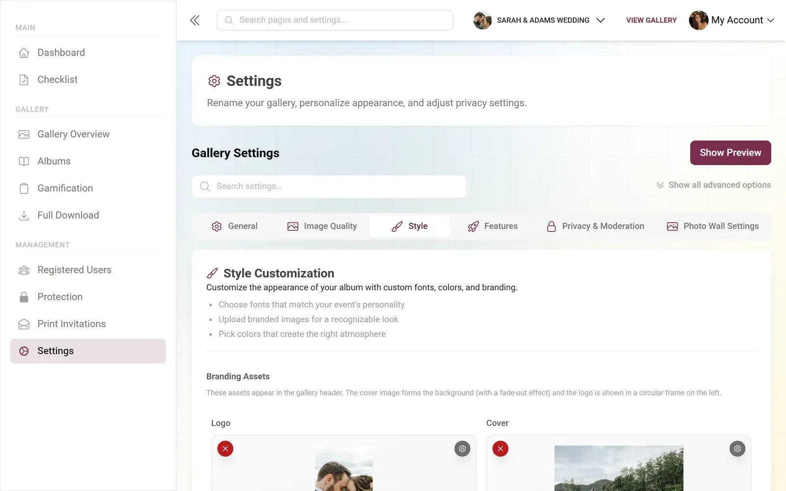
1.Brand color applied across the gallery UI
See it in action
Every guest photo in one album – no app.
Layer 3: Full Color Control (Deluxe Plan)
The Deluxe plan unlocks what I'd call the "designer mode." You get control over three independent color channels: primary color, accent color, and background color. That's enough to fully match any event palette.
Here's a concrete example. Imagine a garden party with a dusty rose, sage green, and cream color scheme. Set the primary to dusty rose (#D4A0A0), the accent to sage (#9CAF88), and the background to cream (#FFF8F0). Now the gallery doesn't just have your logo on it. It looks like it was designed from scratch for this specific event.
The gallery color system also extends to the live photo wall. If you're projecting photos on a screen at the venue, the wall can display your custom logo and match your palette. That's the kind of detail guests notice and remember.
Paired with Photogala's dark mode gallery, the same palette shifts beautifully for evening events. No extra setup needed.
The 70/30 Rule for Photo Galleries
Here's a design principle from gallery wall curation that translates perfectly to digital photo galleries: the 70/30 rule. Use 70% of one dominant visual style and 30% of a contrasting accent. Equal 50/50 splits feel indecisive, while a clear majority creates cohesion.
For photo galleries, this means picking one strong color as your primary (it'll dominate buttons, headers, and accents) and keeping the secondary as a supporting player. Don't try to give equal weight to all five colors in your event palette. Pick the hero. Let it lead.
This is exactly why the three-layer system works. Your primary color handles 70% of the visual identity. The accent handles the remaining 30%. The background stays neutral to let the photos themselves be the focus.
Matching Beyond Colors: Fonts, QR Codes, and Print Materials
Color is the biggest lever, but it's not the only one. The full experience includes your custom QR code design (Deluxe plan lets you customize the QR code itself), font selection for your event title and description, and printable materials like task cards and invitation templates.
Invitation Designer
Design beautiful event invitations with elegant templates and custom styling.
Picture the guest experience from start to finish. They see a printed QR code card on the table that matches the event colors. They scan it. The gallery opens in the same color scheme. They upload photos, maybe tackle a few photo challenges with task cards that carry the same branding. The photo wall behind the DJ displays their shots inside the same visual language. Every touchpoint feels like it belongs.
That's not accidental. That's five minutes of color setup paying off across every interaction.
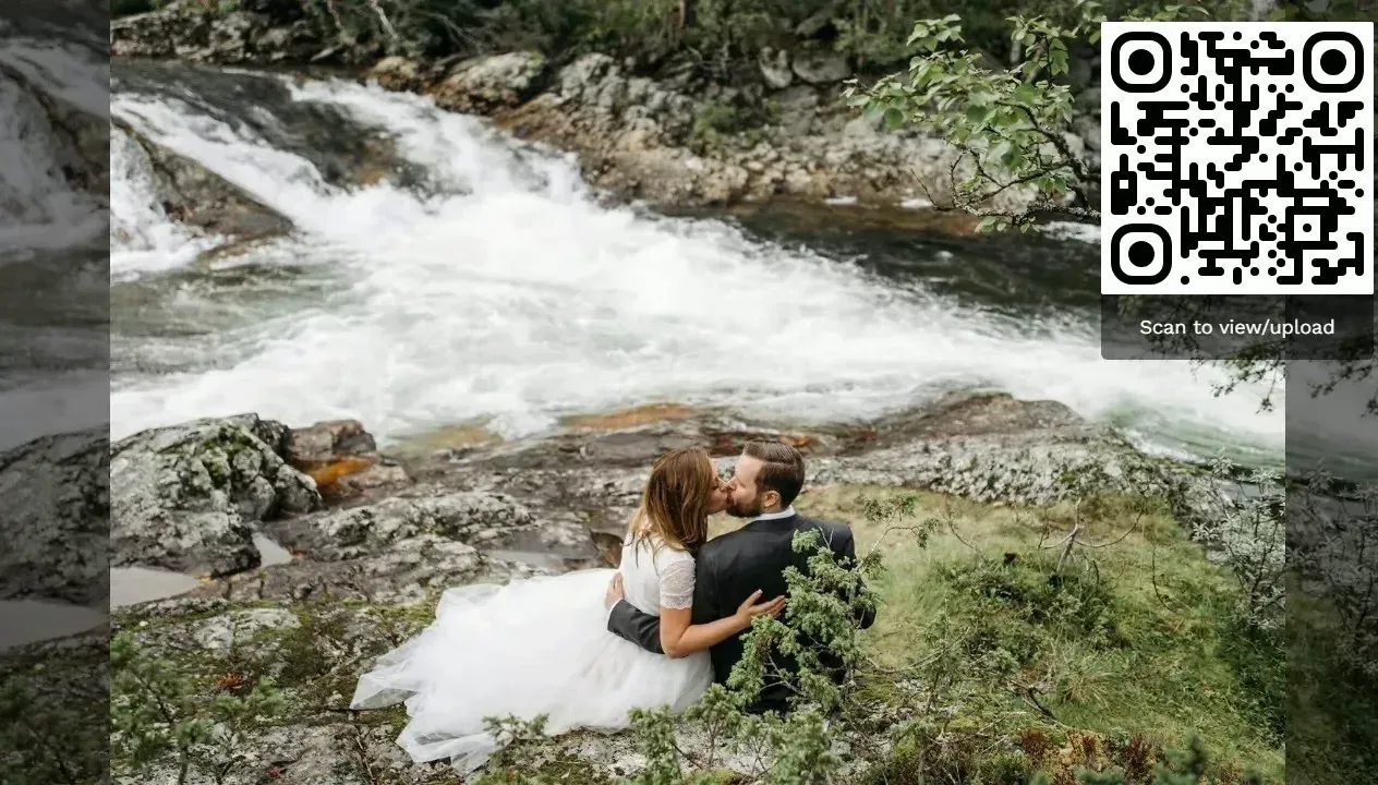
1.Guests see your colors from the very first screen
A Quick Setup Walkthrough
Match Your Gallery in 5 Minutes
Grab your hex codes
Pull the 2-3 main colors from your invitation, mood board, or event planner's style guide. Write down the hex values.
Upload your logo and set the primary color
In your gallery settings, upload your event logo (monogram, company logo, or graphic) and paste your main hex code as the brand color.
Choose your layout and header
Pick the gallery layout and header style that matches your event's mood. Modern for sleek, Polaroid for playful, Vintage for romantic.
Fine-tune accent and background
If you're on Deluxe, set your accent color and background color. Preview the result in both light and dark mode.
That's genuinely it. The changes apply instantly across the entire gallery, including the mobile upload experience, the social features like comments and likes, and any smart albums you've set up.
What About Multi-Event Color Schemes?
Some events span multiple days or have distinct sections with different visual themes. A conference might have a different color per track. A multi-day wedding weekend might shift from rehearsal dinner colors to ceremony to after-party.
For these scenarios, consider creating separate galleries for each section with their own color schemes, then linking between them. Or lean into the primary palette that unites all the sub-events and keep the accent color as the only variable. I've seen conference organizers just swap the accent per track (red for marketing, blue for engineering, green for sales) while keeping the same company logo and primary color. Simple and effective.
If you're running a corporate event with multiple tracks, the moderation dashboard lets you manage content across galleries from one place. The colors stay distinct per gallery, but admin access stays unified.
One Honest Limitation
Full color customization (primary, accent, background) is only available on the Deluxe plan at €119. The Plus plan gives you logo and primary brand color, which covers most use cases well. But if you want pixel-perfect palette matching with three independent color channels, you need Deluxe. For most birthday parties or casual events, the Starter-level branding is plenty. For weddings and corporate events where every visual detail is planned, the Deluxe color control is worth it.
You can start with a free demo gallery to see how the default styling looks, then decide which level of customization your event needs. No credit card required.
Planning a wedding with a specific theme? Our guide on creative photo wall ideas for wedding receptions covers how to extend your color scheme to the live photo display. And if you're working with international guests, check out how to set up a multi-language gallery that keeps your branding consistent across languages.
The Details Guests Remember
Nobody walks away from an event saying "the photo gallery had great hex values." But they do remember when something felt polished. When every piece of the experience, from the printed card to the screen behind the bar to the gallery on their phone, told the same visual story.
Color matching your gallery isn't about perfectionism. It's about removing the moments where the digital experience breaks the illusion of a thoughtfully planned event. Five minutes of setup, and every guest touchpoint is covered.
If you're also collecting photos through photo challenges or building a digital memory book from the uploads, the color-matched gallery makes the final collection look intentional rather than random. That's the difference between a folder of photos and an archive worth revisiting.
All of this comes with your own event.
Setting it up takes five minutes. You can build and view everything before you decide.
Starting from €39 one-timeOne-time payment — No subscription
- No App Required
- Setup in 5 Minutes
- 30-Day Money Back
“We were really thrilled, and everything went so much more smoothly, from the seating plan all the way to the photo games! Simply great! Highly recommended!”
Written by

I believe event photos should be more than static galleries. They should be live, playful, and unforgettable.
Categories
Related Posts

Company Retreat Photo Sharing: How to Actually Keep the Memories
Most offsite photos die on individual phones. Here's how to collect, share, and actually use every photo from your next company retreat.
Neighborhood Block Party Photo Sharing: How to Turn 40 Strangers Into One Shared Album
Block parties create great photos — and zero way to share them. Here's how a QR code gallery turns your street into a connected community.
Why Upload Limits Ruin Event Galleries (and What Unlimited Actually Changes)
Upload caps at events create anxiety, reduce participation, and leave gaps in your photo collection. Here's what happens when you remove the ceiling.