Custom Headers and Branding for Your Event Photo Gallery

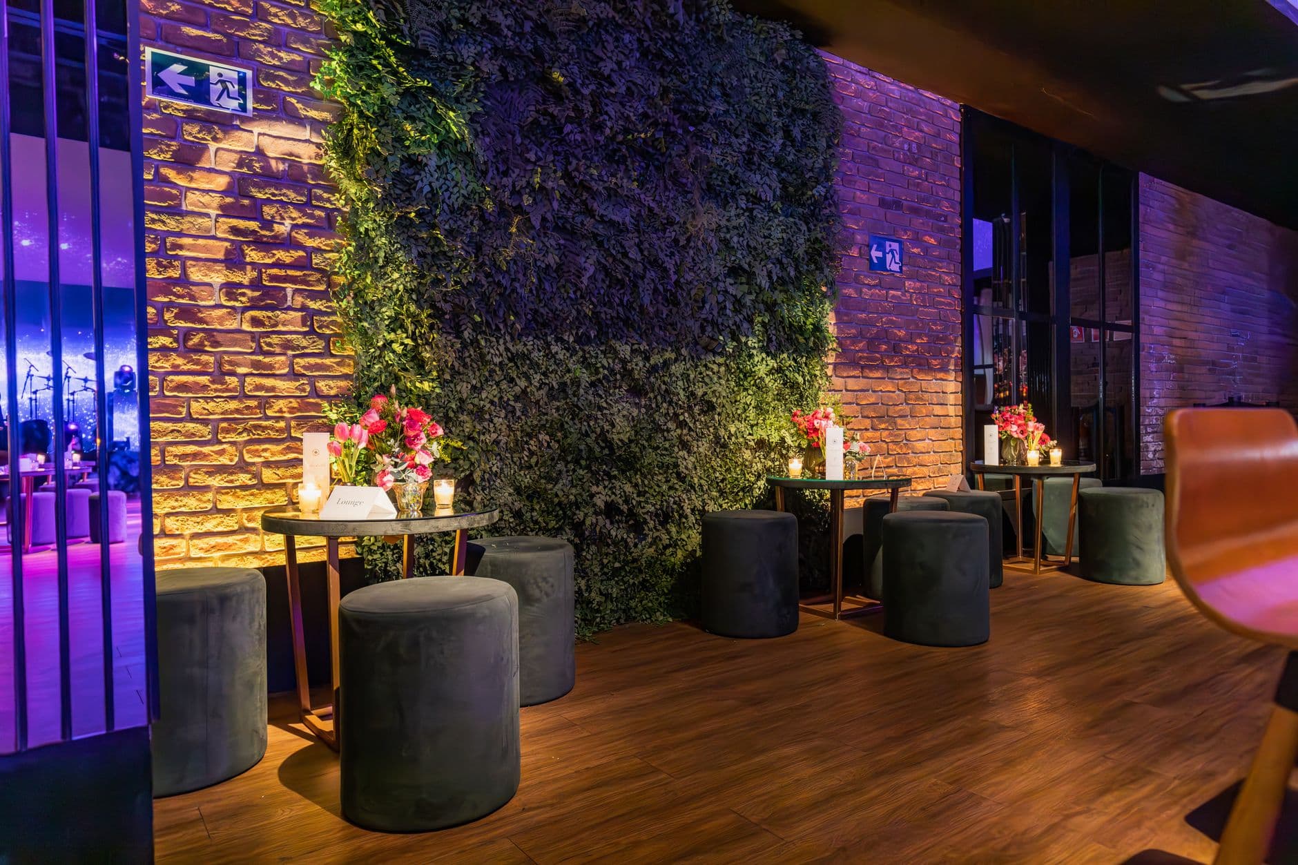
Two photo galleries sit side by side on my screen. Both hold roughly 400 wedding photos. Both were shot at outdoor venues with string lights and long wooden tables. One looks like a generic upload folder with a default blue header and a system font. The other has the couple's monogram in the top corner, a muted sage-green palette that matches the bridesmaid dresses, and a Polaroid-style layout that makes every candid feel intentional.
Same content. Completely different feeling. That's what branding does to a photo gallery.
Most event photo sharing tools treat the gallery as a container: somewhere to dump images. The visual identity of the event stops at the invitation and the table centerpieces. But your gallery is the thing guests actually revisit weeks later. It's the link they send to friends who couldn't make it. If that link opens something generic, you've lost the thread of the experience you worked so hard to create.
This guide walks through how to set up a photo gallery that looks and feels like your event. We're covering header styles, gallery layouts, color customization, and the small details that separate a branded experience from a default one. If you've already read our broader piece on event branding for custom photo galleries, consider this the hands-on sequel.
Why Branding Isn't Just a Logo
There's a practical argument for gallery branding: recognition. When a guest opens the gallery link three weeks after the event, the header and color scheme instantly remind them which event this belongs to. No confusion with other shared albums. No "wait, whose wedding was this?" moment.
But there's an emotional argument too. A well-curated gallery tells a story, and branding is part of that story. The header sets the tone before a single photo loads. A minimalist header with a clean sans-serif font says "modern city wedding." A gradient header with bold type says "corporate product launch." A Polaroid header with a cursive title says "backyard birthday party." Guests notice, even if they can't articulate why.
Professional photographers have understood this for years. According to ShutterReview's analysis of gallery platforms, branded delivery galleries function as a "digital delivery studio" that reinforces the photographer's (or event's) identity. The same principle applies when guests are the ones uploading. Your QR code invites people into a space. That space should look intentional.
Six Header Styles (and When to Use Each)
Photogala offers six distinct header styles, each designed for a different visual personality. Here's a quick rundown. If you want to see how they pair with different gallery layouts, our layout comparison guide covers that in detail.
Elegant Header. Full-width cover image with the event title overlaid in a refined serif or script font. Works beautifully for weddings and formal celebrations. The cover image peeks through, so pick a photo with a clean composition. Busy, cluttered shots get lost behind the text.
Gradient Header. A smooth color gradient (customizable) with bold typography. No cover image. This is your go-to for corporate events, conferences, and product launches. It looks polished without relying on a good photo. Pair it with your company's brand colors and it feels like an extension of your event deck.
Minimalist Header. Barely there. A thin top bar with the event name, maybe a logo. The gallery starts almost immediately. Perfect for events where the photos are the experience and you don't want anything competing for attention. Group trips and casual parties work well here.
Modern Header. Clean geometric lines, a rectangular cover image area, and contemporary sans-serif typography. Sits in the sweet spot between elegant and minimalist. If you're not sure which header to pick, this is a safe default that works for most events.
Modern Compact. Same design language as Modern, but takes up less vertical space. Good for galleries where you expect guests to jump straight into browsing. Less scroll before the first photo appears.
Polaroid Header. A tilted, playful header frame with a handwritten-style font. Immediately sets a casual, fun tone. Birthday parties, bachelorette weekends, informal get-togethers. It tells guests "this isn't a formal gallery, just upload whatever makes you laugh."
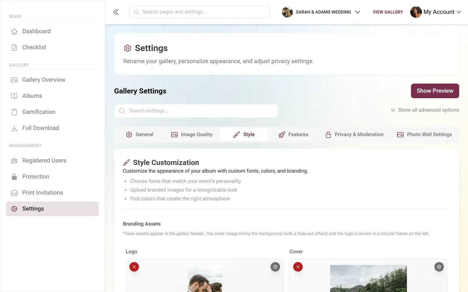
1.Elegant header with a full-width cover image and custom event logo
Quick test for your header choice: If someone who wasn't at the event opens the gallery link, does the header alone give them a sense of what kind of event it was? If yes, you've picked the right style.
Layouts That Complete the Picture
The header is the entrance. The gallery layout is the room. They need to match, or the experience feels off. Photogala's customization options give you four main layouts: Modern, Polaroid, Timeline, and Vintage, plus newer Mosaic and Justified variants. Each one changes how photos are arranged, how much whitespace surrounds them, and what the overall browsing rhythm feels like.
A quick cheat sheet. Elegant header + Timeline layout = chronological story of a wedding day. Gradient header + Modern layout = clean corporate gallery. Polaroid header + Polaroid layout = playful party vibes. Minimalist header + Justified layout = photography-focused, edge-to-edge images. For a deeper visual comparison of Mosaic and Justified layouts, we have a separate guide.
Here's where it gets interesting. On Premium and Deluxe plans, you can tune each layout variant individually: column count, gap spacing, corner rounding, shadow intensity, card color, even image filters. So two people using the Modern layout can end up with galleries that look nothing alike. One tight grid with no rounding and hard shadows. Another with generous spacing, soft rounded corners, and a slight warm filter. Same layout engine, completely different feel.
See it in action
Every guest photo in one album – no app.
Getting Colors Right (Without a Design Degree)
On the Deluxe plan, you get full control over three color channels: primary, accent, and background. That sounds simple, but it's where most people either nail the look or create something that hurts to look at.
The safest approach: pick your event's dominant color as the primary. Use a lighter or darker shade of the same color as the accent. Keep the background neutral (white, off-white, or very light gray for light mode; dark gray or near-black for dark mode). That's it. Three colors. Restraint is the whole game here.
Our guide on matching gallery colors to your event theme goes deeper into color pairing. One thing worth flagging: test your color choices with actual event photos, not just in the settings panel. A teal accent that looks gorgeous on a white background might clash badly with photos that have a lot of warm sunset tones. Upload 5-10 real photos first, then adjust.
If your event has an official color palette (corporate brand guidelines, wedding stationery suite), pull the exact hex codes and drop them in. Don't eyeball it. "Close enough" green is noticeably different from the right green. And if you're running a branded QR code that uses the same colors, consistency across touchpoints matters.
The Complete Setup in 15 Minutes
Here's the actual workflow, start to finish. No fluff.
Branding Your Gallery
Upload your logo
PNG with a transparent background works best. It appears in the header and on your QR code (Deluxe plan). Keep it simple; detailed logos get lost at small sizes.
Pick your header style
Choose one of the six styles. If using Elegant or Modern, upload a cover image. Landscape orientation, at least 1920px wide.
Set your colors
Primary, accent, and background. Use your event's palette. When in doubt, one color plus neutrals.
Choose a gallery layout
Modern for clean grids, Polaroid for playful vibes, Timeline for chronological storytelling, Vintage for a nostalgic feel. Fine-tune column count and spacing.
Preview with real photos
Upload 5-10 test photos and check the gallery on both desktop and mobile. Colors and layouts behave differently on small screens.
One honest limitation: if you're on the Plus plan, you get logo and brand colors but not the full gallery color customization (primary/accent/background). That's a Deluxe feature. For most casual events, the Starter-level branding is plenty. But if you're a wedding planner or corporate event organizer where brand consistency is non-negotiable, the Deluxe tier is worth it.
Beyond the Gallery: Branding the Whole Experience
The gallery is the main attraction, but it's not the only touchpoint guests see. The QR code scan page, the upload confirmation screen, the photo wall on the big screen, the notification when someone comments on their photo. On Deluxe, your logo follows guests through all of these moments.
Picture a corporate holiday party. Guests walk in, scan a branded QR code on the table. The upload page shows the company logo. Photos appear on the live photo wall behind the DJ with the company colors framing each image. A colleague shares a photo, and the social share card carries the event branding. The whole thing stops feeling like a photo gallery and starts feeling like a branded space that runs on guest photos.
For weddings, it's subtler but just as effective. The couple's monogram on the header. Their wedding colors in the accent and background. A Polaroid or Vintage layout that matches the invitation suite's aesthetic. When the gallery link gets texted around at brunch the next morning, it doesn't look like "some photo app." It looks like part of the wedding.
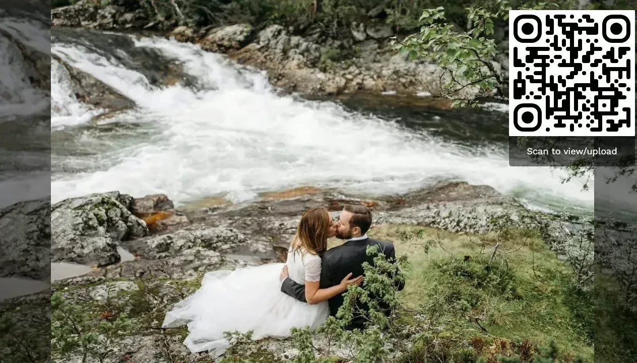
1.A fully branded wedding gallery, right from the start page
If you're also using photo challenges or a leaderboard, the branding extends there too. Challenge cards, achievement badges, and the leaderboard all sit inside the same branded frame. It's a small detail, but it's the difference between a gallery that feels assembled from parts and one that feels designed as a whole.
And speaking of the whole package: once you've nailed the gallery branding, you might want to think about what happens after the event. Our guide on creating a digital memory book from event photos covers how to turn a live gallery into a lasting keepsake. Guests can also download the full archive in original quality, so all those carefully branded moments live on.
What Most People Get Wrong
A few branding mistakes come up again and again in event galleries. Here are the ones worth avoiding.
Too many colors. Three is ideal. Five is chaos. Your gallery has photos in it, and photos bring their own colors. The gallery frame should be calm enough to let the photos breathe.
Wrong cover image. The Elegant and Modern headers show a cover image prominently. People pick their favorite event photo, which is often a close-up of people laughing. Great photo. Terrible header image. Headers need wide, not-too-busy compositions. A venue shot, a table setting, an overhead angle of the space before guests arrive. Save the people shots for the gallery itself.
Skipping mobile preview. More than half your guests will browse the gallery on their phone. A header that looks stunning on a laptop might feel cramped on a phone screen. Always preview both. If you're running a multi-language gallery for international guests, check how longer German or French text fits in the header too.
Forgetting dark mode. Galleries have a dark mode toggle (Starter and up). Your colors need to work in both light and dark. A dark green accent on a white background looks elegant; the same dark green on a dark gray background might vanish. Test both.
Cover image resolution matters. Upload at least 1920px wide. Anything smaller gets stretched and blurry on desktop, which undermines all the branding work you just did.
The gallery that gets passed around, bookmarked, and revisited isn't the one with the most photos. It's the one that looks like the event felt. Branding is how you close that gap. A custom header, a thoughtful color palette, and a layout that fits the mood. Fifteen minutes of setup that shapes how 200 people remember the night.
All of this comes with your own event.
Setting it up takes five minutes. You can build and view everything before you decide.
Starting from €39 one-timeOne-time payment — No subscription
- No App Required
- Setup in 5 Minutes
- 30-Day Money Back
“We were really thrilled, and everything went so much more smoothly, from the seating plan all the way to the photo games! Simply great! Highly recommended!”
Written by

I believe event photos should be more than static galleries. They should be live, playful, and unforgettable.
Categories
Related Posts

Company Retreat Photo Sharing: How to Actually Keep the Memories
Most offsite photos die on individual phones. Here's how to collect, share, and actually use every photo from your next company retreat.
Neighborhood Block Party Photo Sharing: How to Turn 40 Strangers Into One Shared Album
Block parties create great photos — and zero way to share them. Here's how a QR code gallery turns your street into a connected community.
Why Upload Limits Ruin Event Galleries (and What Unlimited Actually Changes)
Upload caps at events create anxiety, reduce participation, and leave gaps in your photo collection. Here's what happens when you remove the ceiling.