The admin area
The admin area is your command center. On its home screen (the dashboard) you see at a glance how far along your event is, which figures matter right now and what’s next – and from here you jump into every other area. This guide explains every strip, tile and card on the dashboard, how to arrange the page yourself, what is different on a phone, and how to get there in the first place.
Who sees the admin area?
Section titled “Who sees the admin area?”The admin area is meant for hosts (owners) and admins. Only someone with the admin role gets in – everyone else (plain guests, but also plain moderators) sees a “no permission” notice instead.
How to reach the dashboard
Section titled “How to reach the dashboard”Guests, moderators and hosts all move around in the same gallery; you open the admin area from within the gallery.
-
Unlock your event and sign in. The full process is in the access your event guide.
-
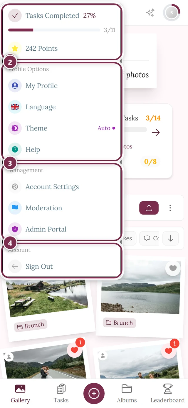
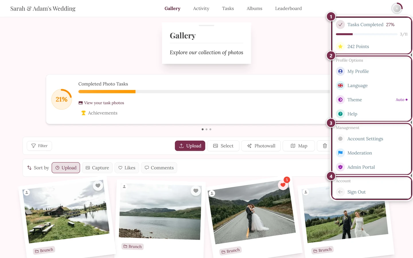
In the gallery, open the profile menu in the top right and pick Admin Portal in the Management section. The entry only appears if you hold the admin role. You land directly on the dashboard, the home screen of the admin area.
-
Get your bearings from the header at the top – left to right:
- Double chevron on the far left: collapses and expands the sidebar.
- Magnifier (mobile only): opens global search as a full-screen dialog. On a computer the search bar sits right next to it instead.
- Event selection (button with event logo and title): if you own several events, switch between them here.
- “View gallery” (computer only): opens your event exactly the way your guests see it.
- Profile menu on the far right: account settings, language, help and sign out.
-
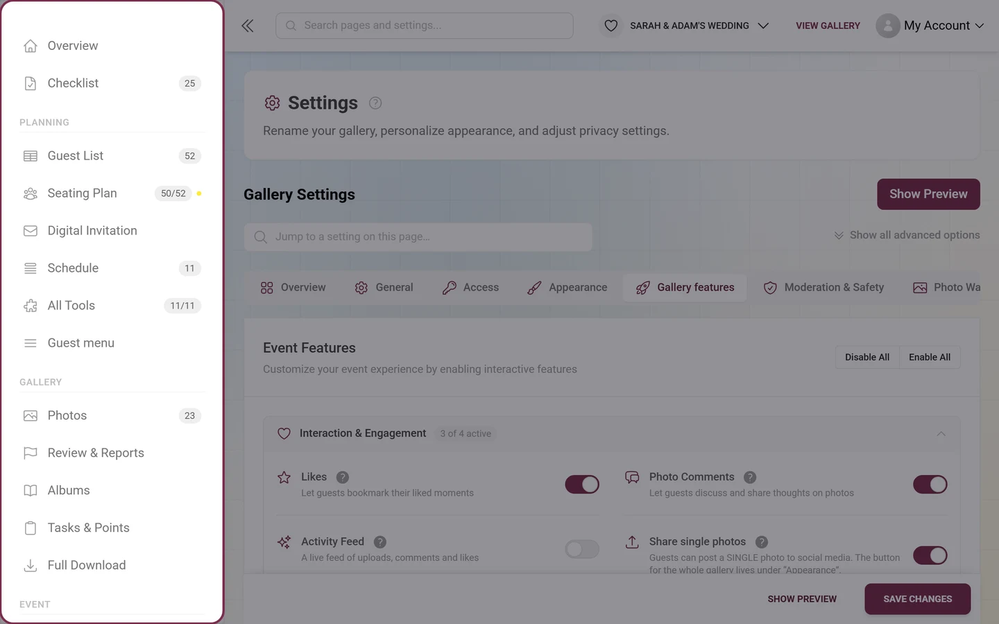
Use the sidebar on the left (with the app logo and an “Admin” badge at the very top) as your map to every other area. It also expands the tabs of the page you’re currently on.
How the dashboard is built
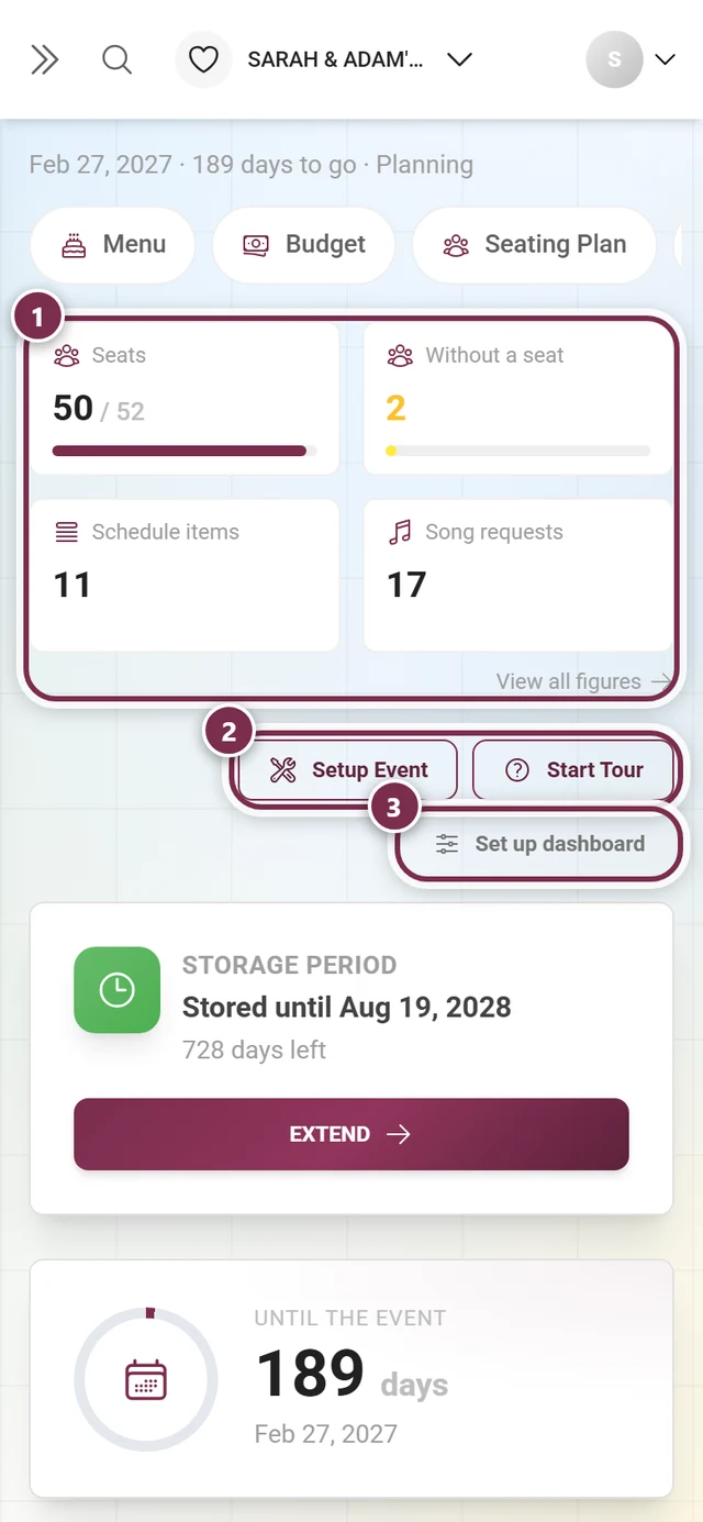
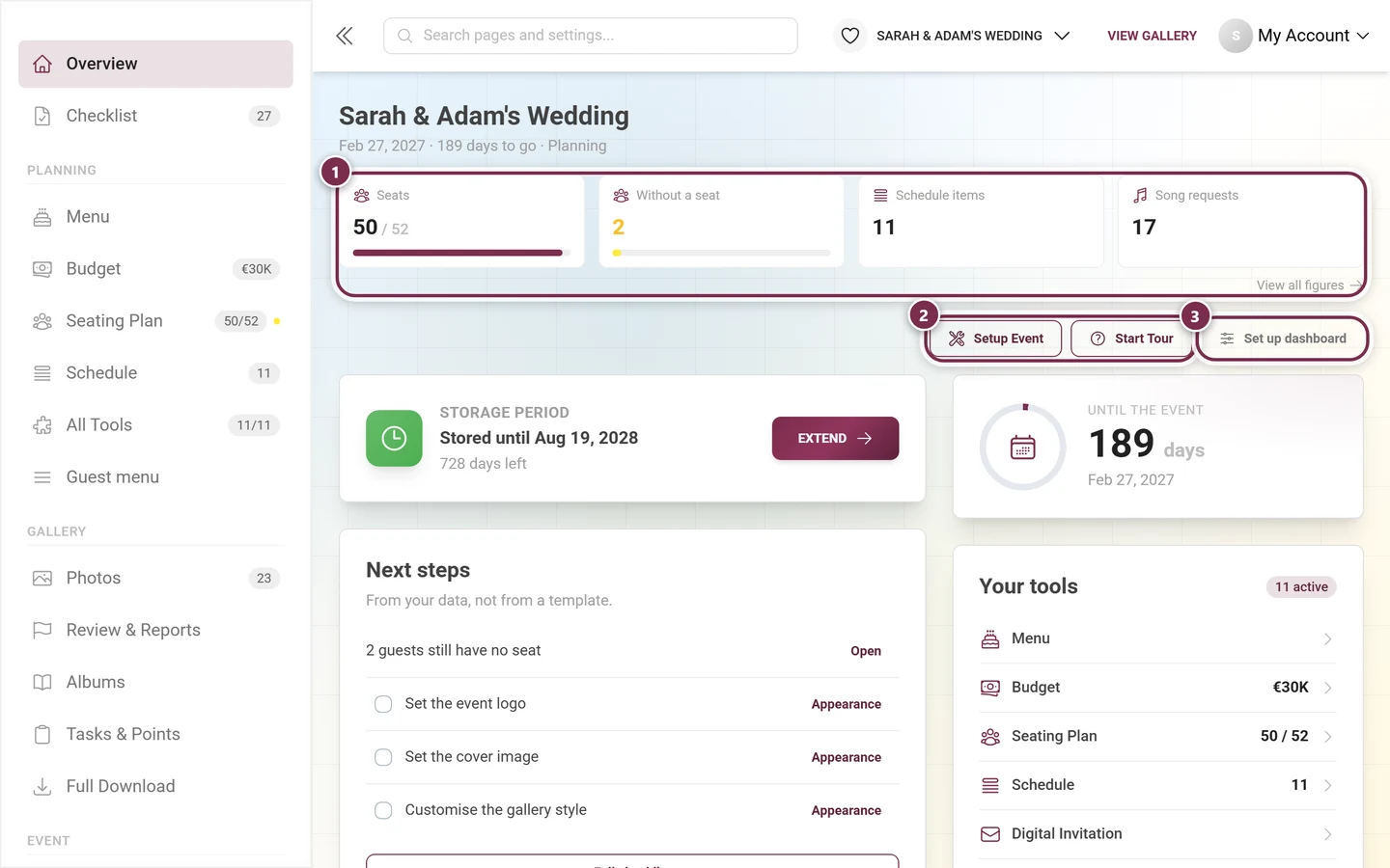
Section titled “How the dashboard is built”The page always has the same structure, top to bottom:
- Notice strips – system and event messages, plus at most one plan notice.
- Event header – your event’s name, date, time remaining and the current phase.
- Tool rail – mobile only: your active tools as tappable pills.
- Metric band – up to four tiles with the figures that matter right now.
- Button row – “Setup Event”, “Start Tour” and “Set up dashboard”.
- The cards – which ones appear and in what order follows the phase and your own settings.
- Plan row – at the very bottom: what your plan holds and how much of it is used.
Notice strips at the very top
Section titled “Notice strips at the very top”Right at the top come system and event notices about your event. Below them there is only ever one plan surface at a time:
- Limit notice: once the photo cap of your free plan is reached, a red “Your gallery is full” block replaces everything else. “Upgrade now” takes you to the pricing page.
- Plan notice: otherwise a colored strip – but only in exactly three dated states: your gallery has expired, it expires within 14 days (free events only), or a time-limited discount is waiting for you. With a discount a countdown chip ticks inside the strip.
Event header: date, time remaining, phase
Section titled “Event header: date, time remaining, phase”Above everything sits one line about your event: the event name, below it date · N days to go (or has taken place) · phase. On a phone the name is dropped – the top bar already carries it.
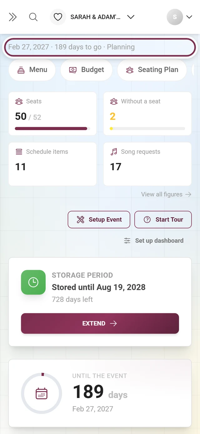
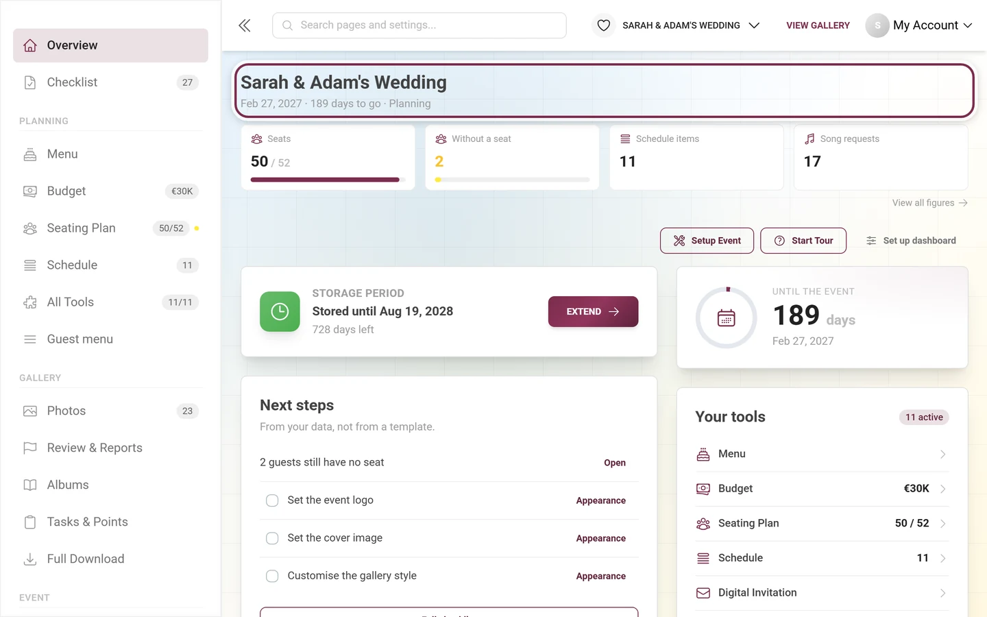
The phase is the important part, because it decides which cards sit at the top. There are three, named Planning, Gallery and After the event in the header. Photogala derives them automatically:
- If you picked a phase by hand in the “Set up dashboard” dialog, that one wins.
- If the event day is more than two days in the past → After the event. (Two days of grace, because photos keep coming in the morning after.)
- If at least one planning tool is switched on – guest list, RSVP, seating plan, menu, budget or digital invitation → Planning.
- Otherwise → Gallery.
Notice: “Your event link shows the invitation”
Section titled “Notice: “Your event link shows the invitation””Right below the event header a blue strip with a link icon can appear: Your event link shows the invitation. It only shows up once you have turned on Event link shows the invitation in the Display tab of the digital invitation – and only while the switch actually takes effect.
The wording names the limit too:
- with the sub-option Only until the event day: “Anyone opening your event link lands on the invitation instead of the gallery until the event day — including you and your event admins. From the event day on, the gallery takes over automatically.”
- without it: the same sentence without a deadline – the link keeps showing the invitation.
Open setting jumps straight to that switch and highlights it. From the event day on the strip disappears by itself, because the switch no longer takes effect. It cannot be dismissed: it is deliberately not a dashboard card, because cards can be switched off.
The metric band
Section titled “The metric band”Directly below the header sit up to four tiles with the figures that matter for your event right now. Below 520 pixels of width they stack 2 × 2.
Each tile carries an icon, a short label, the figure (with a limit shown as “value / limit”) and a progress bar. A click takes you where you act on that number – the photo tile into the gallery, the storage tile to the pricing page, a tool tile into the tool. Below the band on the right sits the link “View all figures” leading to the full event statistics.
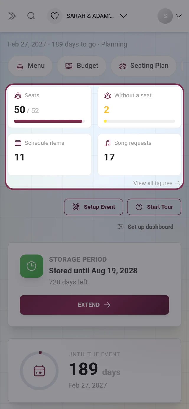
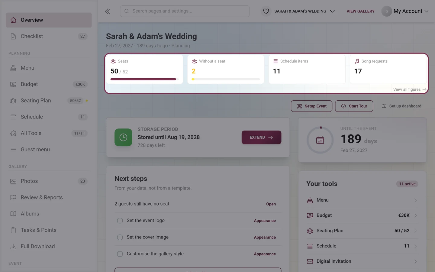
What can appear in the band:
- From your tools: one figure per active tool – acceptances, seats, guests, budget, schedule items, song requests. If something is outstanding there, a second, yellow tile joins it (“Open”, “Without a seat”). Tools with no data contribute nothing and therefore never take a slot.
- From the gallery: Photos (with the limit as denominator), Uploaders, To review (only when something is actually waiting), Storage (only with a limit) and Gallery until.
- Everything else is optional and off by default: Published, Unpublished, Recycle bin, Videos, Registered, Tasks solved, plus awards given and claimed. You switch those on in the “Set up dashboard” dialog.
In the After the event phase the gallery tiles come before the tool tiles – afterwards the pictures are the story, not the planning.
The three buttons above the cards
Section titled “The three buttons above the cards”Right-aligned above the card grid sit three controls:
- “Setup Event” (wrench icon): opens the guided setup wizard – title, logo, cover image, style. The whole process is in the setting up your event guide.
- “Start Tour” (question-mark icon): launches the interactive admin tour: as many as 21 steps in 7 chapters through the whole area. Six of them are conditional – the invitation step, for instance, only shows up when the invitation tool is switched on (the full list is under Setting up your event). Every step navigates to what it talks about. The button always restarts the tour from the beginning.
- “Set up dashboard” (sliders icon): opens the dialog where you switch figures and cards on or off and decide their order. If you have switched cards off, the count sits on the button itself: “Set up dashboard · 2 off”.
“Set up dashboard” – the page is yours
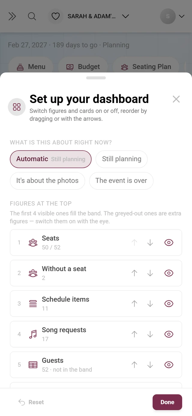
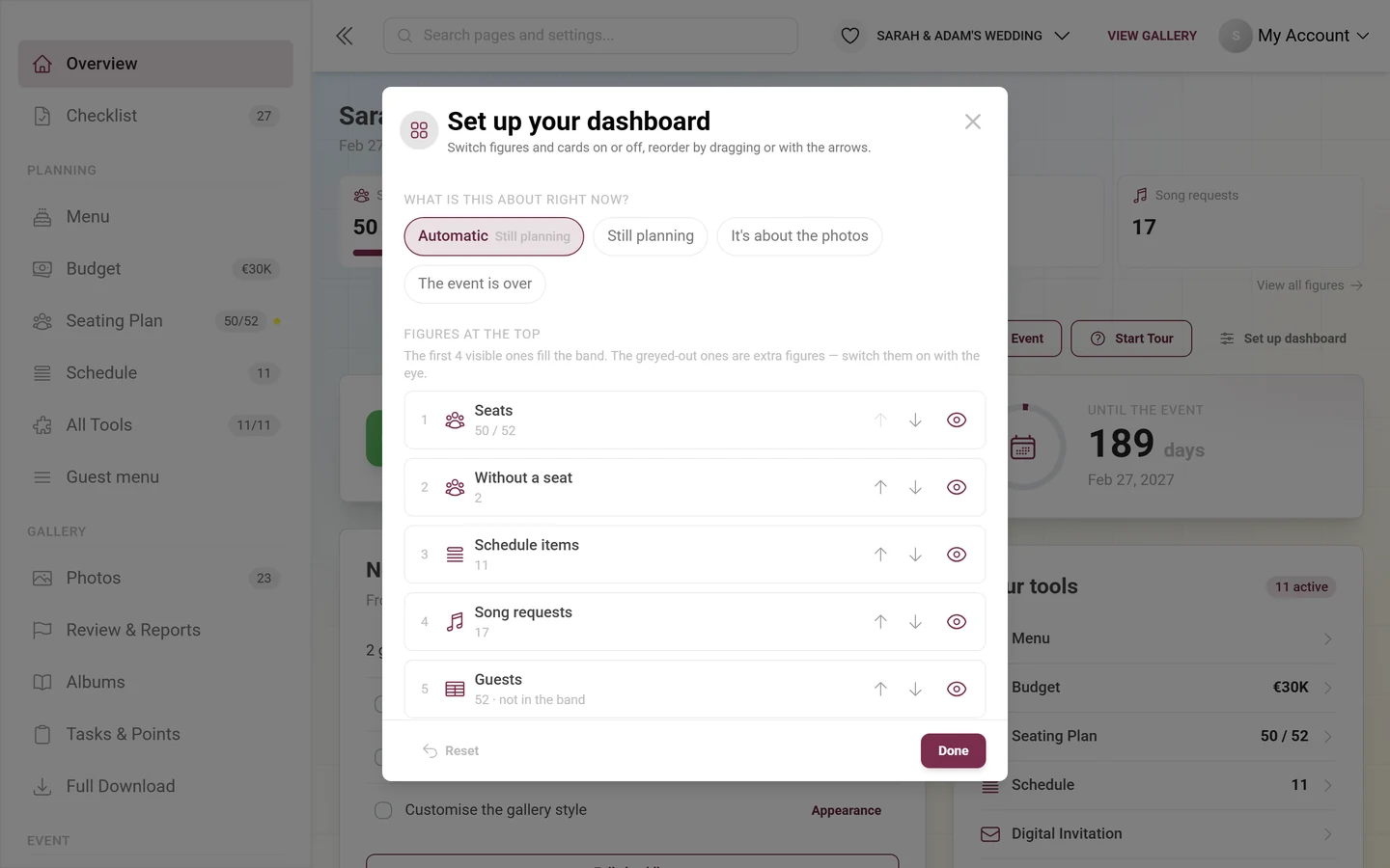
Section titled ““Set up dashboard” – the page is yours”The “Set up your dashboard” dialog carries the subtitle “Switch figures and cards on or off, reorder by dragging or with the arrows” and consists of three blocks.
-
“What is this about right now?” – four pills: Automatic (the derived phase is printed next to it in small type), Still planning, It’s about the photos, The event is over. Pick a fixed phase and it stays until you switch back to “Automatic”.
-
“Figures at the top” – every possible tile as a row with its current value, two arrows to move it and an eye to switch it on or off. Above the list sits the hint “The first 4 visible ones fill the band” – the order therefore decides which four you see. Grayed-out rows marked “optional — off” are the extra counters you have to switch on first. A tile that is on but still didn’t make the cut says “not in the band”.
-
“Cards” – the same mechanics for the cards: drag handle on the left, arrows to move, eye to switch off and on. Below the list sit the cards your plan does not include, dashed and marked “not in your plan” – so “where did the live wall go?” keeps an answer.
-
Bottom left “Reset” (restores phase, order and visibility to the defaults), bottom right “Done”. Every change saves immediately – “Done” only closes the dialog.
The cards in detail
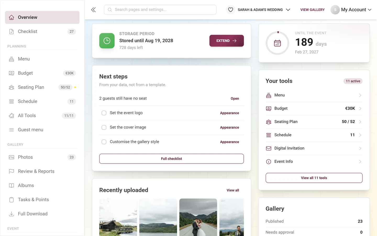
Section titled “The cards in detail”The card order is defined once and depends on the phase. “Storage period” leads in every phase, “Countdown” always comes second; after that it differs: while planning, “Next steps” and “Your tools” follow, in the gallery phase “Recently uploaded” and “Gallery”, after the event “Recently uploaded” and “After the event”.
On a computer the cards are dealt off that one list alternately into a wide (7/12) and a narrow column (5/12) – read left to right, that gives the same sequence as scrolling on a phone. With fewer than five visible cards the page stays single-column.
Storage period
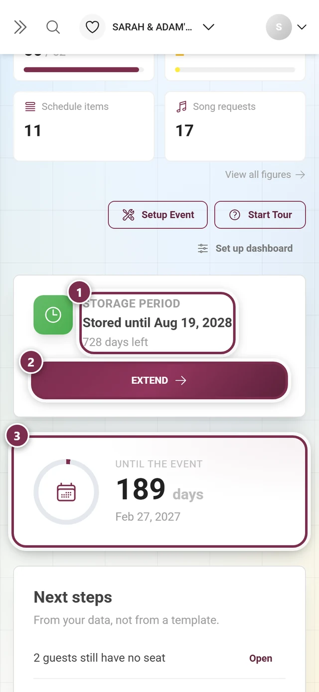
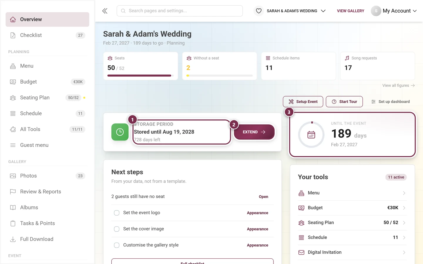
Section titled “Storage period”The leading card says how long your gallery stays online. It knows four states:
- “Begins with the first photo” – free event, the clock has not started.
- “Not started yet — begins with the 10th photo” – paid plan, the clock has not started.
- “Stored until” plus the date and “N days left” – or “Stored permanently” on open-ended plans.
- “Expired — N days of download access left”.
The “Extend” button leads to the pricing page. On branded events the date stays but the button is dropped – there you buy from the provider, not from Photogala.
Countdown
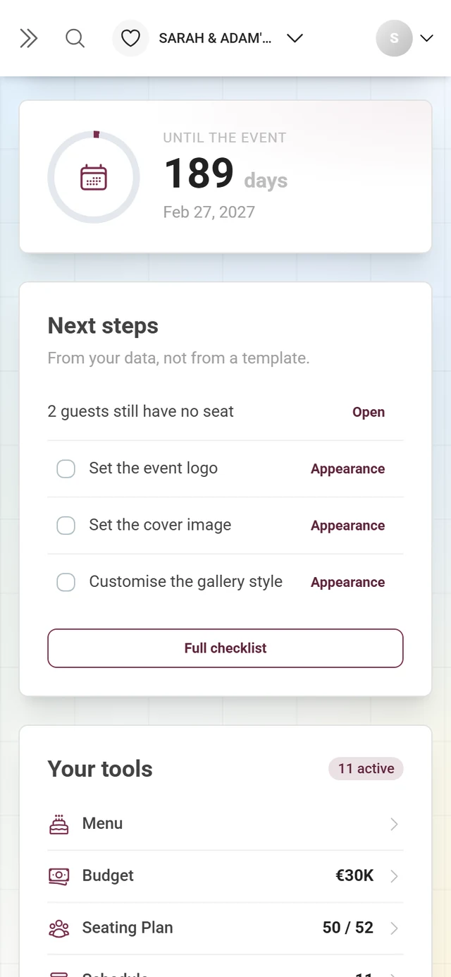
Section titled “Countdown”The one big card of the page: a day counter with a progress ring that fills over the last six months before the event, plus the date. On the event day it reads “Today!”, afterwards “N days ago”.
Without an event date the card asks “When is the big day?” instead and offers the “Add a date” button, which jumps straight to the matching field in the general settings.
Next steps
Section titled “Next steps”This card replaces the former checklist card. Its subtitle says where the difference lies: “From your data, not from a template.” It shows up to four entries:
- First derived steps from your real figures – “4 guests still have no seat”, “7 replies are still outstanding”, “12 uploads are waiting for approval” – each with the text button “Open” that leads straight into the responsible tool or into the gallery.
- Then open checklist tasks with a checkbox and, where defined, their own action button.
A derived step suppresses the template task for the same tool – the card does not state the same job twice, once precisely and once vaguely. Tasks your plan does not include drop out entirely. With nothing outstanding it reads “All done — nothing outstanding right now.” At the bottom a single button “Full checklist” leads to the complete setup checklist.
Your tools
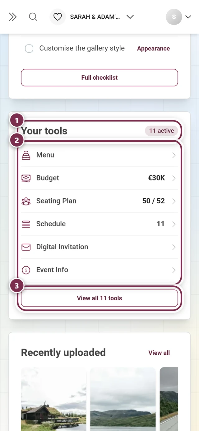
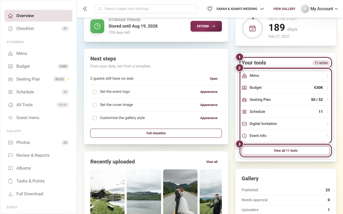
Section titled “Your tools”The card lists your active tools with their respective figure – most recently opened first – and a badge with the count in the top right (“5 active”). If there is room among the six rows at most, it fills up with suggestions: tools not yet switched on are marked “off”, tools missing from your plan carry a lock and “not in your plan”. The button at the bottom reads “View all 11 tools” and leads to the tooling overview.
Gallery
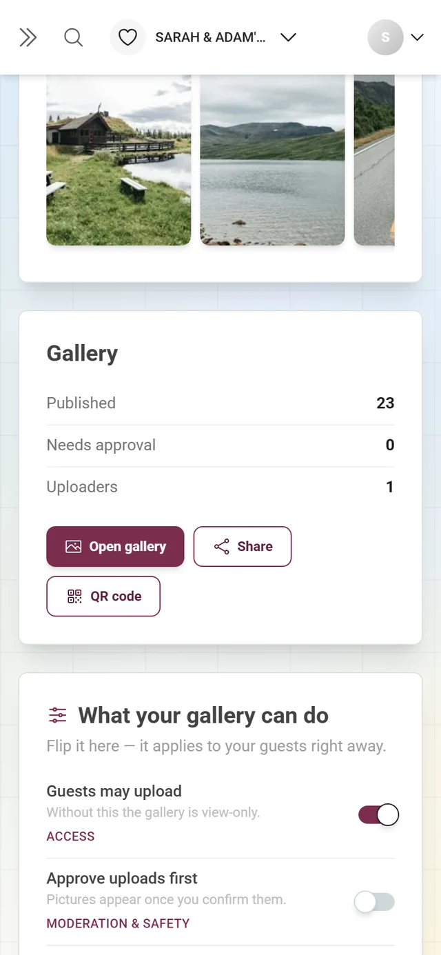
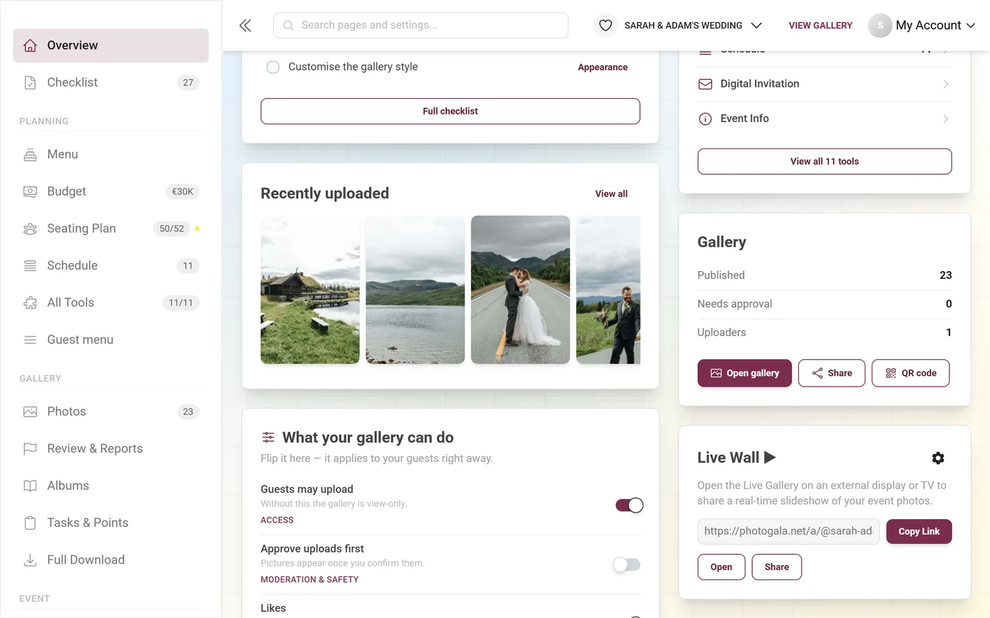
Section titled “Gallery”Three rows with your gallery’s figures – Published, Needs approval (only if your plan can moderate at all) and Uploaders – and three buttons below:
- “Open gallery” – your guest gallery.
- “Share” – opens the share dialog with the event link. Every way to invite guests is covered under invite guests.
- “QR code” – leads to the print templates for QR cards, posters and table cards.
There is deliberately no statistics button here any more: the route to the detailed figures is “View all figures” below the metric band.
Recently uploaded
Section titled “Recently uploaded”A horizontal strip of pictures, newest first, that keeps loading more as you scroll right. A click opens the same slideshow the gallery uses. “View all” in the top right leads into the gallery.
While there are no photos yet it reads “No photos yet. Share the link or the QR code so your guests can get started.” with the button “Get the QR code” – which opens the share sheet, not the print-template editor.
What your gallery can do
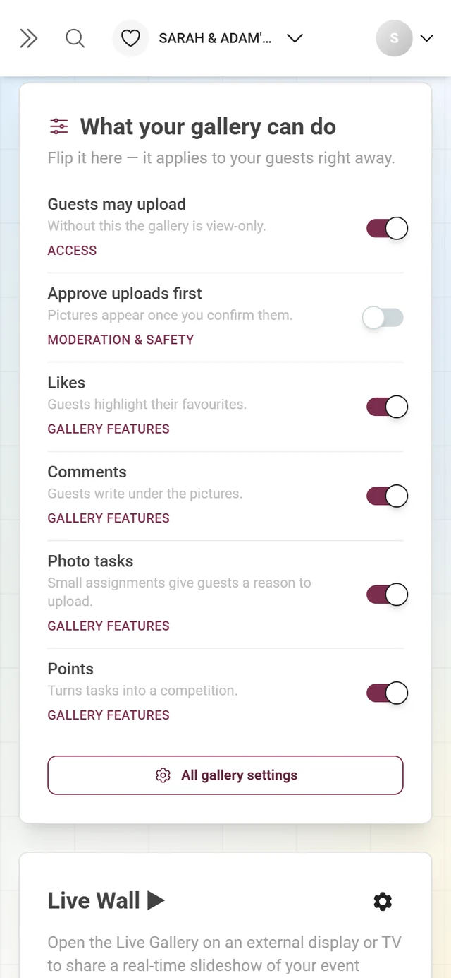
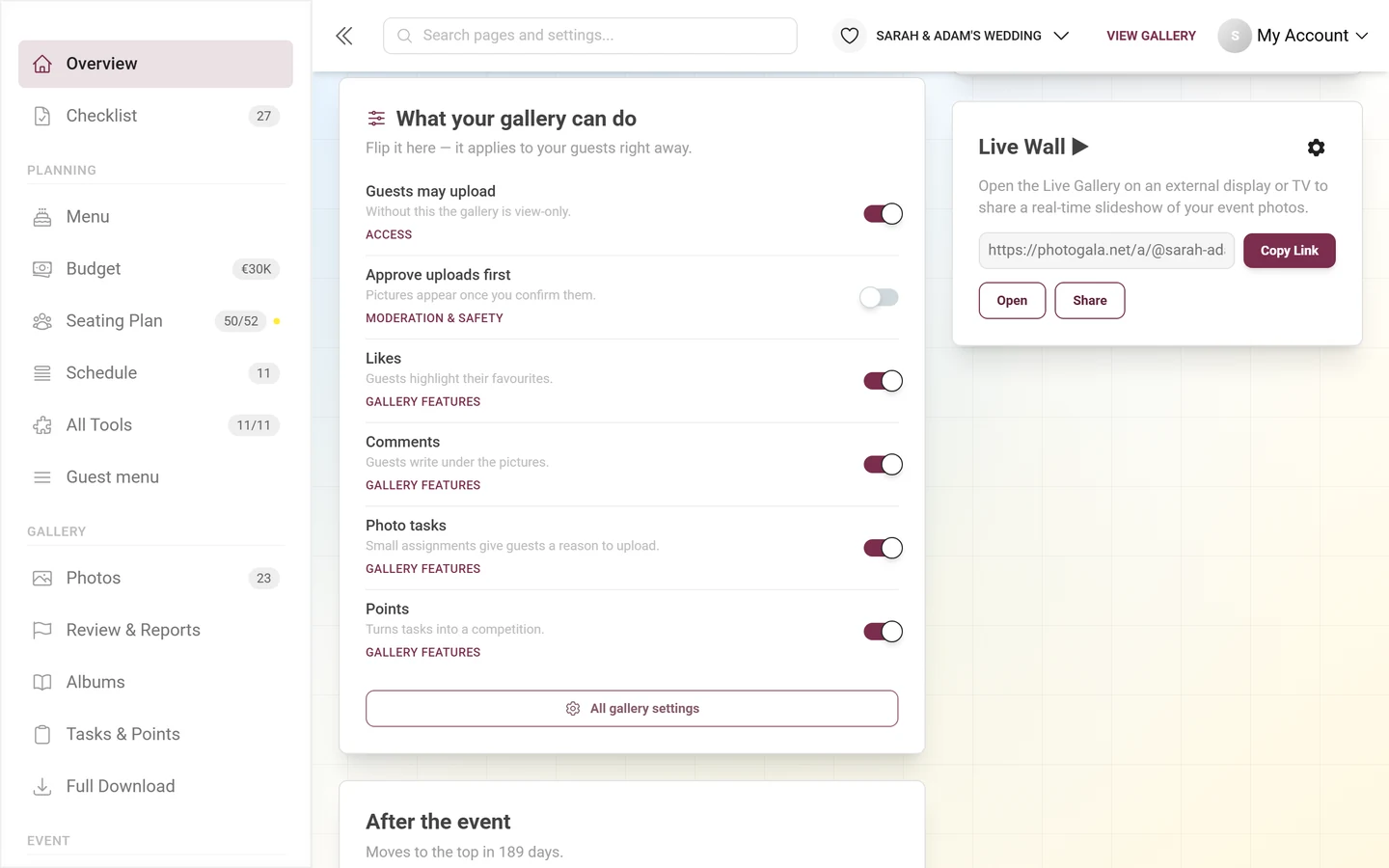
Section titled “What your gallery can do”This card replaces the old “Features” status list – and it is no longer a list but flips the switches directly. Subtitle: “Flip it here — it applies to your guests right away.” Six rows, each with a real switch:
| Row | What it does |
|---|---|
| Guests may upload | Without this the gallery is view-only. |
| Approve uploads first | Pictures appear once you confirm them. |
| Likes | Guests highlight their favorites. |
| Comments | Guests write under the pictures. |
| Photo tasks | Small assignments give guests a reason to upload. |
| Points | Turns tasks into a competition. |
Green checks, red crosses and a gear per row are gone. Instead, every unlocked row carries a small link to the settings page where that switch actually lives – for likes, comments, photo tasks and points that is Gallery features, for Guests may upload the Access tab (see Inviting guests) and for Approve uploads first Moderation & safety. Rows your plan does not include carry the note “Not included in your plan.” and, instead of the switch, a lock with an up-arrow to the pricing page. At the very bottom, “All gallery settings” opens the Gallery features tab.
Live wall
Section titled “Live wall”The “Live Wall ▶” card starts a real-time slideshow of your photos on an external display or TV:
-
Copy the photo-wall link from the read-only field with the “Copy Link” button (it briefly changes to “Link Copied”). The field carries no label – it holds nothing but the address.
-
Open the link on your TV or projector – or click “Open” to start the photo wall right here. Use “Share” to hand out the link via the share dialog.
-
Adjust the look via the gear in the top right; it opens the photo-wall settings.
The full setup is in the photo wall setup guide.
After the event
Section titled “After the event”Three rows for the wrap-up: Download all photos (download & export), Send a thank-you (thank-you tool) and Determine winners (winners).
Before the event the card is deliberately visible but grayed out, with the note “Moves to the top in N days.” – so you learn these things exist while there is still time to prepare them. In the After the event phase it moves up and gains the extra button “Extend storage period”.
Event Statistics (off by default)
Section titled “Event Statistics (off by default)”This card is the only one that ships switched off. It repeats, in one dense block, figures the metric band and the gallery card already carry – useful if you want everything on one screen, wrong as a default for everybody. You switch it on with the eye in the “Set up dashboard” dialog, where it sits with the hint “Every figure at a glance — off by default.”
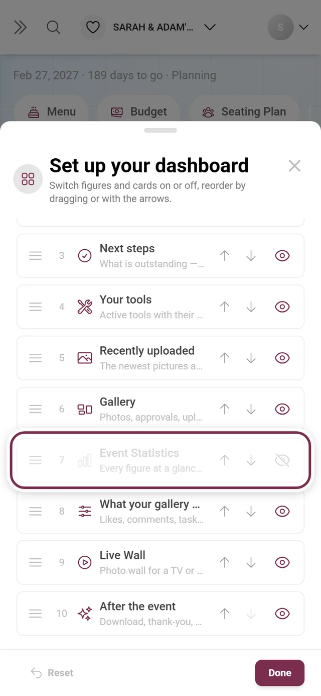
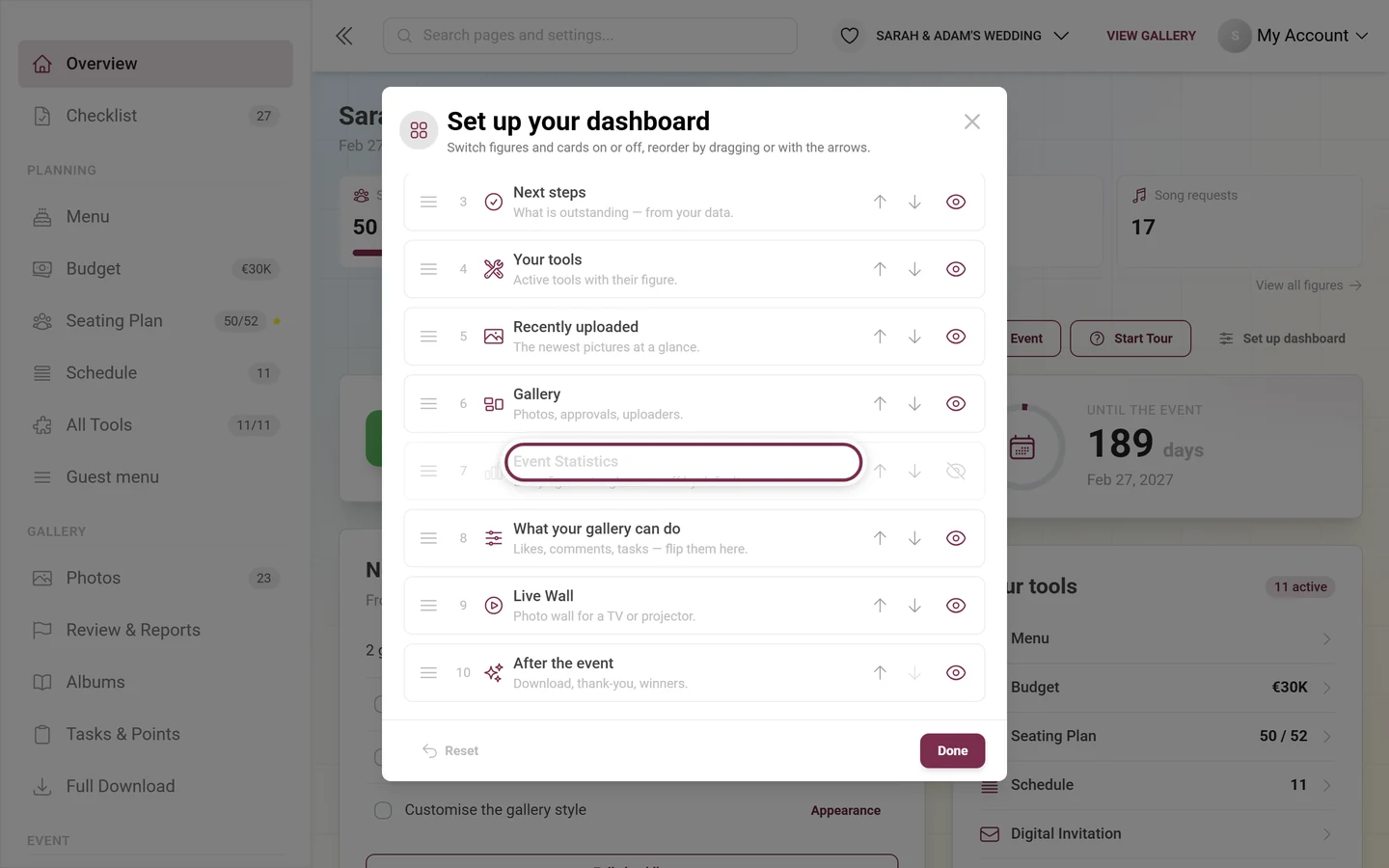
Once on, it shows these groups, depending on your enabled features, every row clickable:
- Uploads: Published, Needs Approval (only with moderation in your plan), Unpublished, Recycle Bin.
- Achievements: Gained and Claimed.
- Tasks: Solved.
- Uploaders: the count of contributors (a bare number, no denominator).
- Visitors: Registered.
- Storage period: the same sentence as the card above, but here without the “Extend” button.
- Storage Usage: “Space used:” with “X of Y GB” or “(No limit)” and a bar. From 90 % the bar turns red.
The circular arrow in the top right reloads the figures (they run live over WebSocket anyway), and “View Detailed Statistics” at the bottom leads to the full event statistics.
The plan row at the bottom
Section titled “The plan row at the bottom”At the very bottom sits a slim row: “Your plan” plus the plan name, next to it one value each for Photos, Videos and Uploaders as “used / limit”, plus “Gallery until” and the date. From 75 % a value turns yellow, from 90 % red and gains a warning triangle. On the right, “View plan” – or “Manage plan” if you are already on the highest plan – leads to the pricing page.
This row replaces the old promo surfaces at the top: it argues from your own consumption rather than from a promise, and it deliberately sits behind your event, not in front of it. On branded events it does not appear.
Quite a bit is different on a phone
Section titled “Quite a bit is different on a phone”Below 641 pixels of width the admin area behaves noticeably differently:
- The sidebar is closed and closes again after every navigation – it slides over the content instead of standing beside it.
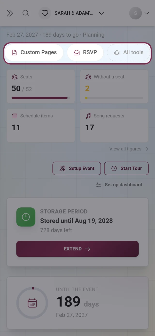
- As a replacement, the tool rail sits directly below the event header: a horizontally scrollable row of pills with your active tools, sorted like the sidebar (most recently opened first), plus an “All tools” pill. One tap is enough. With no tool switched on, the rail does not appear at all.
- The event name is dropped from the header, because the top bar already carries it – what remains is the line with date, time remaining and phase.
- Instead of the search bar there is only the magnifier at the top; it opens search as a full-screen dialog.
- The metric band stacks 2 × 2 below 520 pixels, and the cards run in a single column – in exactly the order that reads left to right on a computer.
Every area in the sidebar
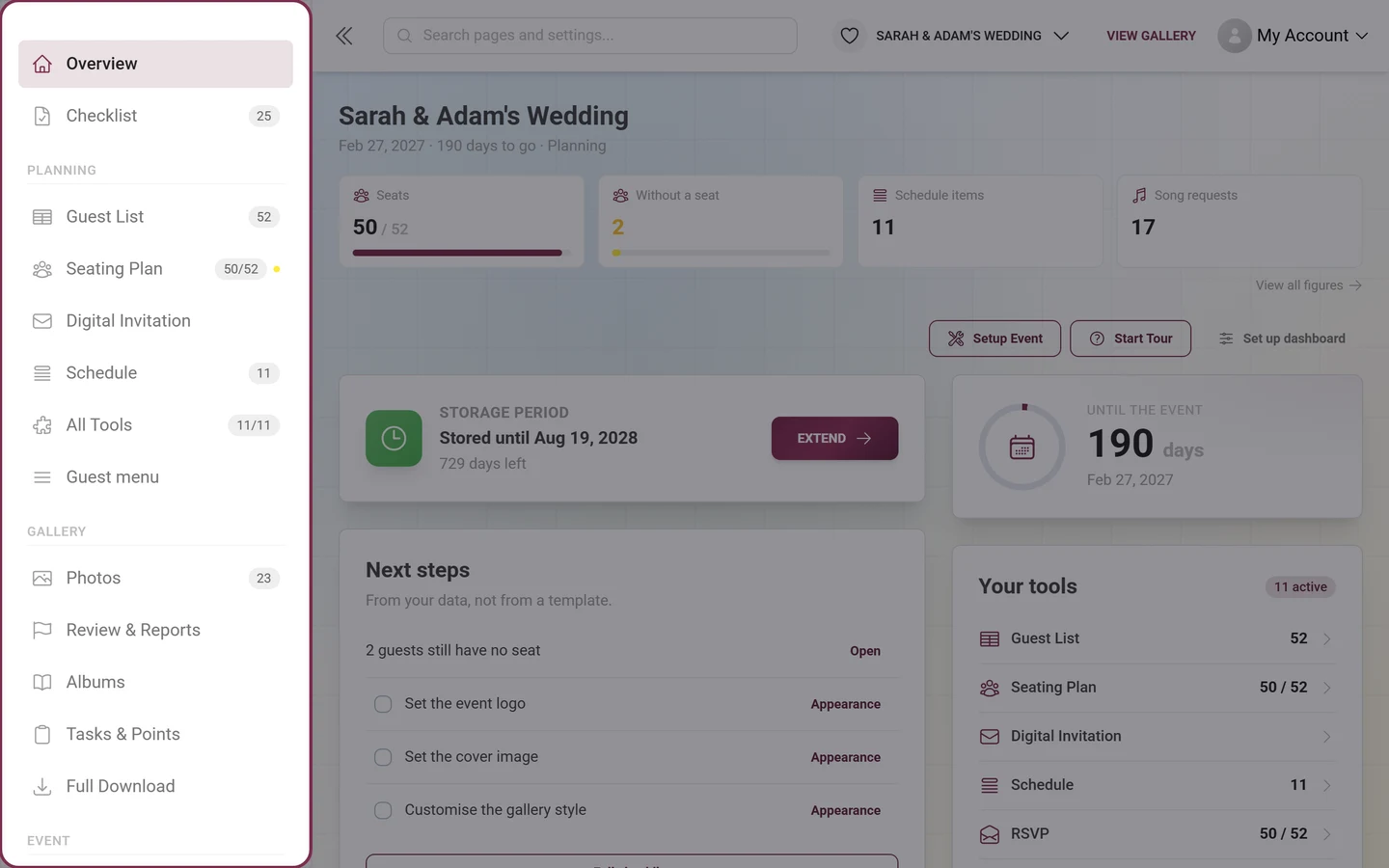
Section titled “Every area in the sidebar”The sidebar is your map through the admin area. It has five groups; depending on your plan, your role and branded events, some entries are hidden.
No heading (at the very top)
- Overview – this home screen.
- Checklist → setting up your event. The badge shows the number of open items.
Planning
- Up to four active tools as rows of their own, most recently opened first, each with its figure as a badge and expandable tabs.
- All Tools → tooling overview. The badge shows “active/total”, next to it a lock with the number of tools your plan does not include.
Gallery
- Photos → gallery management, with the sub-entries Gallery, Recycle bin and Reports (the latter two only when there is something in them).
- Review & Reports → moderation with the tabs Media, Face Clusters, Banned Users and Reports. The badge counts waiting uploads plus open reports.
- Albums → albums manager.
- Tasks & Points → tasks and achievements, with the follow-up pages Real Rewards → rewards and Winners → determining winners.
- Full Download → download & export.
Event
- Participants → registered users.
- Live Upload → live upload (only if your plan includes it).
- Print Templates → QR cards, posters & print templates.
- Statistics → event statistics with the five tabs Overview, Guests, Content, Planning and Moments, plus the follow-up page AI processing.
- Settings → Overview, General, Access, Appearance, Gallery features, Moderation & safety, Photo Wall Settings and White-Label.
Administration – visible only to global platform admins and of no meaning to regular hosts.
Below the groups sits an “Upgrade Plan” or “Manage Plan” box (not on branded events); if a discount is waiting for you it turns into a colored strip with a countdown and a “Claim discount” button.
Global search – your fastest route
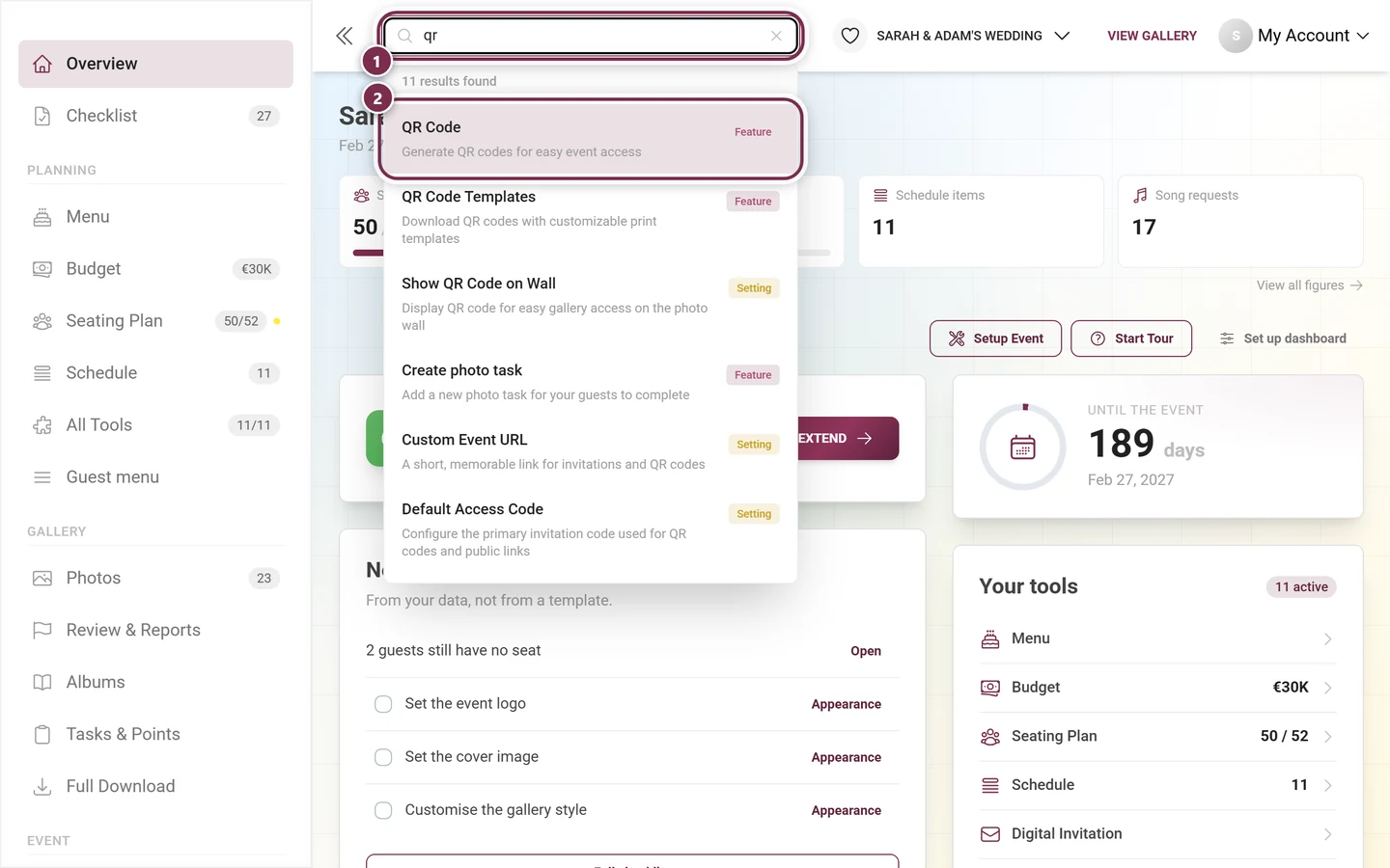
Section titled “Global search – your fastest route”The search bar in the header is more than a page search: it knows individual settings, jumps to the right page, opens the right tab there, scrolls to the field – and highlights it briefly. When you know what you want to change but not where it lives, this is the fastest route.
-
Open it: on a computer, click the search bar at the top with the placeholder “Search pages and settings…”. On a phone, tap the magnifier icon; it opens a full-screen “Search” dialog.
-
Type: results appear as you type. Each result carries a colored badge telling you what it is: Page, Setting, Feature, Tab, Section or Tool.
-
Pick one: click a result – or use the keyboard: arrow keys to Navigate, Enter to Open, Escape to Close. The hints for this sit at the bottom of the result list.
-
Arrive: the search takes you straight to the target. For settings it opens the matching tab, scrolls the field into view and marks it with a colored frame for a few seconds.
The building blocks of the dashboard are search targets in their own right: search for the metric band, the next steps, the tools, the gallery card, the feature list, the live wall or for “set up dashboard”, and the search returns to the dashboard and highlights exactly that block.
On mobile before you type: the search dialog first shows “Search Tips”, then “Quick Links” (dashboard, gallery, albums, review, tasks, achievements, tooling, settings, users, statistics, invitations) and “Popular Searches” as clickable keywords.
When something doesn’t look as expected
Section titled “When something doesn’t look as expected”- “No permission”: anyone who isn’t an admin (say a plain moderator or guest) lands on a notice page instead of the dashboard. Check access and role – see roles & permissions.
- Event deleted or expired: a top banner names the state – for example “This event is deleted and not visible to guests or participants.” or “This event expires in X days.” – and offers the buttons Restore Event (Free), Restore & Extend or Extend Plan, depending on the case. Restoring for free only works as long as paid time is left; otherwise you need an extension. An event locked after a chargeback can only be restored by support. See Managing several events and Plan & term.
- Warning banner “Guest uploads are disabled” or “Standard guests cannot upload photos”: it sits above every page of the admin area as long as the saved settings say guests can’t upload – either because View Only Gallery is selected (“View Only Gallery blocks uploads for every guest, even with a Contributor invitation.”) or because the default role is Viewer (“The default role is Viewer. These guests can view photos but cannot add photos or videos.”). Show details lists who may do what (Standard guests, Contributor invitations, Event admins & owners). Review upload settings takes you straight to the setting. Dismiss warning for this session hides the banner until you close the tab; if you change the setting again, it comes back. See Inviting guests.
- No event yet: if you have no event, the admin area shows your event list or redirects to your first event.
- A card is missing: four possible reasons, to be checked in this order – (1) you switched it off in “Set up dashboard” (the button then reads “· N off”), (2) it is an opt-in card and was never on (Event Statistics), (3) your plan does not include it – it then sits grayed out in the dialog with “not in your plan” (typically the live wall), (4) the phase sorted it far down.
- A figure is missing from the band: only four fit. Open “Set up dashboard” and move it further up in the “Figures at the top” block – tiles that are on but beyond position four carry the note “not in the band” there.
- The plan strip is gone: it only appears in the three dated states (expired, expiring, discount), and never on branded events. There is no “X” to dismiss it, so you did not click it away.
- The phase is wrong: enter an event date, or pick the phase by hand in “Set up dashboard”. Without a date there is never a “The event is over”.
- Figures look stale: they run live over WebSocket; if in doubt click the circular arrow on the statistics card or reload the page.
- Storage or media limit near 100 %: the value turns red – empty the recycle bin or extend your plan.
Best-practice tips
Section titled “Best-practice tips”- Before the party, click “View gallery” once and check everything from the guest’s point of view.
- Walk through “Set up dashboard” once and tailor the page to your event – above all the four figures at the top.
- Click through “Start Tour” once to learn the layout.
- Skim Next steps daily: what’s listed there comes from your real data.
- Use the global search instead of clicking through menus – it finds individual toggles too.
- Test the live-wall link in advance and open it on a TV or projector at the venue.
- Keep an eye on the storage period and “Extend” in good time.
Related pages
Section titled “Related pages”- Setting up your event – wizard, checklist and guided tour
- Tooling overview – all eleven planning tools
- Reading your statistics – the detailed breakdown
- Before, during & after the event – the flow in three phases
- Plan & term – extend the storage period, choose the archive or a subscription, and unlock features