Customizing the look
The Appearance tab is your design hub: as the host you set the look of your event here – header, logo, cover image, brand colors, color palettes, dark mode, photo grid, which details appear on each photo, fonts, the default sorting, the link preview when sharing and the QR code design. This page walks you through every option, group by group.
How to reach the Appearance tab
Section titled “How to reach the Appearance tab”-
Open your event’s admin area. If you are in the gallery, use the profile menu at the top right to get to the management area.
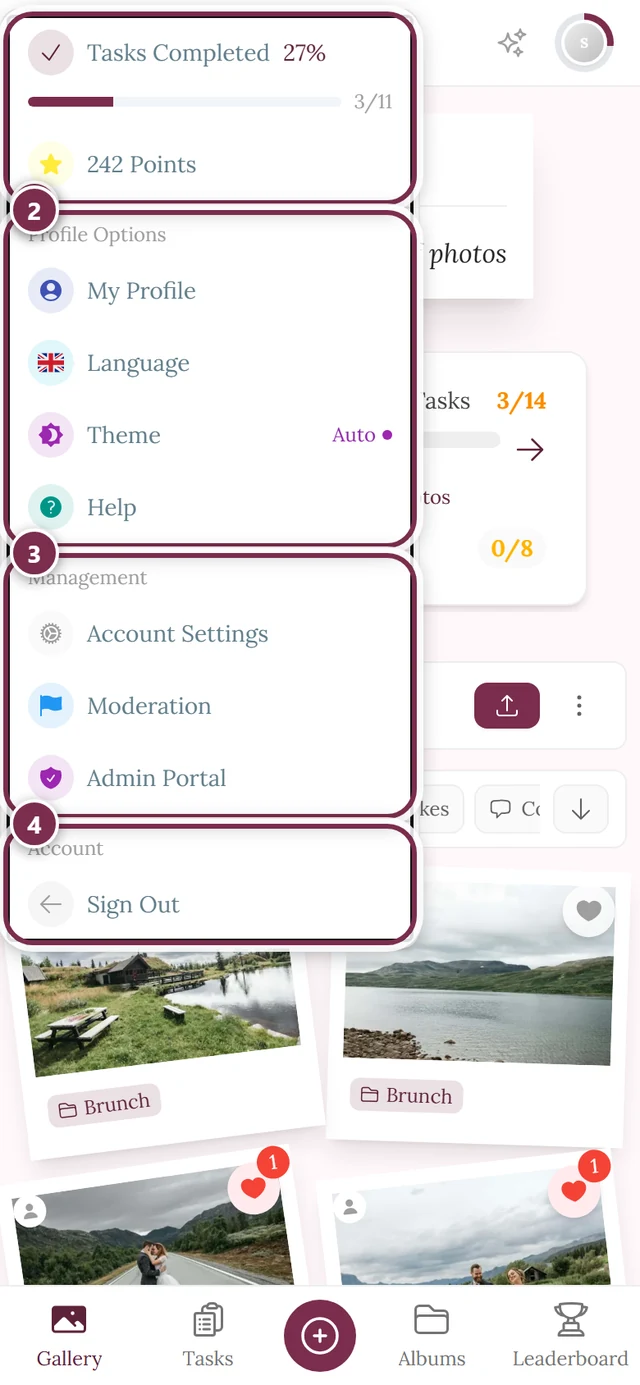
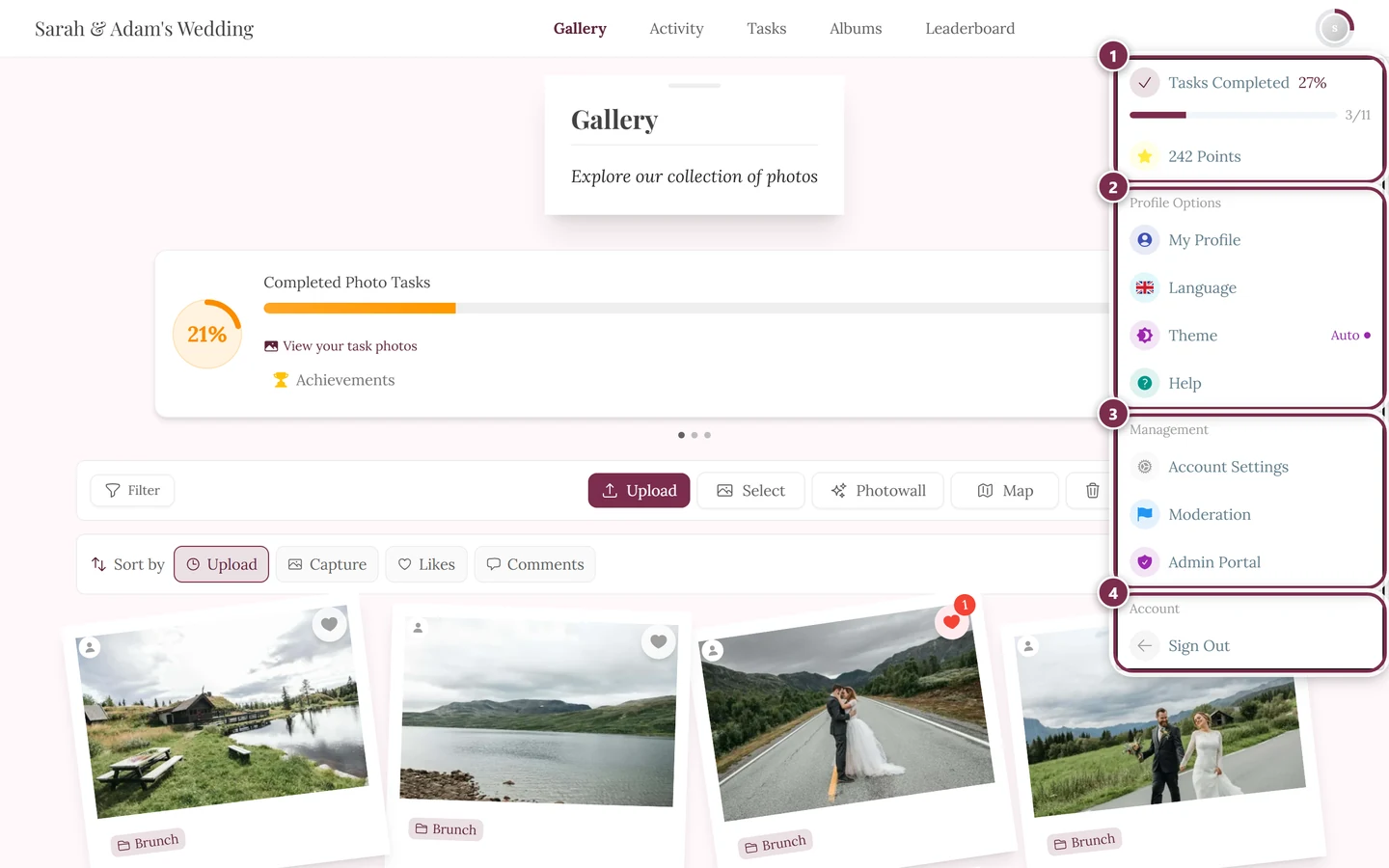
The profile menu at the top right takes you to the admin area. More under “Managing your event”. ① your points and solved tasks, ② Profile options with My Profile, Language, Theme and Help, ③ Management with Account Settings, Moderation and Admin Portal – this section is missing until you hold a role for it, ④ Account with Sign out. -
In the left sidebar, in the Event group, click “Settings” (route
/admin/settings). You land on the Overview first – a grid of tiles describing each settings area in one sentence.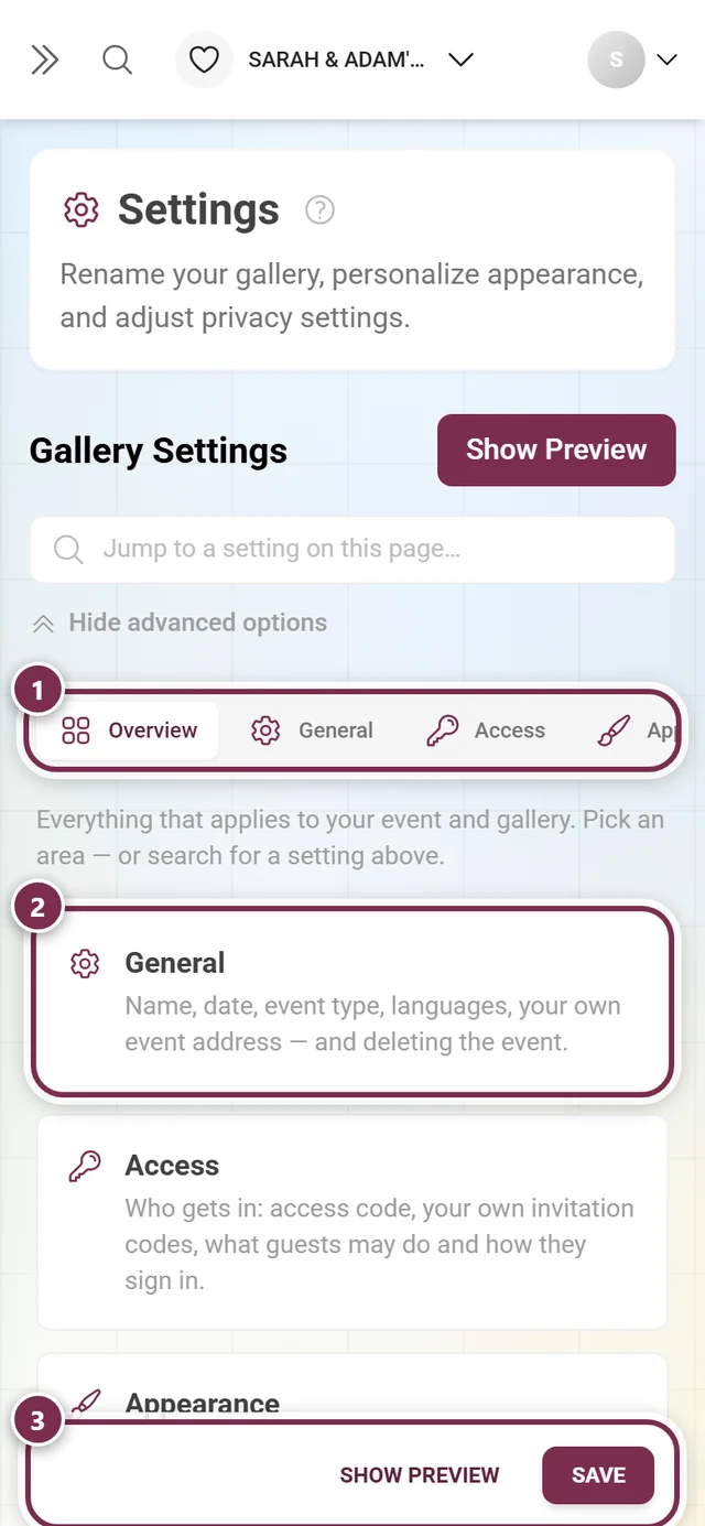
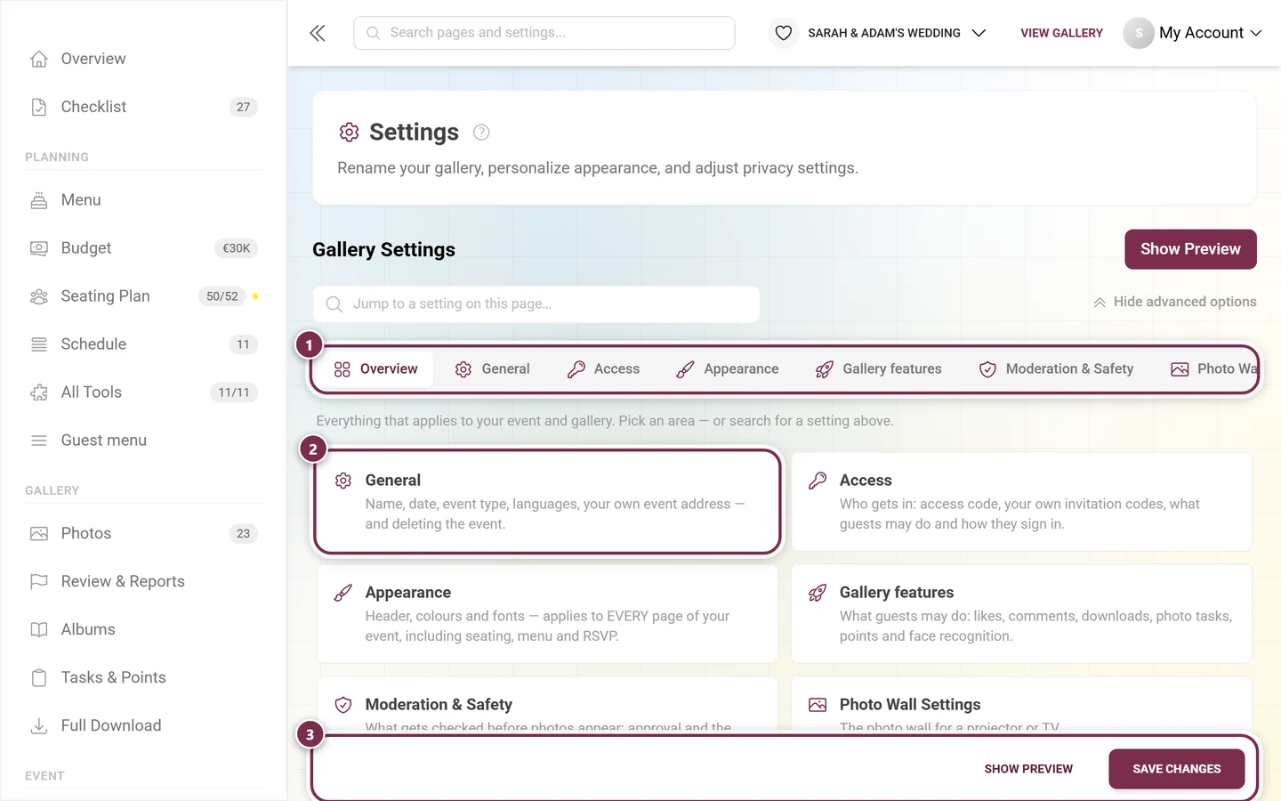
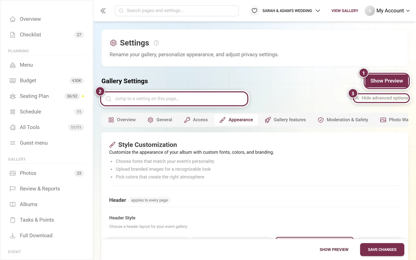
Since the rebuild, Settings opens on the Overview. The “Appearance” tile leads into this tab. ① the tab row with every area – it is wider than the window and scrolls sideways; on a phone only three tabs fit at once, ② one card per area, each with a line about what it holds, ③ the bar that stays at the bottom: Show Preview opens the gallery with your changes, Save Changes (just Save on a phone) commits them. -
Pick the Appearance tile, or the tab of the same name in the tab bar at the top (paintbrush icon). Direct link:
/admin/settings?tab=style. For a full tour of the admin area, see Managing your event and the Admin dashboard.
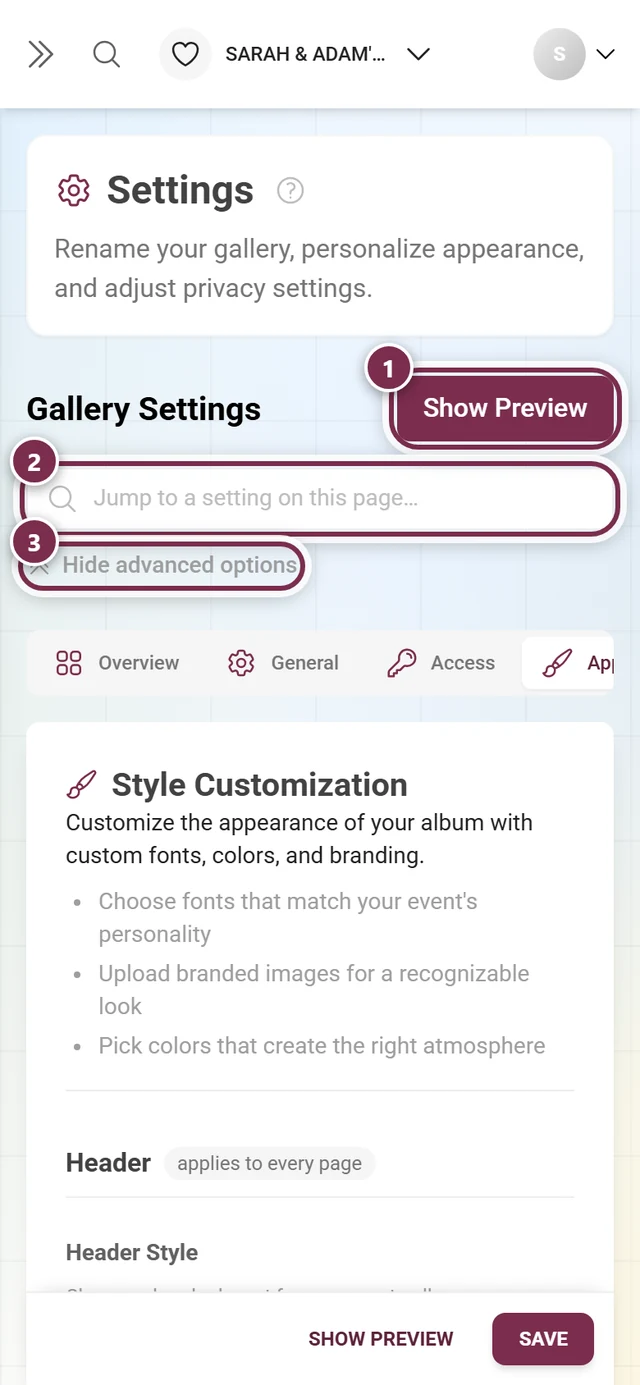
At the top of the settings page you will find three helpers:
- Preview – opens a live preview of your gallery and reflects every change instantly (after a short delay), before you even save. Keep it open while trying out colors and layouts.
- Search field “Jump to a setting on this page…” – finds individual settings across all tabs. Type “color” or “header” and jump straight to the matching option; Clear search resets it.
- “Show all advanced options” – expands the collapsed sections of other tabs. In the Appearance tab it has nothing to do: nothing is collapsed there any more, every block sits open one below the other.
Group 1: Header — applies to every page
Section titled “Group 1: Header — applies to every page”The header sits on top of every page of your event, not just the photos. It consists of the header variant and the branding assets logo and cover.
Header style
Section titled “Header style”In the “Header Style” block you choose your header’s look from horizontally scrolling cards with real preview images.
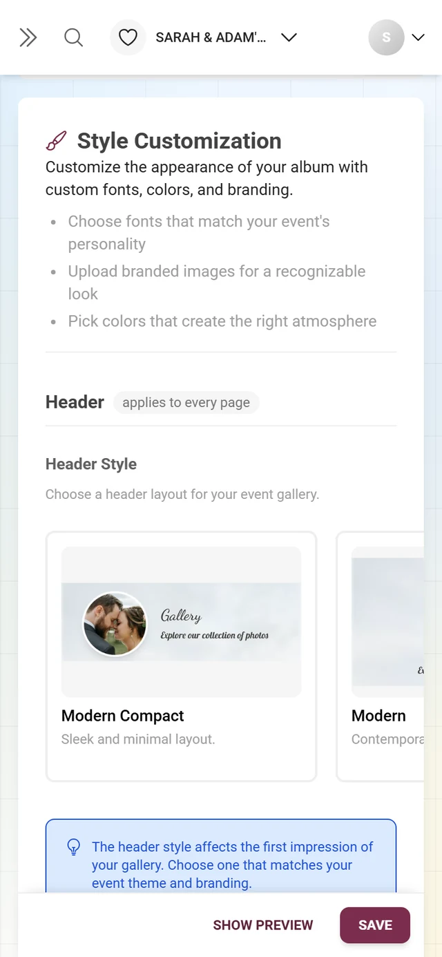
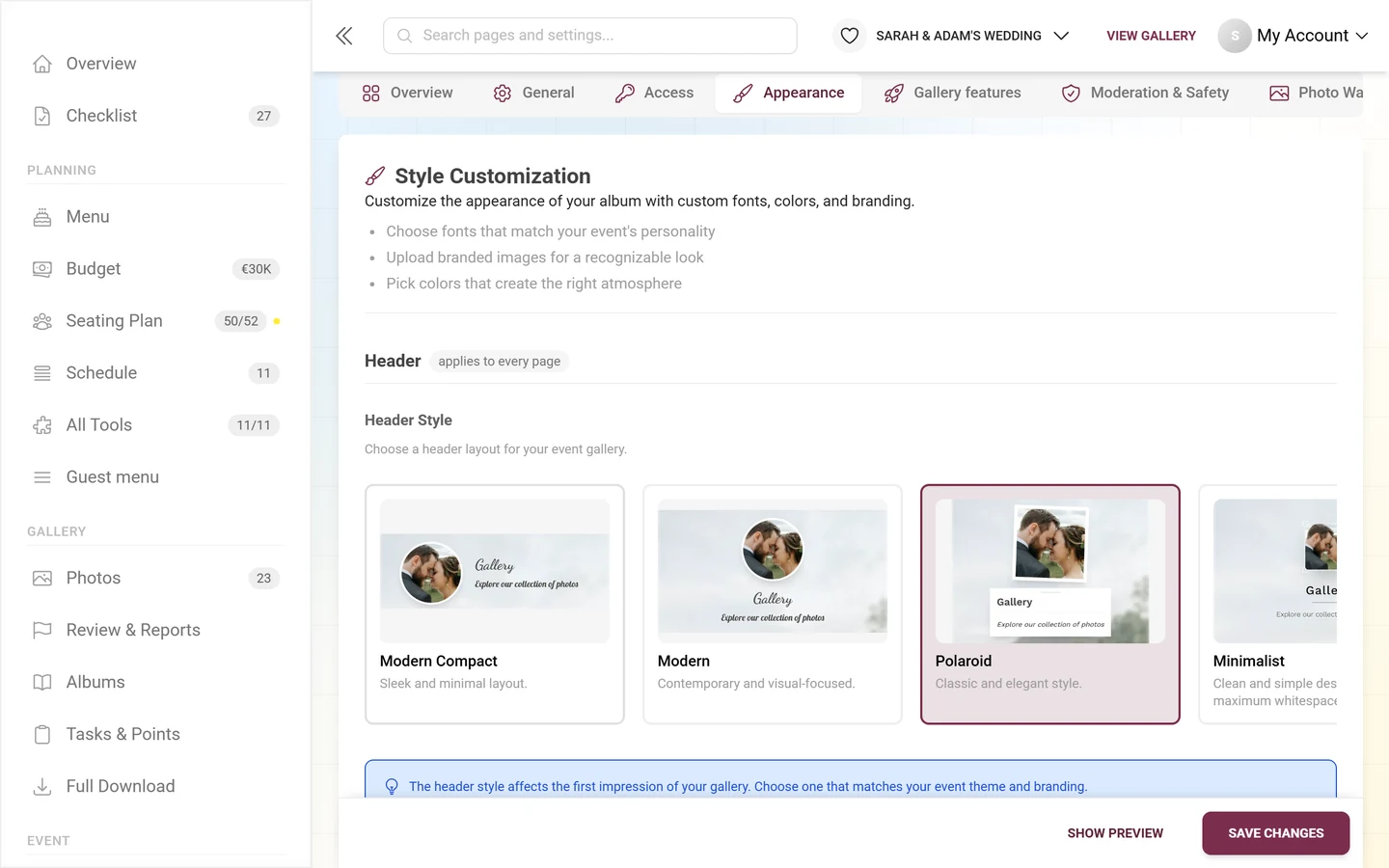
- Six variants: Modern Compact (free) plus Modern, Polaroid, Minimalist, Elegant and Gradient (premium).
- Without premium, only Modern Compact is selectable; the other cards carry a premium badge and cannot be clicked.
Share button in the header
Section titled “Share button in the header”Below the cards sits the checkbox “Share the gallery: button in the header”. It is off by default. Tick it and your guests get a small button in the header that lets them pass the gallery on via QR code and link. Without the tick, guests do not see that button in the header area.
Every other way to share a gallery is covered in Sharing and Inviting guests.
Configure header
Section titled “Configure header”The “Configure header” button expands the fine-tuning for the currently selected variant. A small dot on the button (“Customized”) shows that values are already set for it. Each variant has its own controls:
- On every variant: Header height, Title size, Text color and Alignment (Left / Center / Right).
- Modern adds: Background color and Overlay strength.
- Minimalist and Elegant add: Background color.
- Gradient adds: Gradient start, Gradient end and Gradient angle.
- Polaroid adds: Frame tilt.
Link preview and share text
Section titled “Link preview and share text”Directly below the header style you decide what your gallery link looks like when someone shares it on WhatsApp, Telegram or Facebook: “Global preview when sharing on WhatsApp, Telegram and Facebook. Tools can override this setting.” Every tool can override it in its own QR code tab (see Tools).
- Share title and Share text – optional and per language. They appear as the title and description in the link preview and are sent along as the message when sharing via WhatsApp, email and the phone’s share menu. If you leave them empty, Photogala uses the event title and description as before.
- Preview image – you choose between Logo (default), Custom image, Photogala (for branded galleries Partner logo) and No image:
- Logo (default) uses your gallery logo. Without a logo, Photogala appears; for branded galleries the brand logo applies.
- Custom image opens an upload field (recommended: 1200 × 630 px). Under When the custom image is missing you set what appears instead.
- No image supplies no preview image; each messenger then decides how the link is shown.
Branding assets: logo and cover image
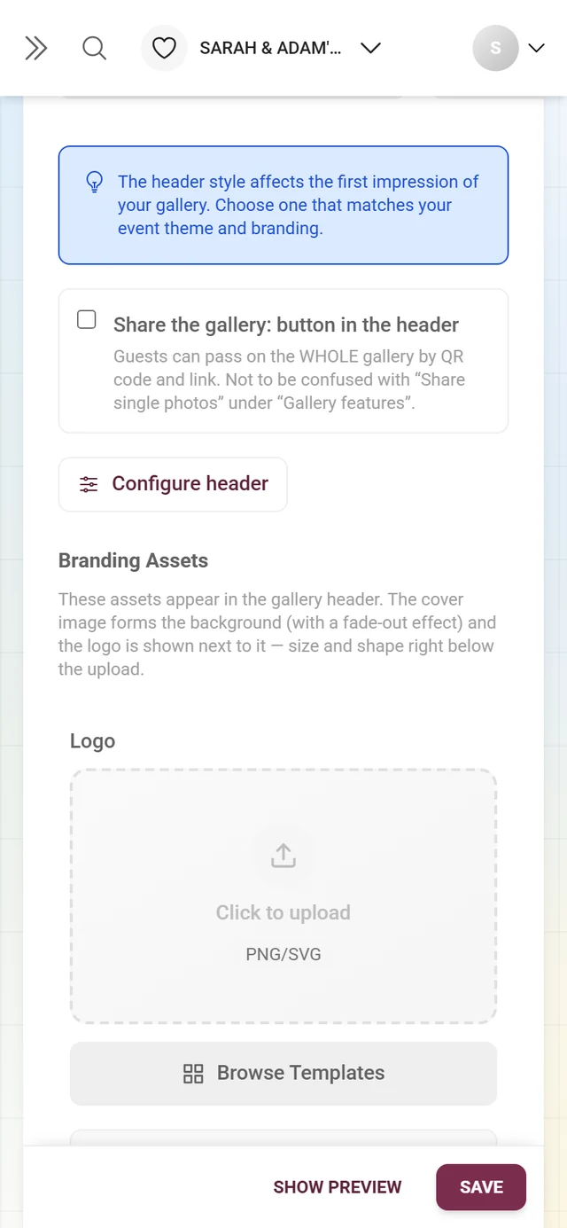
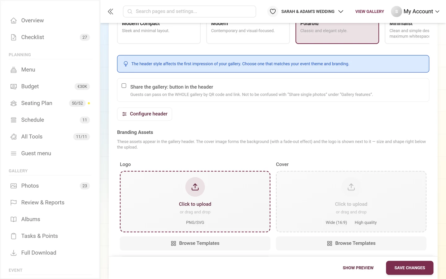
Section titled “Branding assets: logo and cover image”These assets appear in the header: the cover forms the background (with a soft fade-out effect), and the logo sits next to it.
-
Upload a logo. Drag a file into the left “Logo” field or click into it. Recommended (also shown on the field): Square (1:1) as PNG/SVG – ideally with a transparent background.
-
Set how the logo looks. Right below the upload field sits the “How the logo looks” block with Logo size and Logo shape (Round, Rounded, Square, Original (no crop)). Both values apply to the header variant chosen above.
-
Upload a cover. Use the right “Cover” field. Recommended: Wide (16:9) in high quality.
-
Fine-tune the image. After uploading, a gear icon appears at the top right of the image (“Image settings”). It holds Set focus point, Rotate 90° left, Rotate 90° right and Crop ….
-
Pick a template instead of uploading (optional). Instead of uploading your own file, both fields also let you choose a ready-made template from the built-in template library. The templates offered are filtered by category per field (logo or cover background). These are pre-made, centrally stored templates – not your own Design Studio designs (the Design Studio is for QR / print templates).
Focus point for logo and cover
Section titled “Focus point for logo and cover”The focus point decides which part of an image stays visible when it has to be cropped – in the header, the cover and the logo frame. Without one the center always wins, which goes wrong for group photos or off-center subjects.
-
Click the gear on the image and choose Set focus point. The “Focus point” dialog opens.
-
Tap or click the spot in the image that should stay visible. The hint in the dialog says exactly that: the spot that survives the crop.
-
Center resets the focus point back to the middle of the image.
Cover image background options
Section titled “Cover image background options”Below the upload fields you can expand “Cover Image Background Options” to fine-tune the cover:
- Position – “Behind Header Only” (cover sits only behind the header) or “Fullscreen” (cover fills the whole page background).
- Dark overlay – lays a dark veil over the image so light text stays readable. When the overlay is on, an Overlay Intensity slider (0–100 %) appears as well.
- Blur (0–20 px), Brightness (0–200 %), Contrast (0–200 %), Saturation (0–200 %) and Opacity (0–100 %) shape the image look.
- Under “Better readability on backgrounds”: “Enable Text Stroke”, “Enable Text Shadow” and “Enable Text Glow” – a soft, dark halo that keeps text readable even on busy backgrounds. All three make text directly on the image stand out, especially in full-screen mode.
- “Reset to Defaults” – restores every control in this block (overlay on at 40 %, position “Behind Header Only”, no blur, text stroke on, text shadow off, text glow off).
Group 2: Photo grid — the photo view only
Section titled “Group 2: Photo grid — the photo view only”This is the only group that touches the photo view exclusively. Seating, menu or RSVP are unaffected by it.
Gallery layout
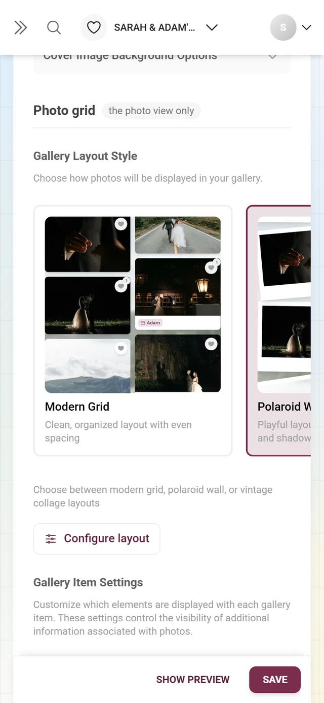
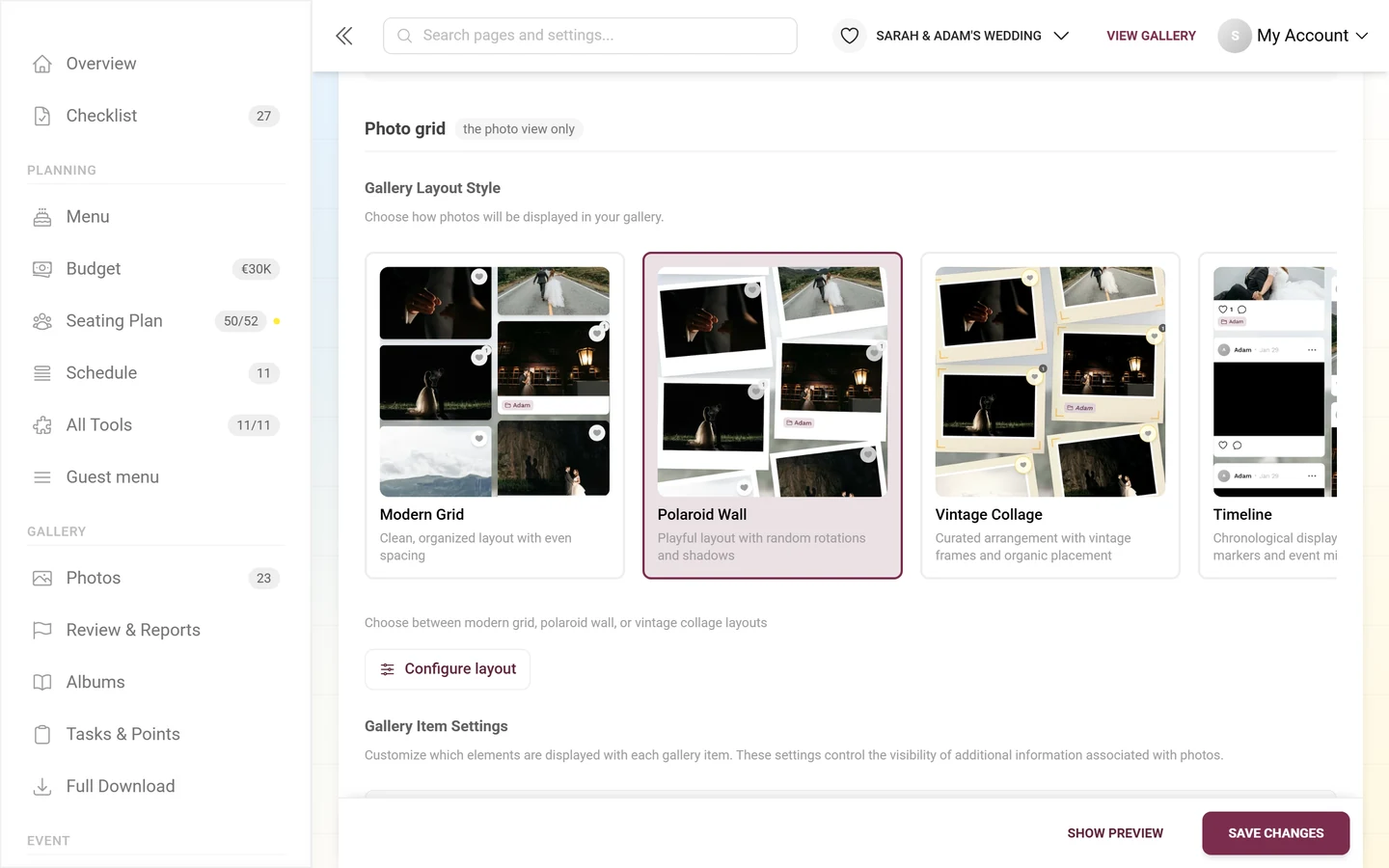
Section titled “Gallery layout”The “Gallery Layout Style” block controls how photos are arranged – also via cards with real previews.
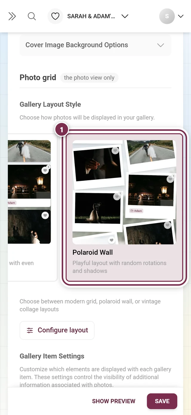
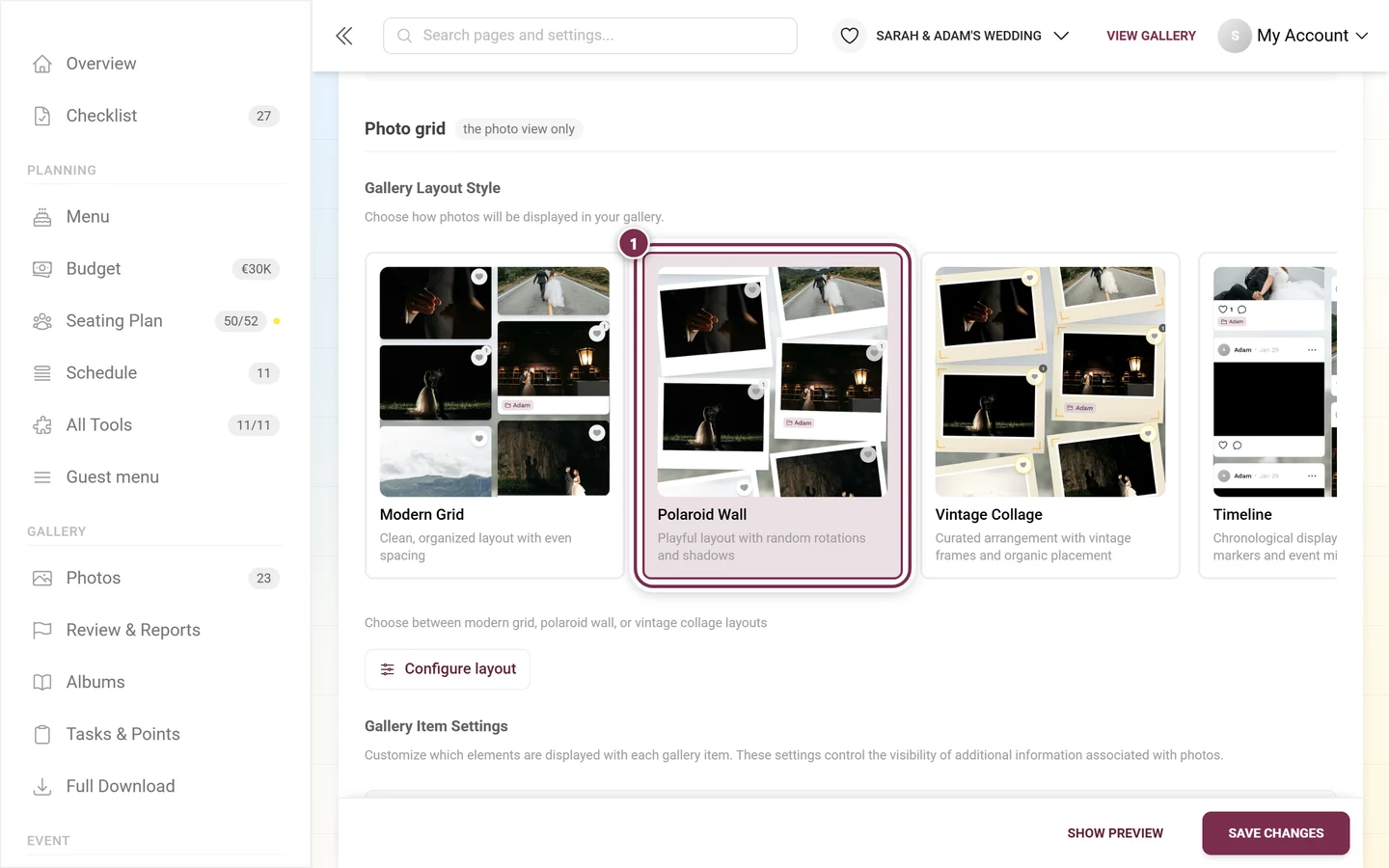
- Eight layouts: Modern Grid and Uniform Grid (free) plus Polaroid Wall, Vintage Collage, Timeline, Seamless Mosaic, Featured and Justified Rows (premium).
- Without premium, only the two free grids are selectable; the others carry a lock overlay.
- “Configure layout” – opens the fine-tuning for the chosen layout, again with per-control resets and “Reset all to defaults”. Here too, every setting applies to that one layout only.
- Typical controls are Columns on mobile, Columns on desktop, Spacing between photos and Corner roundness; the playful layouts add Tilt amount, Random tilt, Position jitter, Shadow strength, Frame width, Frame/card color and a Photo filter (None, Sepia, Black & white, Warm, Cool). Justified Rows has a Row height instead of columns.
Gallery item settings
Section titled “Gallery item settings”The “Gallery Item Settings” block controls which extra details appear on each photo:
- Show album – displays the album name on each photo. If no albums exist yet, a hint with a link to create them appears. See Managing albums.
- Show task – displays the associated task. If tasks are not in your plan or turned off in the Gallery features tab, a hint points that out. See Managing tasks.
- Show caption – displays captions beneath each photo.
- Show comment icon – shows the comment icon (depending on plan and feature setting).
- Show favorite icon – shows the like icon (depending on plan and feature setting).
Default sorting
Section titled “Default sorting”The “Default Gallery Sorting” block sets the initial sort order – guests can still re-sort themselves.
- Sort by – “Upload Date” or “Capture Date (Photo Taken)”.
- Sort order – “Newest First” or “Oldest First”.
Below it, “Albums Page Sorting” controls the order of the album and task cards:
- Options: Photo Count, Manual Order (as arranged in the Albums Manager), Alphabetical, Shuffled (random), Visitor’s Own Uploads.
- The Sort Order control only appears when neither “Manual” nor “Shuffled” is chosen (there the direction has no meaning).
Directly below, “Tasks Page Sorting” sets the order in which guests see the photo tasks:
- Options: Manual Order (as arranged in Task Manager), Alphabetical, Shuffled (random), Points, Total Uploads, Visitor’s Own Uploads.
- The default is “Shuffled (random)”. For numbered tasks choose Manual Order.
- If you rearrange tasks in the task manager, this setting automatically switches to “Manual Order”.
- It is only the starting order: guests can still change the sorting on the tasks page themselves. The upload dialog also suggests the next unsolved task in this order.
See also Managing albums and the album view from the guest’s perspective.
Controls above the grid
Section titled “Controls above the grid”At the bottom of the group sit two toggles that used to live in the Gallery features tab under “Gallery Views”. They now sit with the grid they appear on:
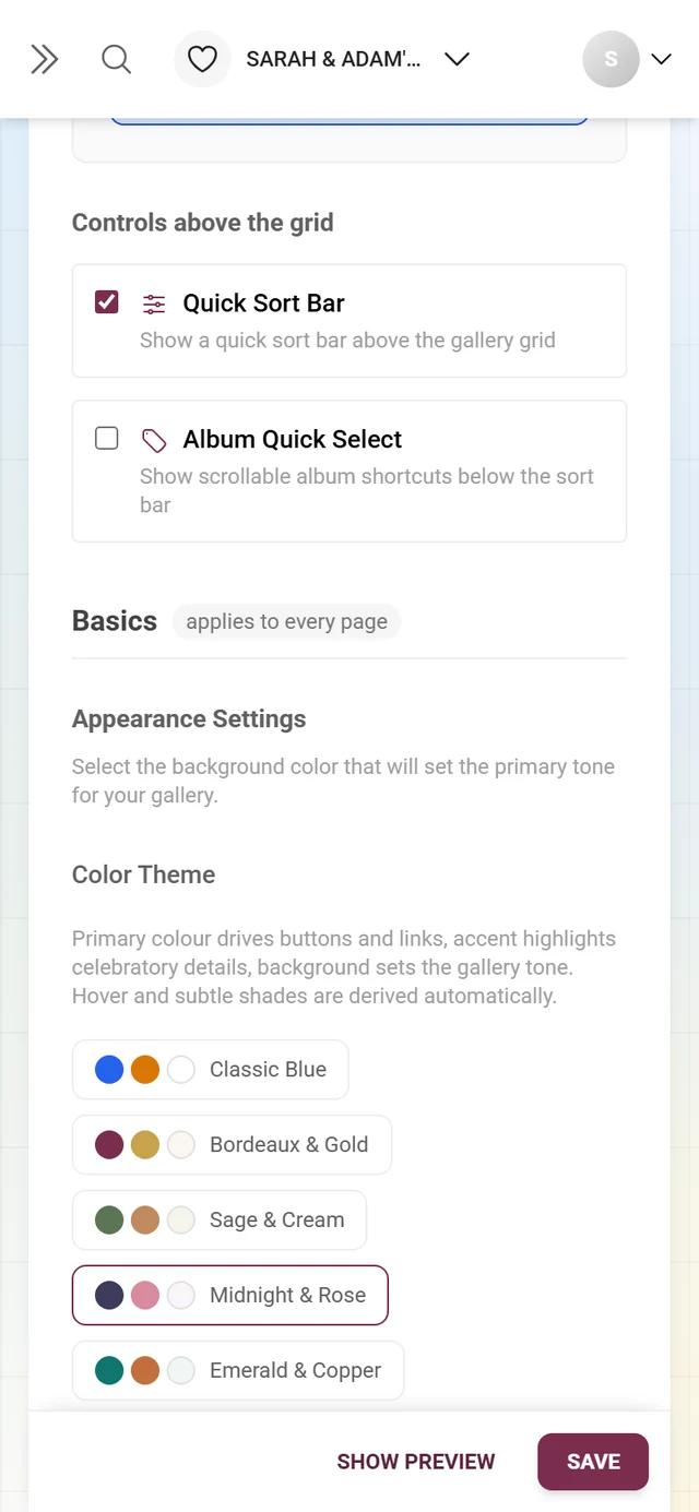
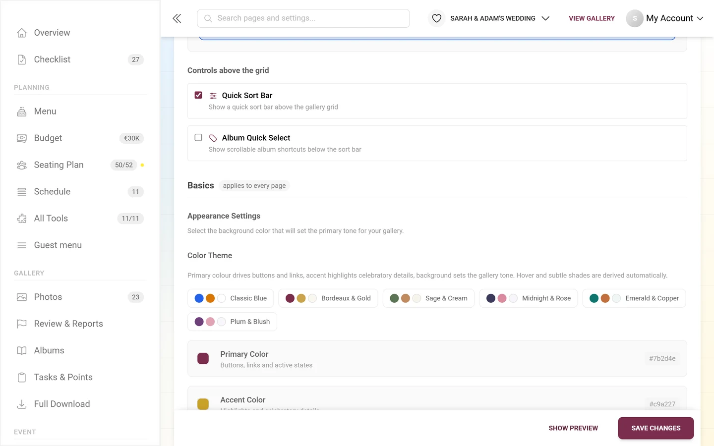
- Quick Sort Bar – “Show a quick sort bar above the gallery grid”. Guests can reorder by upload, capture date, likes or comments without opening the search panel.
- Album Quick Select – “Show scrollable album shortcuts below the sort bar”. Your event’s albums appear as tappable chips; one tap jumps into an album. The toggle is locked if the feature is not part of your plan.
Group 3: Basics — applies to every page
Section titled “Group 3: Basics — applies to every page”Colors and fonts are written to the whole event surface. They therefore also color seating, menu, timeline, RSVP and the digital invitation.
Colors, palettes and dark mode
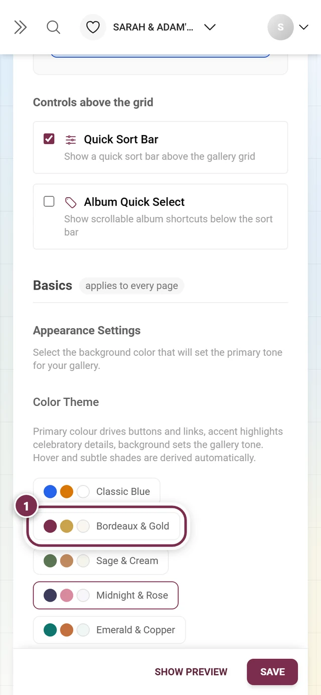
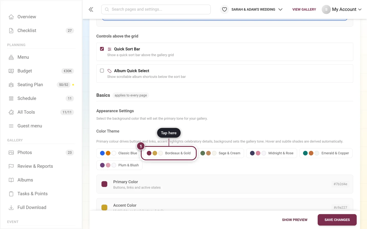
Section titled “Colors, palettes and dark mode”In the “Appearance Settings” block, under the Color Theme heading, you tune your event’s color world.
-
Pick a color palette (recommended start). Above the individual colors sits a row of curated palettes, each previewing three color dots: Classic Blue, Bordeaux & Gold, Sage & Cream, Midnight & Rose, Emerald & Copper and Plum & Blush. One click sets the primary, accent and background color together. You can then adjust each color individually – the palettes are a starting point, not a lock.
-
Primary color – for buttons, links and active states. Chosen via the color picker and resettable at any time. If none is set, the field on the right reads “inherited”, or “brand default” on brand-managed events, and the picker shows exactly the color your event actually renders.
-
Accent color – for highlights and celebratory details, also resettable.
-
Background color – sets the tone of the surface. The current hex value is always shown on the right.
-
Enable dark mode (optional). With the “Enable Dark Mode” toggle, your guests may switch to a dark theme themselves. Below it a sun/moon icon shows your own browser preference.
In the “Font Settings” block you choose via three dropdowns:
- Title – for main headings.
- Subtitle – for body text.
- Text – fallback font for all remaining text.
Fonts apply to every page of the event too, not only to the photo view.
Group 4: QR code — for printouts
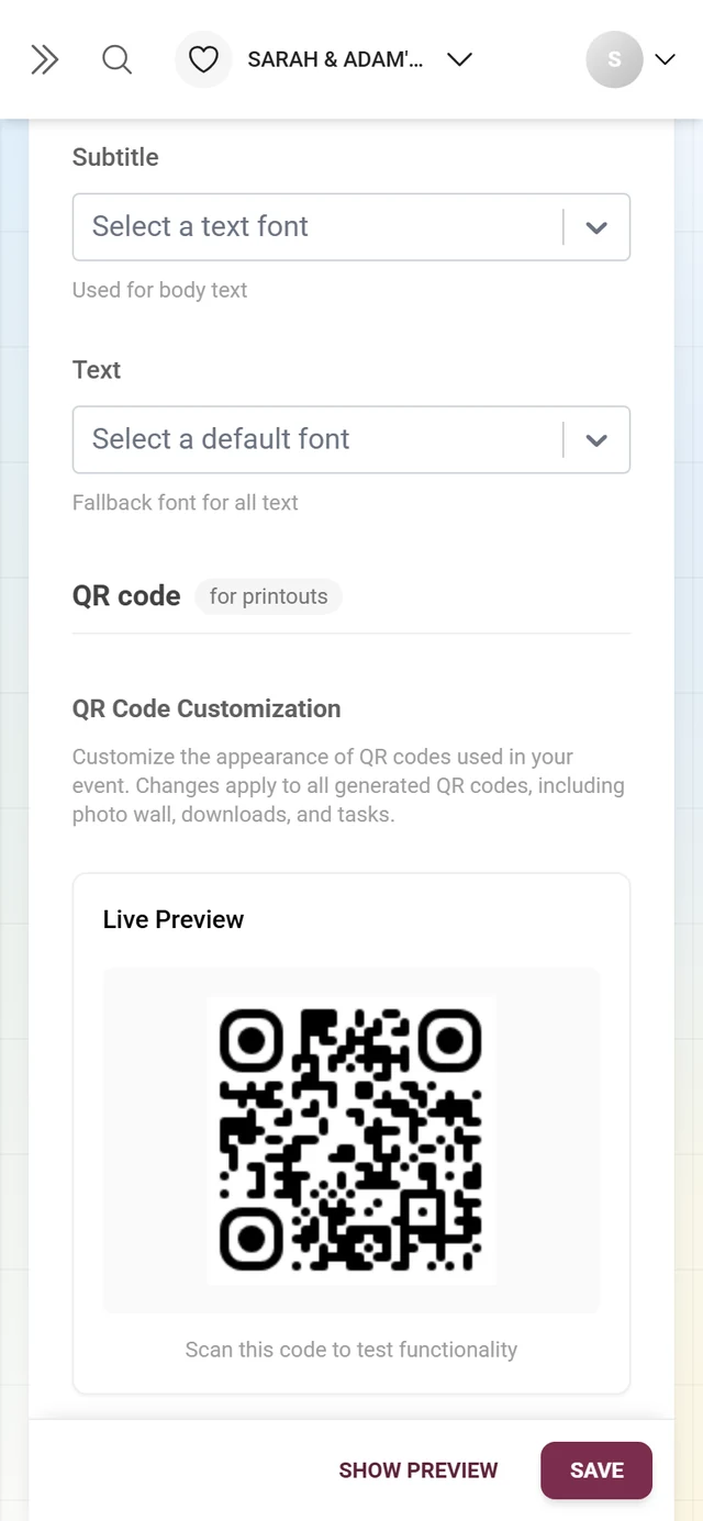
Section titled “Group 4: QR code — for printouts”The “QR Code Customization” block is a premium feature. With a plan, you design the look of all generated QR codes (photo wall, downloads, tasks).
-
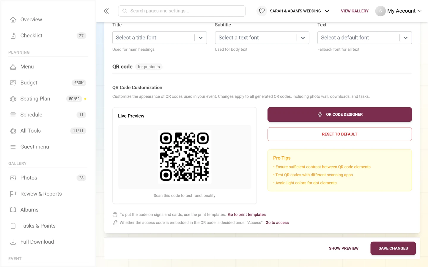
On the left you see a live preview of the QR code.
-
Click “QR Code Designer” on the right. The “QR Code Customization” dialog opens with a real-time preview: you adjust dot color, corners and background. Confirm with “Use This Code” or dismiss with “Cancel”.
-
“Reset to Default” – resets the dot color back to your primary color.
Below the designer sit two cross-links, because a QR code is not looked at here – it is printed:
- “To put the code on signs and cards, use the print templates.” → Print templates
- “Whether the access code is embedded in the QR code is decided under ‘Access’.” → Settings → Access, see Inviting guests
Premium and role overview
Section titled “Premium and role overview”| Block | Without a matching plan |
|---|---|
| Logo & cover | upgrade note, no upload |
| Link preview and share text | note only, the preview always shows Photogala |
| Color palettes, primary & accent color | missing entirely; background color display-only with a “Premium” badge |
| Dark mode | lock overlay over the toggle |
| Header variants (except Modern Compact) | only Modern Compact selectable |
| Gallery layouts (except Modern/Uniform Grid) | only the free grids |
| Album Quick Select | toggle locked |
| QR design | lock overlay |
Common questions and troubleshooting
Section titled “Common questions and troubleshooting”- “I can’t find the ‘Style’ tab any more.” It is called “Appearance” now. The address
?tab=stylestayed the same, so old links keep working. - “I’m looking for the ‘Advanced style options’.” That collapsible section is gone. Fonts, gallery item settings, sorting and QR design sit open in their groups – fonts under Basics, the other three under Photo grid and QR code.
- “My change is gone.” It was not saved – click “Save Changes” at the bottom (red dot on the tab).
- “I can’t find logo size and logo shape in the header panel.” They sit directly beneath the logo upload in the “How the logo looks” block. Remember: the value applies only to the currently selected header variant.
- “My background color has no effect.” Either the cover position is set to “Fullscreen” (covering the color) or the viewer has enabled dark mode.
- “The color controls or the palettes are missing.” You lack the premium plan for brand colors, or the brand has locked them.
- “I cannot find a header variant’s preview card at all.” On brand-managed events, variants that are not unlocked are hidden rather than locked – ask your managing brand.
- “The album/task toggles are grayed out.” The feature is not in your plan or is turned off in the Gallery features tab.
- “The QR code scans poorly.” Increase the contrast and avoid light dot colors (see pro tips).
- “The logo or cover is cropped wrongly.” Use the gear on the image to set the focus point on the spot that should stay visible. Only crop if that is not enough – cropping replaces the image.
Best-practice tips
Section titled “Best-practice tips”- Pick a color palette first, then fine-tune – and keep the preview open. Check a tool page too (the seating chart, say): colors and fonts show up there as well.
- Cover in 16:9 and high resolution, logo in 1:1 with a transparent background; for wide wordmark logos set the logo shape to Original (no crop).
- For light cover images, enable the dark overlay so titles stay readable.
- Turn on the share button in the header if guests should pass the gallery on – otherwise the only routes are QR codes and invitation links.
- Related pages: General settings, Gallery features, Set up the photo wall, Custom domain.