Setting up your event
Before your guests get started, your event should be fully set up. There are three tools that go hand in hand: the guided setup wizard (takes your event from zero to ready in minutes), the checklist (your customizable map of what’s left to do), and the guided tour (a walkthrough of the interface). This page also serves as your signpost to every other admin area.
How to reach these areas
Section titled “How to reach these areas”You’ll find all three tools in the admin area. Here’s how to get there:
-
Open the profile menu in the top right and, under Management, choose Admin portal. You land on the dashboard at the
/adminroute.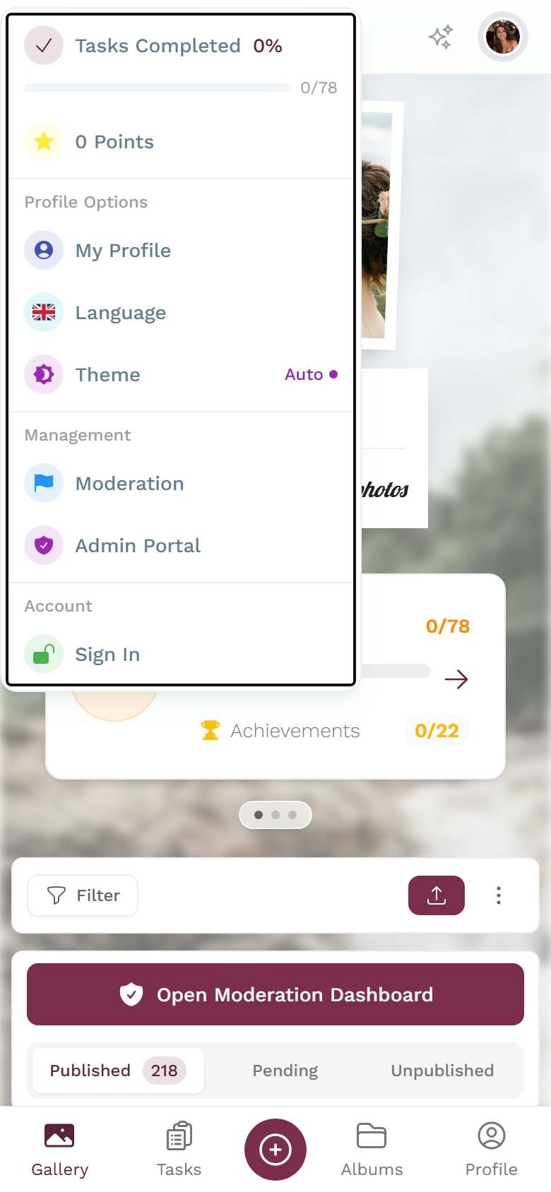
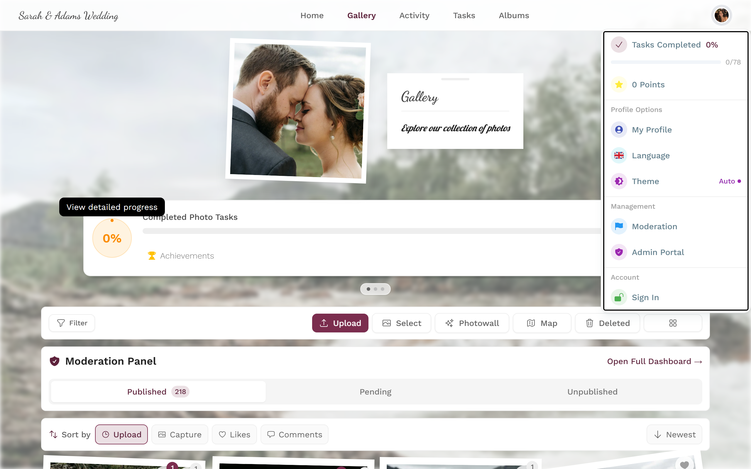
The profile menu in the top right takes you into the admin portal. -
On the dashboard, a bar in the top right holds two buttons: “Set up event” (wrench icon) opens the setup wizard, and “Start tour” (question-mark icon) starts the guided tour.
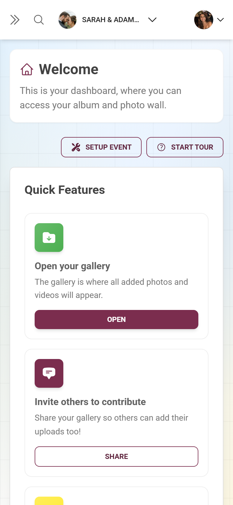
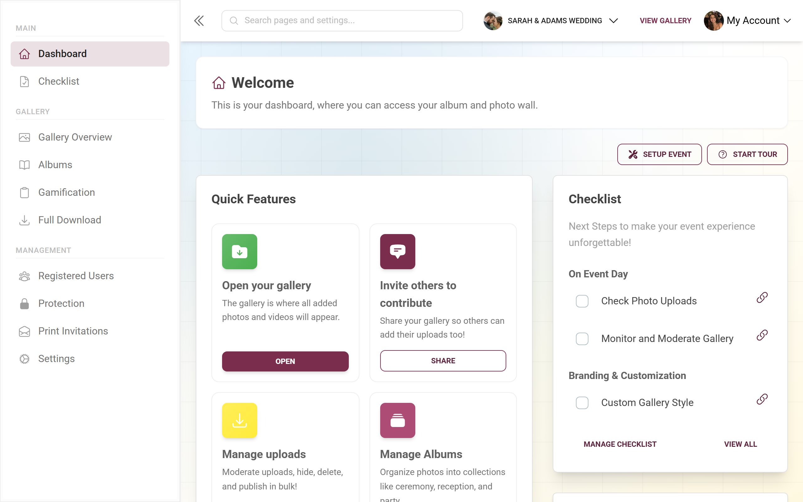
The dashboard bundles the setup wizard, the tour, and a short version of the checklist. -
Open the checklist from the left sidebar under “Checklist” (main area). It opens the full view at
/admin/checklist. A short version also sits as a widget on the right of the dashboard.
| Goal | Where |
|---|---|
| Setup wizard | Dashboard button “Set up event” (opens a full-screen wizard) |
| Guided tour | Dashboard button “Start tour” |
| Checklist (full view) | Sidebar → “Checklist” (/admin/checklist) |
| Checklist (short version) | Widget on the right of the dashboard (/admin) |
The setup wizard
Section titled “The setup wizard”The wizard runs full-screen and walks you through the essentials in two to three steps. A progress indicator sits at the top. Your progress is kept – if you leave mid-way, the browser warns you. When you reopen it, it preloads your existing values, so you only change what you actually want to. Nothing is changed until you tap “Launch gallery” at the end.
Step 1 – Basics
Section titled “Step 1 – Basics”Heading “Let’s create your gallery!”. Here you lay the foundation:
-
Event type (“What kind of event is this?”): Pick a tile, e.g. wedding or birthday. The type drives sensible defaults – such as which challenge and achievement templates are imported automatically and which style presets apply.
-
Gallery title (required, marked with an asterisk): Give your event a name. While this field is empty, the “Continue” button stays greyed out.
-
Description (optional): A short welcome text your guests will see.
-
Event date (optional): Via the date picker; you can also set the date later.
-
Gallery language: A toggle between German and English – this sets your event’s main language.
-
Tap “Continue”.
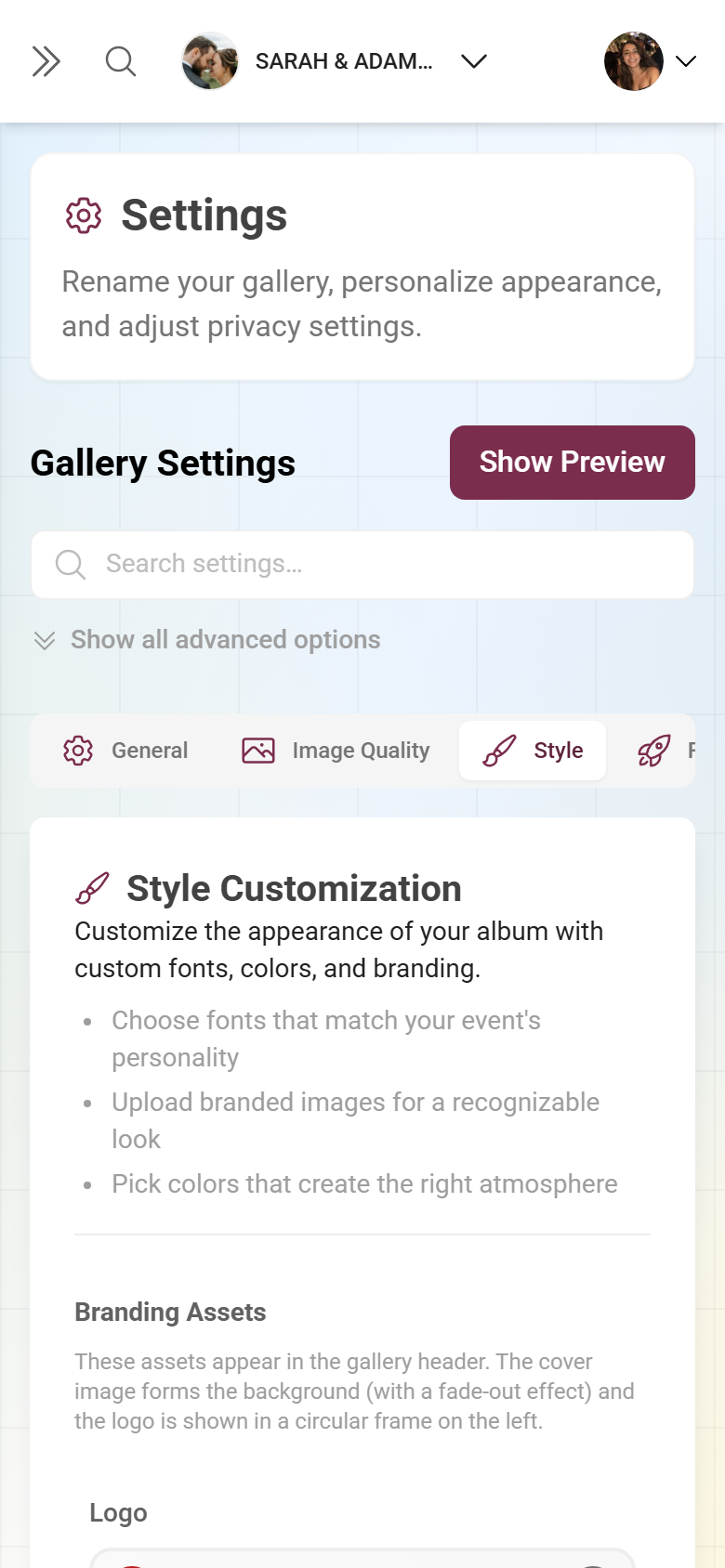
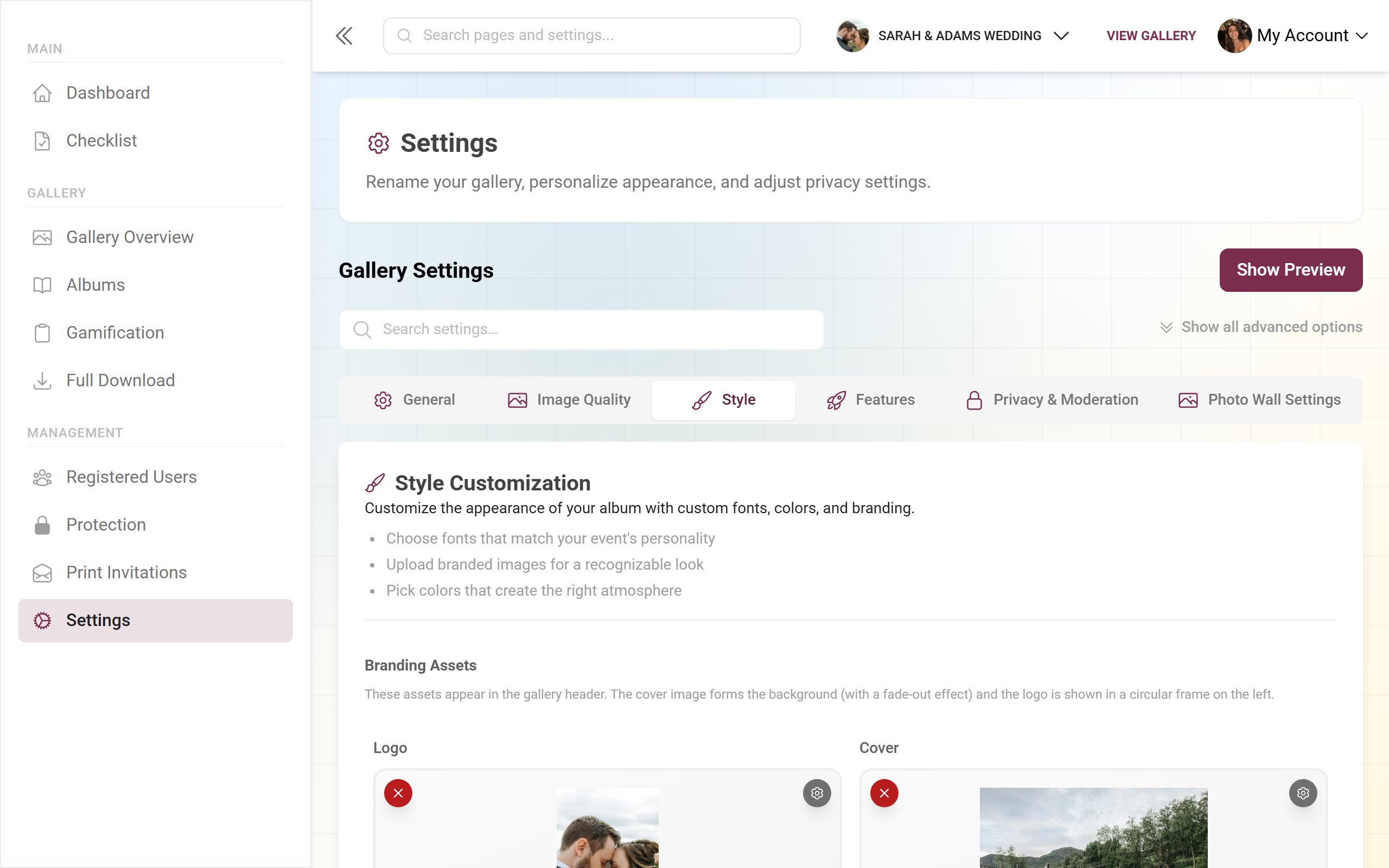
Step 2 – Style (only on a matching plan)
Section titled “Step 2 – Style (only on a matching plan)”Heading “Design your gallery”. This step only appears if your plan unlocks it:
- Choose a theme (“Choose your theme”): A horizontal selection of eight layout variants with real preview images – Modern Grid, Polaroid Wall, Vintage Collage, Timeline, Uniform Grid, Seamless Mosaic, Highlights, and Flush Rows. Only shown if your plan supports multiple layouts.
- Add branding (optional): Upload a logo (square, 1:1, PNG or JPEG) and a cover image (16:9). Only shown if your plan supports custom branding.
Use “Back” and “Continue” to navigate. To fine-tune these settings later, see Customize the look.
Step 3 – Launch
Section titled “Step 3 – Launch”Heading “Ready to launch!”. The final step bundles privacy and features:
- Privacy: The “Invite only” toggle makes your event private. When you turn it on, the “Password (invite code)” field appears – it’s automatically prefilled with an easy-to-read code (example: lisa-max-2026) that you can overwrite; at least 4 characters. Only people who know this code can get in. More on this under Privacy and access.
- Gallery features: One toggle per feature. Which toggles appear depends on your plan:
- Guest uploads – always available; lets your guests contribute their own photos.
- Photo likes – guests can like photos.
- Photo challenges – with a sub-toggle to automatically import challenge templates.
- Points and leaderboard – playful competition with a score.
- Achievements and rewards – with a sub-toggle to automatically import achievement templates.
Use “Back” to step back; “Launch gallery” saves everything (it reads “Creating…” meanwhile). Afterwards a success screen appears with “Go to dashboard” and “View gallery”.
The guided tour
Section titled “The guided tour”The “Start tour” button on the dashboard lays an interactive walkthrough over your real interface. In roughly 14 steps it guides you through: the dashboard welcome, the navigation menu, the media gallery, photo albums, photo challenges, invitations, templates and QR codes, event settings, quick actions, event statistics, recent activity, the event checklist, and a “Need help?” note.
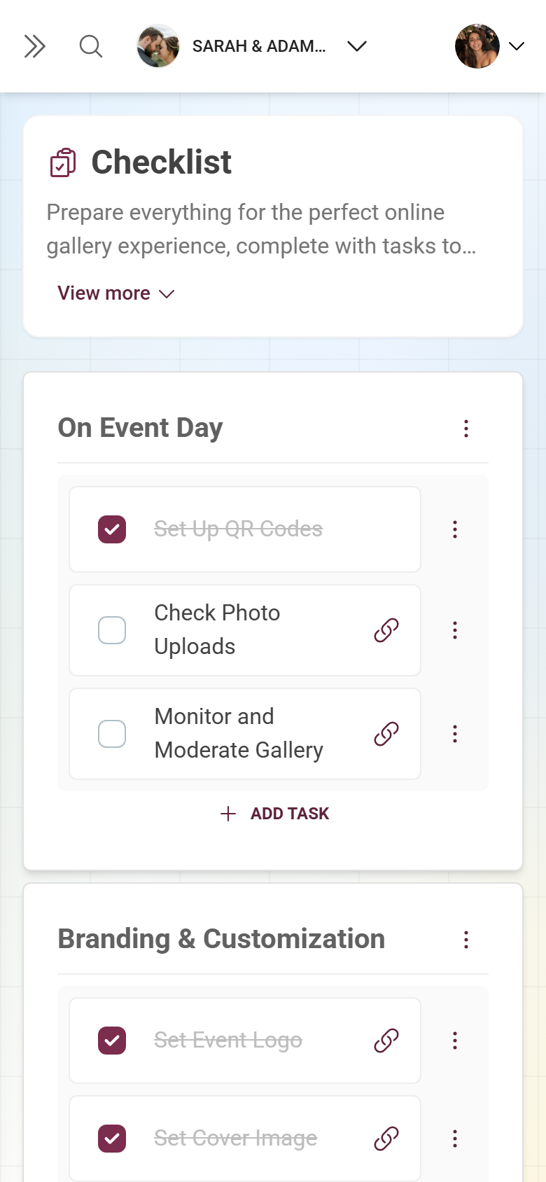
The checklist – short version on the dashboard
Section titled “The checklist – short version on the dashboard”On the right of the dashboard sits the “Checklist” card with the subtitle “Next steps”. It shows up to three open tasks, grouped by category. Each row has a checkbox; when you tick it, the text is struck through and turns green. Tasks with attached actions carry a chain icon – one click opens a menu of links that jump straight into the matching admin area. Once all visible items are done, “All tasks complete!” appears.
Use “Show all” / “Show less” to expand or collapse, and “Manage checklist” to open the full view.
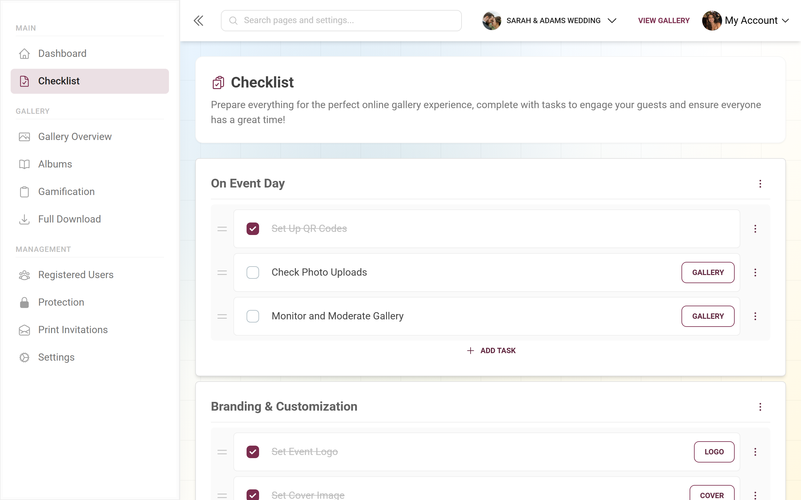
The checklist – full view and management
Section titled “The checklist – full view and management”The checklist is fully customizable: you can create, edit, sort, and delete your own categories and tasks, building a clickable setup map for your team.
-
Open “Checklist” in the left sidebar. At the top are a title and a short description, below them your categories as cards.
-
Tick off tasks: Check the box in front of a task – it saves immediately. If the task carries actions, its link jumps you straight into the responsible admin area (internal links stay in the admin portal, external ones open a new tab).
-
Edit or move a category: The three-dot menu in each category header offers “Edit”, “Delete”, “Move up”, and “Move down”. The same actions are available via right-click or long-press on the category.
-
Edit or move a task: Each task has its own menu for editing, deleting, and moving.
-
Sort by drag and drop: Categories and tasks can be dragged and rearranged with the mouse (the cursor turns into a move symbol). Alternatively use the “Move up/down” menu entries. The order is saved immediately.
-
Create a new task: The “Add task” button at the bottom of each category opens the task dialog.
-
Create a new category: At the very bottom sits a dashed card “Add category” with a plus symbol.
The “Add / edit category” dialog
Section titled “The “Add / edit category” dialog”When you create or edit a category, a dialog opens titled “Add category” or “Edit category”. It contains:
- Language selector – at the top you switch between your event’s languages, so you can maintain name and description in multiple languages.
- Name (per language, required) – the category title.
- Description (per language, optional) – an explanatory text.
- Priority – a number that controls sorting (a higher priority moves up).
Use “Cancel” to discard, “Save” to apply. Saving is optimistic: the dialog closes immediately and the change appears in the list right away.
The “Task details” dialog
Section titled “The “Task details” dialog”The task dialog is titled “Task details”. Here’s how to fill it in:
- Language selector – switches the language for the task name and action labels.
- Task name (per language) – what to do, e.g. “Check the cover image”.
- Actions – zero or more clickable links per task. Use “Add action” to create one; per action you fill in:
- Action label (per language) – the menu text you click in the checklist, e.g. “Go to style settings”.
- Link – either an internal path that starts with a slash (e.g.
/admin/settings?tab=style) and navigates within the admin portal, or a full external URL (opens a new tab). - Use the trash icon to remove an action again.
Use “Cancel” to discard, “Save” to apply.
Saving and behaviour
Section titled “Saving and behaviour”- Ticking a task: reported to the server immediately. If it fails, you see an error – just tick it again.
- Creating or editing a category/task: optimistic. The dialog closes at once and the change appears right away; on a server error it’s rolled back automatically.
- Order: persisted immediately as you drag.
- “Launch gallery” in the wizard: sends only the changed or filled fields; branding images are uploaded first.
When something goes wrong
Section titled “When something goes wrong”- “Set up event” seems to do nothing – you’re already set up. The wizard then opens in edit mode with your existing values and only changes anything when you tap “Launch gallery”.
- “Continue” stays grey in the Basics step – the gallery title is missing; it’s required.
- No style step appears – your plan doesn’t include multiple layouts or custom branding. Adjust style and branding later under Customize the look, or move to a larger plan under Upgrade your plan.
- An action link unexpectedly opens a new tab – internal paths must start with a slash, otherwise the link is treated as an external URL.
- A category is gone by accident – deleting can’t be undone and removes all tasks it contained. The dashboard widget deliberately shows only three open items; use “Show all” or “Manage checklist” to see the rest.
Recommended order
Section titled “Recommended order”-
Run the setup wizard first to set the foundation (title, style, privacy, features) in one go.
-
Then use the checklist as a progress tracker. Create your own categories and tasks with action links to the matching admin pages, and set priorities to pull important things to the top.
-
Before the event, tick off every item and review your event via “View gallery”.
Related pages
Section titled “Related pages”- Dashboard – the entry point with buttons and widget
- Customize the look – logo, cover, colors, and layout
- Features – the toggles from step 3 in detail
- Privacy and access – “Invite only” and the access code
- Challenges · Achievements and rewards · Albums
- Invite guests · Save all photos · Upgrade your plan
- For guests: Access the event shows how your guests join after setup.