Before, during & after the event
To keep everything running smoothly on your big day, a clear timeline helps. This guide is not a screen of its own, but a bracket around the three phases of your event – preparation, the event itself, and the follow-up.
The dashboard now knows these three phases itself and sorts its cards accordingly: “Still planning”, “It’s about the photos”, and “The event is over”. The three phases in this guide map exactly onto those three states. For each one it shows you where to click and points you to the matching detailed guides.
Your control center: the dashboard
Section titled “Your control center: the dashboard”Almost every step starts at the dashboard – the landing page of your admin area, called Overview in the sidebar. Here is how to get there: sign in as the host, open your event, and pick Admin Portal under Management in the profile menu at the top right; the address then ends in /admin. Only owners and admins see this area; access the event admin explains how to find it.
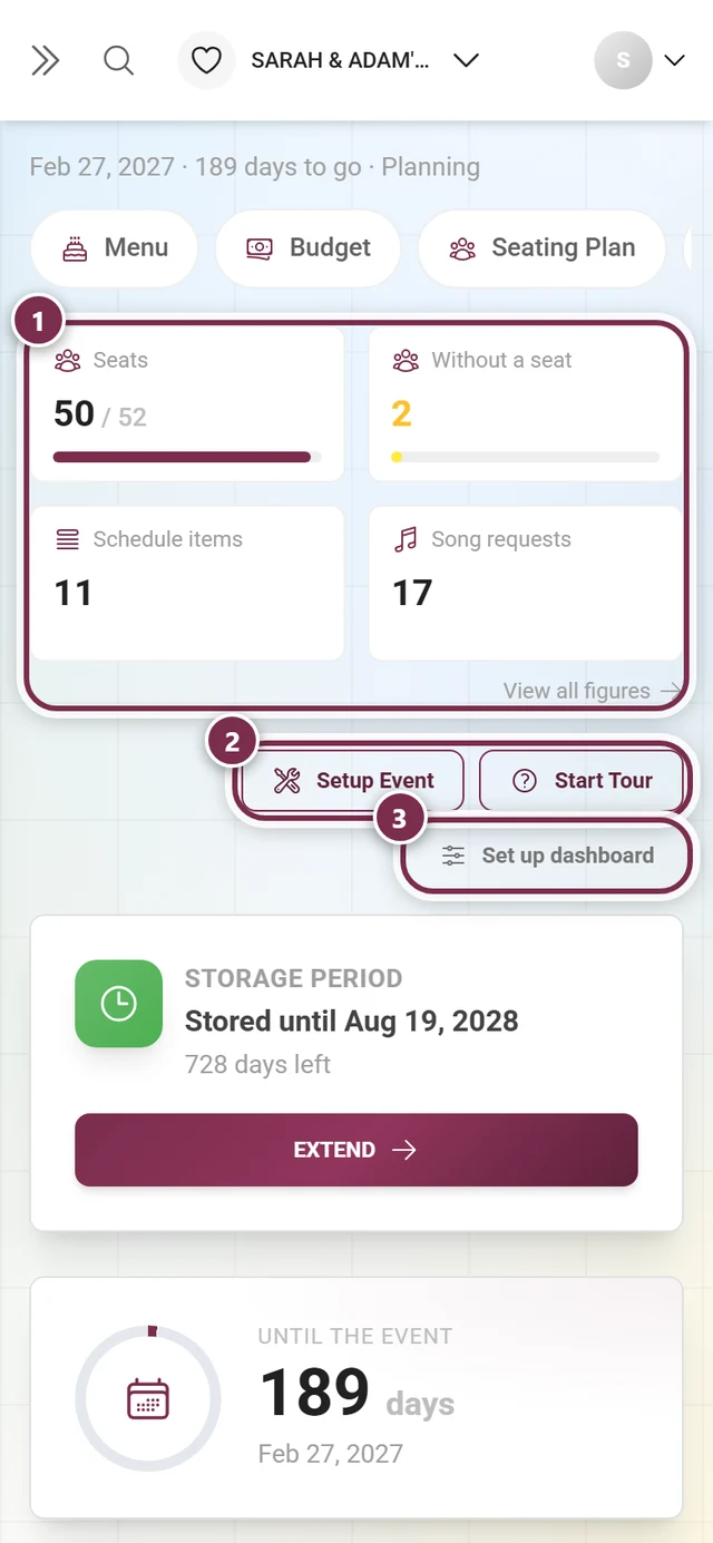
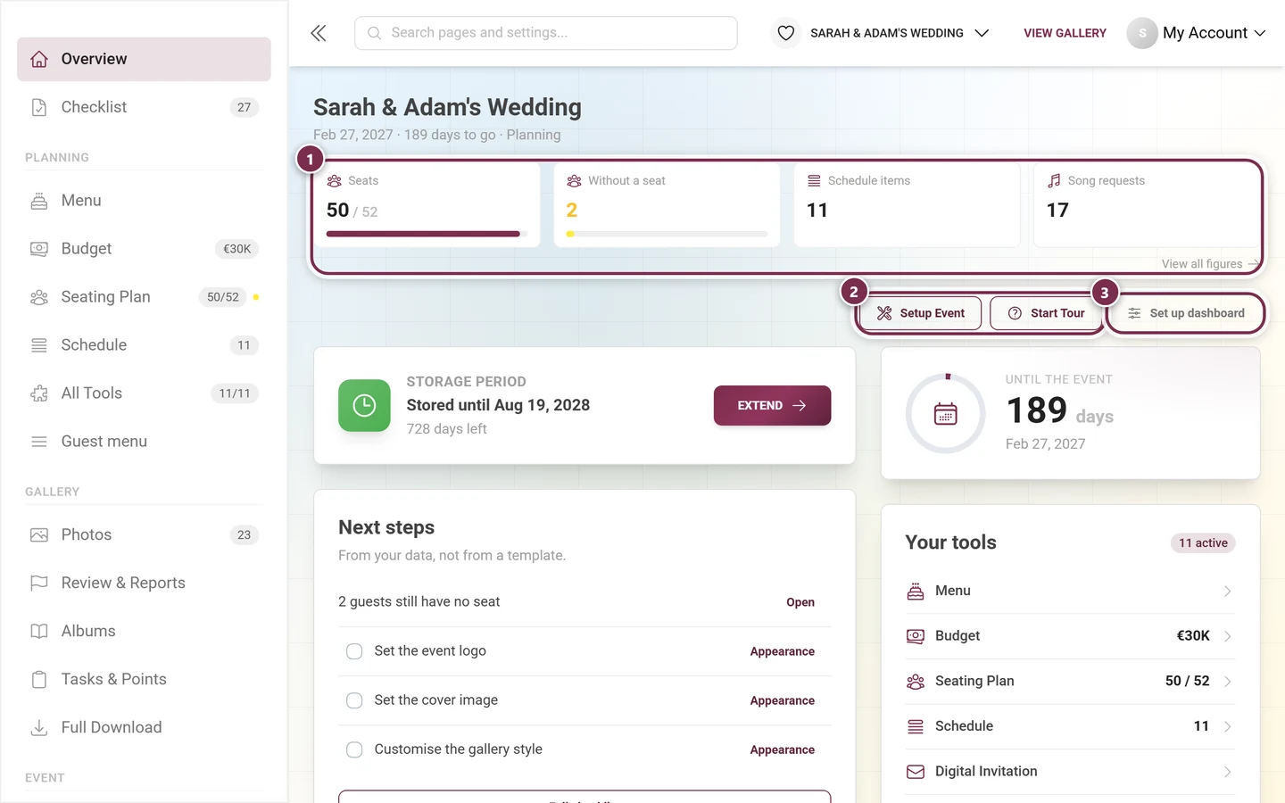
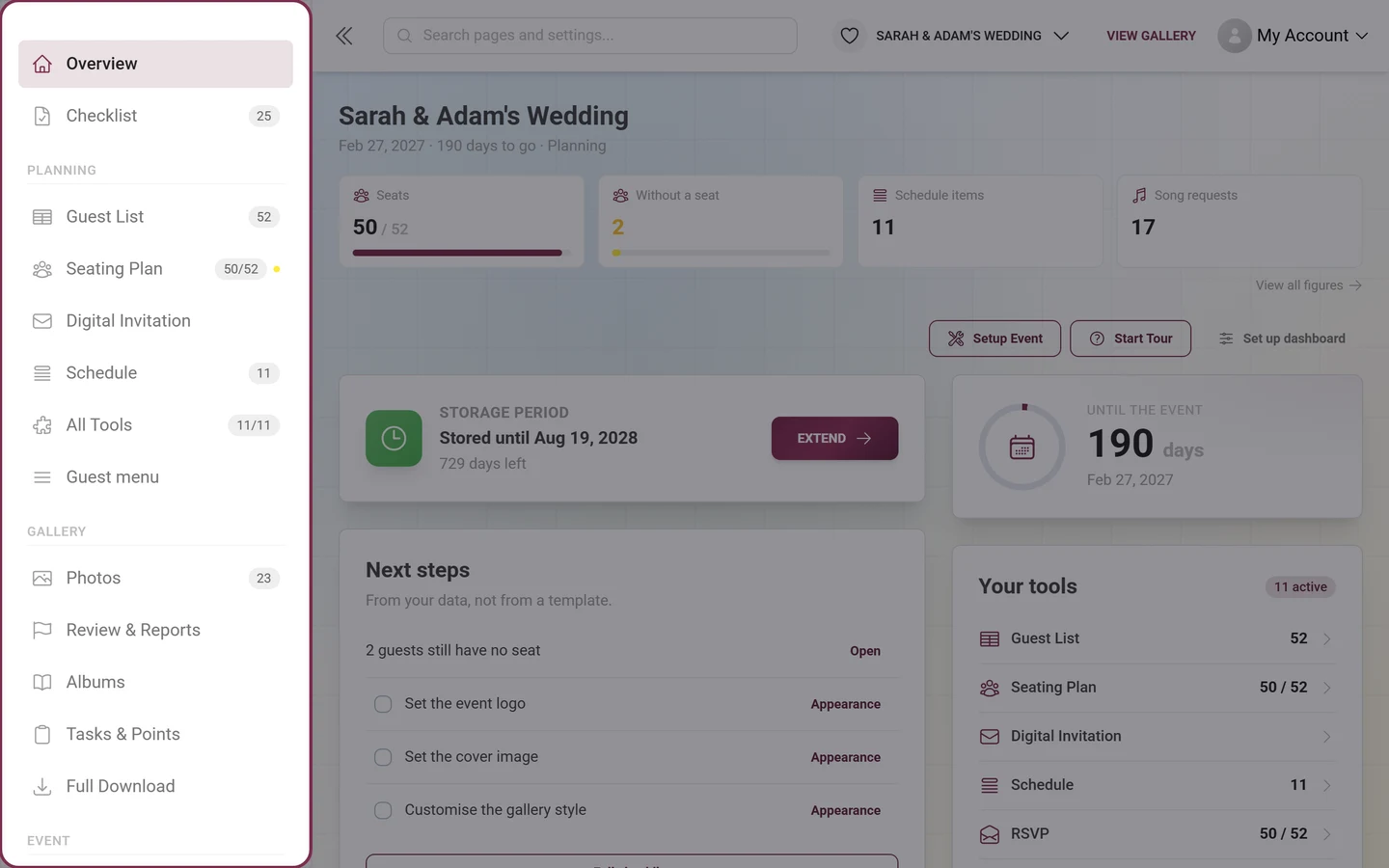
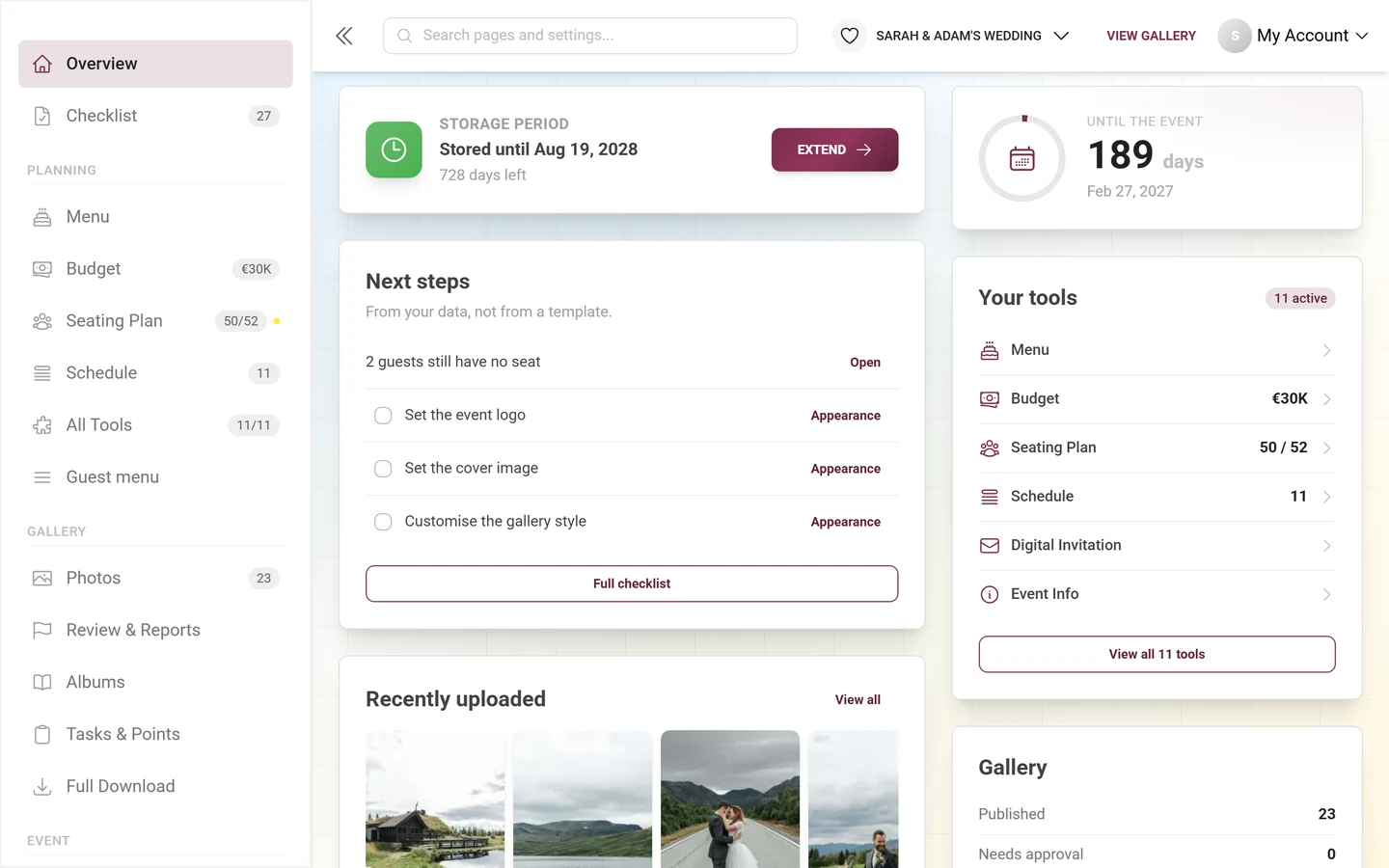
From top to bottom you see:
- The header: the event name, and below it a line made of the date, the time left (“N days to go” or “has taken place”) and the name of the current phase – Planning, Gallery, or After the event.
- The figure band: four tiles with a number and a progress bar. Every active planning tool contributes its own figure (acceptances, seats, budget, schedule items …), and the gallery always contributes Photos, Uploaders, To review (only while something is waiting), Storage and Gallery until. Below it on the right, “View all figures” leads into the statistics.
- The cards, whose order changes with the phase.
On a phone there is an extra horizontal strip right under the header with your active tools and an “All tools” pill – that is where the sidebar is collapsed. It only appears once at least one tool is running.
The cards worth knowing
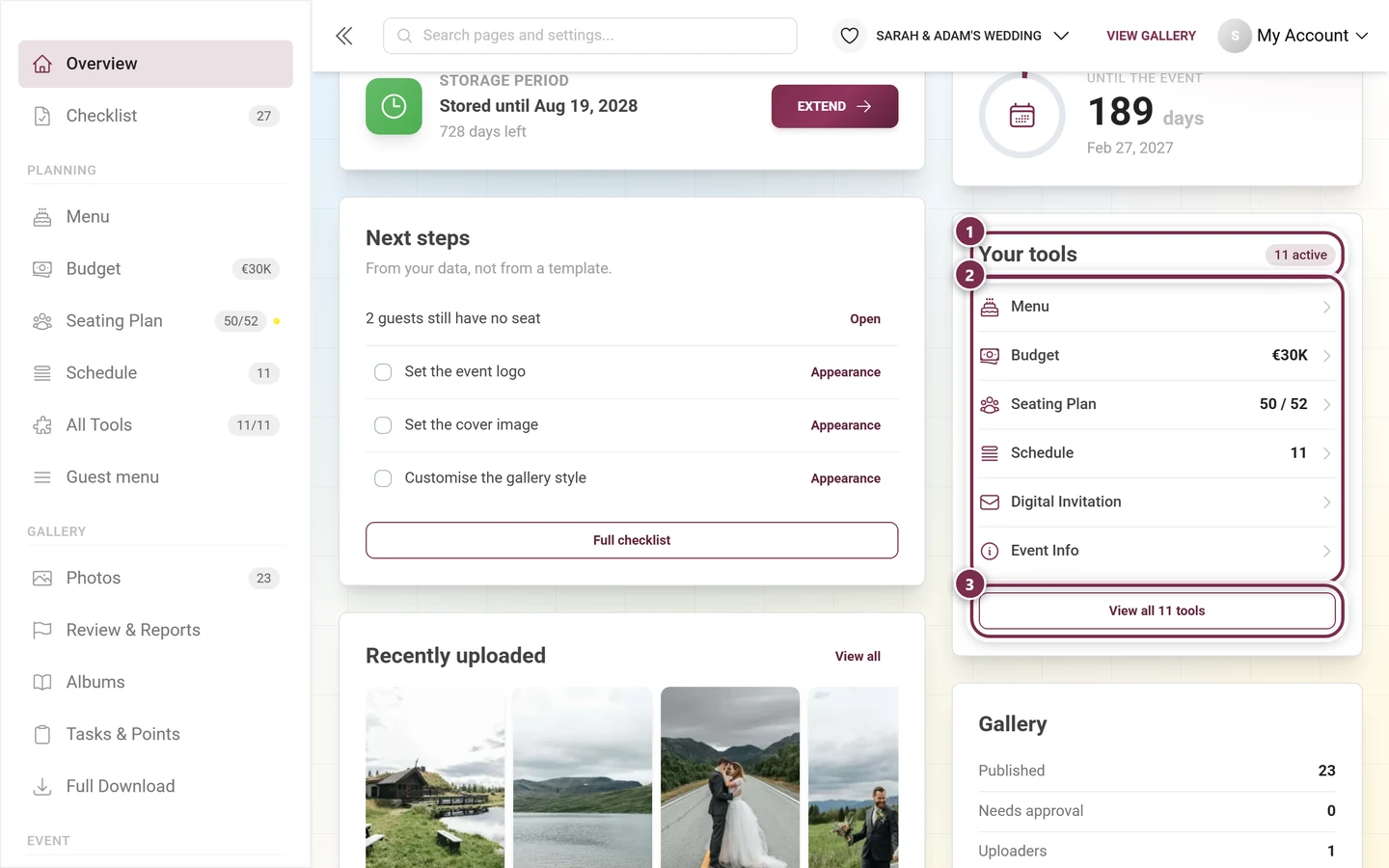
Section titled “The cards worth knowing”- Storage period – the clock that matters most. It leads in every phase and tells you how long your gallery stays online; the “Extend” button goes to the Plan & term page.
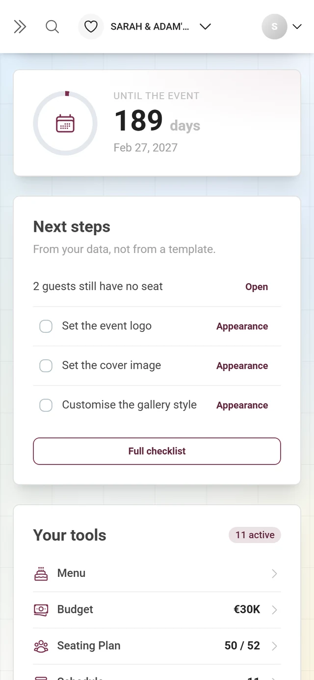
- Countdown – always the second card: a large day counter with a progress ring. Without an event date it reads “When is the big day?” and offers “Add a date”.
- Next steps – at most four items, subtitled “From your data, not from a template.” First come the things your real data leaves open (such as “N guests still have no seat” or “N uploads are waiting for approval”) with an “Open” text button, then open checklist tasks. At the bottom, “Full checklist” opens the complete list.
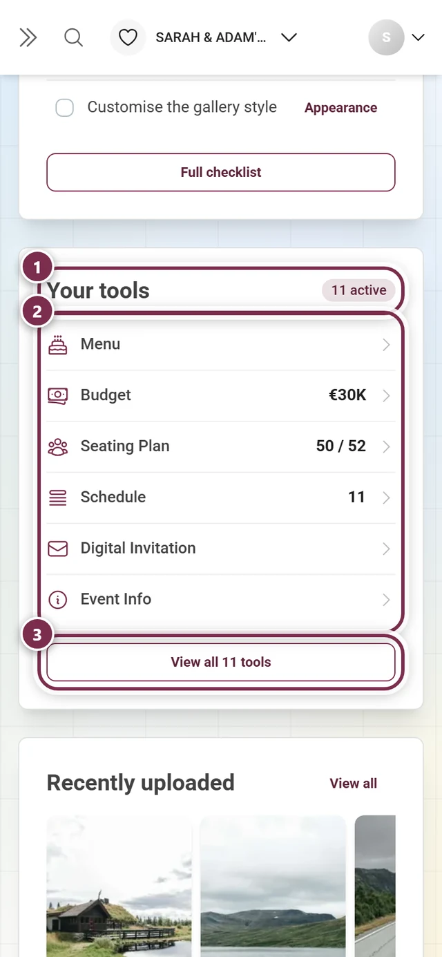
- Your tools – your active tools with their current figure, followed by suggestions; the footer button reads “View all 11 tools”.
- Gallery – the three rows Published, Needs approval and Uploaders, with “Open gallery”, “Share” and “QR code” below them.
- Recently uploaded – a strip of the newest photos. While there is nothing yet, it shows a hint and the “Get the QR code” button.
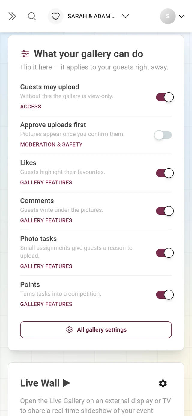
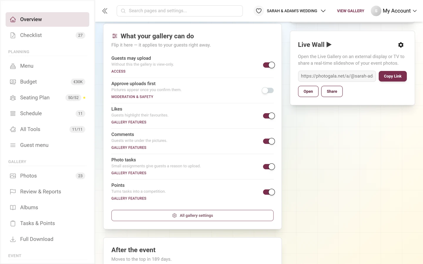
- What your gallery can do – six real switches: guests may upload, approve uploads first, likes, comments, photo tasks, points.
- Live Wall – the gallery address for the big screen, with “Copy Link”, “Open” and “Share”.
- After the event – “Download all photos”, “Send a thank-you”, “Determine winners”.
- Event Statistics – every counter in one dense block. This card is off by default; you switch it on in the “Set up dashboard” dialog.
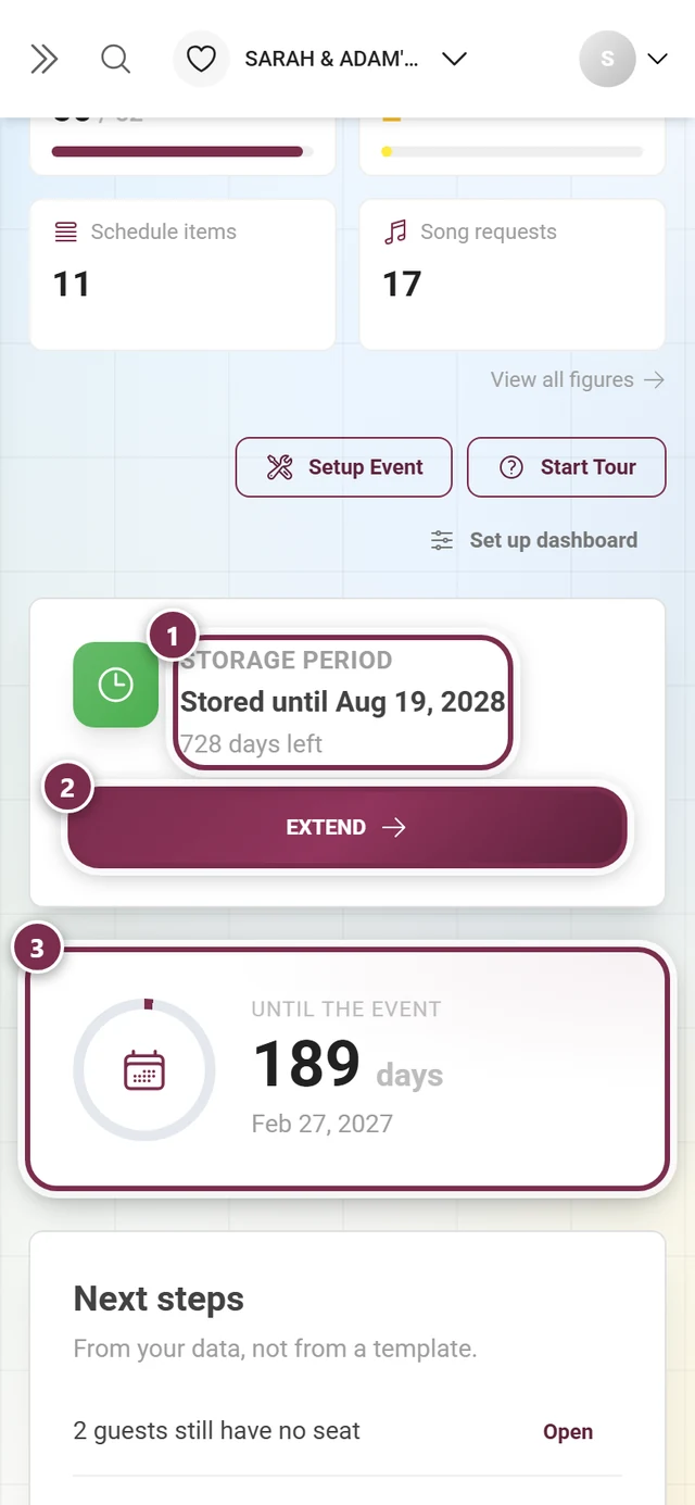
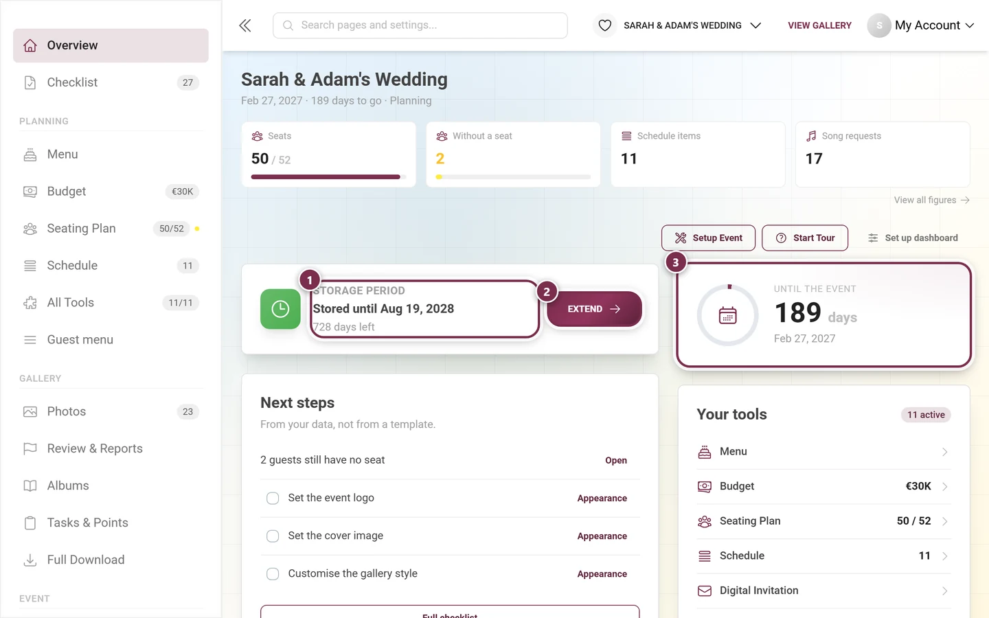
The action row and the “Set up dashboard” dialog
Section titled “The action row and the “Set up dashboard” dialog”Above the cards, three buttons sit on the right: “Setup Event” (reopens the setup wizard), “Start Tour” (the guided tour through the admin area), and “Set up dashboard”. If you have switched cards off, the third button carries a suffix like “· 2 off”.
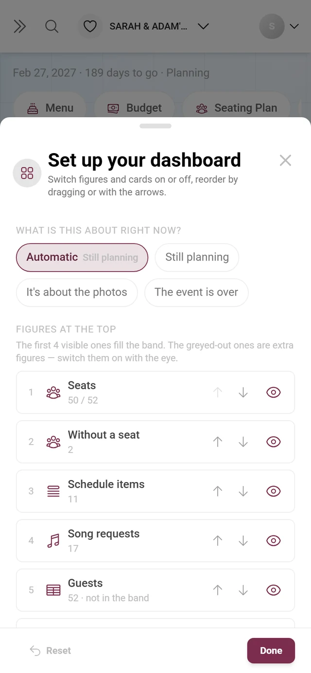
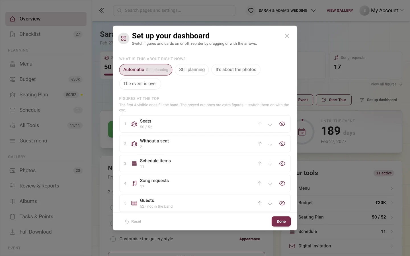
The dialog has three blocks:
-
“What is this about right now?” – the phase. “Automatic” is the default, next to it are “Still planning”, “It’s about the photos” and “The event is over”. Automatic means: if the event date is more than two days in the past, the dashboard switches to “The event is over”; if at least one planning tool is active (guest list, RSVP, seating, menu, budget, invitation), it is “Still planning”; otherwise everything is about the photos. Without a date it never switches to “The event is over” on its own – then you set the phase here yourself.
-
“Figures at the top” – every tile with an eye and arrows. The hint “The first 4 visible ones fill the band.” tells you which ones make it onto the dashboard. Grayed-out figures are marked “optional — off” and have to be switched on first.
-
“Cards” – the same mechanic for the cards: the eye switches them on and off, dragging or the arrows reorder them. Cards your plan does not include sit at the bottom marked “not in your plan”. “Reset” and “Done” close the dialog.
Phase 1 — Before the event
Section titled “Phase 1 — Before the event”The best foundation is laid calmly ahead of time. Set aside a few days so that nothing is missing on the event day. On the dashboard this phase is “Still planning”.
Set up the event & work through the checklist
Section titled “Set up the event & work through the checklist”-
Look at the Next steps card on the dashboard. It shows at most four items – first what your real data leaves open, then open checklist tasks.
-
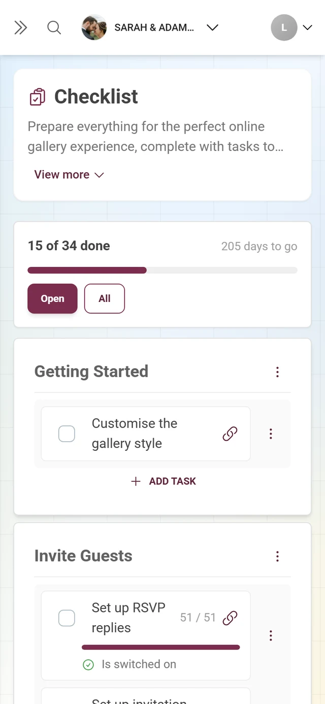
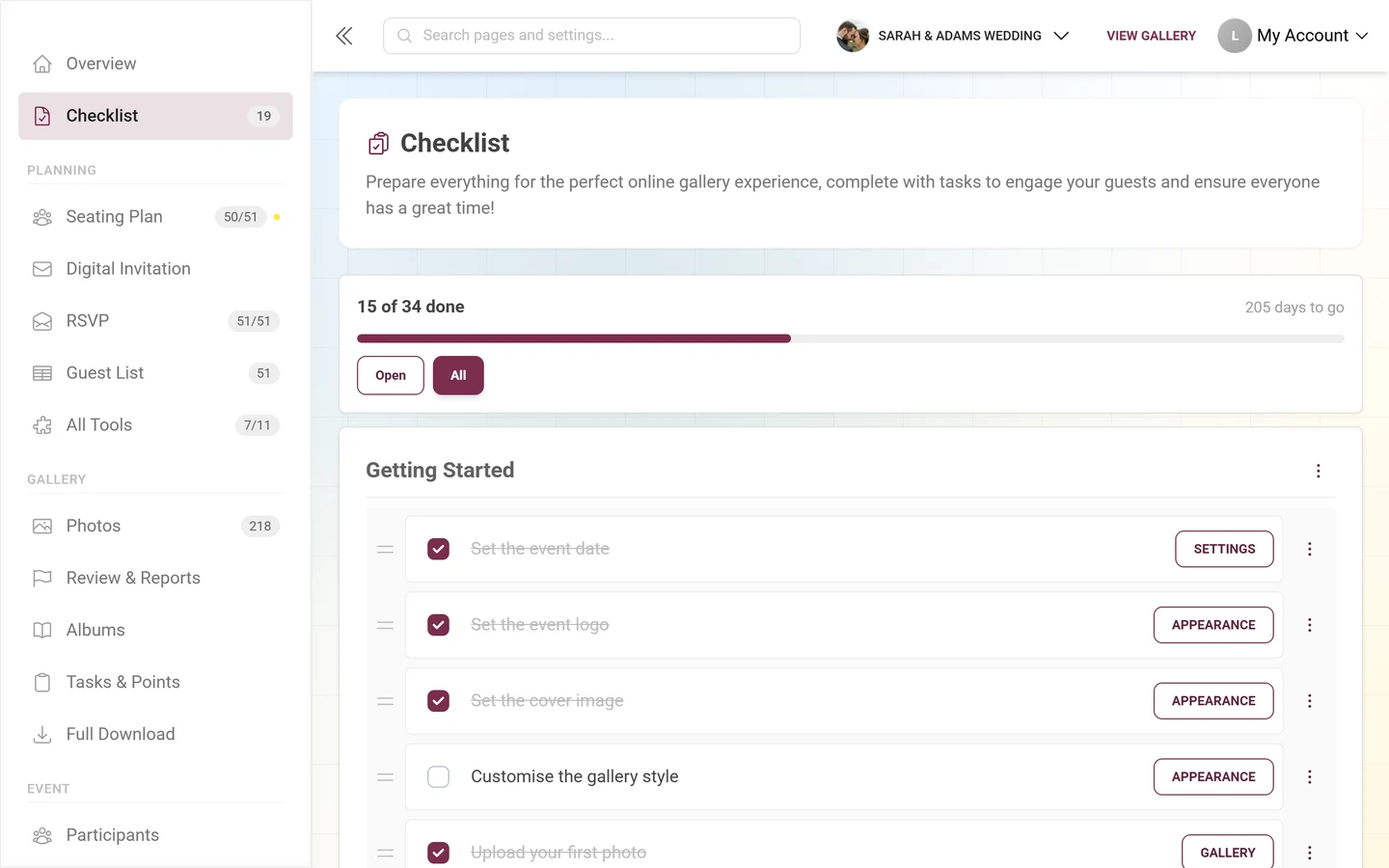
The “Full checklist” button at the foot of the card opens the complete list. Alternatively, use the Checklist entry in the sidebar; its badge shows how many items are still open.
-
Work through the items in order. The full view defaults to the “Open” filter – completed tasks are hidden until you switch to “All”. You will find details on each item in the setting up your event guide.
Set the look & branding
Section titled “Set the look & branding”-
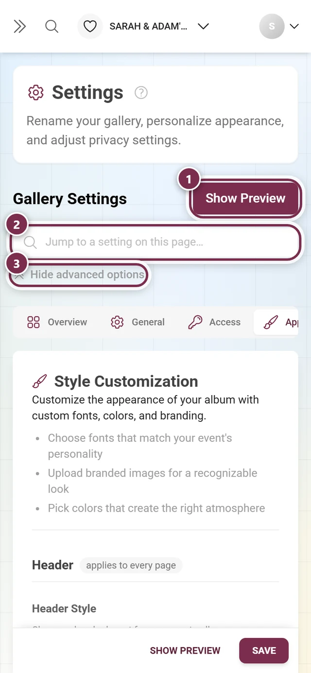
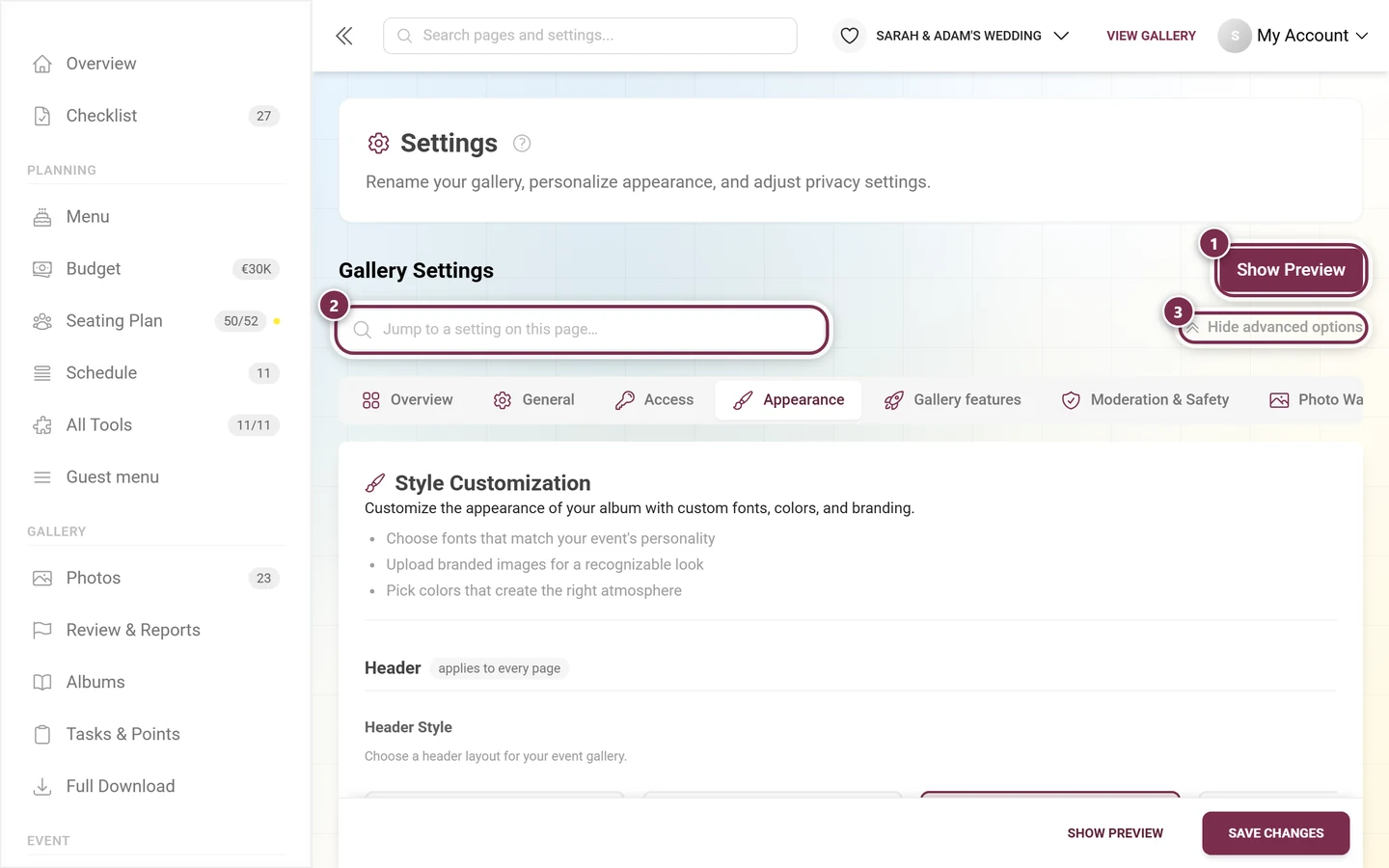
Open the settings and switch to the Appearance tab. It is no longer called “Style”; the address
?tab=styledeliberately stayed the same, so old links keep working. -
Set the header area, the photo grid, colors, fonts and the QR code. The appearance guide explains every option.
-
For printed QR cards and posters, use the Print Templates area – see QR cards, posters & print templates.
Turn features on
Section titled “Turn features on”-
Use the What your gallery can do card on the dashboard. The six switches – guests may upload, approve uploads first, likes, comments, photo tasks, points – take effect immediately; you do not have to open the settings first. Under each row a small link points to the settings area the switch lives in.
-
If your plan does not include a feature, the row reads “Not included in your plan.” and carries a button to the pricing page instead of a switch.
-
If you need more than those six switches, go to the settings: approval and safety live in the Moderation & Safety tab (see the privacy & moderation guide), everything else about tasks, points, likes and downloads in the Gallery features tab (see the features guide).
Prepare the guest tools
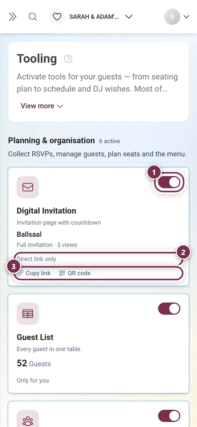
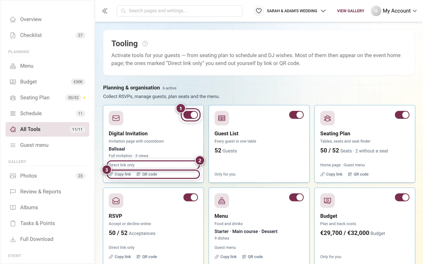
Section titled “Prepare the guest tools”The step that saves the most time: everything around invitation, replies, menu, run sheet and seating gets done before the event. There are eleven tools in total. You reach them via the Your tools dashboard card (footer button “View all 11 tools”), via Planning → All Tools in the sidebar – and on a phone via the tool strip at the very top of the dashboard.
-
Send the invitation: design a digital invitation page with date, venue and run sheet, and share it by link or QR code – see digital invitation.
-
Collect replies: switch on RSVP so your guests can accept or decline online. You can add your own questions and send personalized links – see RSVP.
-
Maintain the guest list: the replies build your guest list – the basis for seating, meal choices and follow-ups. See guest list.
-
Add menu and schedule: the courses and the run of the day are separate tools – see menu and schedule.
-
Build the seating plan: place tables, seat guests, honour their wishes. On the day, guests find their own seat – see seating plan.
Once a tool is running it shows up in three places by itself: as its own row in the sidebar under Planning, as a tile in the figure band, and – if something is outstanding – as an item in Next steps. Which tools exist in total, how you switch them on and make them visible to guests, is covered in the tooling overview.
Prepare challenges, tasks & albums (optional)
Section titled “Prepare challenges, tasks & albums (optional)”Playful elements encourage your guests to join in. Everything is optional:
-
Tasks/challenges: in the sidebar under Gallery → Tasks & Points. The page has three tabs: Tasks, Achievements and Points Configuration. In the dialog you set a name, a description, the point value, and the conditions. The full flow is in the tasks guide.
-
Achievements/rewards: you create achievements in the tab of the same name; real prizes are managed one level below under Real Rewards. See the achievements guide.
-
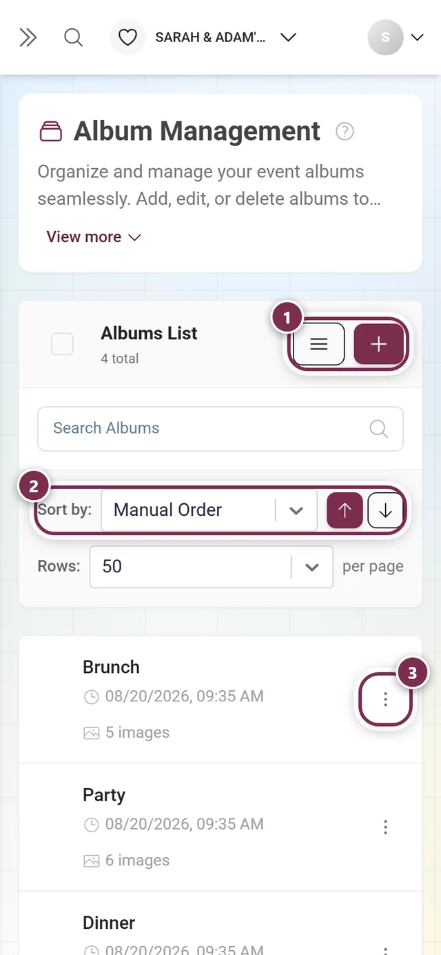
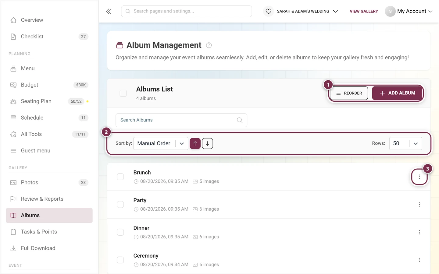
Albums: open the album manager from the sidebar under Gallery → Albums. The dialog asks for a name, cover, and optional smart rules. Handy for sections like ceremony, reception, and party – see the albums guide.
Prepare access & protection
Section titled “Prepare access & protection”-
For the quick path, click “Share” on the Gallery dashboard card – a dialog with the event link opens. While there are no photos yet, “Get the QR code” on the Recently uploaded card leads to the same place.
-
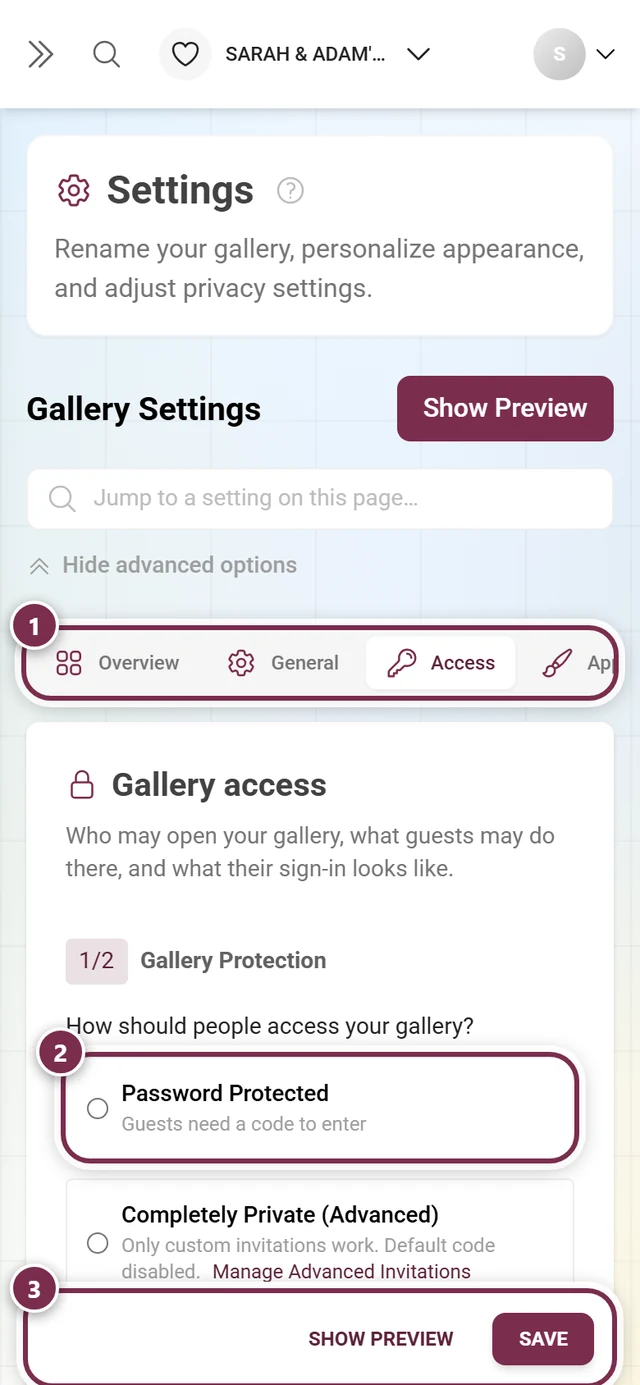
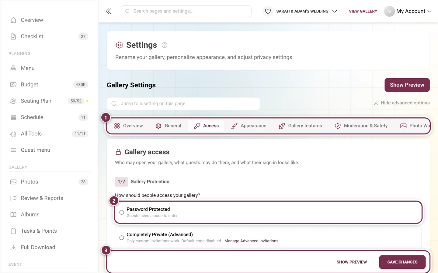
Password, individual codes and uploader access live in the Settings under the Access tab. The former separate page “Manage invitations” is gone – its address redirects there. All options (link, QR, codes) are explained in invite guests.
-
If you want to appoint helpers as moderators, you assign that role in the Access tab as well. There is no “advanced mode” any more, both views are merged – see roles & permissions.
Generate & print QR codes
Section titled “Generate & print QR codes”-
Click “QR code” on the Gallery dashboard card – it leads into the Print Templates area (sidebar: Event → Print Templates). If your plan includes none of the QR download features, the button is not shown.
-
The print assistant opens. Choose Share your gallery, then the destination and the output – Quick design for a ready-made card, Free editor for the Design Studio or QR code only for a PNG or SVG file. Download the result, test the QR code with your phone and print it.
-
Place the cards clearly visible on the event day (tables, entrance, bar).
Phase 2 — During the event
Section titled “Phase 2 — During the event”Now everything runs live. You do not have to stay glued to the screen, but a few glances in between are worthwhile. On the dashboard this phase is “It’s about the photos” – the pictures and the gallery figures move up.
Keep the Live Wall running
Section titled “Keep the Live Wall running”-
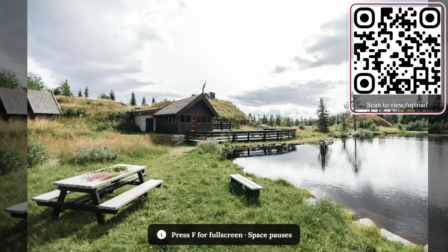
Open the Live Wall card on the dashboard and click “Copy Link” or “Open” to show the photo wall on a TV or projector.
-
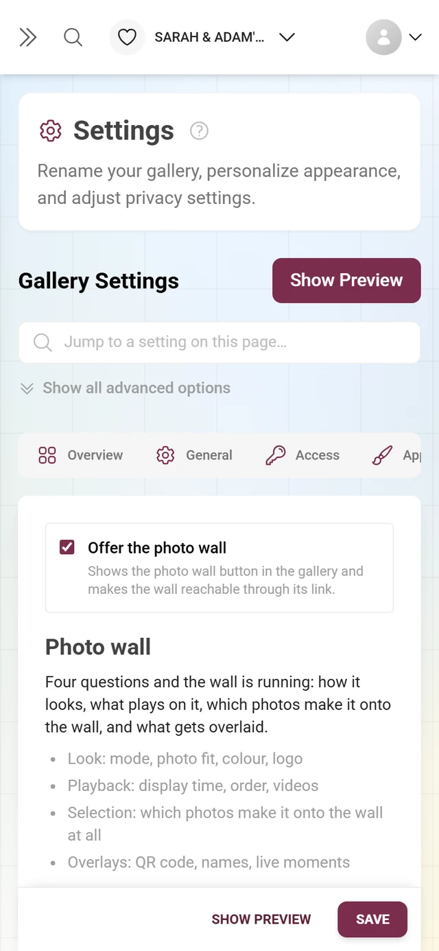
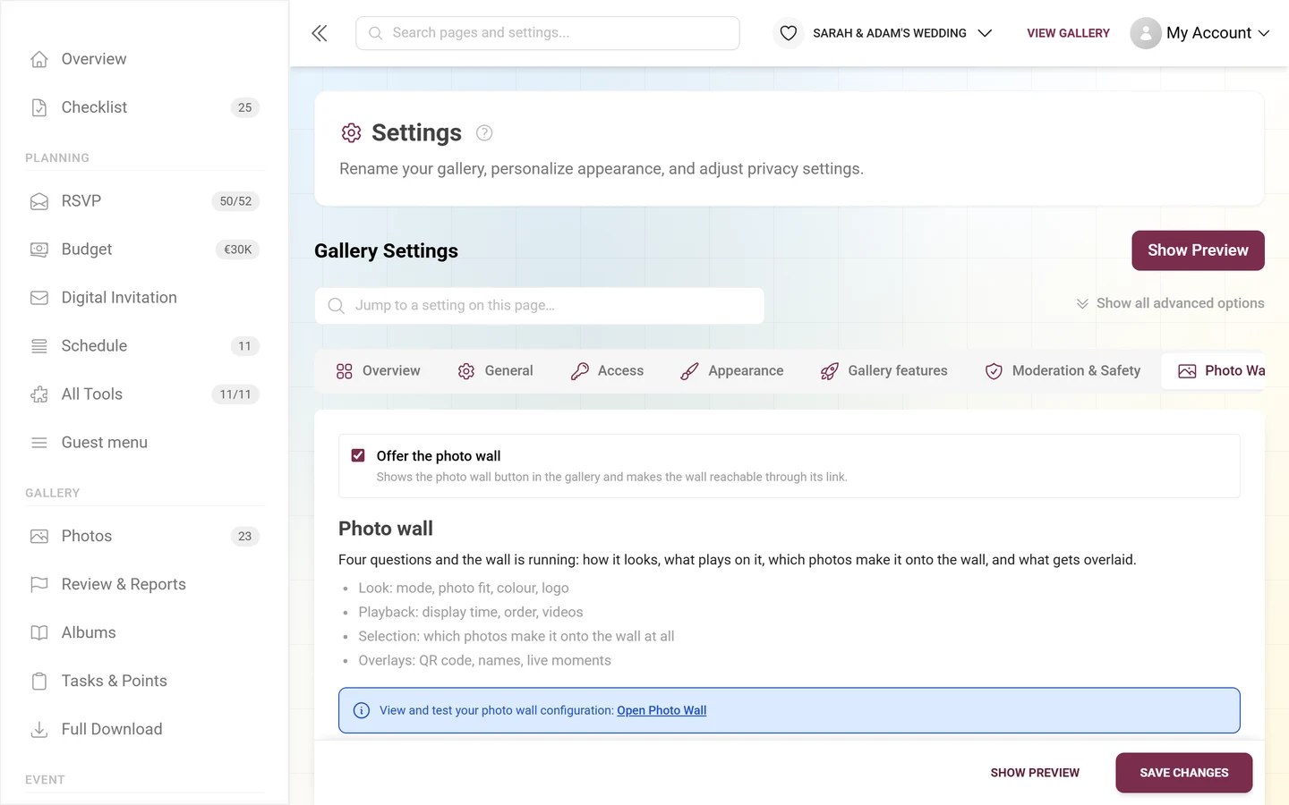
The gear on the card takes you into the settings, to the Photo Wall Settings tab – which is also where the switch that turns the photo wall on now lives. The photo wall guide explains every option.
Keep moderation in view
Section titled “Keep moderation in view”If approval is active, new images need your confirmation before they appear in the gallery. You can tell that something is waiting from four places: the To review tile in the figure band, the same row on the Gallery card, the “N uploads are waiting for approval” item in Next steps, and the badge on the Review & Reports sidebar entry.
-
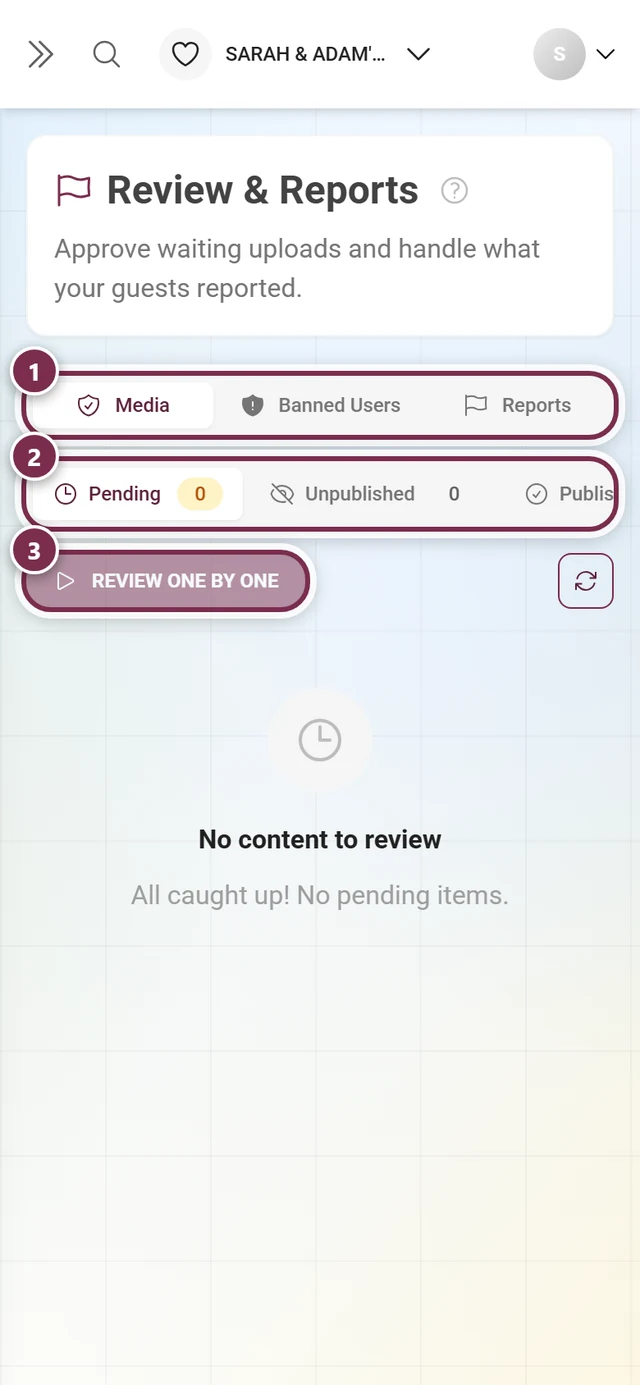
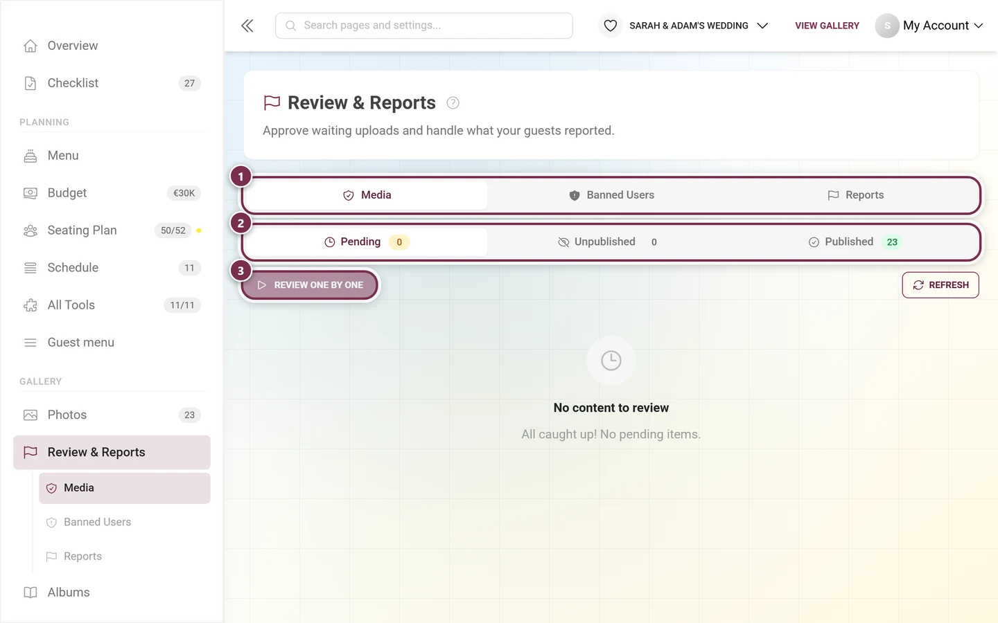
Open Gallery → Review & Reports in the sidebar. The page is subtitled “Approve waiting uploads and handle what your guests reported.” and has the tabs Media, Face Clusters (only with AI), Banned Users and Reports.
-
Decide straight on the tile (approve or reject), or click “Review one by one” to go through each picture full screen. Your decisions stay where they are; a bar at the bottom collects the tally and offers “Undo last”. Details in the moderation guide.
-
If someone repeatedly disrupts things, you can ban them – and hide their visible photos in the same step. See ban users.
Delegate moderation
Section titled “Delegate moderation”-
Appoint a trusted person as a moderator in the Settings under the Access tab.
-
That person can then review uploads while you get to celebrate yourself. Pure moderators without an admin area work on the guest-side route
/moderation– the same screen, just without the sidebar. Roles & permissions explains how.
Phase 3 — After the event
Section titled “Phase 3 — After the event”Even when the party is over, there are still important steps – above all the backup. Two days after the event date the dashboard switches to “The event is over” by itself: the After the event card moves far up and bundles download, thank-you and the award ceremony. If you never entered a date, that does not happen automatically – then you set the phase yourself in the “Set up dashboard” dialog.
Nudge latecomer uploads
Section titled “Nudge latecomer uploads”Remind your guests in the days afterward to upload their last photos. Many did not share everything right away during the evening. If you use a live-upload access for photo booths, you can leave it open for this – see live upload.
Crown the winners & hand out prizes
Section titled “Crown the winners & hand out prizes”If you worked with points and a leaderboard, the award ceremony belongs here:
-
Open the winners page: from the After the event card via “Determine winners”, or in the sidebar under Gallery → Tasks & Points → Winners.
-
Freeze the standing once the last upload is in – after that the result no longer changes, even if more points come in.
-
Hand out the prizes and confirm each handover with the code the winners received. The full flow is explained in crowning winners & handing out prizes.
Publish the thank-you
Section titled “Publish the thank-you”A short thank-you brings the gallery to life once more and pulls guests back in. On the After the event card, “Send a thank-you” takes you straight into the tool. It is best prepared in advance; driven by the event date it then appears by itself at the right moment. See thank you.
Check the storage period
Section titled “Check the storage period”-
Open the dashboard and look at the Storage period card – it sits at the very top, in every phase.
-
The text shows the state: “Stored until” plus the date (with “N days left” below it), “Stored permanently”, or – when expired – “Expired — N days of download access left”. After expiry the gallery is offline; until the date shown you can still bring it back yourself, after that only through support.
-
If time is short, click “Extend”: there you renew, move the gallery to the archive for less, or switch on automatic renewal – see Plan & term. In the “The event is over” phase the After the event card also offers an “Extend storage period” button.
Pull a complete backup
Section titled “Pull a complete backup”-
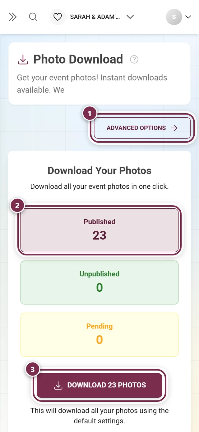
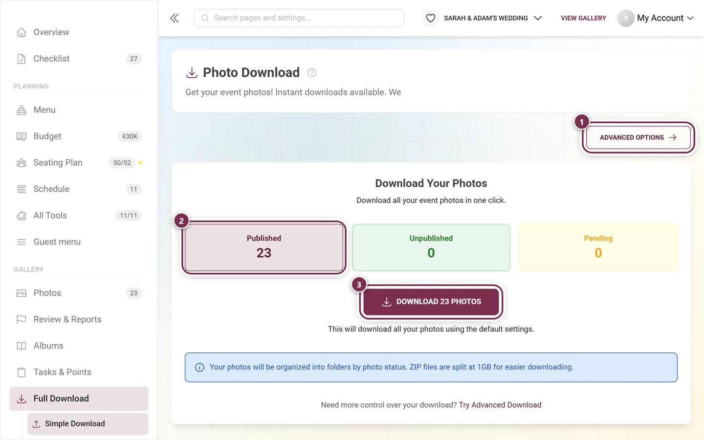
Click “Download all photos” on the After the event card, or open Gallery → Full Download from the sidebar. Here you configure your ZIP backup in several steps.
-
Folder structure: choose how the files are grouped – Single Folder, By Photo Task, By Uploader, or By Album.
-
File naming: keep the original names or add a status prefix, like count, or uploader name. A preview shows you the resulting file name.
-
Descriptions: optionally generate a
.txtfile with the caption for each image. -
Recycle bin & selection: decide whether deleted images are included or excluded, and which statuses you back up.
-
Optionally create a separate folder for each status. The tree preview shows the finished ZIP structure.
-
Finally, click Download. Large backups are automatically split into multiple ZIP files. The full flow is in the download & export guide.
Related guides
Section titled “Related guides”- Preparation: setting up your event, appearance, print templates, moderation & safety, gallery features, tasks, achievements, albums, invite guests, roles, dashboard.
- Guest tools: tooling overview, digital invitation, RSVP, guest list, menu, schedule, seating plan.
- Live operation: photo wall, moderation, ban users.
- Follow-up: live upload, crowning winners, thank you, Plan & term, download & export, recycle bin, event statistics.