Designing QR cards, posters & print templates
To help guests reach your gallery in seconds on site, this page produces all of your print material: the QR code as a PNG, invitation cards, posters, task and achievement cards. Everything ends up as a print-ready PDF. For designed cards there is a print assistant that guides you step by step, plus either a simple editor or the Design Studio – a canvas editor with layers, multiple pages, fold marks, guides and multi-language support.
How to reach this area
Section titled “How to reach this area”-
Open your event’s admin area (the gear / “Manage event” – guests reach it via the profile menu top right under Management).
-
In the left sidebar, in the Event group, click Print Templates (icon: an open envelope). Route:
/admin/templates. The entry used to be called “Print Invitations”. -
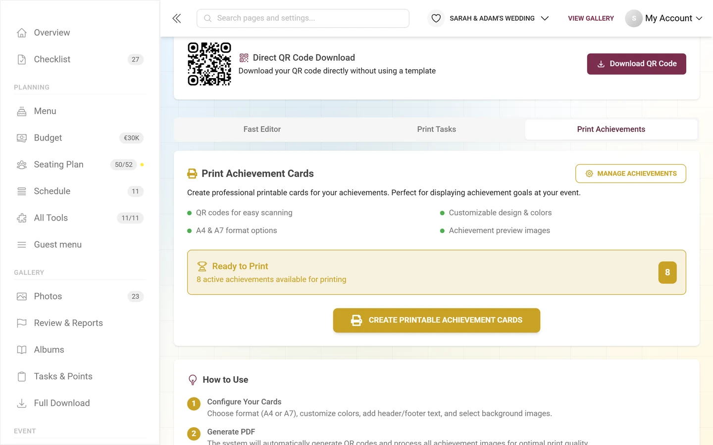
The page opens with two tabs: Create (Step by step) and Templates & designs (Continue editing directly). Create is preselected and walks you through the print assistant (see Creating print material step by step). Under Templates & designs you find the invitation code control with a direct QR download at the very top, and below it the three tabs Gallery design, Print Tasks and Print Achievements. The two tabs Create and Templates & designs also appear as sub-entries in the sidebar while you are on the page.
Creating print material step by step
Section titled “Creating print material step by step”In the Create tab the print assistant takes you to finished print material in four steps. It sets the right QR link automatically – you don’t have to copy any link.
-
Choose the purpose: answer “What would you like to share?” with one of the three cards:
- Share your gallery – share your event start page or open the photo gallery directly.
- Hand out photo tasks – each task gets its own QR code that opens exactly that task.
- Share event tools – song requests, seating, menu and more. Guests open the selected tool directly.
-
Choose the content:
- For the gallery, under “Where should the QR code take guests?” you pick the Event start page (recommended) or the Gallery directly.
- For photo tasks you take All photo tasks or Choose specific tasks. If no tasks are active yet, Activate & manage photo tasks takes you to the task manager.
- For tools you pick the tool, and for Custom pages also the published page. A tool marked Setup required has to be set up first.
For the gallery and tasks, the Include access code in the QR link switch sits below. With a code, guests open the content directly; without one, they have to enter their access code themselves for a protected event. Under Access code you decide which code – and with it which role – is passed along.
-
Choose the output: “What would you like to create?”
- Quick design – a ready-made layout; you adjust text and background.
- Free editor – place text, images and QR codes freely, i.e. the Design Studio.
- QR code only – customize the QR style and download it as PNG or SVG for your own design, for example in Canva.
-
Design & download: for Quick design and Free editor, Open editor opens the matching editor with the QR link already set. When you come back, Continue designing takes you to your draft. For QR code only you choose a Frame (No frame, Simple frame, With scan label, Corner marks, Polaroid, Ticket), for With scan label, Polaroid and Ticket also the Frame label, and the File format. With Use an easy-to-scan default or Use saved QR design you switch between the QR styles. For several photo tasks you download all codes at once with Download QR package (ZIP), otherwise with Download QR code.
Existing designs and the direct QR download are still in the Templates & designs tab.
Invitation code settings & direct QR download
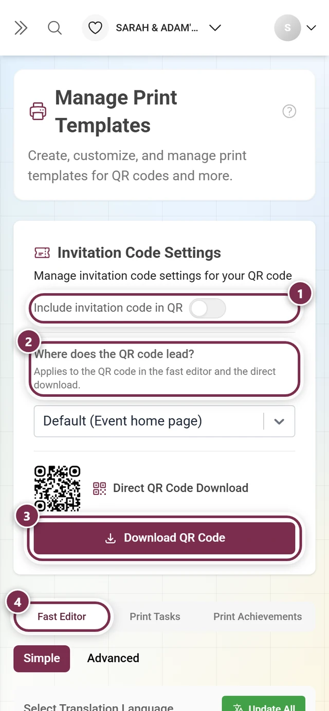
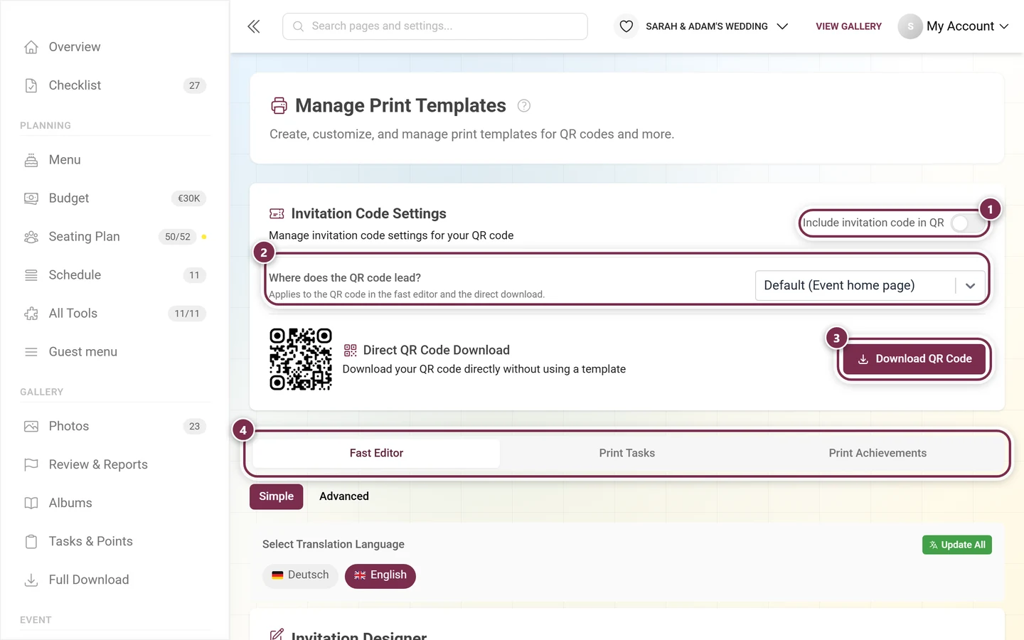
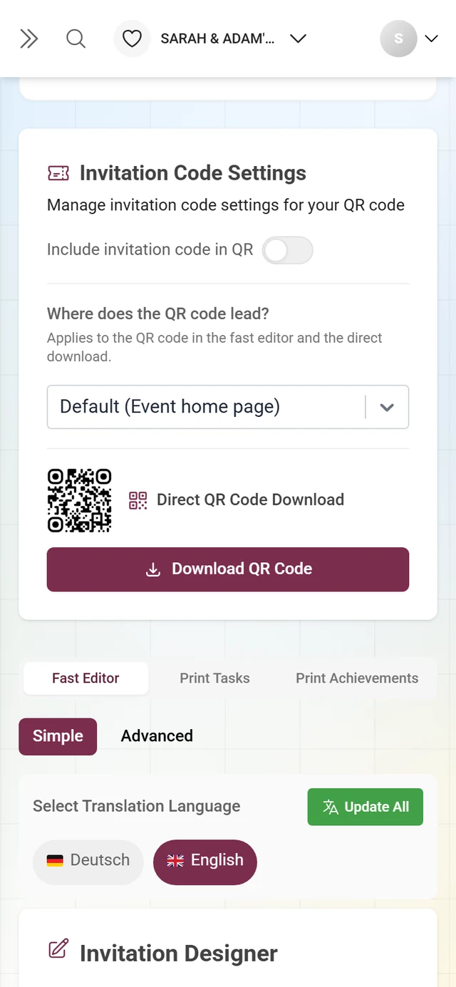
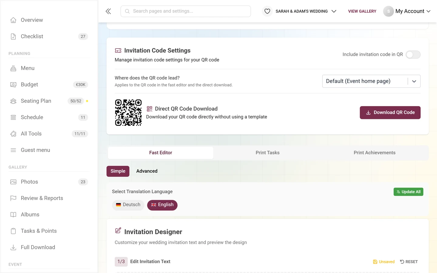
Section titled “Invitation code settings & direct QR download”The Invitation Code Settings card always sits on top in the Templates & designs tab, above the tabs. Here you decide which permissions your QR code grants when scanned, and you download it as a PNG. In the Create tab you set the same thing with the Include access code in the QR link switch.
-
Include invitation code in QR: When it is on, the QR carries a specific invitation code and your guests join with the matching permissions without typing a password. If the toggle is grayed out, a hint below explains why – for example “No invitation codes available” or “Invitation codes are not required for this event”.
-
Select Code (only when the toggle is on): the dropdown groups the codes into Default Invitation and Other Invitations, each with a role icon and a colored badge.
-
Watch the warnings:
- Yellow “Non-default invitation code selected!” – you picked a specialized code. The QR then grants exactly its permissions.
- Red “Warning: Creating QR without invitation code for invite-only event!” – guests would have to type the password manually. In that case, always embed a code.
- “Error generating QR code” – wait a moment and check the code selection.
-
Download the QR: Under Direct QR Code Download you see a small preview. Click Download QR Code to save it as a PNG. While generating, the button shows “Generating…”; without a finished QR it is disabled. A badge “Invitation code included: …” confirms which code is embedded.
Tab 1 – Gallery design
Section titled “Tab 1 – Gallery design”At the top of the tab you choose between two modes:
- Simple – the rich-text editor with background picker and PDF preview.
- Advanced – opens the Design Studio as a full-screen editor.
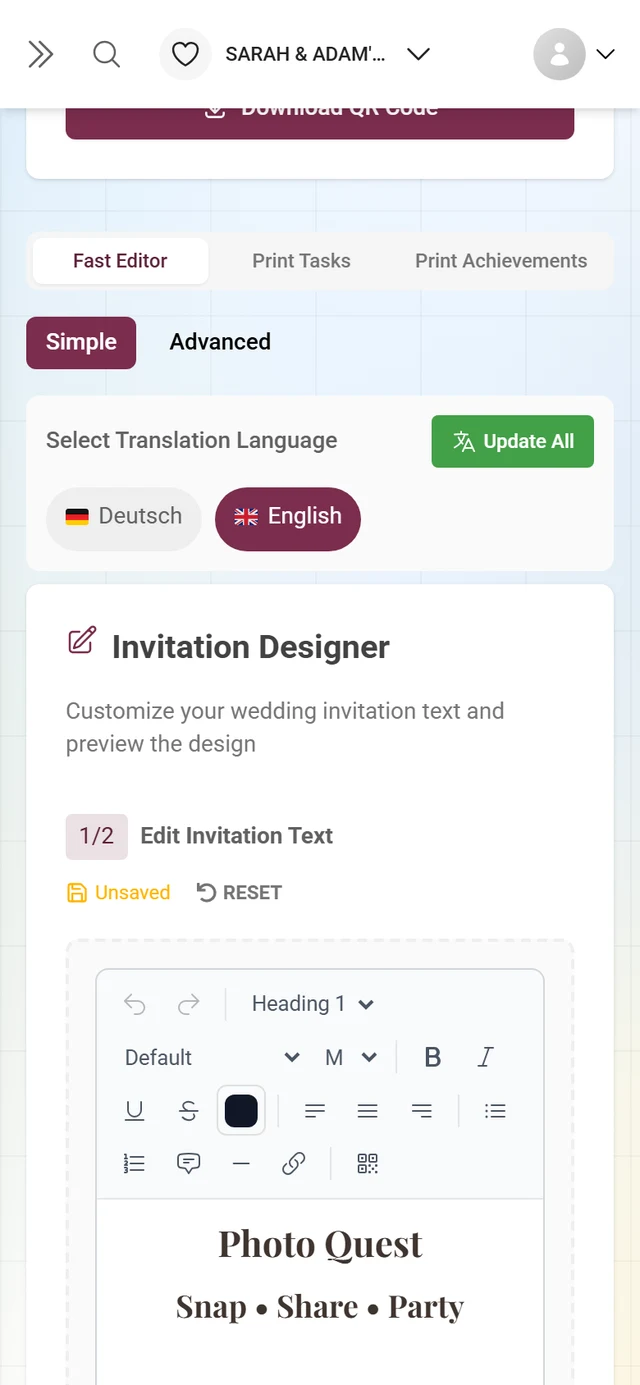
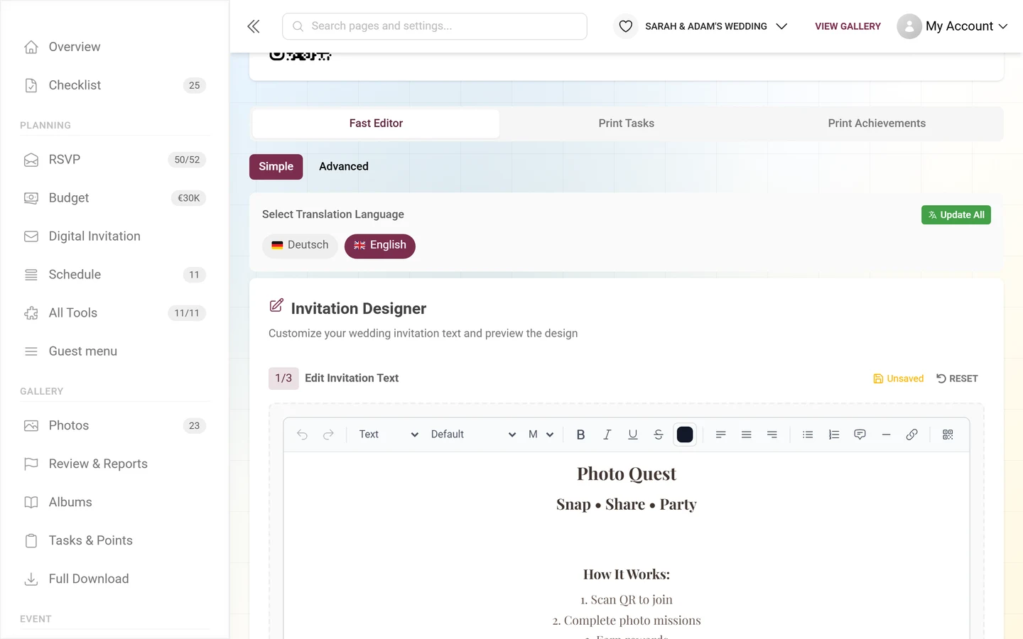
The simple editor is headed Invitation Designer and walks you through three steps (two on a phone – the preview is desktop only):
-
1/3 – Edit Invitation Text: a rich-text editor with a toolbar: headings, font, size, text and background color, lists. Two special elements: insert QR code (a placeholder replaced by the real QR when printed) and a decorative line. On the right you see the save status (“Saving…” / “Unsaved” / “Saved”). Reset restores the default text.
-
2/3 – Background: pick a background image. Browse Templates opens the Choose Invitation Card Background picker; Upload Custom Background takes your own image.
-
3/3 – Live Preview (desktop only): shows the finished card as a PDF preview with the real QR. Without a QR it reads “No QR code available for preview”.
-
Download: click Download Invitation. Without a QR the button is disabled (“QR Code Required”); without the feature it reads “Upgrade to Download PDF”.
Opening the Design Studio
Section titled “Opening the Design Studio”There are several ways in, depending on what you want to print:
- Create → Share your gallery → Free editor in the print assistant, or Templates & designs → Gallery design → Advanced for invitation cards.
- Print Tasks and Print Achievements (tabs 2 and 3 under Templates & designs), or Hand out photo tasks → Free editor in the assistant, for task and achievement cards.
- From the event tools: Place cards, Table numbers and Seating plan poster in the seating export, Design in the Design Studio from the menu card, Design invitations from the RSVP tool, and Design in the Design Studio from the QR section of any tool.
How the studio is laid out
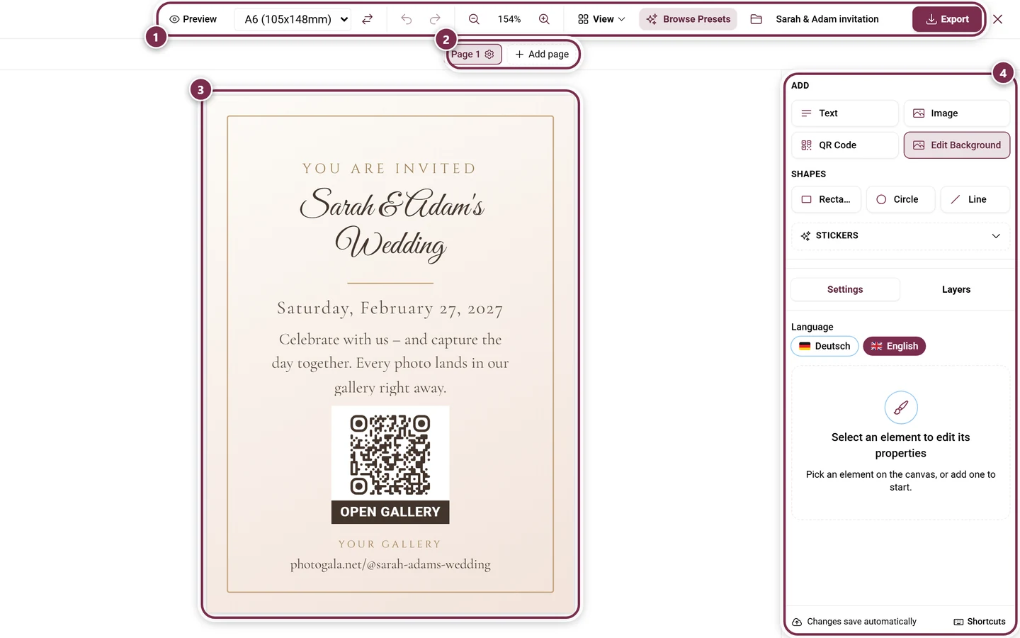
Section titled “How the studio is laid out”The studio consists of the toolbar on top, the canvas in the middle with the page navigator below it, and a sidebar on the right. The sidebar shows the Add section at the top and the two tabs Settings and Layers below it; the divider between them can be dragged. On the desktop it is hidden in preview mode; on a phone you reach the same areas from the bar at the bottom.
Toolbar
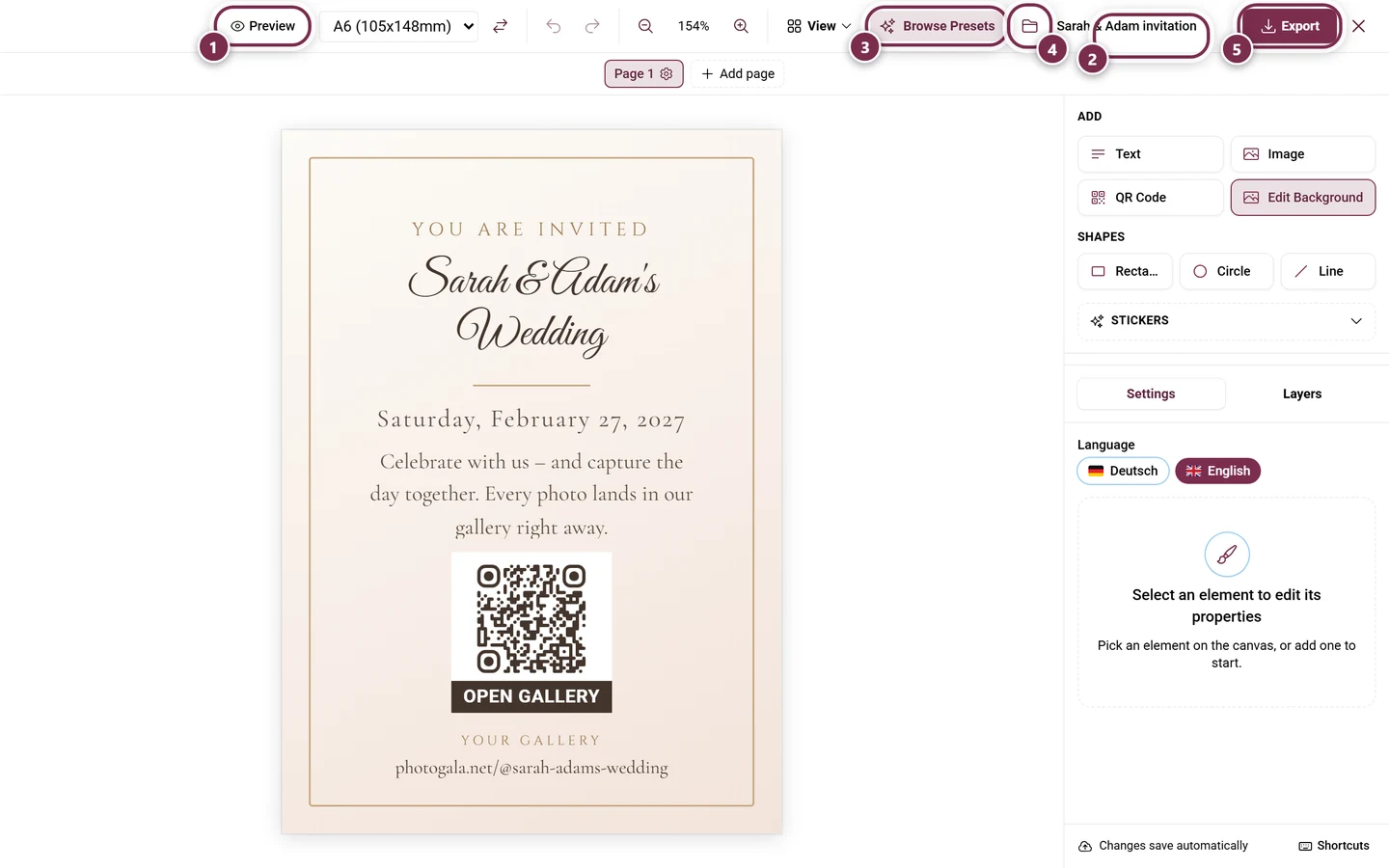
Section titled “Toolbar”- Edit / Preview: preview shows real event data instead of placeholders.
- The paper size (desktop only): a dropdown listing the A formats with their dimensions – from
A3 (297x420mm)toA7 (74x105mm)– or Custom with width × height in mm (10 to 1000). Next to it, Swap Orientation. - Undo / Redo, Zoom In / Zoom Out (desktop only).
- View (desktop only) with Grid, Ruler, Snap, the Measurement unit and all guide and fold options.
- Layers – the stack icon; it opens the Layers tab on the right.
- Browse Presets opens the design browser.
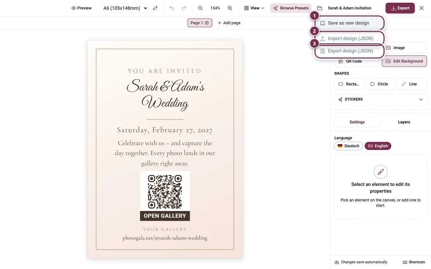
- File – the folder icon next to it. It carries no caption, only a tooltip. Behind it: Save as new design, Import design (JSON) and Export design (JSON).
- On the right: the editable design name, Fullscreen, Export and Close.
Adding elements
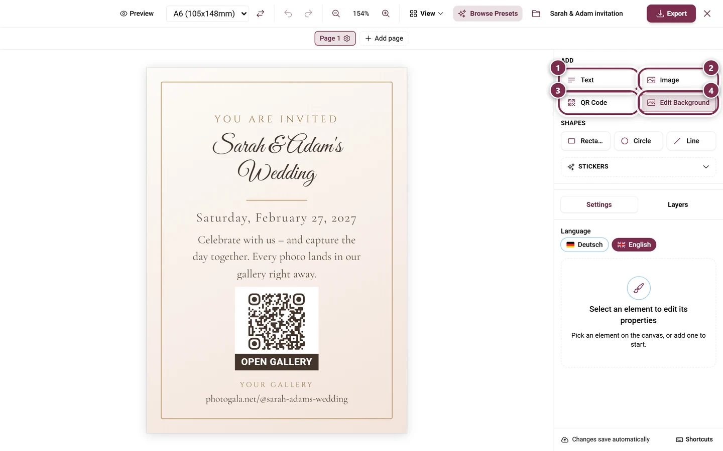
Section titled “Adding elements”The Add section offers:
- Base Elements: Text, Image, Shapes (rectangle, circle, line), QR Code and Background.
- Dynamic Fields – see below.
- Stickers – 39 ready-made graphics in five categories: Ornaments, Wedding, Party, Nature and Shapes+. One click inserts a sticker as an ordinary image element (30 % of the canvas width, centered), so all image controls apply afterwards.
- Insert content – blocks built from real event data, see below.
Layers
Section titled “Layers”The Layers tab lists every element, topmost first. Per row: visibility (Show / Hide), Lock, Bring forward / Send backward, Rename (double-click the name, max. 60 characters) and Delete. Drag to reorder.
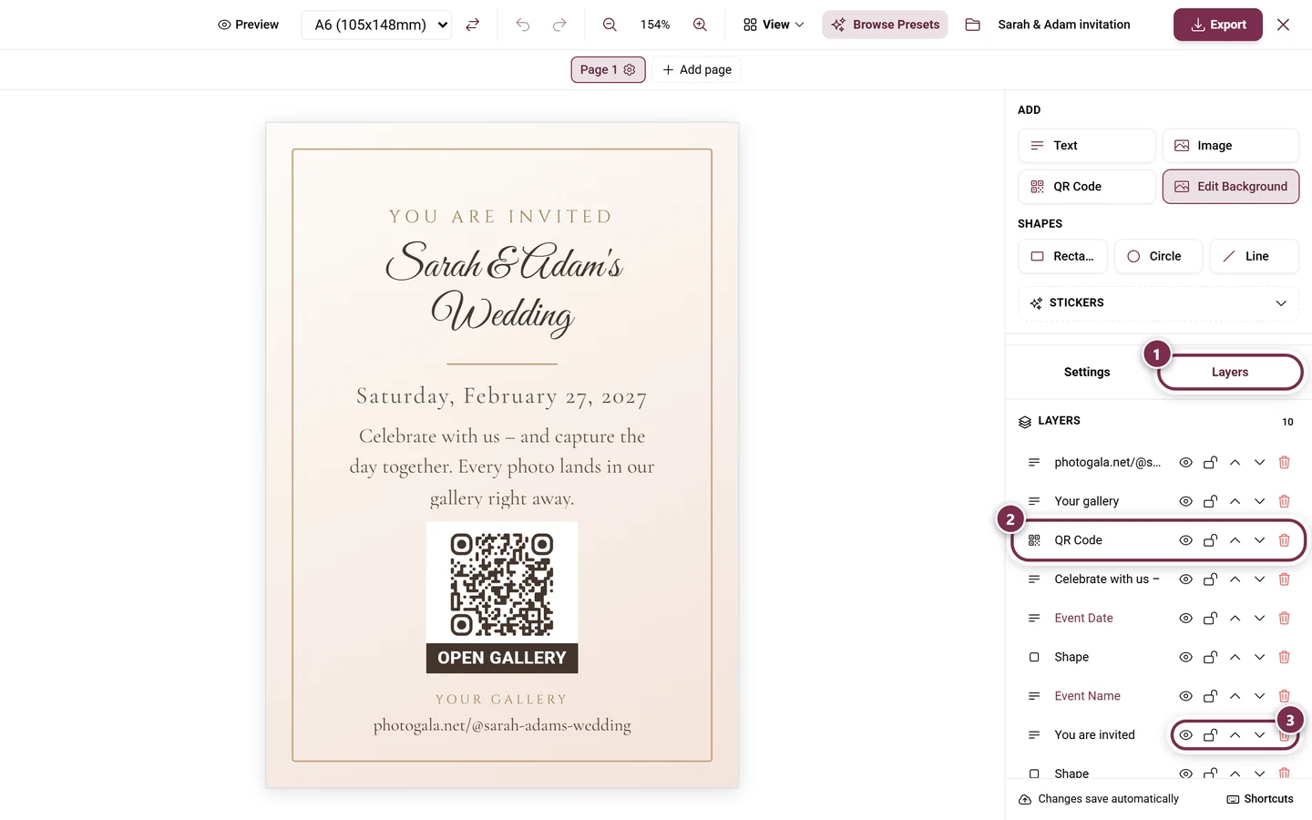
Several elements can be combined into a group: Group selection and Ungroup. A group gets its own header row with Rename group, Expand group / Collapse group, Lock group and a member count. Clicking the header selects all members.
Multi-page documents
Section titled “Multi-page documents”Below the canvas sits the page navigator – one chip per page. This is how you build folded cards, menus or whole booklets:
- Add page (the dashed plus) appends an empty page at the end.
- Rename: double-click the name or use the pencil on the active page (max. 40 characters). Without a name it reads “Page 1”, “Page 2” …
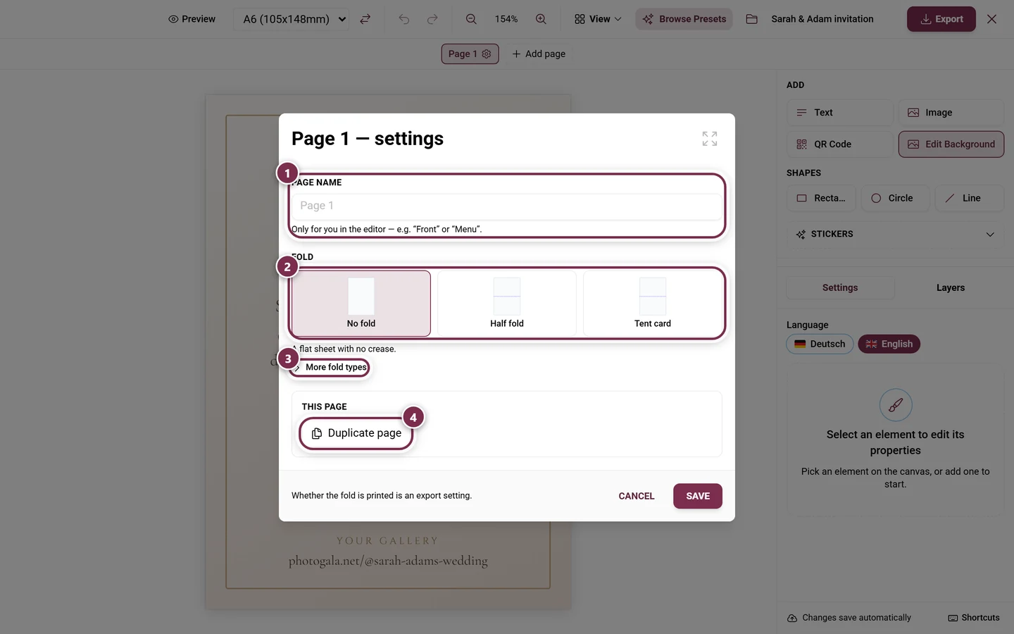
- Duplicate page copies the elements, guides and fold of that page.
- Delete page removes the page with every element on it – without a confirmation prompt. At least one page always remains; Undo brings it back.
- Page settings (fold, name) (the gear) opens the Page N — settings dialog.
- A
⌇on the chip means This page has a fold; with several creases the count follows.
There is no upper limit on the number of pages.
One background across all pages
Section titled “One background across all pages”Select a background element and the property panel offers Use on all pages. It then appears on every page without its own background – a page that has one keeps it.
Text flow across pages
Section titled “Text flow across pages”Long text does not have to fit into one frame. Select a text frame (not possible for dynamic fields) and use the Text flow across pages section of the property panel:
-
Flow across pages links the frame. A second frame with the same size and typography is created on the next page; if there is none, it is added.
-
The panel then reads Linked text — N frames. Page appends another frame, Unlink dissolves the chain.
-
If the text no longer fits, a red badge appears on the last frame. Clicking it immediately appends another frame.
Guides, rulers and snapping
Section titled “Guides, rulers and snapping”Everything lives in the View menu (desktop only, not in preview mode):
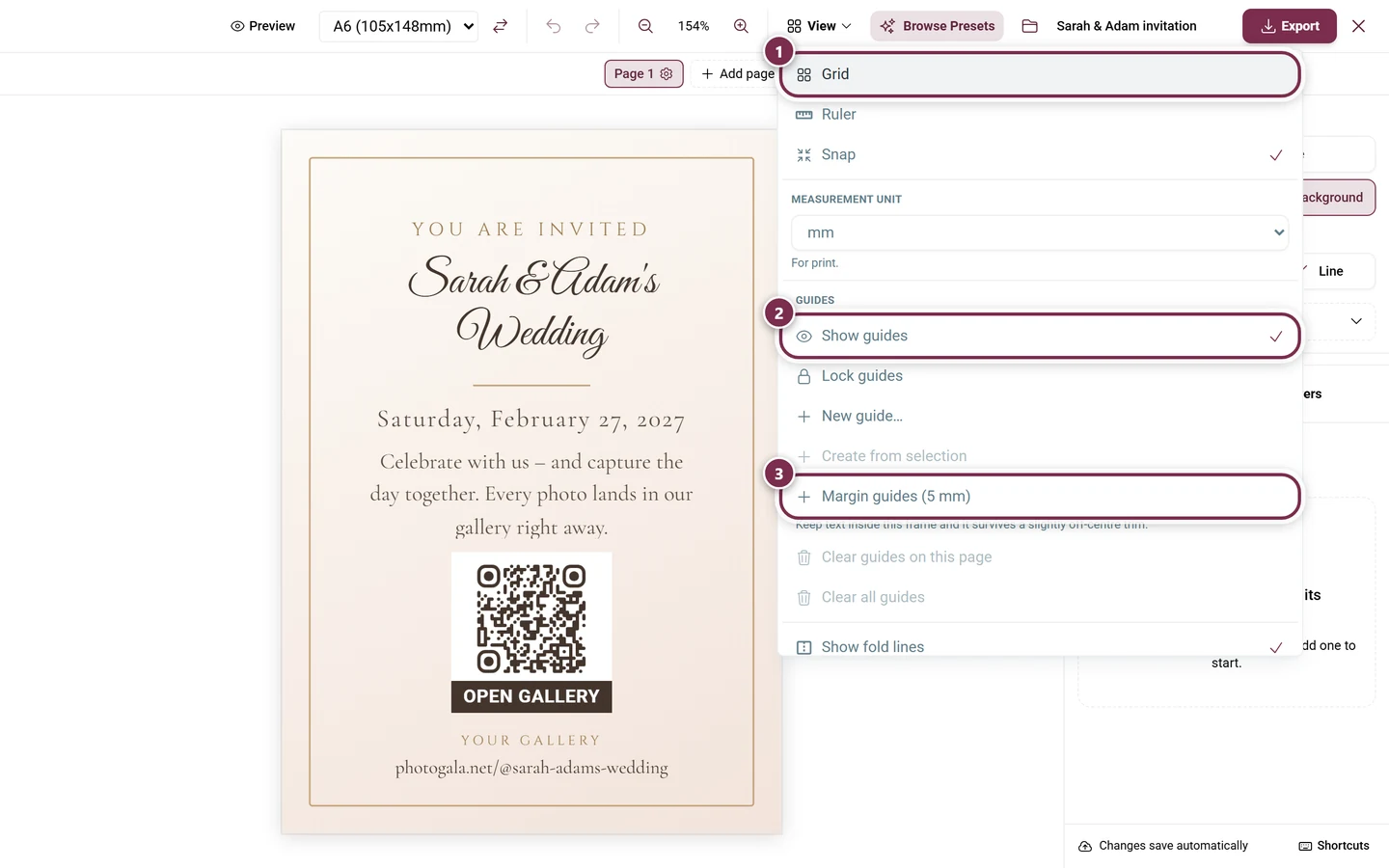
- Grid, Ruler and Snap as checkbox options. Snap is on by default.
- Measurement unit: mm, cm, pt, px or %. The unit is a display preference of your browser; internally the document always works in points. You can also click the corner box between the rulers to cycle through them. Every length field accepts a typed unit, such as
12mmor50%.
In the Guides section:
- Show guides (on by default) and Lock guides.
- New guide… opens a dialog with Orientation (Vertical / Horizontal), Position, the option On all pages (from two pages on) and Locked.
- Create from selection places guides along the edges and centers of the current selection.
- Margin guides (5 mm) adds four guides 5 mm from each edge: keep text inside and it survives a slightly off-center trim.
- Clear guides on this page and Clear all guides. Guides marked for all pages survive the per-page clear.
On the canvas you simply drag a guide out of a ruler. Dragging moves it, a double-click opens the dialog, and a right-click (long press on touch) opens a menu with Edit…, Lock / Unlock, On all pages / Only on this page and Delete guide. Drag it back onto the ruler to delete it. Hold Alt to place it without snapping.
Snapping targets the page edges and center, guides (only while they are shown), fold creases including the panel edges, and the edges and centers of other elements on the same page.
Fold marks
Section titled “Fold marks”The fold is a property of the page. Open it via the gear on the page chip → Page N — settings.
Fold types
Section titled “Fold types”Three presets are shown up front:
- No fold – a flat sheet.
- Half fold – one crease down the middle, four printable faces.
- Tent card – creased in the middle so it stands on the table like a tent.
More fold types reveals:
- Letter fold – three panels; the one that folds in is slightly narrower.
- Z-fold (concertina) – three equal panels, folded alternately.
- Gate fold – two creases at 25 % and 75 %, both sides open towards the middle.
- Custom – place your own crease positions.
Setting the creases
Section titled “Setting the creases”- Crease direction: Horizontal or Vertical. Switching keeps the relative positions.
- Crease positions: one numbered row per crease, in mm, cm or percent. Crease adds one, the × removes it, Distribute evenly spaces them (from two creases on). Any manual change switches the preset to Custom. Creases closer than 5 mm to an edge or to each other are dropped.
- Safety margin around the crease: the zone left and right of the crease where no text should sit – 3–5 mm is typical, the default is 3 mm. It is never printed; it only drives the warnings in the editor.
- Labels for the halves: your own name per half. With exactly one crease the studio assigns Front and Back automatically. Labels only show small in the editor and are never printed.
- Apply to all pages (from two pages on) – handy for double-sided printing, because front and back have to crease in the same place.
In the editor you show or hide the creases via View → Show fold lines (on by default). Whether the fold is printed is decided separately in the export dialog.
Selecting, aligning, rotating
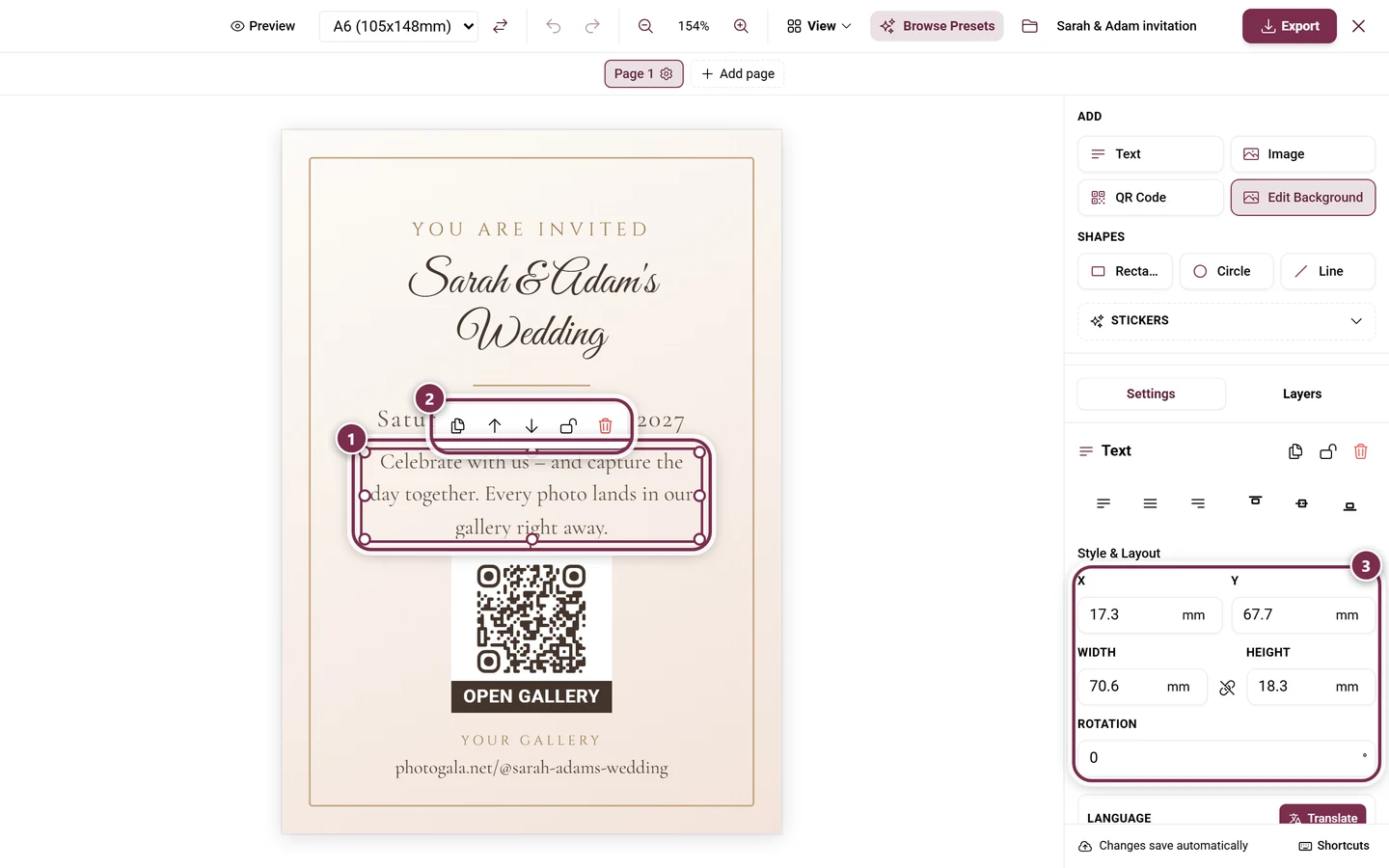
Section titled “Selecting, aligning, rotating”- Multi-selection: click with Ctrl or Shift, or drag a selection box over empty canvas. The panel then reads “N elements selected”.
- Align: six buttons – Align left, Align center, Align right, Top, Middle, Bottom.
- Distribute horizontally and Distribute vertically – active from three elements on.
- Rotate: the buttons -90°, +90°, +180° and 0° (Straighten everything) – the last one straightens everything without moving it.
- Group rotation: a handle sits below the selection box (Rotate selection — hold Shift for 15° steps). The whole selection rotates rigidly and keeps its spacing. Without Shift it softly snaps to 0°, 45°, 90° and so on. If the selection spans several pages, each page rotates around its own center – the panel says so.
Images: lossless crop, masks, filters
Section titled “Images: lossless crop, masks, filters”Crop in the property panel opens the Crop image dialog. The subtitle says the essential part: you only choose the visible area, the full image is kept – all that is stored is the crop window, the image itself is never re-encoded.
- The frame can be moved and grabbed at the corners; in Free you also get edge handles.
- Aspect ratio: Frame (the default, the element’s shape), Free,
1:1,16:9,9:16or Original (the image’s own ratio). For a full-bleed background this choice is hidden. - Zoom (not in Free) tightens the crop.
- Reset restores the full area, Remove crop clears it entirely. Apply saves.
Afterwards the button reads Edit crop. Images bound to a dynamic field cannot be cropped.
The panel also offers:
- Flip horizontally and Flip vertically, independent of each other.
- Mask shape: None, Circle, Rounded or Arch.
- Image Filters: Blur, Brightness, Contrast and Saturation. Separately there is Color Overlay.
- Fit Mode (Cover, Contain, Stretch, Original), Border, Radius and Opacity.
QR code: target, style and frame
Section titled “QR code: target, style and frame”A QR element does not have to point at the default address. In the property panel you pick a Link target:
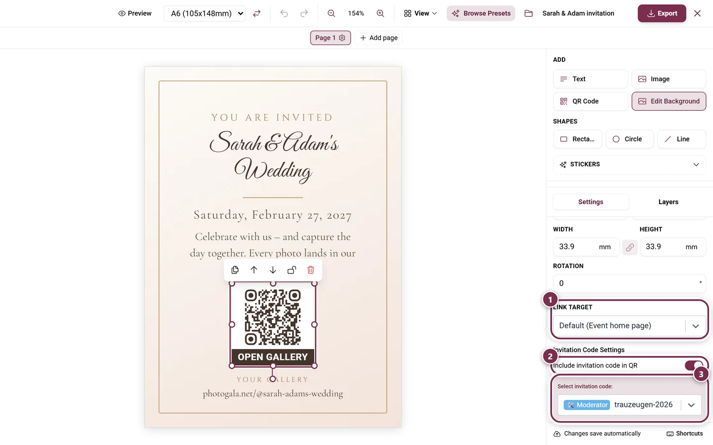
- General: Default (the actual destination is named in brackets), Event home page, Gallery and Custom link….
- Event tools: every tool that has a guest page and is active in your event.
- Photo tasks: every task you created.
- Achievements: every achievement you created.
Custom link… reveals a field for the full address. Without https:// a hint appears and the QR keeps using the default link. If a stored target is no longer available in the event, it shows Target not available and the code falls back to the default as well.
On top of that:
- QR colors (Code and Background, optionally Transparent) and Customize QR Style for patterns and shapes.
- QR frame: eight variants – from scanner corners through a speech bubble and a sign below the code to a hand-drawn prompt.
- With a frame active: Frame text (default “Scan me”, per language), Frame colors and the font size.
QR elements are always square.
Dynamic fields and mail merge
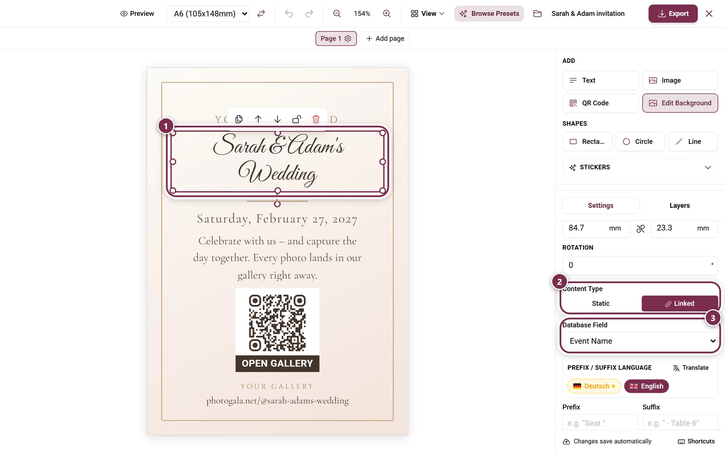
Section titled “Dynamic fields and mail merge”Dynamic Fields holds placeholders that are filled automatically when printing. Which ones exist depends on the template type – for example Event Name, Event Date, Invite Code, Task Name, Points, Task Image, Reward, or for seating templates Guest Name, Table, Seat Number, Group, Meal Choice and Dietary Notes.
- For a text element you switch the Content Type between Static and Linked; when linked, you pick the Database Field. For the event date a date format is added (short, medium, long, date & time, time only).
- Prefix and Suffix wrap the value – for example “Seat ” before the number. Both are per language and can be styled on their own.
- Placeholders also work inline: write
{{eventName}}in a normal text block, or use Insert field. - If a field has no value for a record, the element is simply left out of the export – so a stray “Seat ” never prints on its own.
Mail merge: when the template produces several records – one place card per guest, one stand per table – you step through them in Preview Mode with Previous record and Next record in the toolbar (desktop only). Between them the current record is named, for place cards the guest’s name. On export this turns into one card per record automatically.
Content blocks from real data
Section titled “Content blocks from real data”Insert content pulls whole data blocks into the design instead of you retyping them:
- For the Menu Card: Ganzes Menü (the whole menu, which automatically flows onto further pages), Pro Gang (per course), Pro Gericht (per dish) and Bilder pro Gericht (dish photos).
- For the Seating Chart: Plan als Bild (plan as an image), Plan als Liste (pro Tisch) (plan as a per-table list) and Mini-Plan pro Tisch (mini plan per table).
Each block remembers what the data looked like when it was inserted. If you change the menu or the seating plan afterwards, an amber bar appears at the top: “N block(s) out of date” and, where applicable, “N deleted source(s)”. Update all pulls in the new content without touching position or styling. Deleted sources are only reported, never removed automatically.
Warnings, saving and handling
Section titled “Warnings, saving and handling”Validation banner
Section titled “Validation banner”An amber strip appears below the toolbar when needed. It never blocks, but flags the classic print mistakes:
- “N elements extend past the page edge and will be cut off when printing.”
- “N QR codes sit on the fold line — creased, many phones can no longer scan them.”
- “N texts cross the fold line — the crease will crack the ink there.”
- “Missing translation in: …”
- “These fields won’t be filled for …: …”
Show jumps to the page in question and zooms to the element. Dismiss collapses the strip into a small warning triangle; Show warning brings it back. A gray note also reminds you when the design contains no dynamic field at all.
Autosave and recovery
Section titled “Autosave and recovery”There is no manual save – changes are stored automatically as a design; the status sits at the bottom (“Saving…” / “Saved”). On the first edit a draft named Untitled design with the Autosave badge is created; the design name or Save as new design turns it into a named design.
If the session breaks off, the studio greets you next time with “Unsaved changes from a previous session were found.” plus Restore and Discard. Nothing is applied until you decide.
Keyboard shortcuts
Section titled “Keyboard shortcuts”The Shortcuts button sits in the status line at the very bottom. It opens the Keyboard shortcuts overview – the same list as here:
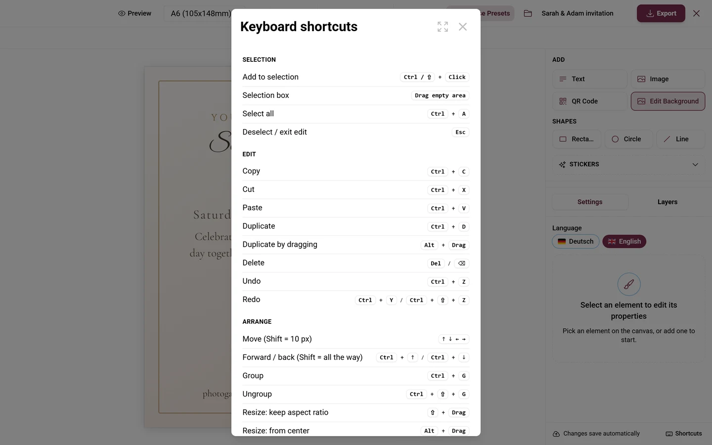
Selection
| What | Keys |
|---|---|
| Add to selection | Ctrl or Shift + click |
| Drag a selection box | drag on an empty area |
| Select all | Ctrl + A |
| Deselect / exit editing | Esc |
Edit
| What | Keys |
|---|---|
| Copy · cut · paste | Ctrl + C · Ctrl + X · Ctrl + V |
| Duplicate | Ctrl + D |
| Duplicate while dragging | Alt + drag |
| Delete | Del or Backspace |
| Undo | Ctrl + Z |
| Redo | Ctrl + Y or Ctrl + Shift + Z |
Arrange
| What | Keys |
|---|---|
| Nudge | arrow keys (1 px, 10 px with Shift) |
| Forward / backward | Ctrl + ↑ or Ctrl + ↓ (all the way with Shift) |
| Group / ungroup | Ctrl + G · Ctrl + Shift + G |
| Resize keeping the aspect ratio | Shift + drag a handle |
| Resize from the center | Alt + drag a handle |
| Rotate in 15° steps | Shift while rotating |
View
| What | Keys |
|---|---|
| Zoom in / out | Ctrl + + · Ctrl + − (× 1.2 per step) |
| Reset zoom to 100 % | Ctrl + 0 |
| Zoom to the selection | Shift + 2 or Ctrl + Shift + 0 |
| Show / hide rulers | Shift + R |
| Show / hide guides | Ctrl + ; |
| Lock guides | Ctrl + Alt + ; |
| Place a guide without snapping | Alt while dragging it off the ruler |
Context menu
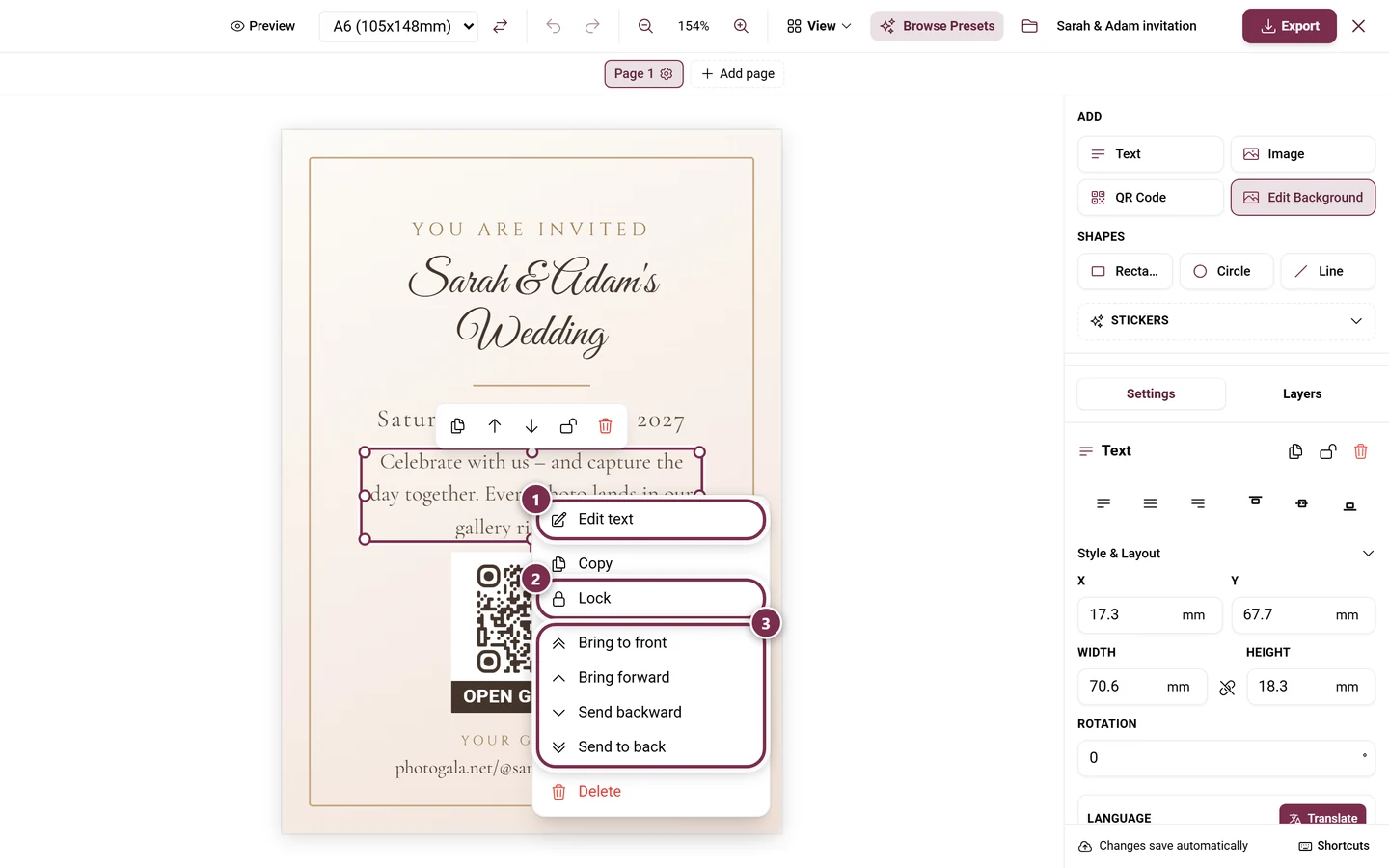
Section titled “Context menu”Right-clicking an element (long-press on a phone) opens the context menu with Edit text, Copy, Lock / Unlock, the group actions, plus Bring to front, Bring forward, Send backward, Send to back and Delete.
Managing designs
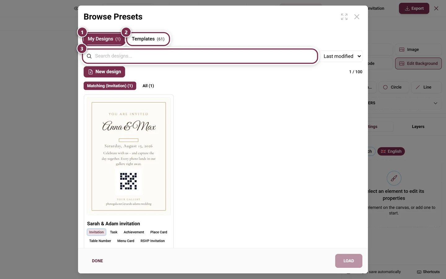
Section titled “Managing designs”Browse Presets opens the browser with two areas:
- My Designs: your saved designs, with search, sorting (Last modified, Name A–Z, Paper size) and the filter chips Matching and All. Under Scopes you decide which template types a design is offered for. Load opens it, the trash icon deletes it (with a Delete design? prompt), New design starts an empty one.
- Templates: curated templates. Start empty, or take a template into your own design with Use as starting point.
Exporting a PDF
Section titled “Exporting a PDF”Export in the toolbar opens Export PDF. The dialog walks through options, generation and download.
Options
Section titled “Options”- Language – only for multi-language events. It decides which language the PDF is typeset in.
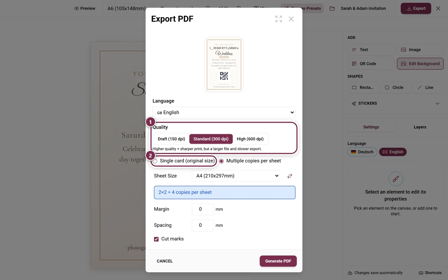
- Quality: Draft (150 dpi), Standard (300 dpi) or High (600 dpi). Standard is the default. Higher quality means a sharper print, but a larger file and a slower export.
- Single card (original size) or Multiple copies per sheet (preselected). If the card is larger than every sheet, only the single card remains.
- For a multi-page document this choice disappears: “Multi-page document — each page prints on its own sheet, in order.” That applies from three pages on, for the seating chart, and for designs whose text flows across pages.
- Print back side (double-sided) – for a two-page design. Back sheets are mirrored so they line up after flipping.
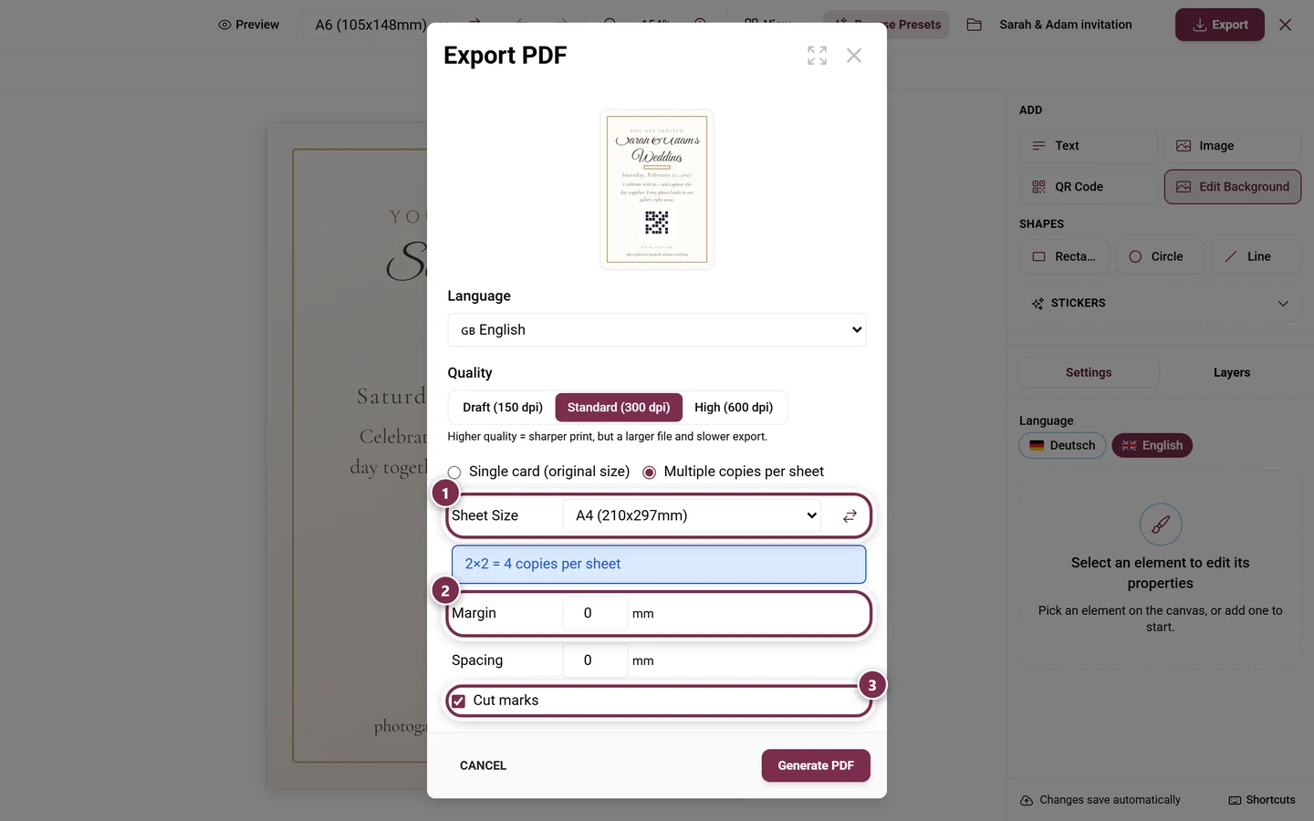
Multiple copies per sheet adds:
- Sheet Size (A3 to A7 or Custom in mm) plus Swap orientation. Only sheets your card actually fits on are offered.
- A layout line in the style “3×4 = 12 copies per sheet”, optionally with “rotated 90°”.
- Margin and Spacing in mm (0–50 each, default 0).
- Cut marks (on by default).
- Fold marks – only when at least one page has a fold: None, In the margin (default), Dashed or Dotted. Margin marks need at least 3 mm of margin, otherwise the option is disabled; they sit outside the card and are gone after trimming. Dashed and dotted are printed and stay visible.
- Fill remaining page – with several records: empty slots on the last sheet are filled with random cards from this export.
Generating and downloading
Section titled “Generating and downloading”Generate PDF starts the run: loading records → resolving image URLs → processing images → generating pages → finalizing, with five print tips rotating along the way. Then it reads “Your PDF is ready!” with the file size; Download PDF is a deliberate second click, Back returns to the options.
Saving a design as a file
Section titled “Saving a design as a file”The folder icon in the toolbar – its tooltip reads File – opens the menu for this. There you save the design as JSON (Export design (JSON)) and load it back elsewhere (Import design (JSON)). The file carries elements, paper size, guides, fold settings and page names. If the file is not a valid design, the studio says so and changes nothing.
The template types
Section titled “The template types”A design always belongs to a template type – that determines the dynamic fields, the records and the matching presets. There are nine:
| Type | What it is for |
|---|---|
| Invitation | printed invitation card with a QR |
| Task | one card per photo task |
| Achievement | one card per achievement |
| Place Card | one card per guest, with name and table |
| Table Number | one stand per table |
| Menu Card | menu with courses and dishes |
| RSVP Invitation | personalized invitation with its own RSVP link |
| QR Poster | a sign with a QR to a tool or the gallery |
| Seating Chart | the whole seating plan as a poster |
The seating, menu and RSVP templates are started right inside the matching tool: Printing & exporting the seating plan, Menu card and RSVP.
Tab 2 – Print Tasks
Section titled “Tab 2 – Print Tasks”The second tab produces print cards for your photo tasks – each with its own QR. A star on the tab means the feature is not unlocked yet.
- Tasks Not Enabled: enable tasks first under Settings → Gallery features → Joining in & points (Features).
- No Active Tasks: a hint with the Go to Task Manager button (Task manager).
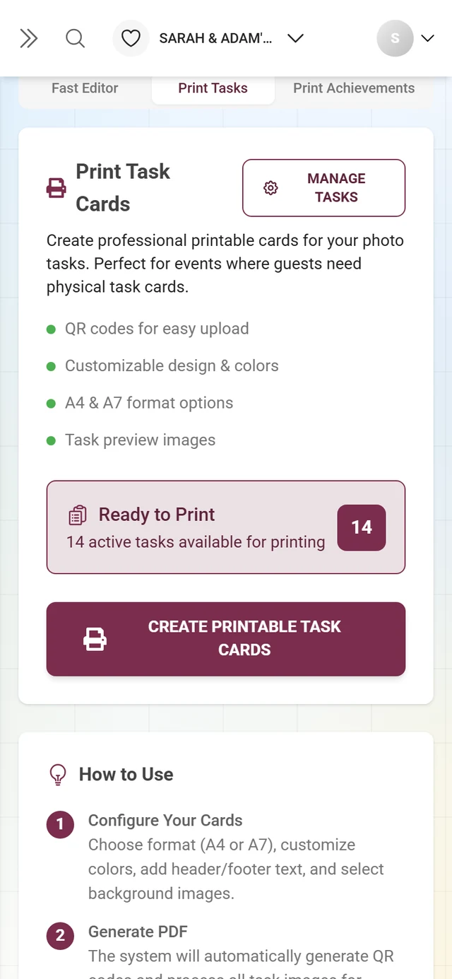
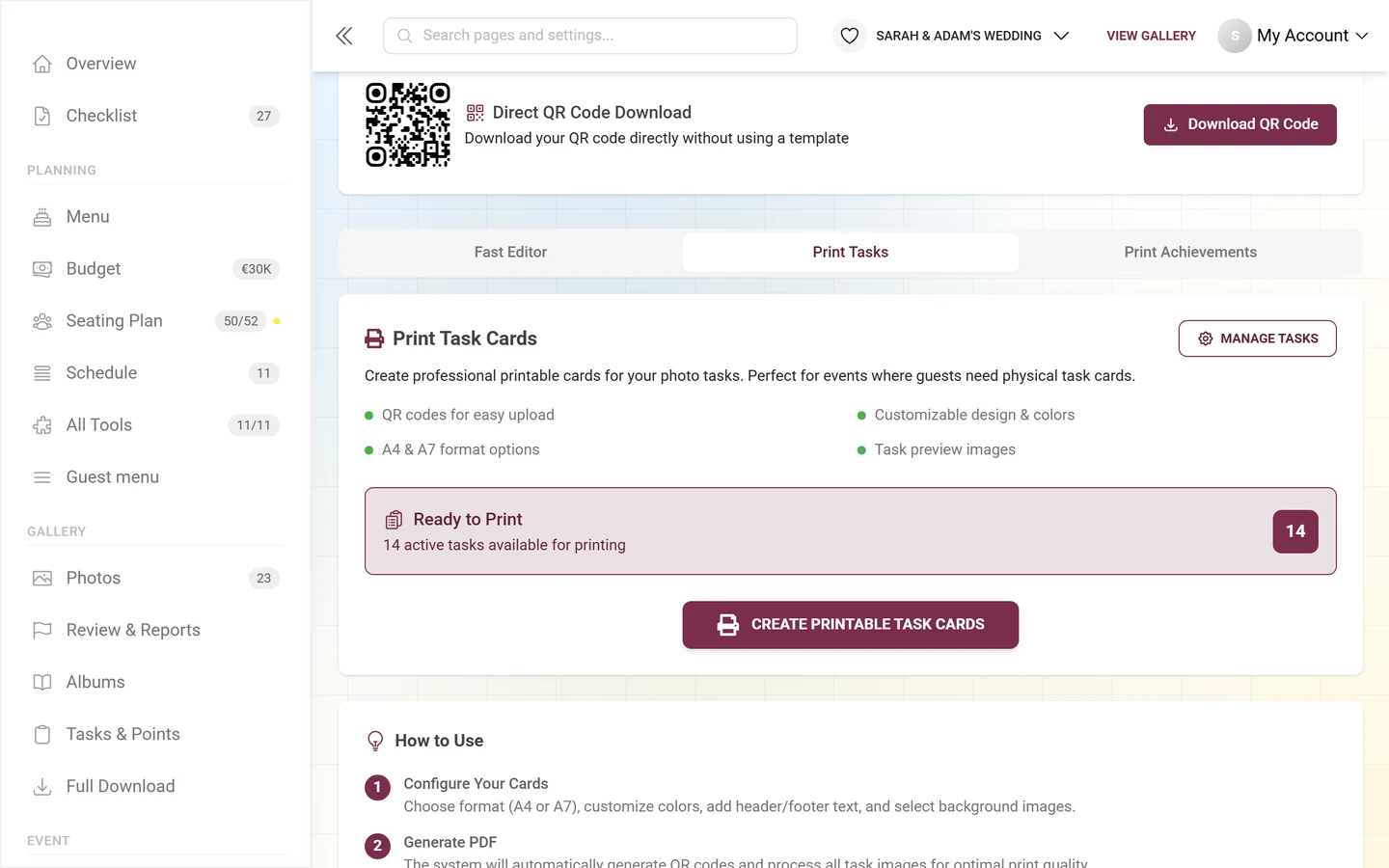
- Active tasks present: an overview with the count and a feature list. Create Printable Task Cards opens the card wizard – there too, Advanced leads into the Design Studio, with the task fields and one export across all tasks at once.
Tab 3 – Print Achievements
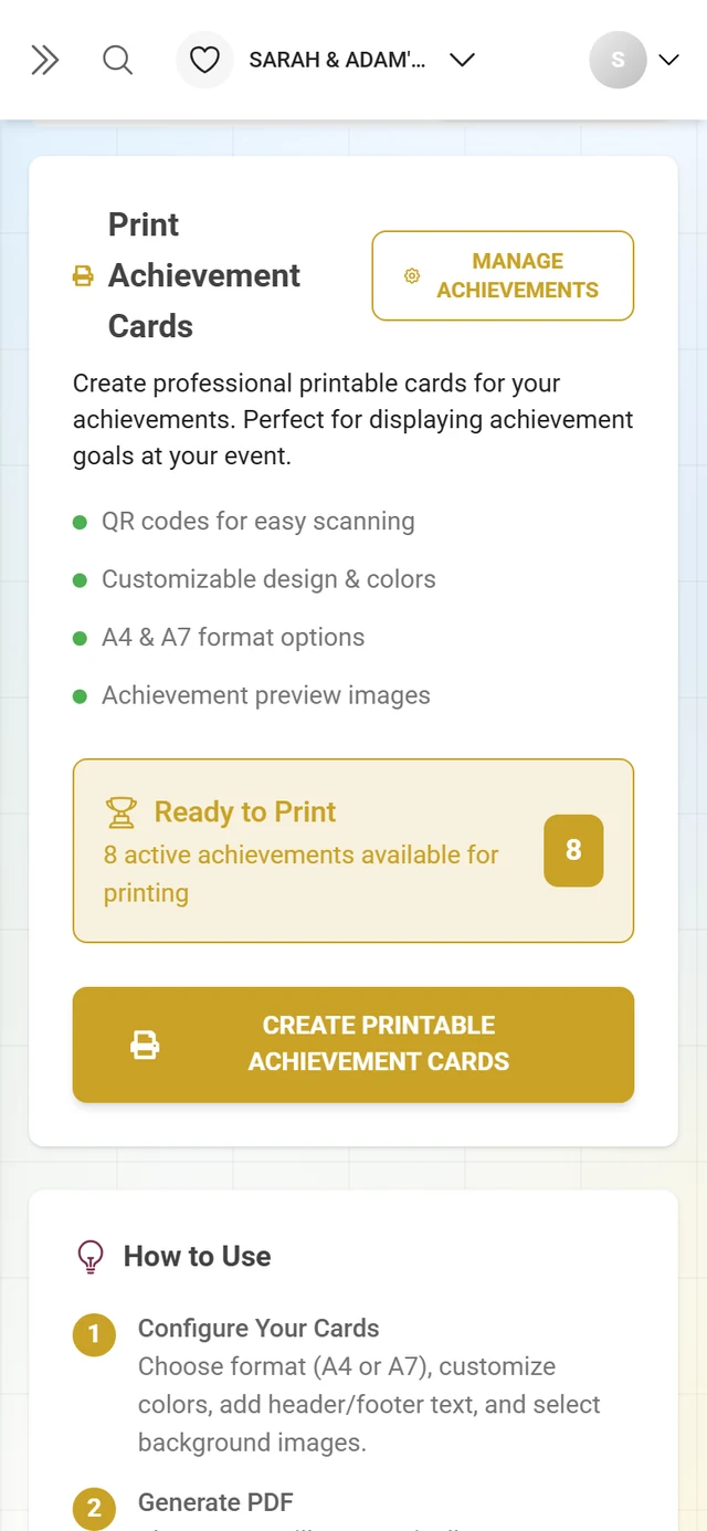
Section titled “Tab 3 – Print Achievements”The third tab works the same way, but for achievements: the hints Achievements Not Enabled and No Active Achievements, the Go to Achievement Manager link and the Create Printable Achievement Cards button. For details see Achievements.
Premium & roles
Section titled “Premium & roles”- The menu item only appears in branded events when at least one QR download feature is unlocked; without it you see a premium lock over the page.
- Each tab may show its own star. Individual download buttons are gated as well.
- Demo mode: server-side saving is disabled (“Auto saving disabled - Demo Mode!”); local changes persist and the Design Studio still works.
Unlock under Plan & term.
Troubleshooting
Section titled “Troubleshooting”- QR missing / button disabled: the QR is still generating (“Generating…”) or an error occurred – wait a moment and check the code selection.
- Invite-only without a code: a red warning – embed a code, otherwise guests must type the password.
- The QR will not scan: it sits on the fold line. The validation banner flags this; move it into one half.
- Text sits on the crease: respect the Safety margin around the crease (3–5 mm).
- One half is upside down: only happens on the tent card – use the Ends up upside down — rotate button.
- “Card is larger than all available sheet sizes”: then only the single card works – or pick a larger sheet or a smaller paper size.
- Margin fold marks grayed out: raise the Margin to at least 3 mm, or use a printed line instead.
- Menu or seating plan out of date in the design: click Update all in the amber bar.
- Text does not fit the frame: click the red badge on the frame, or use Flow across pages.
- “You’ve reached the limit of 100 designs”: delete old designs in the browser.
- Changes gone? In demo mode nothing is saved to the server. Otherwise wait for the Saved status – after a crash the studio offers Restore. If you open the studio via Continue designing in the print assistant, your last draft is loaded automatically.
- Guides will not move: they are locked – unlock them in the View menu or via right-click.
- Rulers, grid and guides are missing: the View menu is desktop only.
Best-practice tips
Section titled “Best-practice tips”- Before a bulk print, print one test copy and scan the QR with your phone.
- Print on 200–300 g/m² card stock, laminate optionally, round the corners.
- For multi-up, keep the Cut marks on – they help you trim cleanly.
- Work with Margin guides (5 mm) so a slightly off-center trim cuts nothing important.
- For multi-language events use Translate and fill in the missing languages.
- For double-sided printing, carry the fold over with Apply to all pages.
- Build a design once and reuse it for several template types via Scopes.
Related help pages
Section titled “Related help pages”- Access the event and Join an event – how guests scan the QR.
- Customizing the look – QR look and branding colors.
- Invite guests and Roles & permissions – invitation codes and permissions.
- Printing & exporting the seating plan, Menu card and RSVP – the tools behind the templates.
- Digital invitation – the animated invitation page, not the printed card.
- Task manager and Achievements – create the content for the cards.
- Plan & term – unlock premium features.