Finding your way
This page is written for guests – but it points out everywhere what moderators and hosts/admins additionally see. One ground rule first: the app adapts to your device (phone or computer) and to what the host has enabled. That’s why not every guest sees the same menu items – this is normal, not a bug.
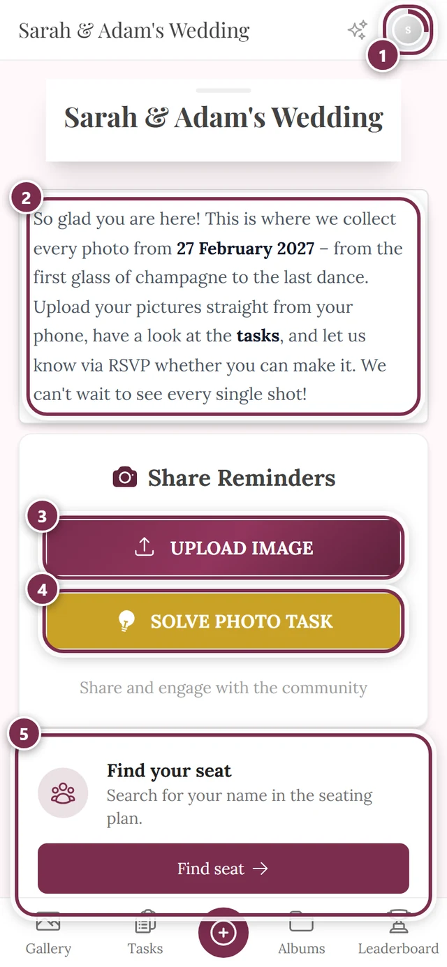
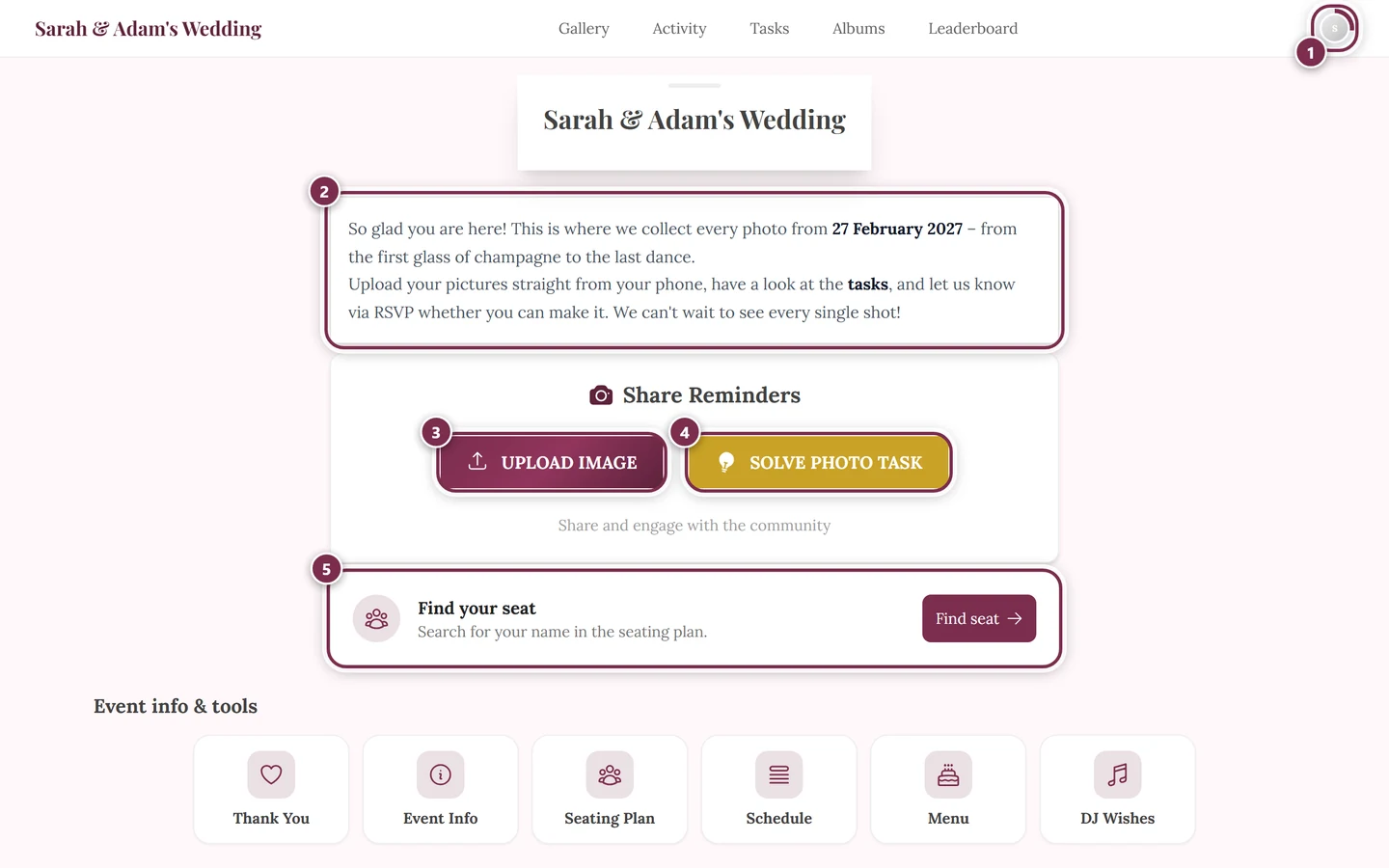
Two base layouts: phone vs. computer
Section titled “Two base layouts: phone vs. computer”Photogala has two completely different navigation bars, depending on screen width. The switch point sits at around 1024 pixels:
- Narrow screen (phone): a small top bar plus a fixed bar at the very bottom.
- Wide screen (computer): a single bar at the very top.
On a phone
Section titled “On a phone”On a phone you have three elements:
-
Top bar (sticks to the top). On the left is the event title – it’s always clickable and takes you back to the home screen. On the right are the icons: an optional activity spark (only when the activity feed is on), the bell for notifications, and your profile picture.
-
Bottom navigation bar (fixed at the bottom). These are your main jump points – Gallery, Tasks, Albums, Leaderboard, the host’s custom pages, Profile, Home (depending on what’s enabled).
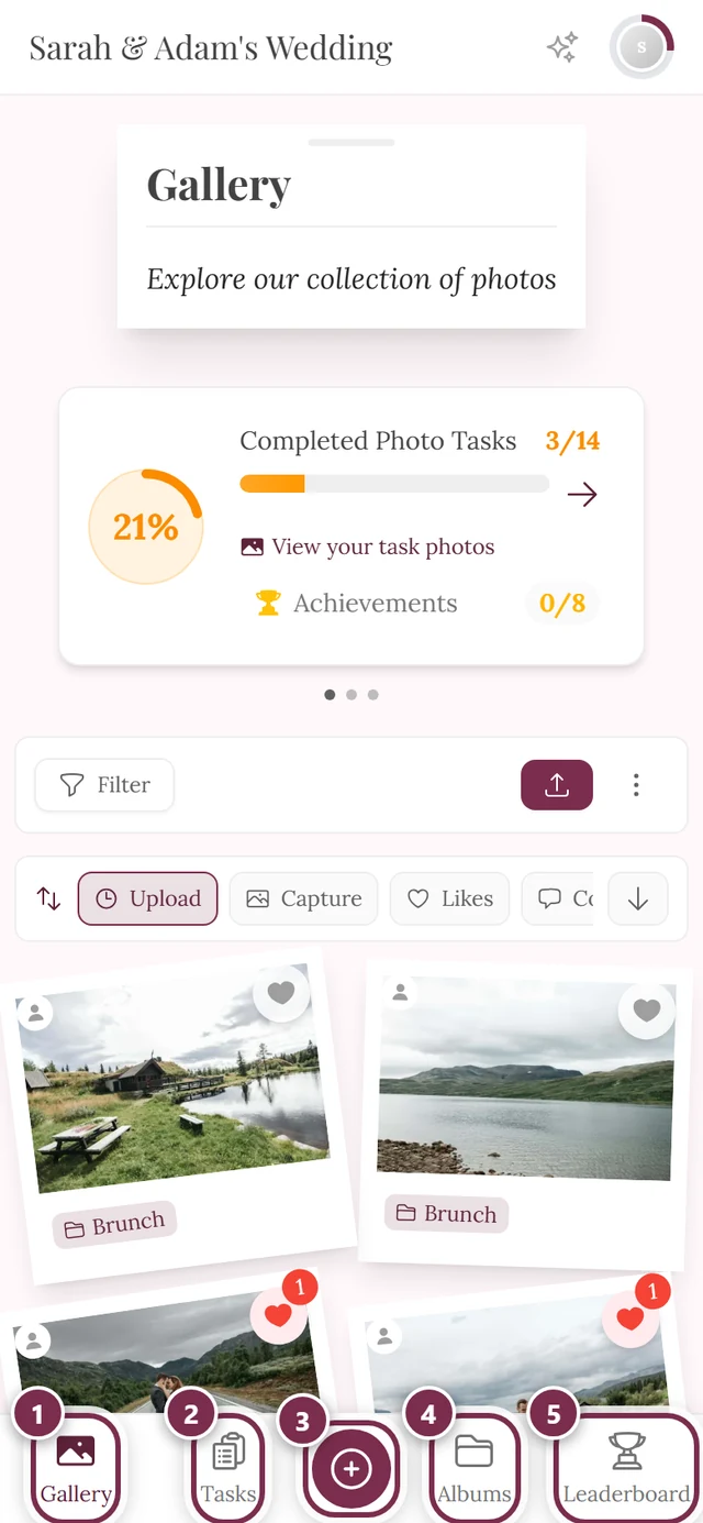
The bottom bar on a phone. The big button in the middle is the upload button. ① Gallery, ② Tasks, ③ the round button in the middle opens the upload, ④ Albums, ⑤ Leaderboard. Switched-off areas are missing from the bar – without photo tasks, for instance, the remaining entries close the gap. -
Central upload button. In the middle of the bottom bar sits a large round upload button – but only if uploading is allowed for you.
Which entries appear at the bottom (and in what order) depends on the event:
| Entry | Route | When visible |
|---|---|---|
| Gallery | /gallery |
always |
| Tasks | /tasks |
only when photo tasks are active and some exist |
| Albums | /albums |
only when albums or tasks exist |
| Leaderboard | /leaderboard |
only when the leaderboard is active |
| Custom pages | per page | one tile per page the host put into the navigation |
| Profile | /profile |
filler (can be pushed out) |
| Home | / |
filler (pushed out first) |
The active icon is filled and tinted in the brand color; the others are gray outlines. That way you see at a glance where you are.
On a computer
Section titled “On a computer”On a computer there’s just one bar at the very top. From left to right: the event title (link to home), the text links in the middle, and the bell plus your profile picture on the right.
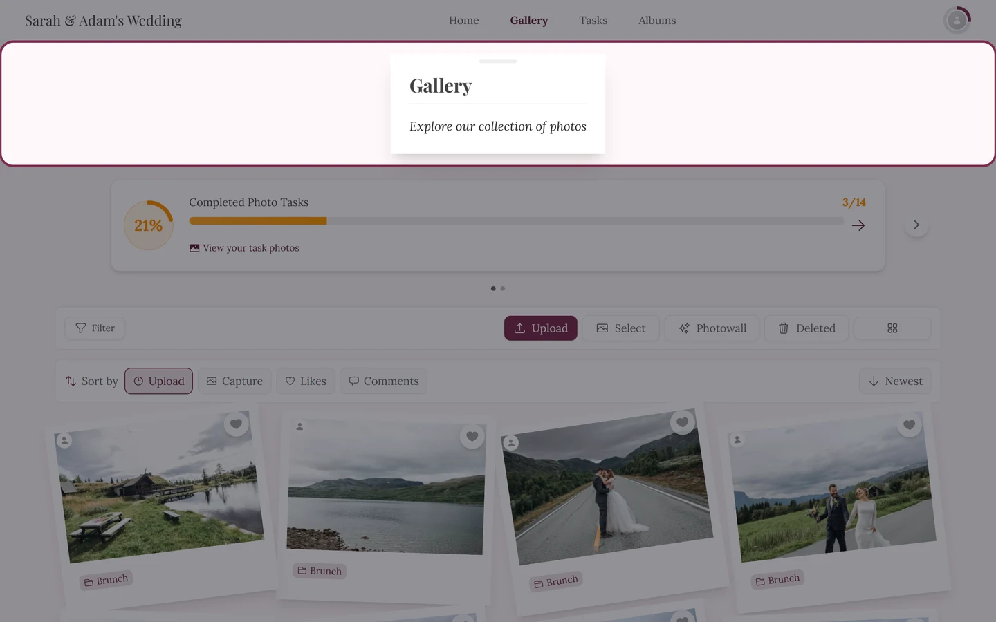
Possible text links: Home (only shown when there are few areas, otherwise hidden to save space), Gallery (always), Activity (only when the activity feed is on), Tasks, Albums and Leaderboard (each when active), plus the host’s custom pages. The active link is bold and in the brand color.
The host’s custom pages
Section titled “The host’s custom pages”The host can create their own info pages – “Directions”, “Shuttle” or “FAQ”, for example – and put any of them into the navigation. Such pages then show up as ordinary menu items:
- On a computer as an extra text link in the top bar, carrying the page title.
- On a phone as its own tile in the bottom bar, with the icon the host picked for that page.
At the bottom they rank after the leaderboard but before Profile and Home. That is exactly why the bottom bar looks different from event to event: every extra page pushes out one of the fillers. More on this under Tools at the event.
The home screen: event info & tools
Section titled “The home screen: event info & tools”On the event’s home screen – where the event title takes you – two elements sit below the photos that exist nowhere else.
The widgets. Some tools show their most important content right on the home screen as a small card: the next item on the schedule, a taste of the menu, the search for your seat, a thank-you note from the host. The host decides per tool whether such a widget appears; empty widgets are never shown at all.
The event info & tools rail. Below them sits a section with exactly that heading: a row of tiles, each with an icon and a name. A tap opens the tool’s full page. If the tiles don’t all fit side by side, you swipe the row horizontally. If no tool with a list entry is active, the rail is missing entirely.
Above the gallery: the progress cards
Section titled “Above the gallery: the progress cards”On the gallery page a small carousel can sit above the photos. It shows up to three cards – which ones depends on what the host has enabled:
- Completed Photo Tasks – your progress bar for the photo tasks, with a link to your task photos. See Challenges.
- Next Achievement – the achievement you are closest to, plus a hint on what you still need for it. See Points & rewards.
- Captured together – the counter of all memories every guest has contributed together.
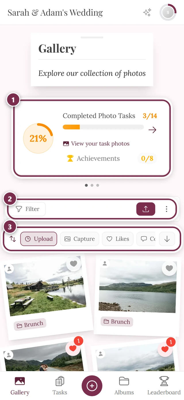
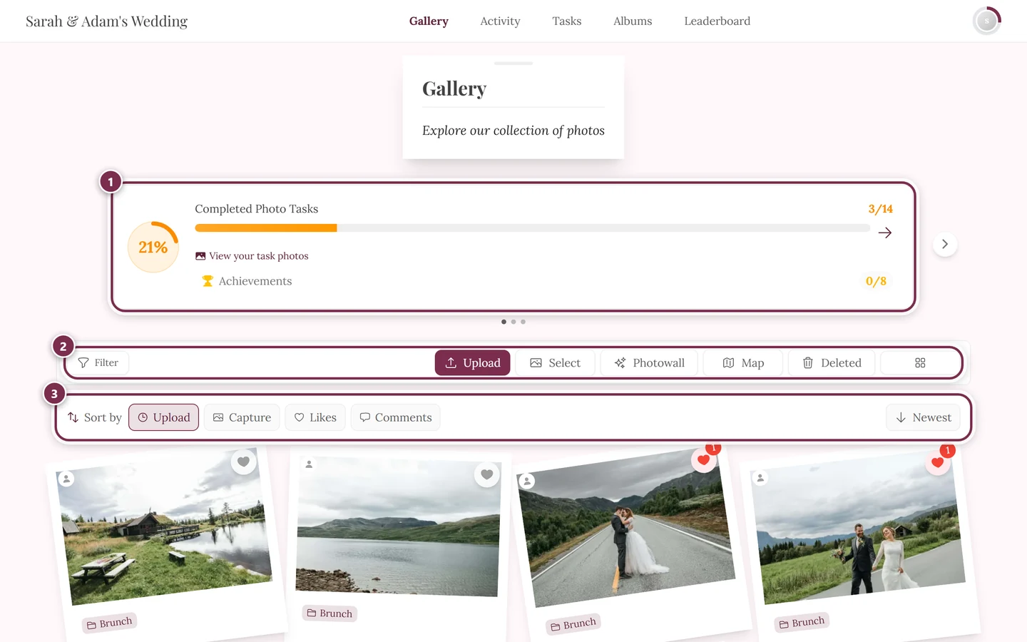
How they are presented depends on the count:
- One card (or none): it simply sits there, with no carousel.
- Two or more cards: they become a carousel. You swipe sideways; on a computer there are arrows on the left and right as well. Small dots below the carousel show where you are – tapping one jumps straight to that card.
The gallery toolbar
Section titled “The gallery toolbar”Only on the gallery page does an extra tool strip appear above the photos. These tools live nowhere else in the app.
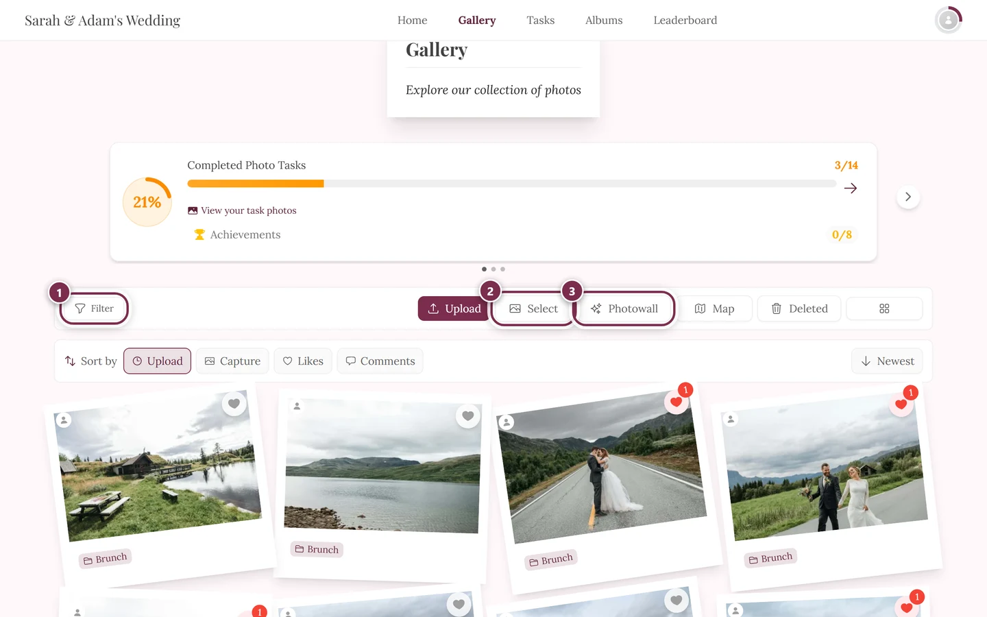
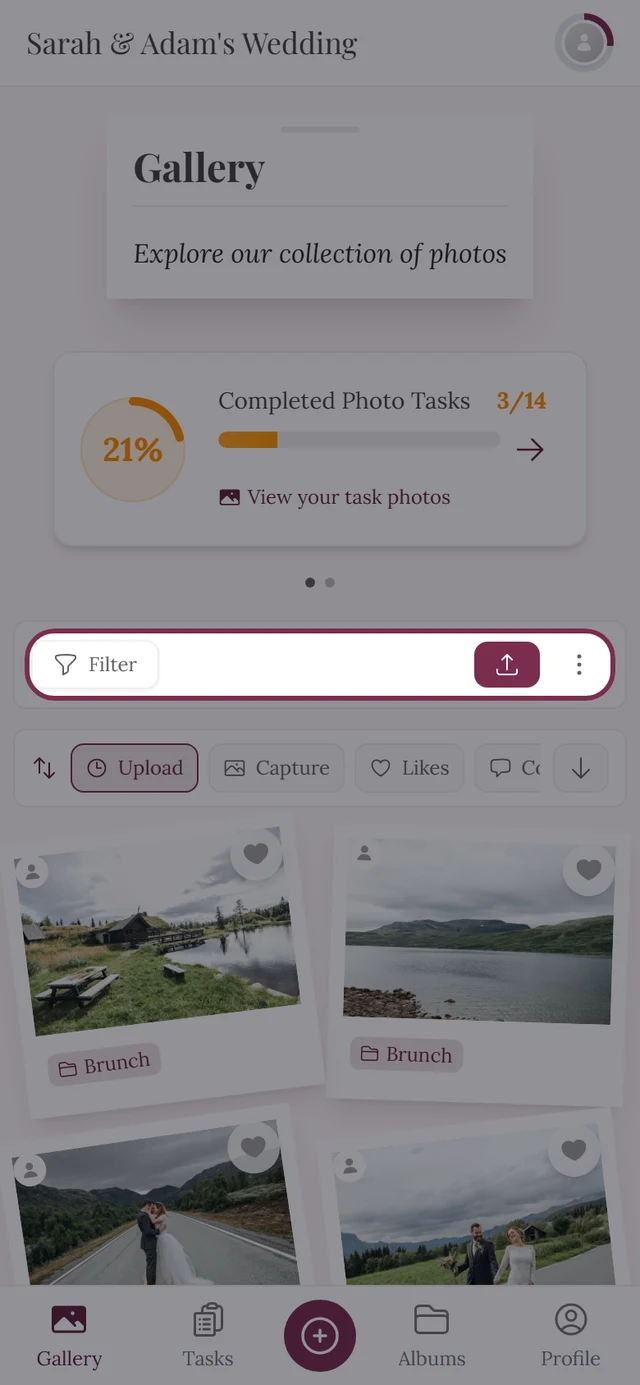
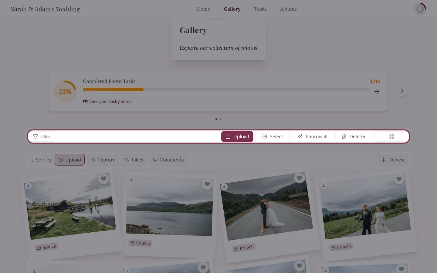
On the left of the strip:
- Filter – opens search and filters. When filters are active, the button shows the count as a badge, and an X appears beside it to clear them. More under Finding photos of you.
On the right of the strip (order as in the app):
- Upload – only if uploading is allowed for you. On a phone the button shows just an icon; on slightly wider screens it adds text. Details under Uploading photos.
- Select – turns on multi-select mode (like or save several photos together). On a computer it’s its own button; on a phone you’ll find it as Select Photos in the three-dot menu.
- Photo wall – opens the live photo wall for the big screen. Directly visible only on a computer; on a phone it’s in the three-dot menu. Only when the photo wall is enabled.
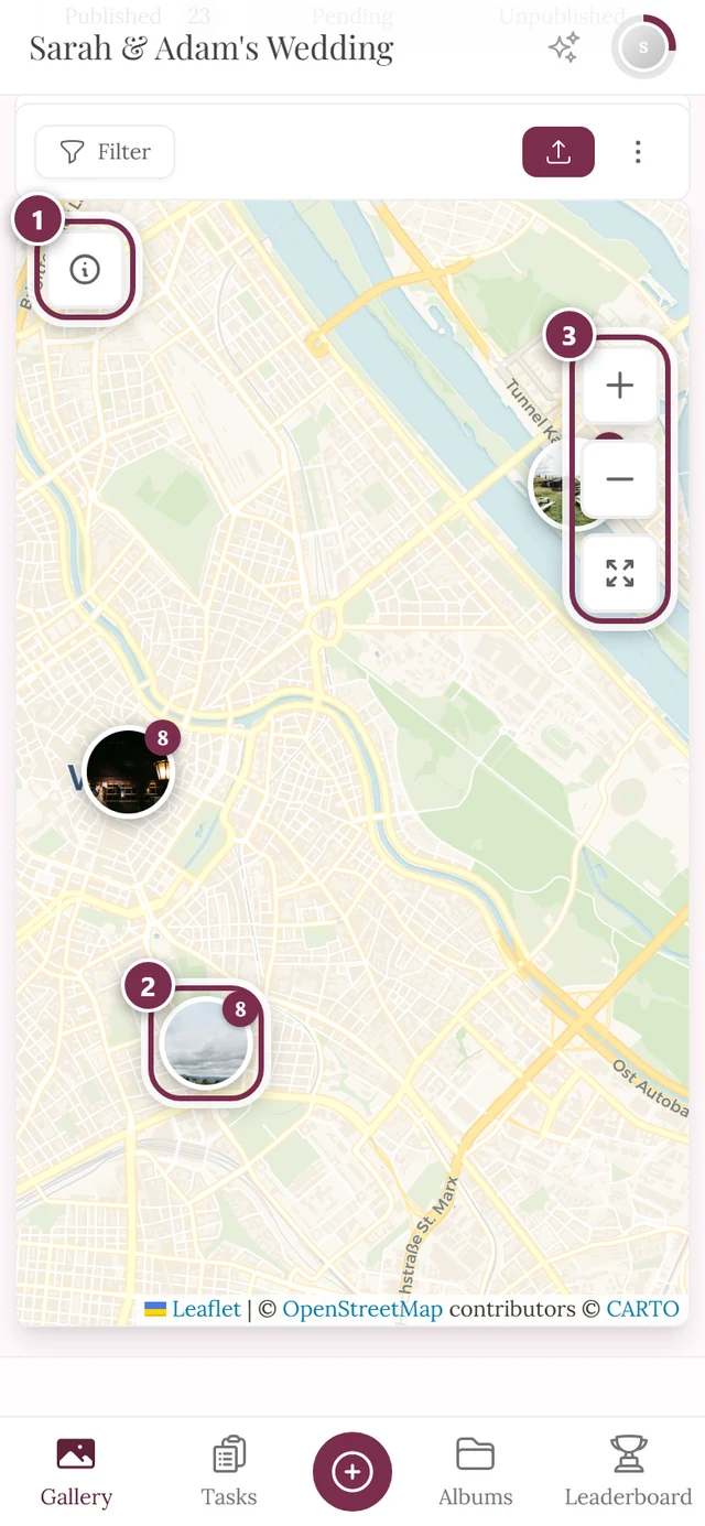
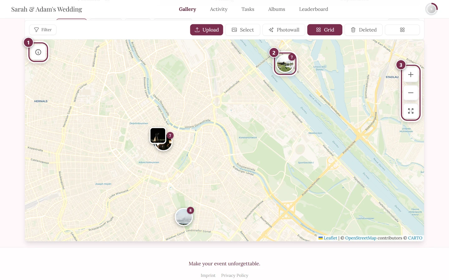
- Map – switches the gallery between Grid and Map (in map mode the button reads Grid). Shows where the photos were taken.
- Deleted – opens the recycle bin. This button is always there, regardless of whether you have deleted anything yourself; on narrow screens it sits in the three-dot menu as Recycle Bin. For guests the bin is usually empty – deleted photos land there and can be brought back, see Restoring deleted photos.
- Columns – a grid icon that sets the grid density (Auto or 1 to 5). Purely cosmetic, it doesn’t change the photos. With the host’s row-based layouts the same button controls the tile size instead.
The sort bar
Section titled “The sort bar”Directly above the photos – separate from the tool strip – is the sort bar labeled Sort by. Options: Upload, Capture, and (when active) Likes and Comments.
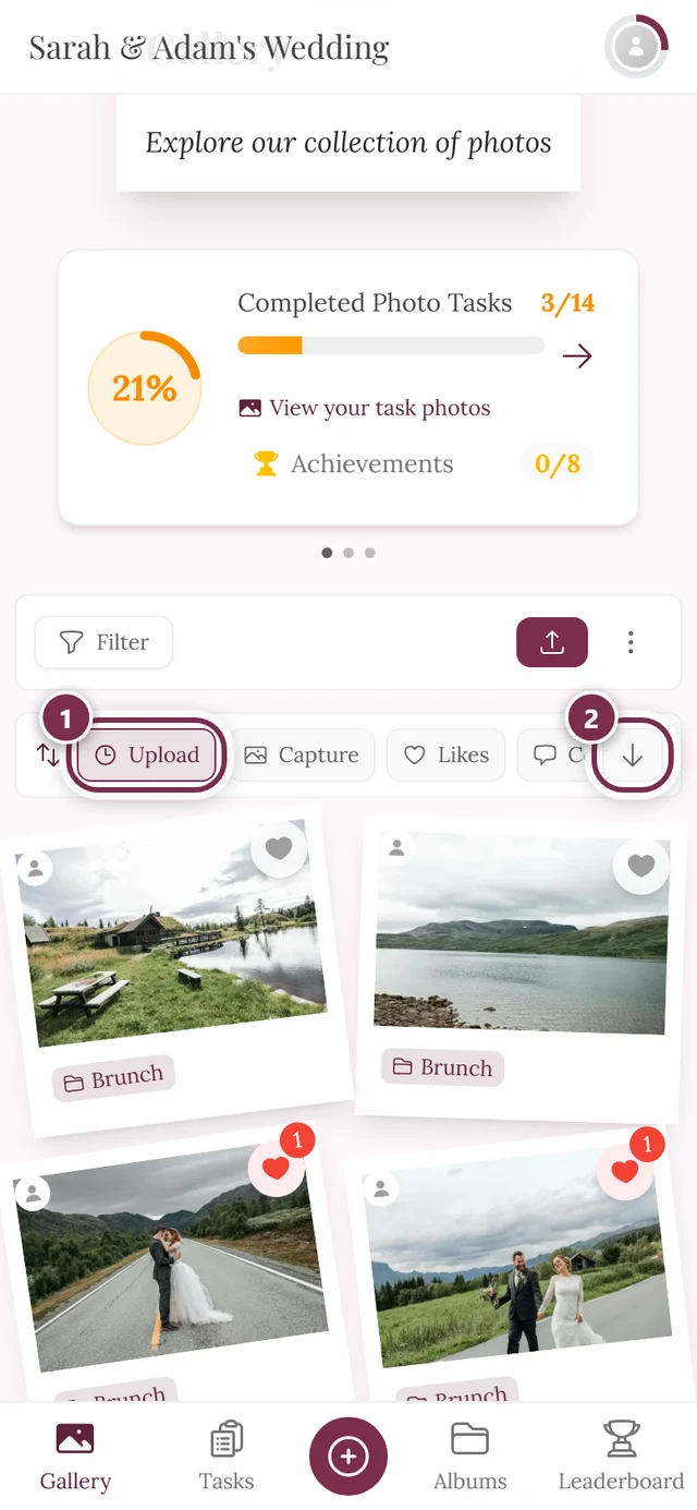
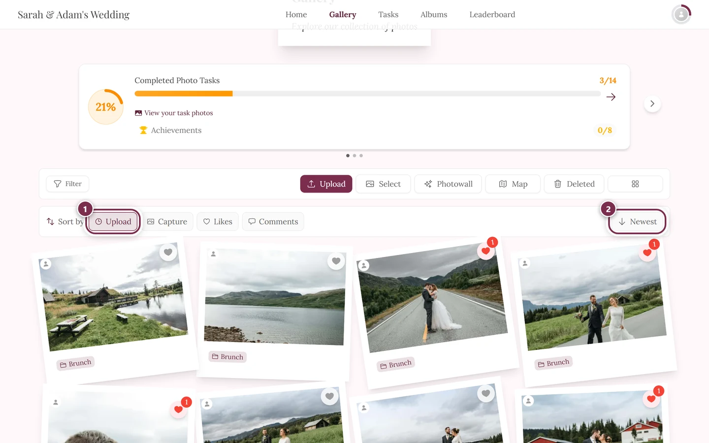
Beside it sits a single button that reverses the order. Its label changes with the criterion:
- With Upload and Capture it reads Newest or Oldest.
- With Likes and Comments it reads Most or Least.
The arrow on the button rotates by 180 degrees when you switch to ascending order.
The album quick select
Section titled “The album quick select”Directly below the sort bar another row can appear: pill-shaped buttons with the album names, each followed by its photo count. On the far left sits All.
- Tapping an album filters the gallery to that single album right away.
- Tapping the album that is already active – or All – clears the filter again.
- If the albums don’t all fit side by side, you swipe the row horizontally.
On a computer a small hint strip Upload your photos! with an Upload button may also appear at the bottom. The X on the right dismisses it for the session.
The profile menu (top right)
Section titled “The profile menu (top right)”The profile menu is your hub for profile, settings and – depending on your role – the management areas. Open it by tapping your profile picture in the top right (on a phone in the top bar, on a computer on the right of the top bar).
-
Tap your profile picture in the top right.
-
The menu unfolds. At the top are (if active) your task progress and your points, below them the sections Profile Options, Management (only with a role) and Account.
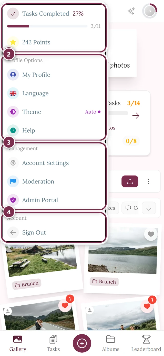
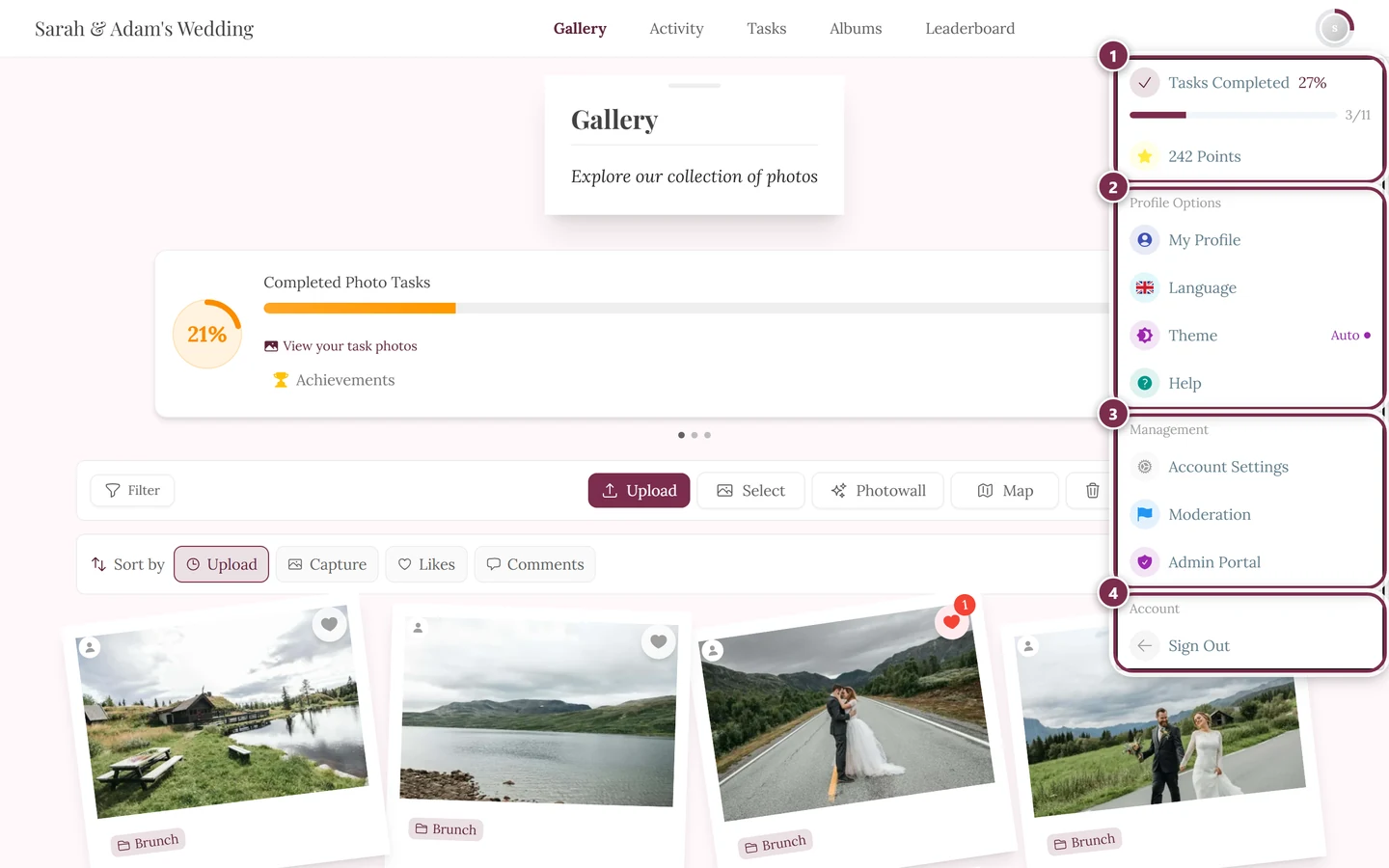
The profile menu. The Management section with Moderation and Admin Portal only appears if you have the matching role. ① your points and solved tasks, ② Profile options with My Profile, Language, Theme and Help, ③ Management with Account Settings, Moderation and Admin Portal – this section is missing until you hold a role for it, ④ Account with Sign out.
Task progress: with active tasks your profile picture shows a progress ring – the filled part is solved tasks. When everything is done a green dot appears (and even a brief burst of confetti when you open it). In the menu the progress leads straight to your photo tasks.
Profile Options section:
- My Profile – your own profile page with your contributions.
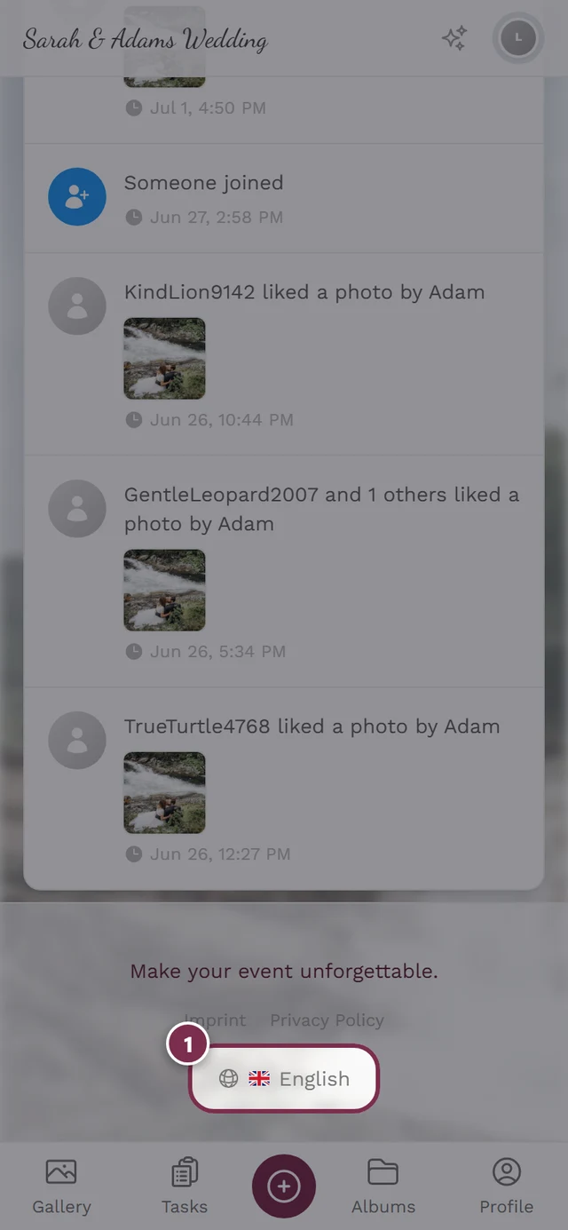
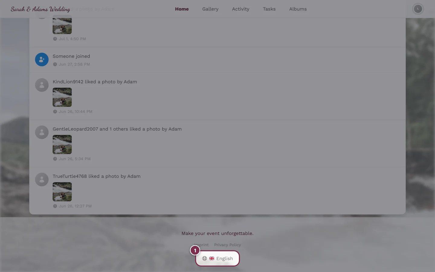
- Language – opens the language picker (shows the current flag). See Changing the language.
- Theme – only when dark mode is available for the event. Choose between Auto, Dark and Light; your current choice is shown right next to the entry.
- Help – opens this help center in a new tab, in your current language. The gallery stays open, so you lose nothing.
Management section (appears only if you have the matching rights):
- Account Settings – only for logged-in users (not pure guests).
- Partner Dashboard – only for partner/affiliate users.
- Moderation – only for moderators. A red counter shows open reports and pending media. Clicking opens the moderation page. See Reporting & moderating content.
- Admin Portal – only for hosts/admins. Clicking opens the admin dashboard. See The admin area.
- Administration Portal – only for platform administrators (irrelevant for normal guests and hosts).
Account section:
- Sign Out – only for logged-in users.
- Sign In – only for guests; opens the sign-in dialog.
The bell (notifications)
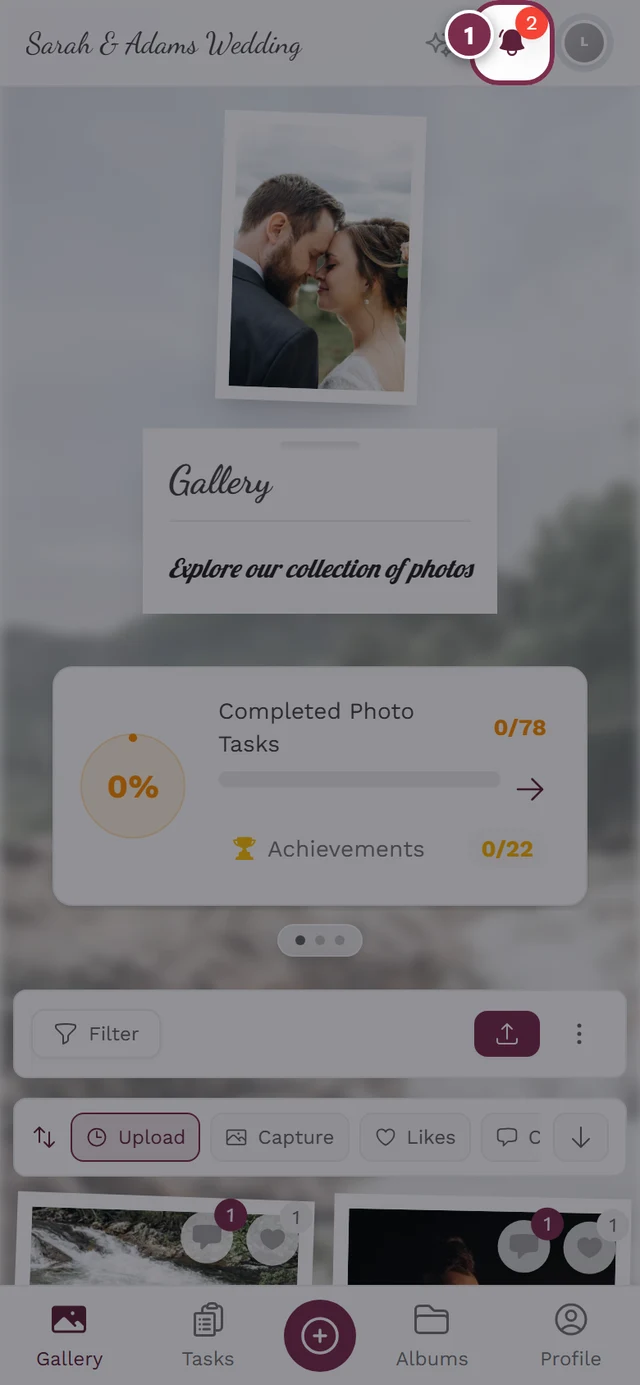
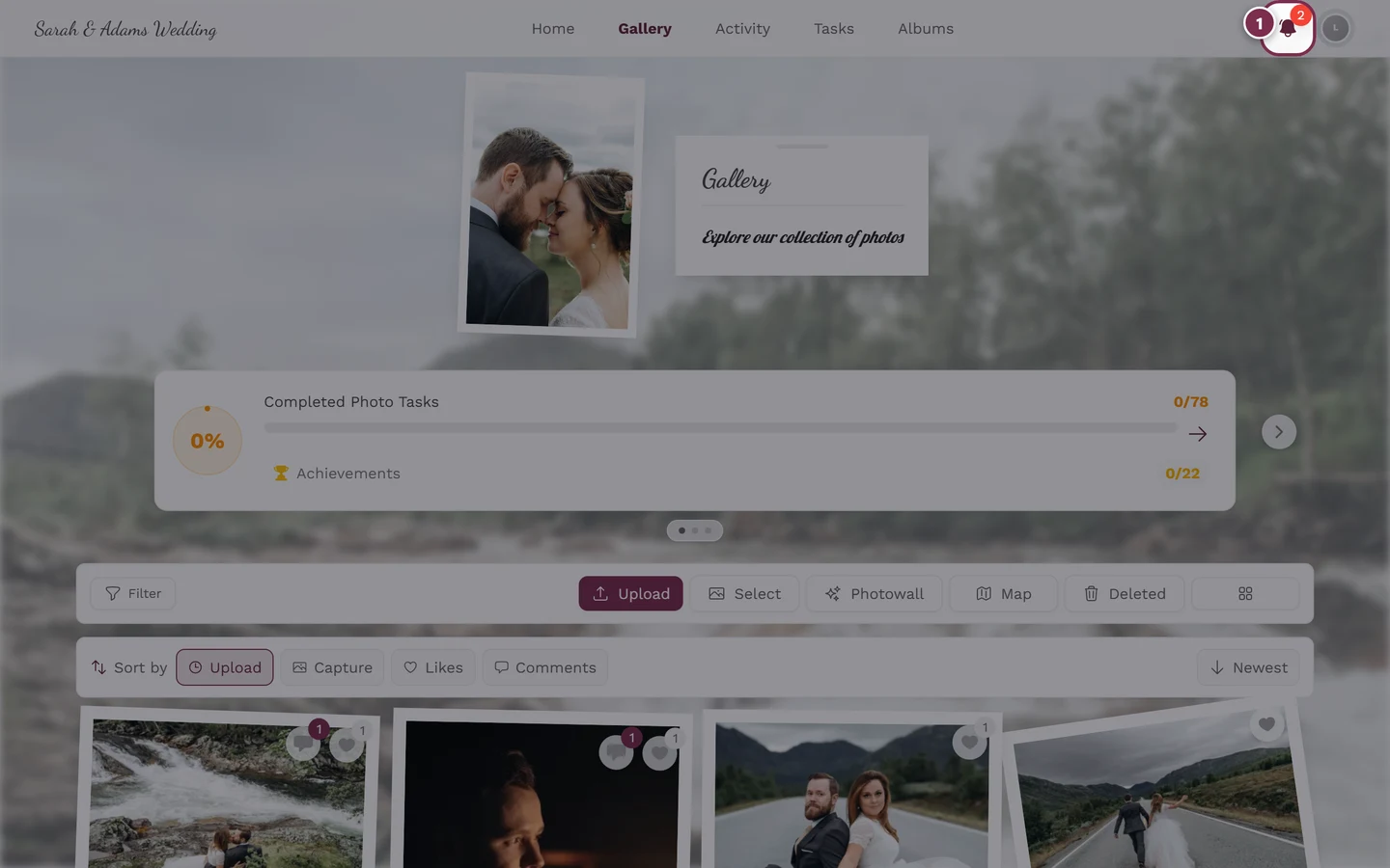
Section titled “The bell (notifications)”The bell in the top right appears only when there are notifications at all. When there are unread ones it wiggles, turns the brand color and shows a red counter (from 100 shown as “99+”). A click opens the notifications.
Who sees what: roles at a glance
Section titled “Who sees what: roles at a glance”Everyone uses the same gallery. Your role only adds extra entries in the profile menu:
| Role | Navigation | Extra in profile menu | Access to |
|---|---|---|---|
| Guest | Gallery + enabled areas; Sign In instead of Sign Out | My Profile, Language, Help, (Theme) | Viewing, uploading (if allowed), liking, commenting, tasks |
| Moderator | like guest | additionally Moderation (with counter) | Moderation page |
| Host/Admin | like guest | additionally Admin Portal (+ usually Moderation) | Admin dashboard |
| Platform admin | like guest | additionally Administration Portal | Platform administration |
For hosts: navigating the admin area
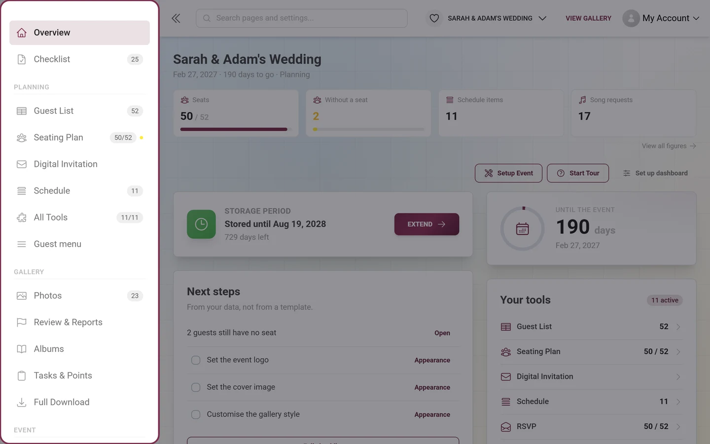
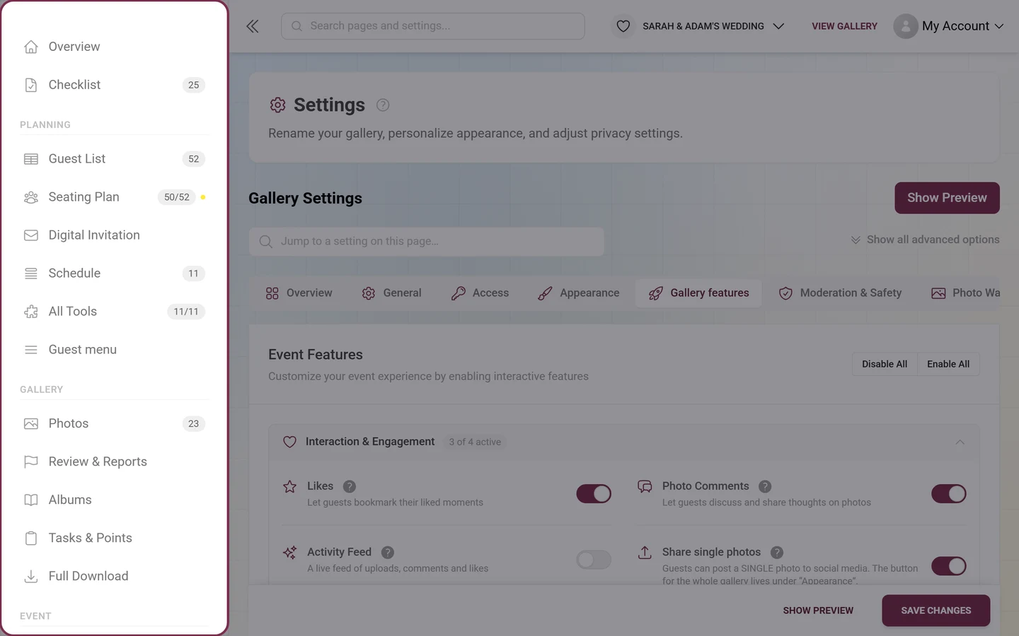
Section titled “For hosts: navigating the admin area”The admin area has a navigation of its own. You get in via profile menu → Admin Portal (only with the host or admin role). Instead of the gallery bars you’ll find a sidebar on the left, grouped into four sections:
| Group | What’s in it |
|---|---|
| (no heading) | Overview (the dashboard) and Checklist with the number of open items |
| Planning | up to four active tools as entries of their own, with All Tools below them |
| Gallery | Photos, Review & Reports, Albums, Tasks & Points, Full Download |
| Event | Participants, Live Upload, Print Templates, Statistics, Settings |
When you’re inside an area, its entry expands and shows the tabs of that same page as sub-entries – the very list that also sits at the top of the page.
Everything else about these areas: The admin area and Accessing your event.