Event Info
Event info is the place for everything your guests need to know beforehand: directions and parking, a short outline of the day, dress code, who to ask on site, notes about accommodation. One block of text, one image – and both land as a widget right on the event home page.
Where to find Event Info
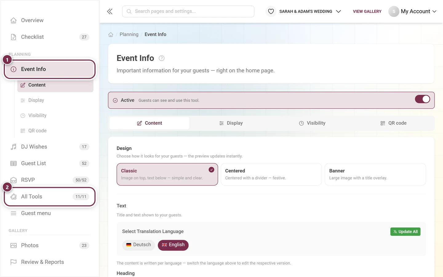
Section titled “Where to find Event Info”In the left-hand sidebar of your event administration it sits in the Planning section. One click unfolds four sub-items – they match the four tabs of the page exactly.
Enabling the tool
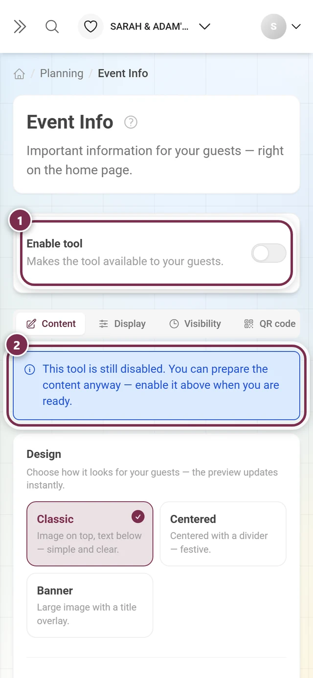
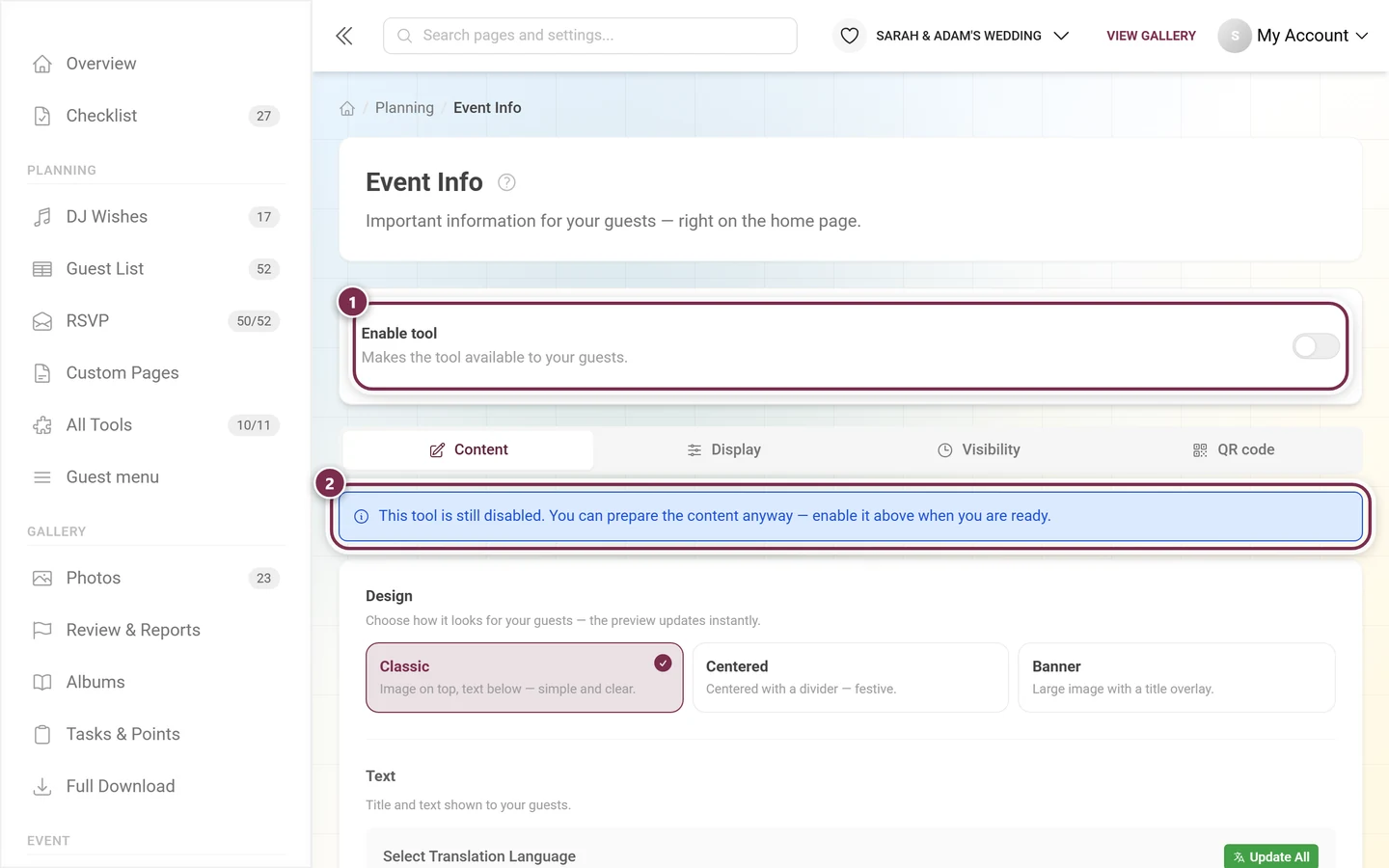
Section titled “Enabling the tool”At the very top of the page sits the switch that decides everything else. While it is off, the box reads Enable tool with the note Makes the tool available to your guests. Once it is on, it reads Active – Guests can see and use this tool.
The layout: one text section, one image
Section titled “The layout: one text section, one image”The Content tab always has the same layout, from top to bottom:
- Design – one of three display styles (explained further down).
- Text – Heading and Content.
- Image (optional) – an image shown above the text.
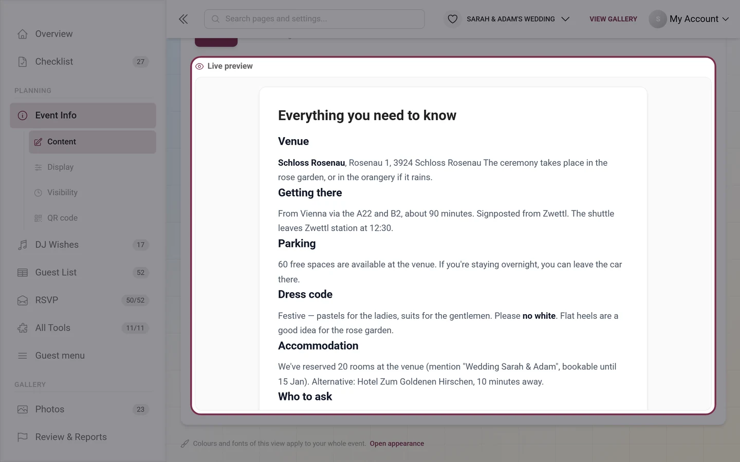
- Save – and below it the Live preview.
- Heading – for example Everything at a glance. Up to 200 characters.
- Content – your actual text, written in the full editor (next section).
- Image (optional) – the drop area spells out the requirements: Landscape, at least 1200px wide. A sketch of the route or a photo of the venue works well here.
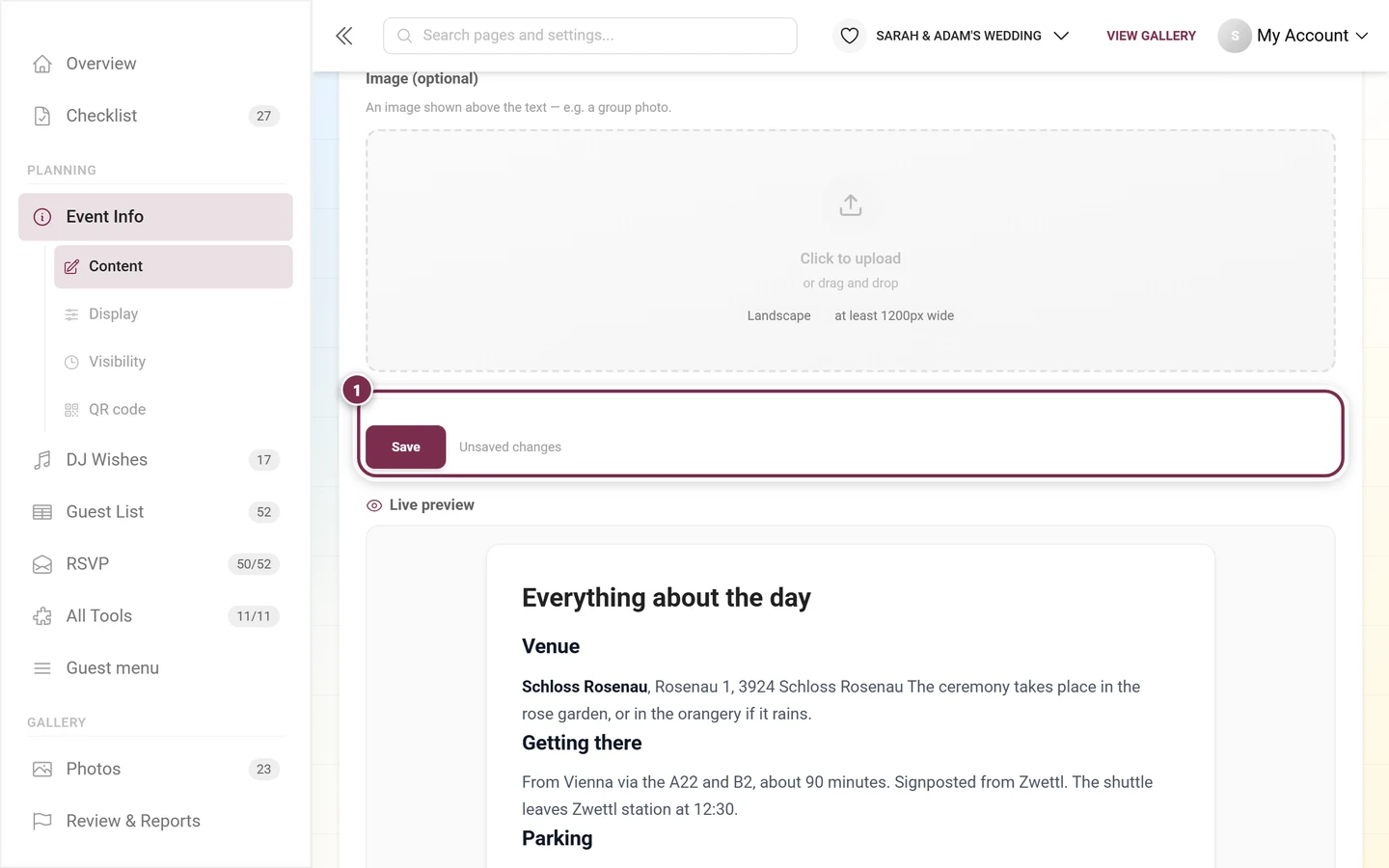
The Live preview at the bottom shows your current draft in the chosen design – before you even save. With the Desktop and Mobile buttons to the right above the preview you check how the text looks on a large screen and on a phone; on a phone, Mobile is preselected.
The rich-text editor in detail
Section titled “The rich-text editor in detail”The Content field is not a plain text box but a full editor. Thank You and Custom Pages use the very same editor – everything here applies there too.
Formatting text
Section titled “Formatting text”On the far left of the toolbar sit Undo and Redo, followed by three dropdowns:
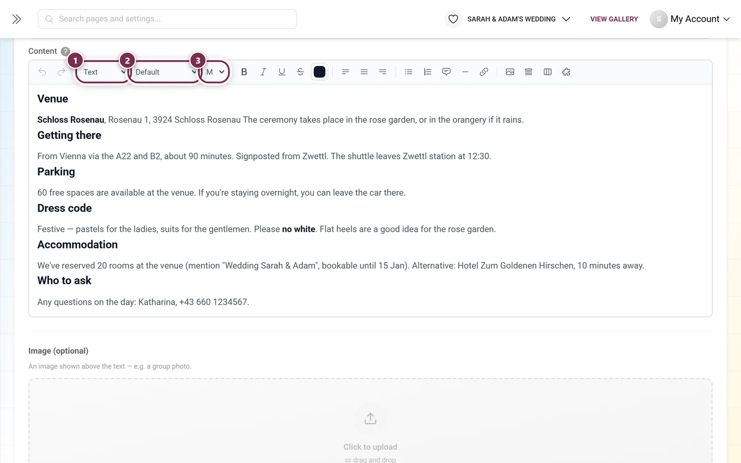
- Paragraph style – Text, Heading 1, Heading 2 or Heading 3.
- Font – a large selection grouped by category: Sans-Serif, Serif, Display, Handwriting and Monospace. Default keeps your event font.
- Font size – four steps: S, M, L and XL.
- Bold, Italic, Underline and Strikethrough.
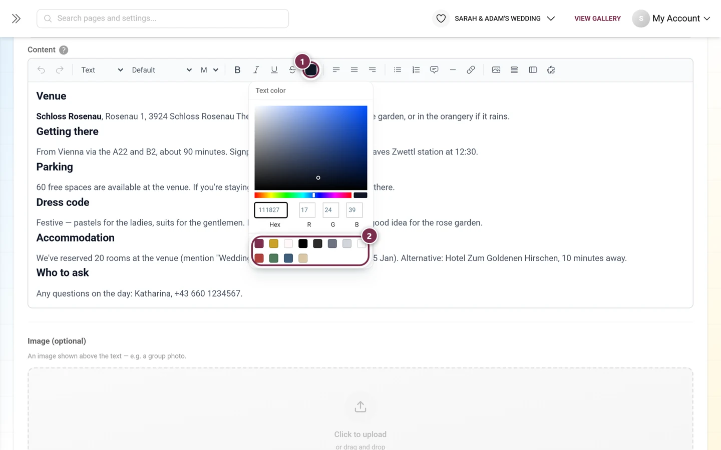
The color swatch next to them opens the Text color picker:
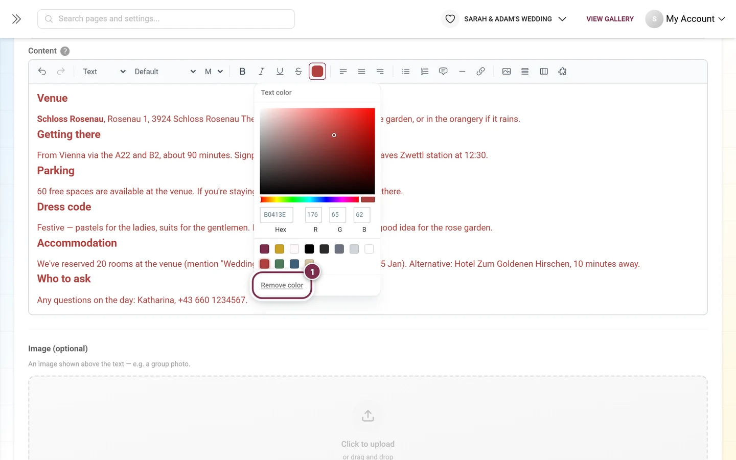
If the selected text already carries a color, an extra link appears at the very bottom of the picker:
Alignment, lists and links
Section titled “Alignment, lists and links”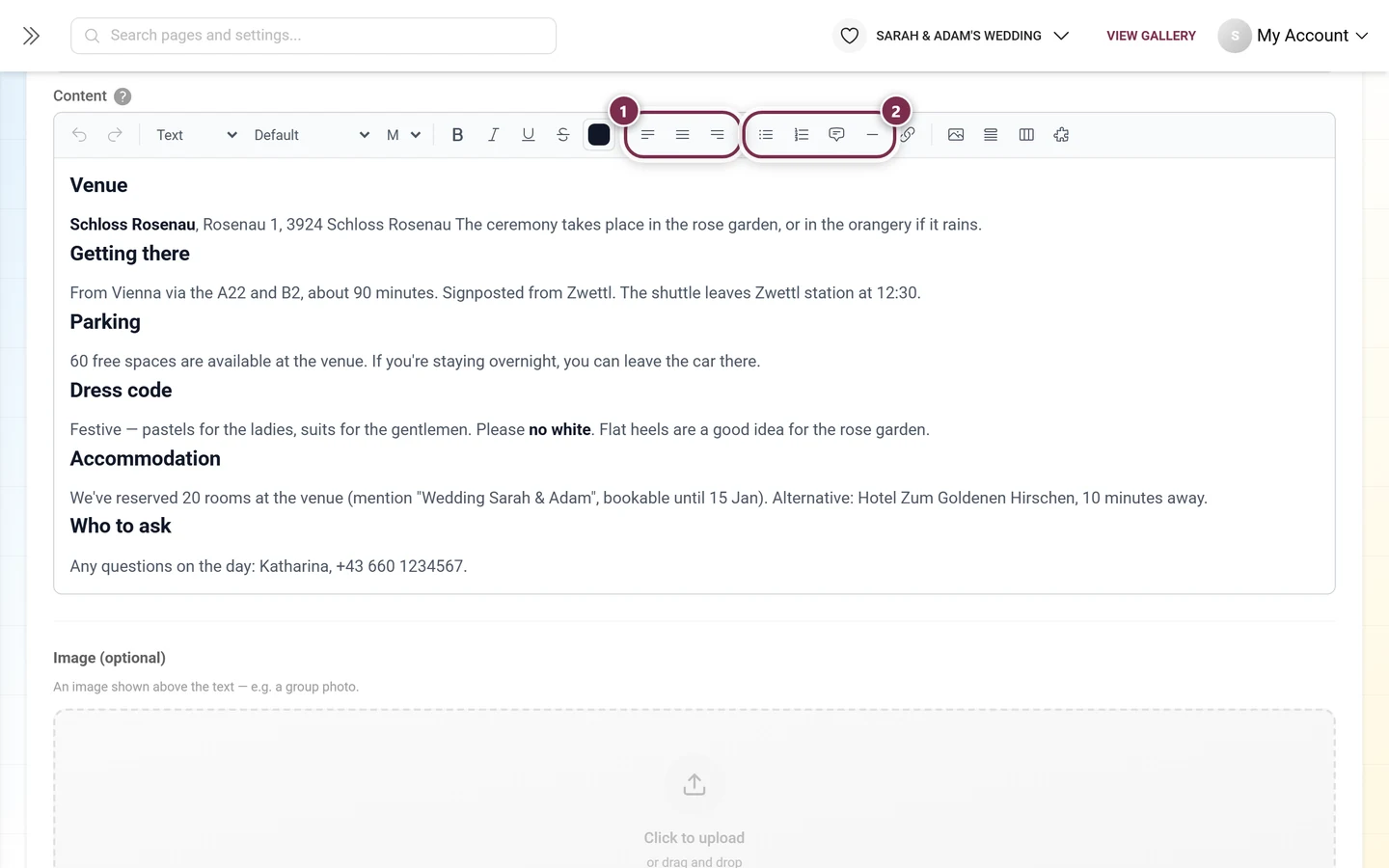
- Quote – an indented block, good for a motto or a short welcome note.
- Divider – visibly separates one topic from the next.
The link button opens a small input field:
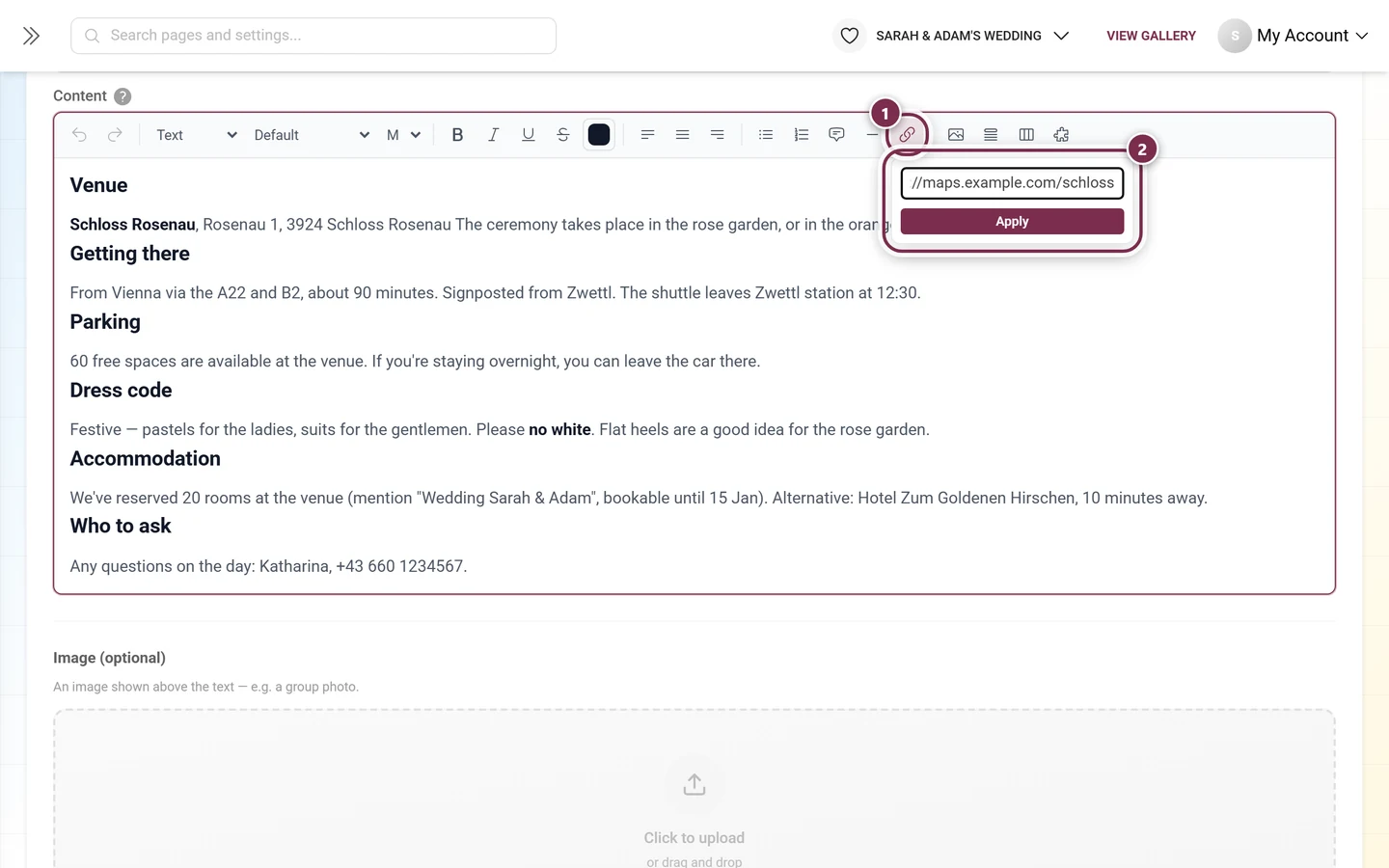
Clicking the link icon again removes the link. For your guests, links open in a new tab.
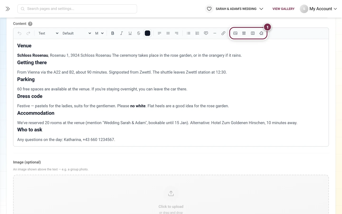
The four insert buttons
Section titled “The four insert buttons”At the far right of the toolbar sit the buttons that place a whole block into the text – always at the cursor position:
Insert image
Section titled “Insert image”Insert image picks an image from your device – it is uploaded immediately and placed at the cursor position. Pasting from the clipboard and dragging and dropping work exactly the same way.
Click an inserted image and you get:
- Handles on the left and right – drag them to the width you want (between 10% and 100% of the text column).
- A small bar with align left, center, align right and a bin to remove it.
This image inside the text is not the same thing as the Image (optional) further down the form: one sits in the middle of the text, the other above the entire content.
Collapsible section
Section titled “Collapsible section”Insert collapsible section creates a section that folds away. You give it a title at the top and write the content below it as usual.
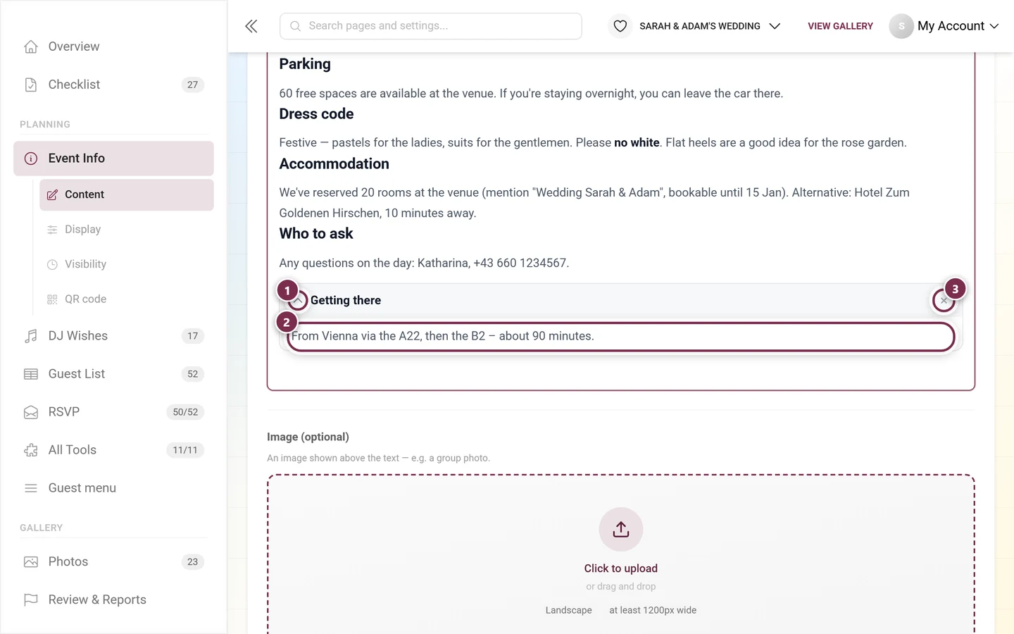
The difference between editing and viewing: in the editor, collapsible sections are open so you can edit them – your guests see them collapsed and open them with a click. Perfect for long answers to frequent questions.
Insert tabs creates a block with two tabs to start with, which you can rename and extend – up to twelve of them.
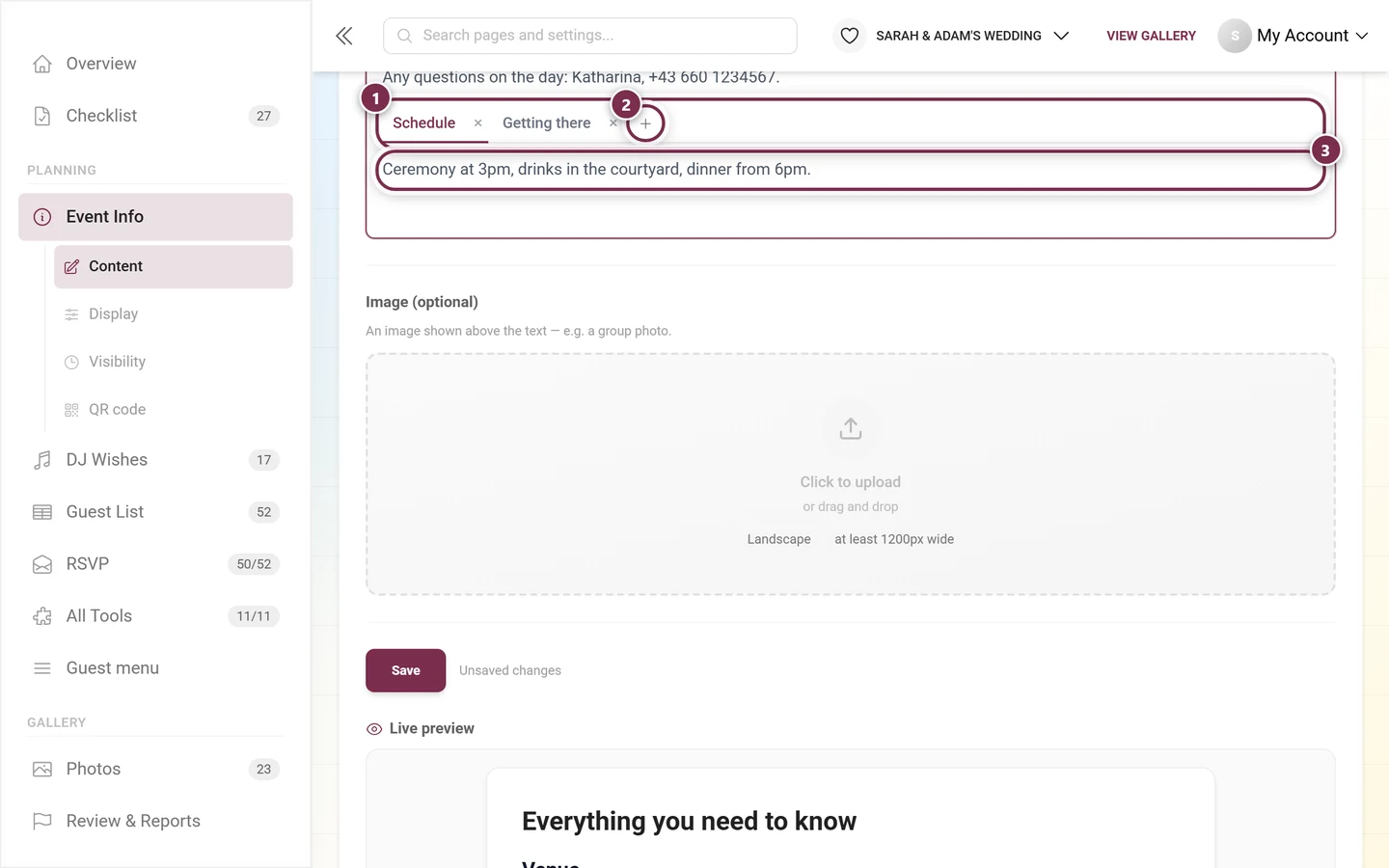
Whichever tab is active when you save is the tab your guests see first. Handy when the same piece of information exists in several variants: By car, By train, On foot.
Embed tool
Section titled “Embed tool”The last button in the toolbar, Embed tool, inserts the live content of another tool at the cursor position.
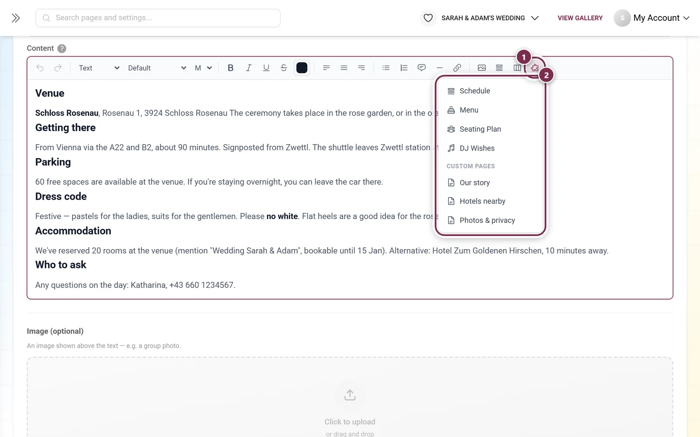
Inside the editor you then see nothing but a placeholder card:
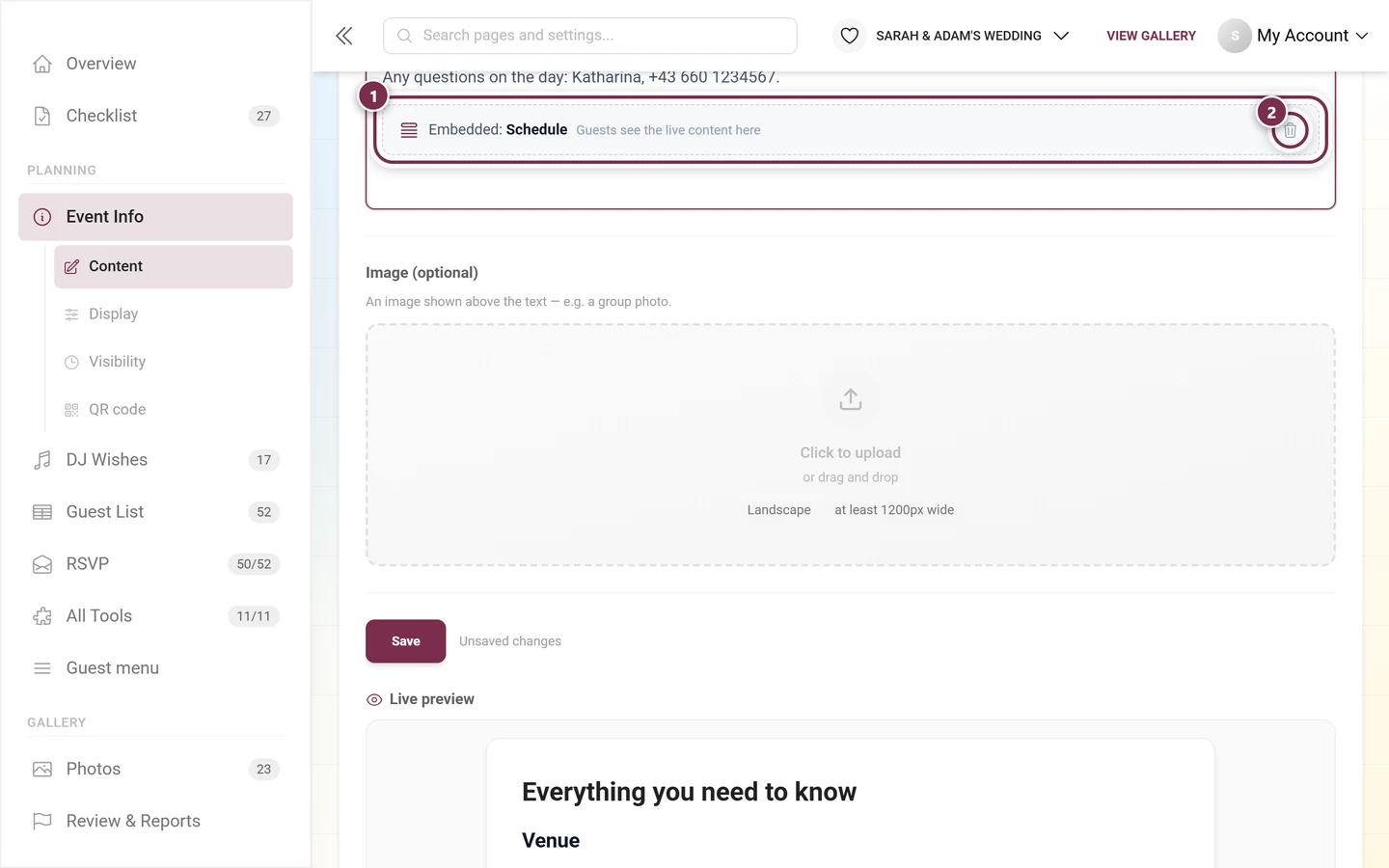
So the embedded content is not copied but loaded fresh every time: change the schedule later and the embedded version changes right along with it.
Content per language
Section titled “Content per language”If your event is multilingual, a language bar appears above the fields.
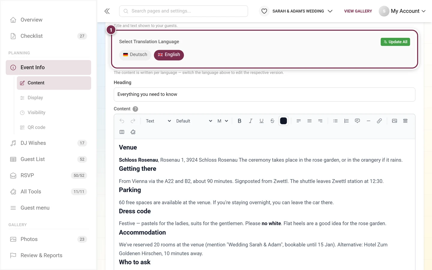
Both the heading and the content go through this bar. Automatic translation recognizes formatted text and translates it section by section – formatting, images and embeds are kept. Which languages your event has is set in the General settings.
The three display styles
Section titled “The three display styles”At the very top of the Content tab sits the Design block with the note Choose how it looks for your guests – the preview updates instantly.
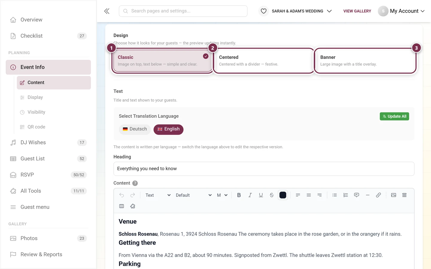
- Classic – image on top, text below; simple and clear. This is the default.
- Centered – everything set centered, with a short divider under the heading and the image at a moderate width; festive.
- Banner – a large full-width image with the heading as an overlay on top. If you have not added an image, a colored title area in your event color appears instead.
The difference only affects presentation – the text stays the same. The chosen style does land in the draft, though: it only reaches your guests after you Save. Try the styles in the live preview first, one click is enough.
Visibility: working with fixed dates
Section titled “Visibility: working with fixed dates”Event info is meant as permanent information and therefore works with fixed dates. On the Visibility tab you pick one of three modes each for Visible from and Visible until:
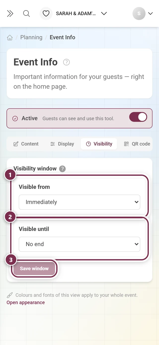
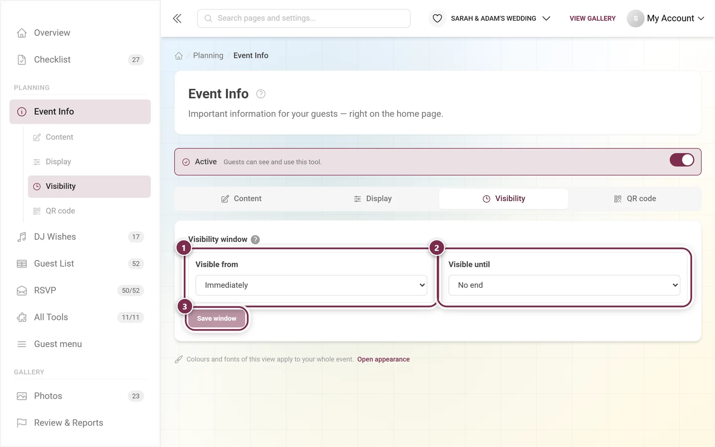
- Immediately and No end – no boundary. Exactly right when the info should simply always be there.
- Fixed date – a specific date and time, for instance the day you send out the invitations.
- Event date – the boundary hangs off the event date, with a Time and ± days. This mode is mainly what Thank You needs.
What your guests see
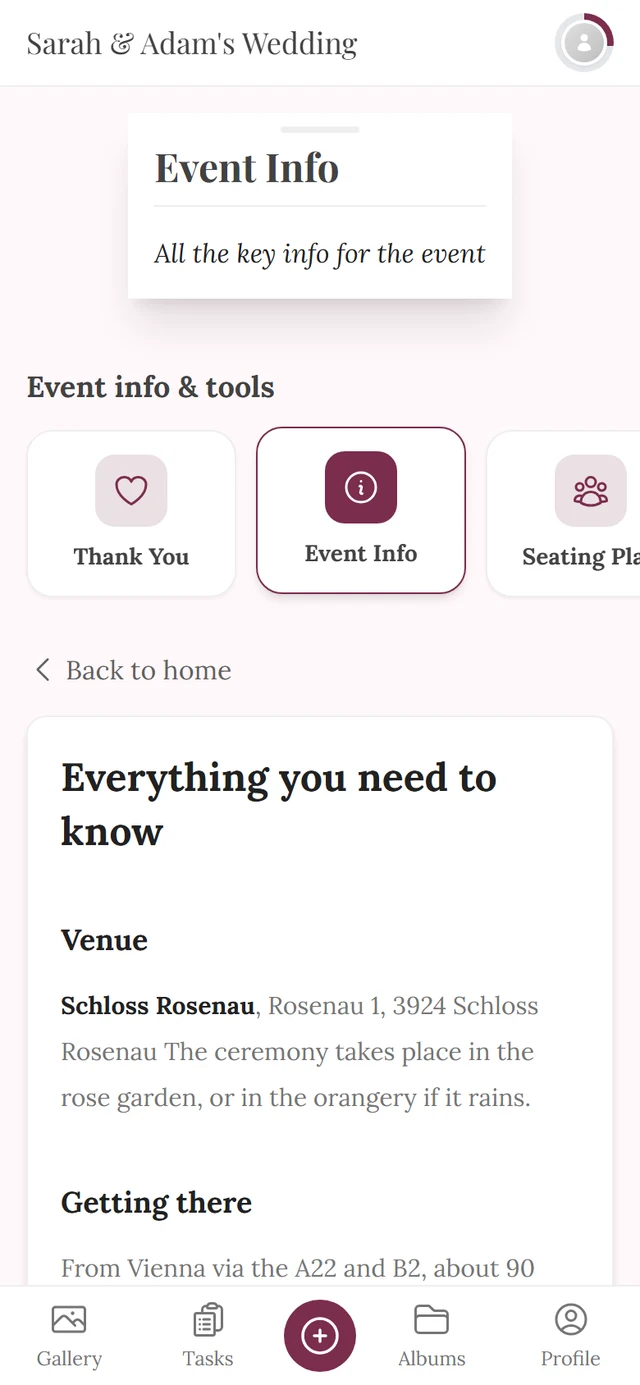
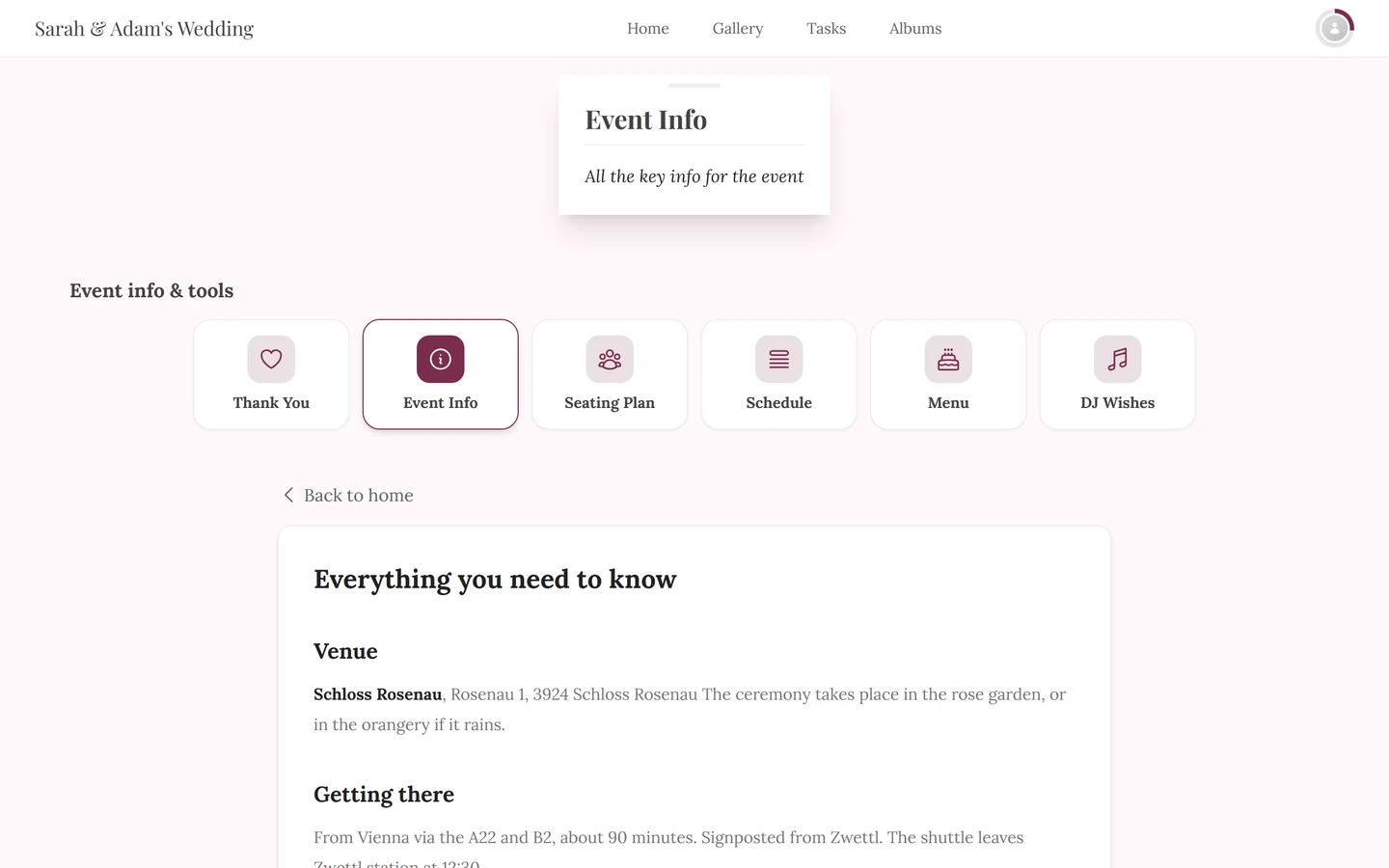
Section titled “What your guests see”Event info reaches your guests along two paths, which you switch separately on the Display tab:
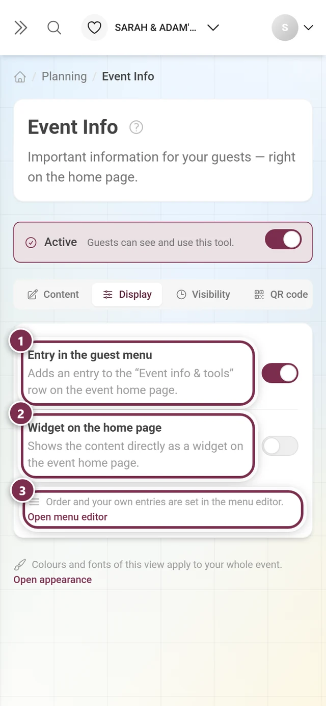
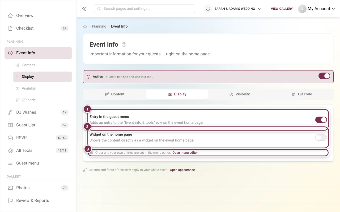
Switch Widget on the home page on and the Widget style picker appears below it. Without the widget on, it is not there – there would be nothing to style.
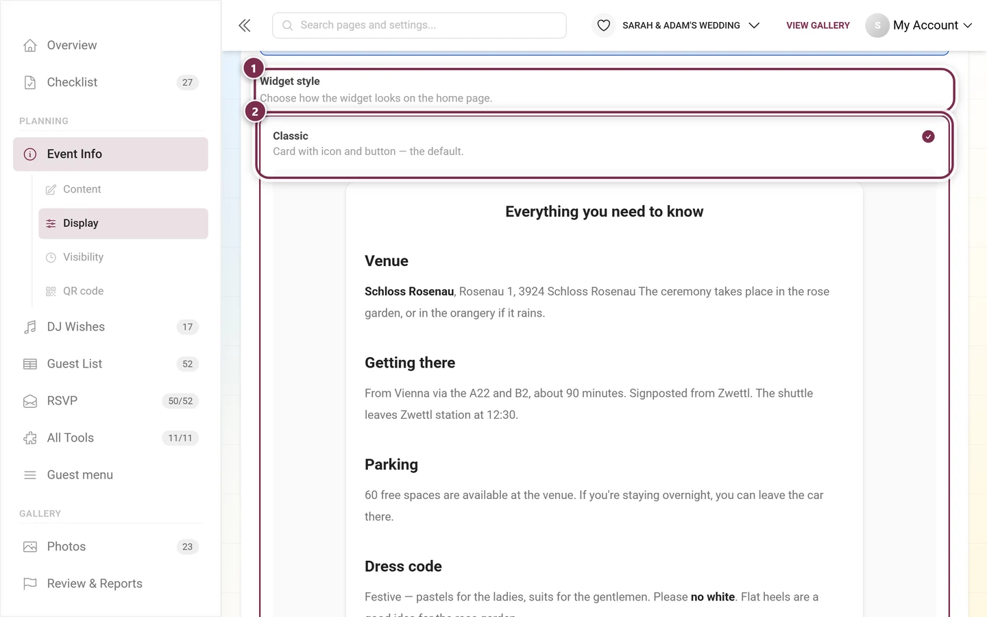
You can choose between Classic, Elegant, Minimal, Bold and Soft.
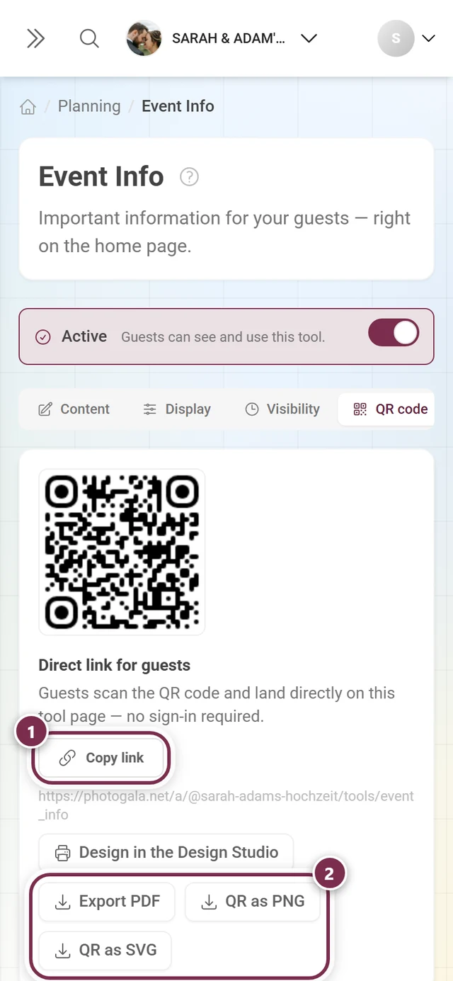
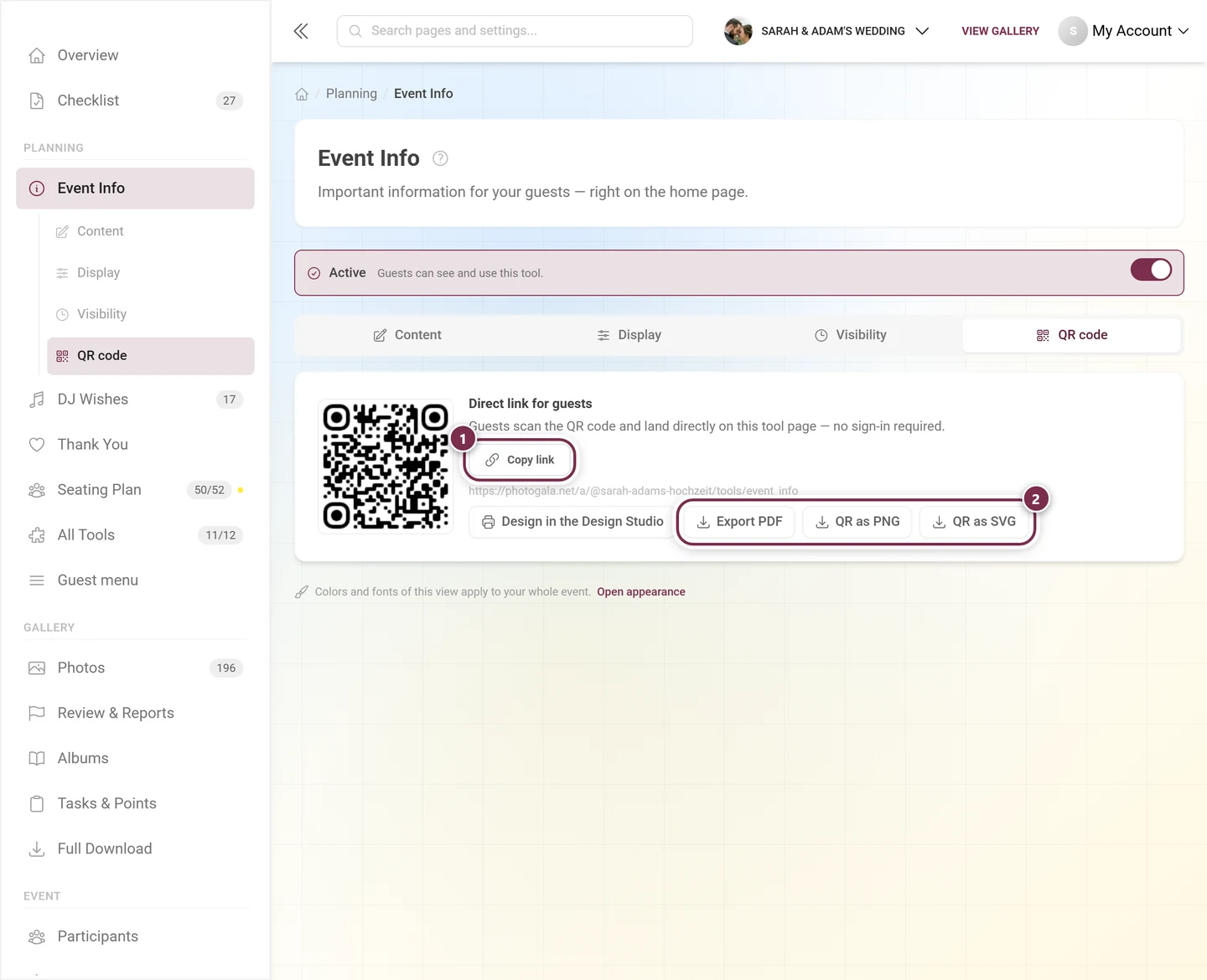
The QR code tab additionally gives you a Direct link for guests. Guests scan the code and land directly on this tool page – no sign-in required.
Troubleshooting
Section titled “Troubleshooting”- My changes are gone. You did not press the Save button on the Content tab. Only the switches save immediately.
- No widget appears on the home page. Check in order: is Enable tool on at the top? Is Widget on the home page on in the Display tab? Is anything saved at all? And does the current moment fall inside the visibility window?
- I cannot find the widget style picker. It only appears once Widget on the home page is switched on.
- Event info is missing from the navigation. Then the tool is disabled. Open it via All tools and switch it back on at the top.
- Guests only see the heading, not my text. The content is written per language. Switch to the missing language in the language bar and add the text – or have it translated automatically.
- The embedded tool shows nothing. It is disabled or currently outside its visibility window. An embedded custom page also has to be published.
- The image looks blurry or is cropped. Use a landscape image that is at least 1200px wide. In the Banner style it is cropped into a wide band – pick one with a calm center there.
Related pages
Section titled “Related pages”- For guests: Tools at the event – how event info reaches your guests.
- For hosts: Thank You · Custom pages · Schedule · Tooling – Overview
- Further reading: General settings – event date and languages · Design Studio – design QR posters