Manage your gallery
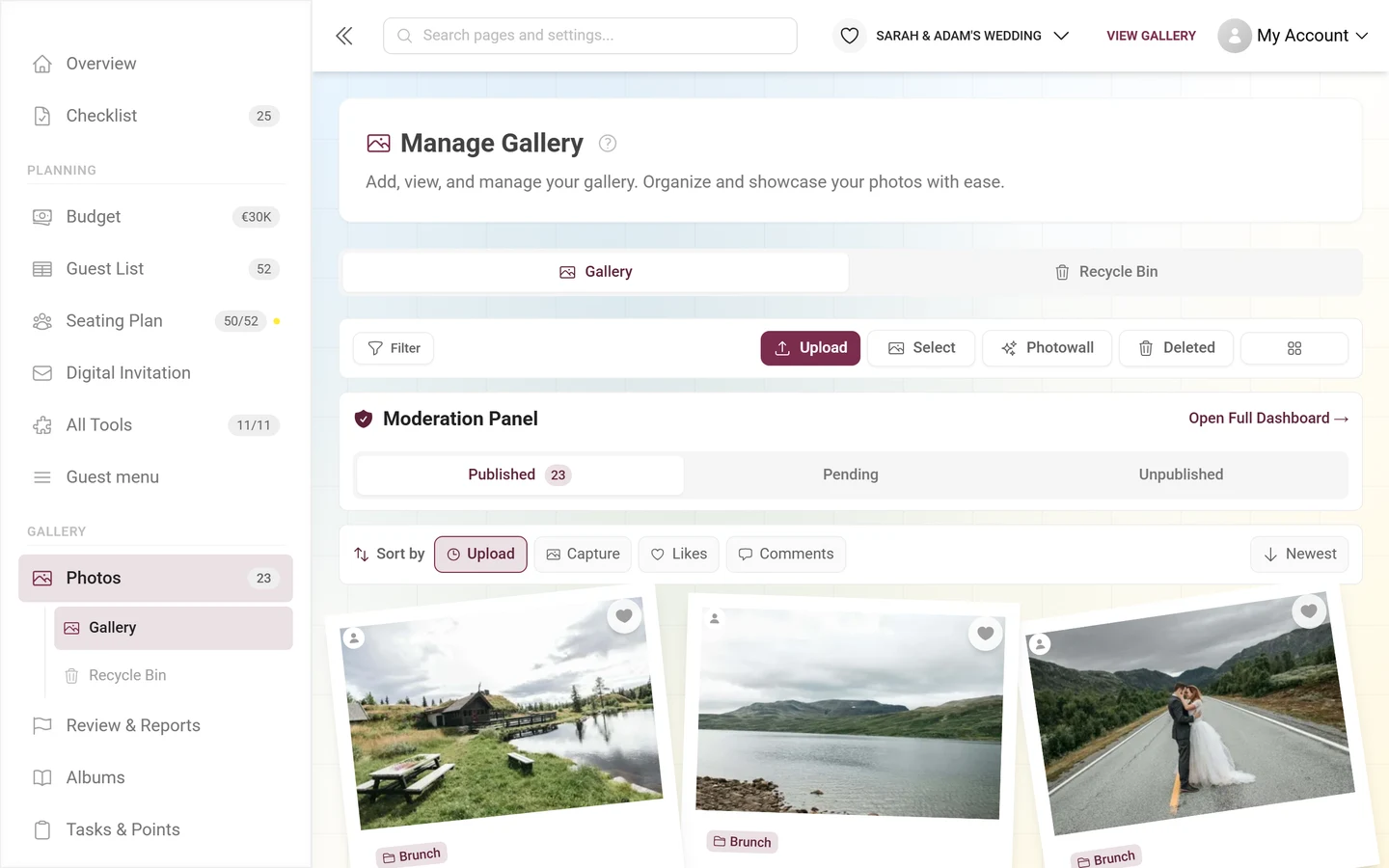
Everything uploaded to your event comes together in one place: the Photos page in the left-hand menu, group Gallery. The page itself is headed Manage Gallery with the subtitle “Add, view, and manage your gallery. Organize and showcase your photos with ease.” and lives at the route /admin/gallery.
Every other media feature starts here - this article walks through each bar on the page from top to bottom and tells you which button leads into which guide.
How to open the page
Section titled “How to open the page”-
Open your event’s admin area - from the gallery via the profile menu in the top right.
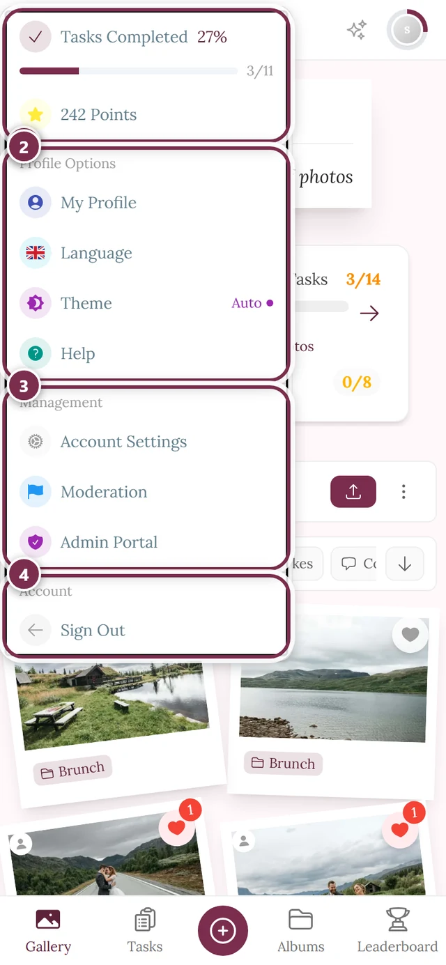
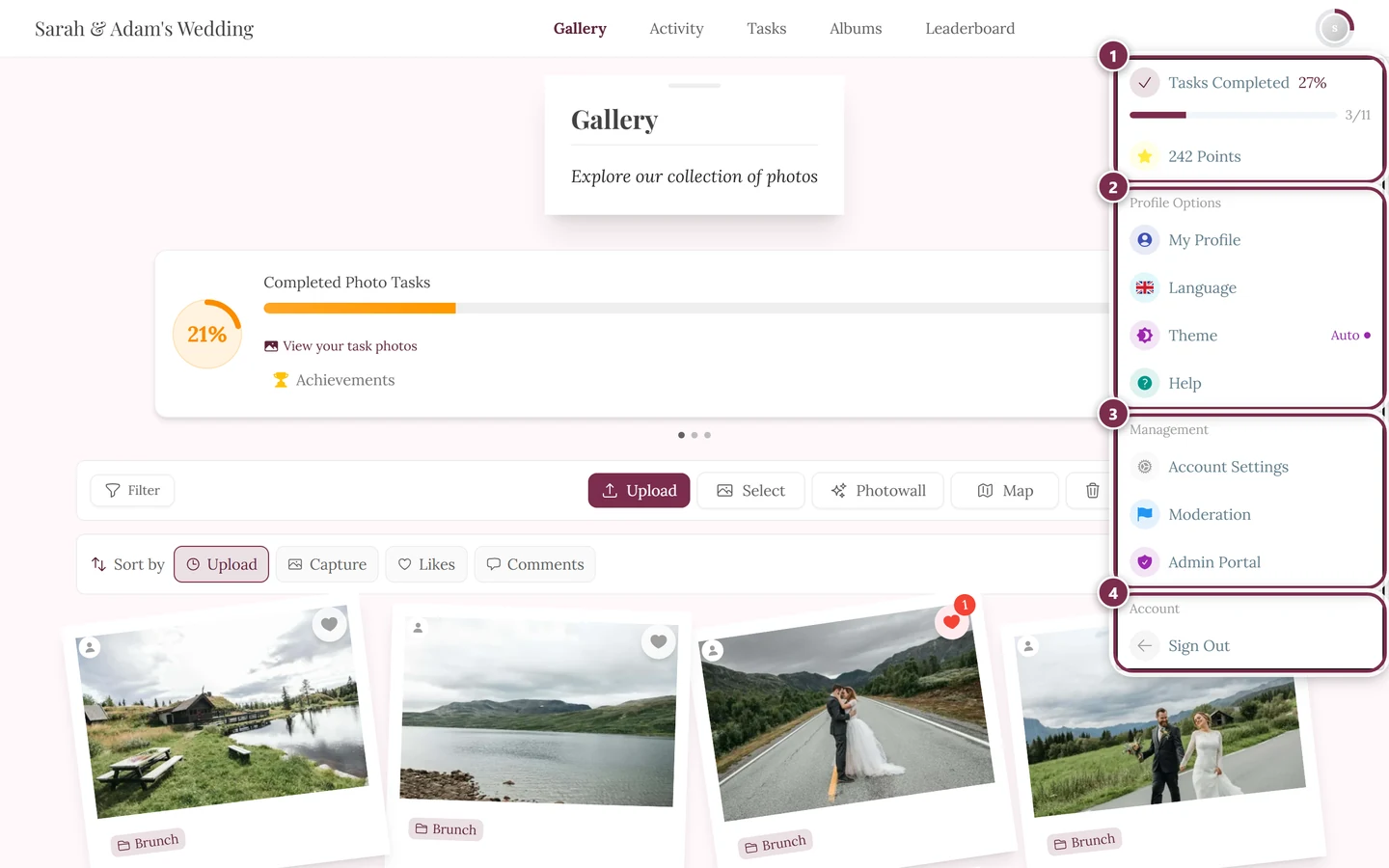
The profile menu in the top right takes you into the admin area. ① your point score and solved tasks, ② Profile options with My Profile, Language, Design and Help, ③ Administration with Account Settings, Moderation and Admin Portal - this section is missing unless you hold a role for it, ④ Account with Log out. -
In the left-hand menu, group Gallery, click Photos.
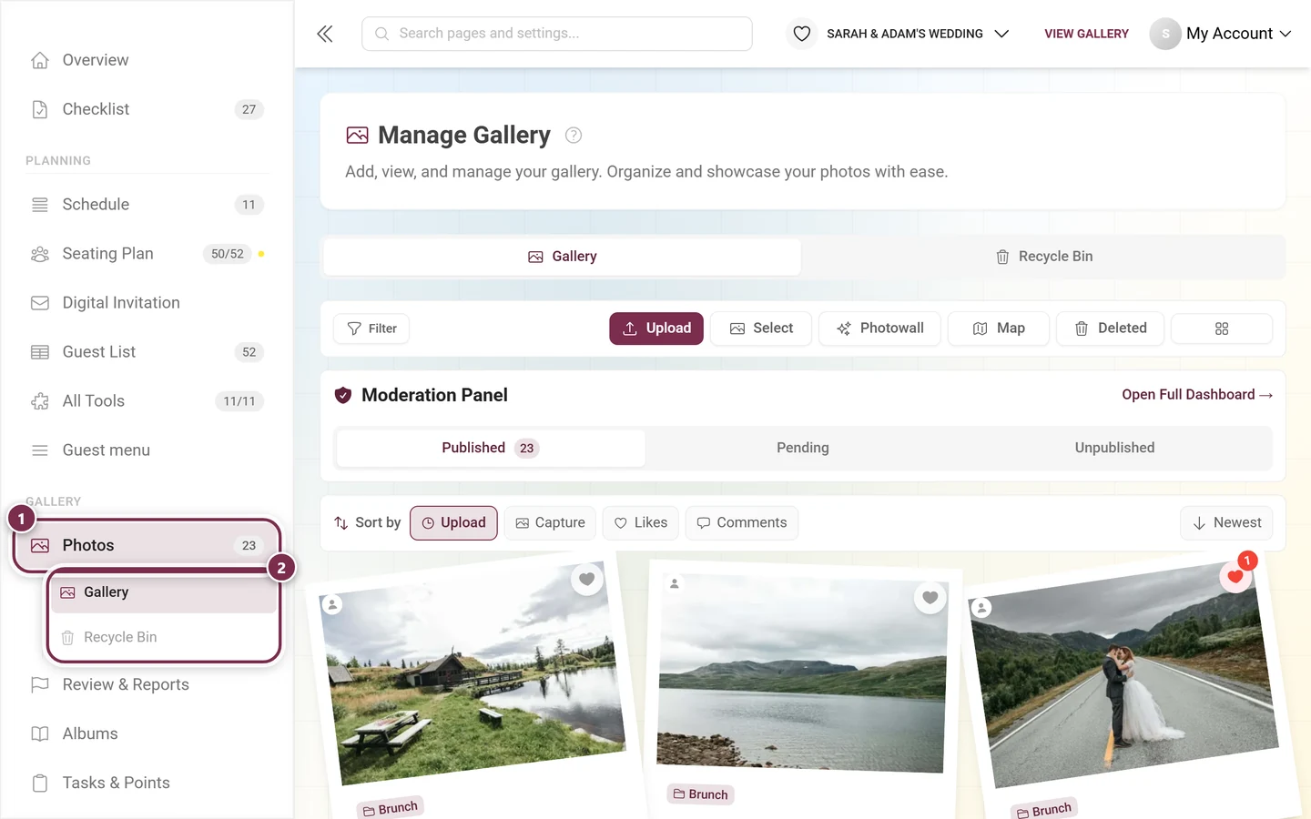
① Photos in the Gallery group; the number next to it is the count of published media - 23 in this example. ② Below it the sub-items Gallery and Recycle Bin unfold and jump straight into the matching tab of the page.
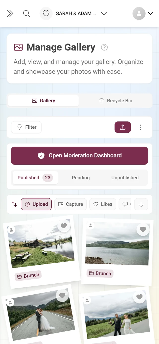
The page tabs
Section titled “The page tabs”Right below the heading sits a tab bar. It belongs to the page, not to the gallery, and switches between three views:
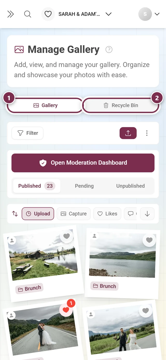
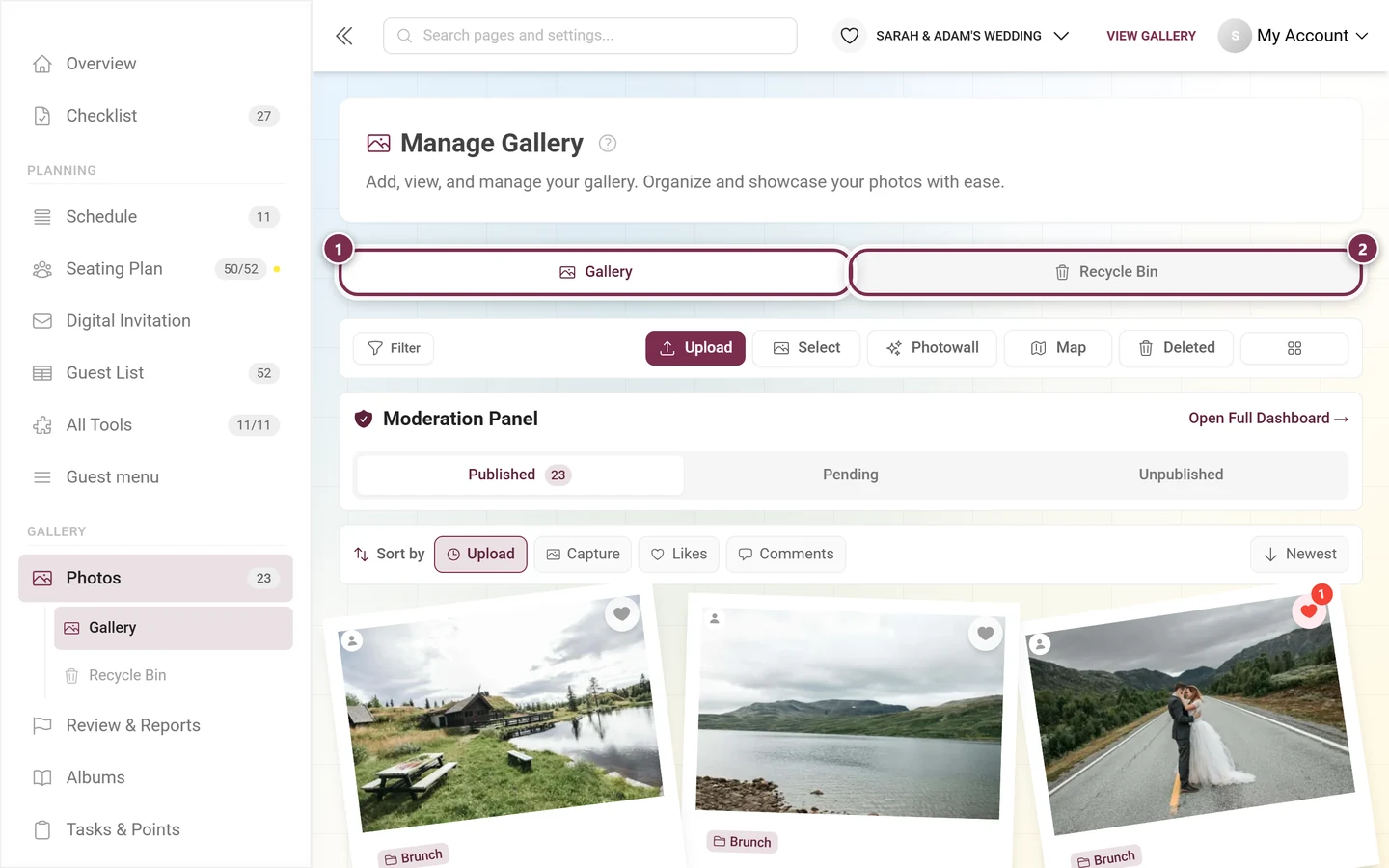
- Gallery - the photo grid this article is about.
- Recycle Bin - only appears once at least one media file has been deleted. What you can do there is covered in Recycle bin & restoring.
- Reports - only appears once there are reports. The red number counts the open ones.
As long as Gallery would be the only visible tab, the page hides the whole bar - so a brand-new event shows no tabs at all. The active tab is stored in the address (?tab=recycleBin), which means bookmarks and shared links land in the same spot again.
The action bar
Section titled “The action bar”Below the tabs sits the action bar. The filter on the left, everything else on the right:
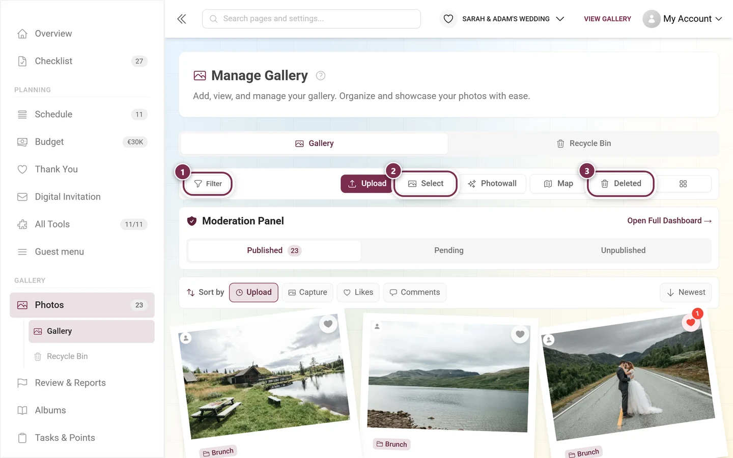
- Filter - opens the Gallery Filters dialog (see below). While filters are active the button turns solid, shows the count and gains a red ✕ next to it for resetting.
- Upload - lets you add photos and videos as the host. The flow is the same one guests use, described in Uploading photos. If you are currently filtering on exactly one task, the dialog opens with that task preselected.
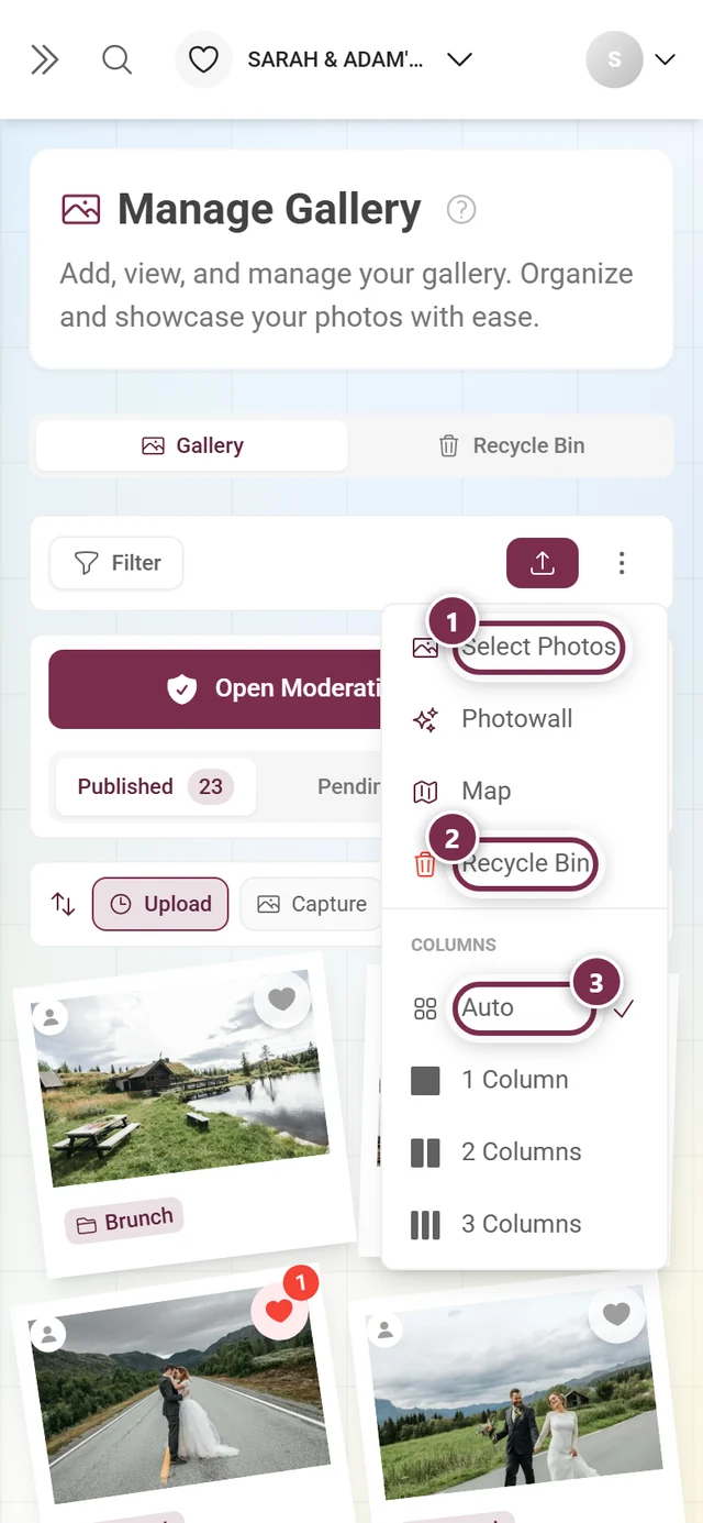
- Select - turns on select mode (visible from tablet width; on phones it lives in the ⋮ menu as Select Photos).
- Photowall - starts the photo wall for a projector or TV, see Set up the photo wall. The button only appears on large screens; below that the entry sits in the ⋮ menu.
- Map - switches the grid to map view. It only shows up when at least one photo carries location data and the feature is part of your plan; more in Map view.
- Deleted - opens the recycle bin as a dialog on top of the gallery. The Recycle Bin tab above leads to the full view; in the ⋮ menu the same entry is called Recycle Bin.
- On the far right, a button without a label: the column picker.
Column picker and ⋮ menu
Section titled “Column picker and ⋮ menu”The column picker decides how many photos sit side by side:
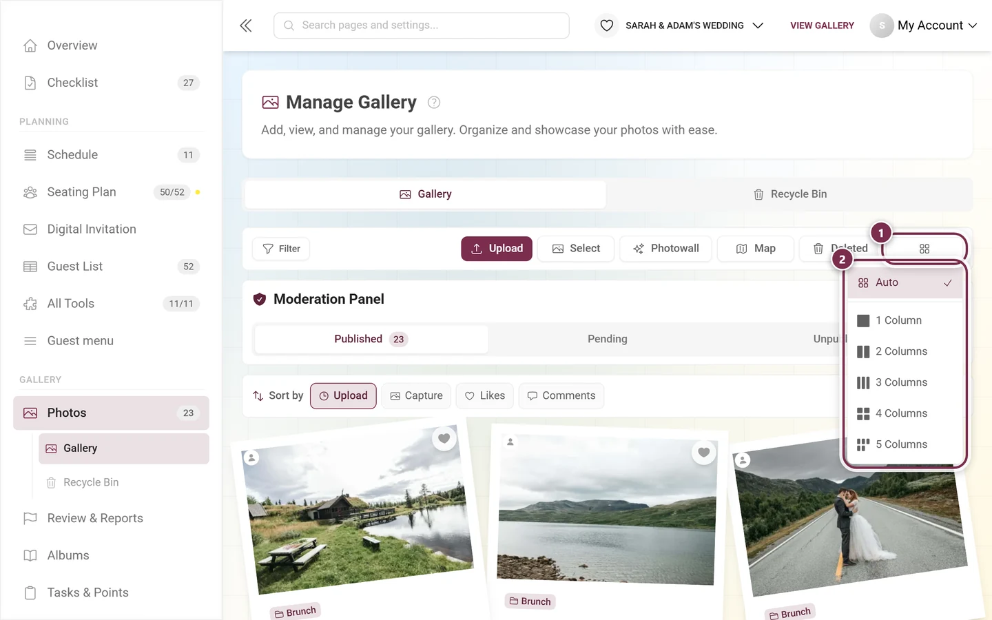
In the row-based gallery variants the same value doesn’t control the column count but the tile size - then the entries read Very Large, Large, Medium, Small and Very Small, and the heading says Size instead of Columns. Which variant your event uses is set in Customizing the look.
On phones and tablets the column picker is missing; there the ⋮ menu collects everything that doesn’t fit into the narrow bar:
The moderation panel and the status tabs
Section titled “The moderation panel and the status tabs”Below the action bar there can be a box of its own that only moderators, admins and the owner get to see:
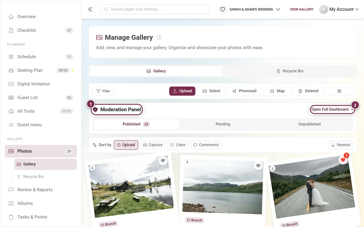
The box depends on two conditions - and not on whether there is anything to do right now:
- You hold a moderation permission (moderator, event admin or owner).
- The Show approval bar in the gallery toggle is on. You’ll find it in Moderation & safety; it is on by default.
Turn it off and the status tabs disappear from the gallery as well - the moderation page itself stays reachable through the profile menu and through Review & Reports.
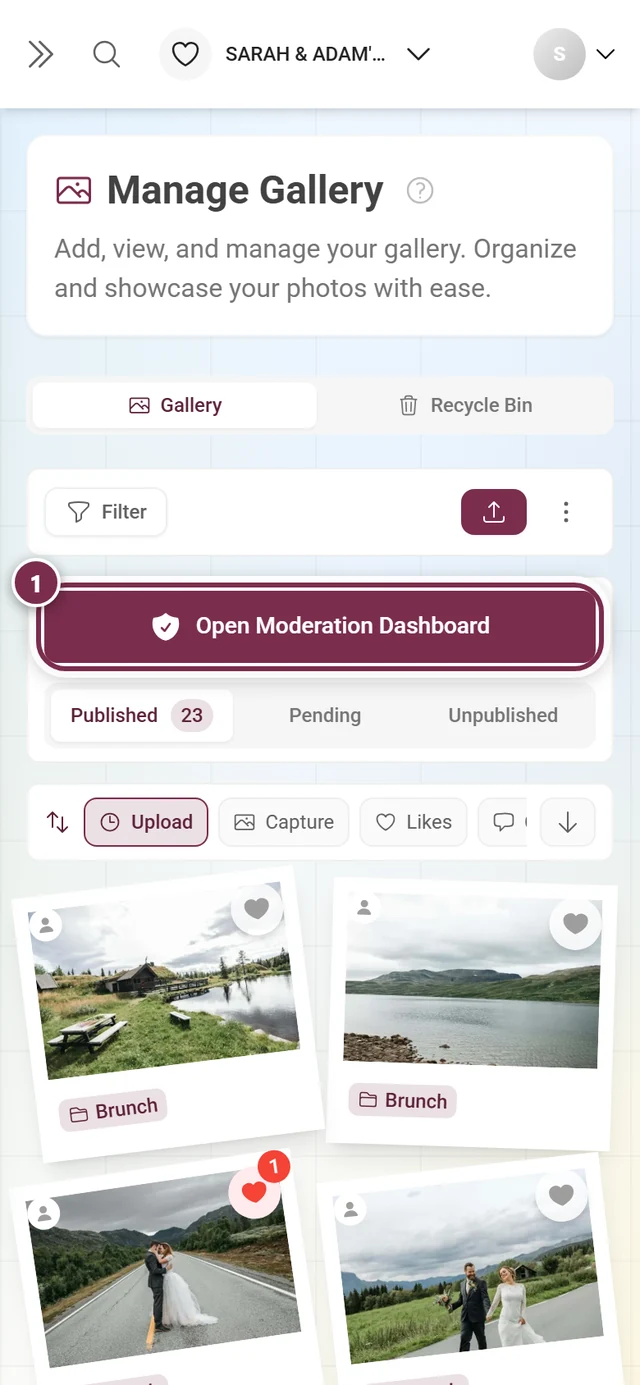
On a phone the same box shows a full-width button instead of the small link:
The three status tabs
Section titled “The three status tabs”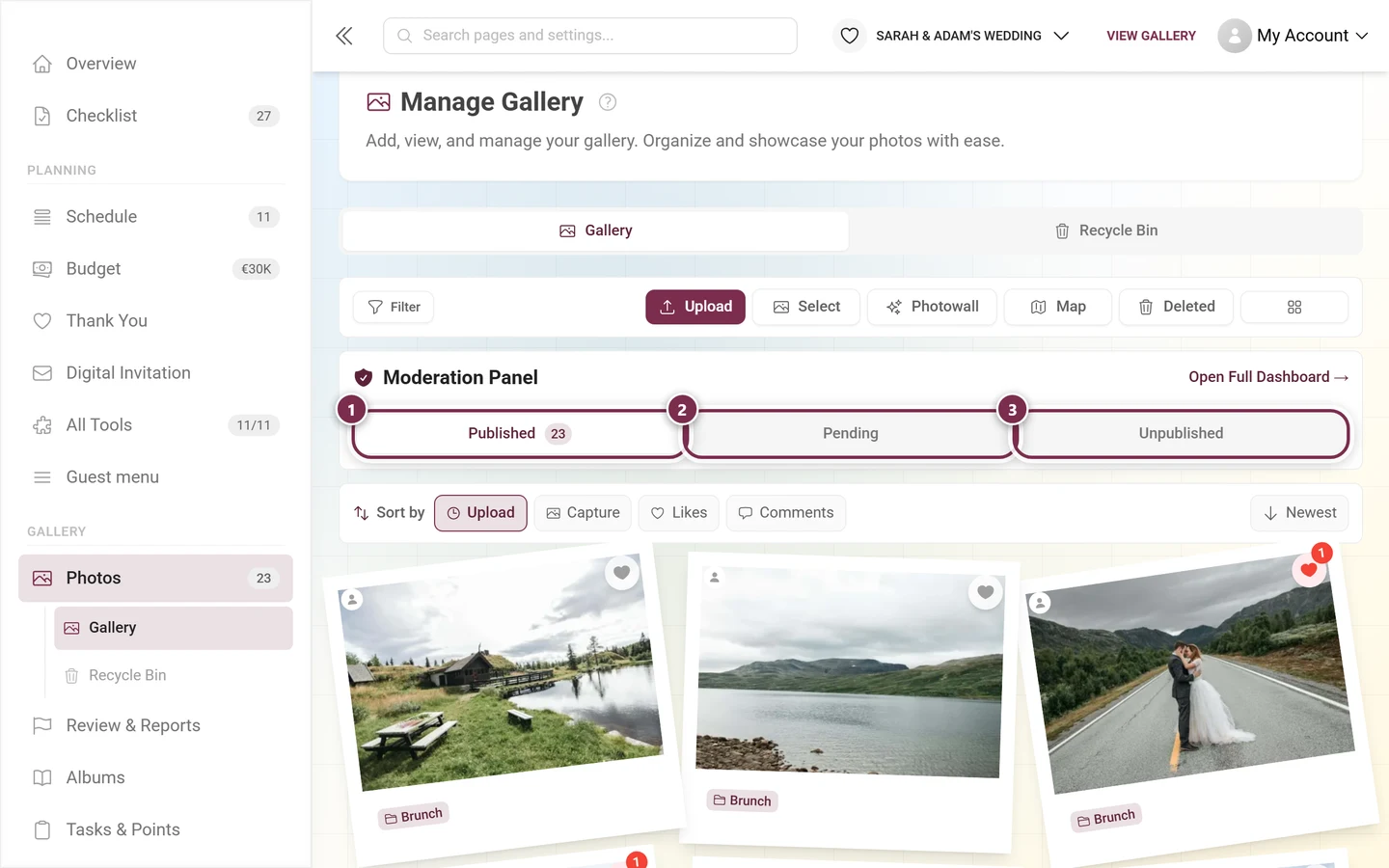
- Published - visible to guests. The number in the tab is the same one shown next to Photos in the menu. While filters are active it only counts the filtered media.
- Pending - waiting for approval. This tab only fills up when moderation is switched on.
- Unpublished - withdrawn media: uploaded, but deliberately hidden.
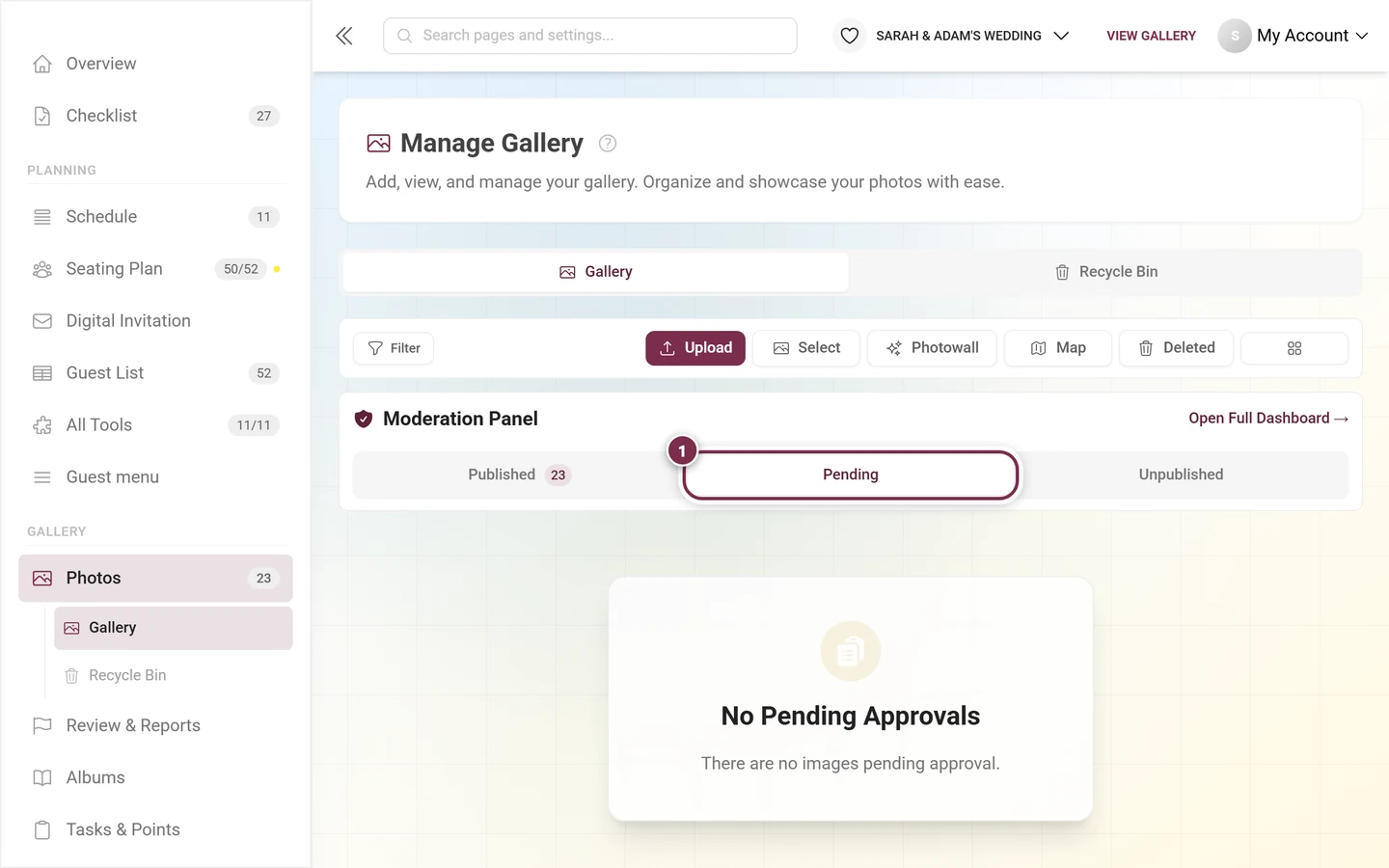
The active status tab lands in the address as well (?filter=pending). A link to /admin/gallery?filter=pending therefore takes you straight to the open approvals.
The sort bar
Section titled “The sort bar”Right above the grid sits a row of its own for sorting. It is not an event setting but applies only to the view you currently have open:
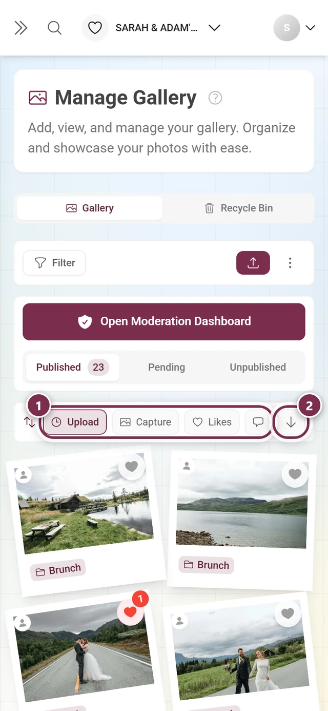
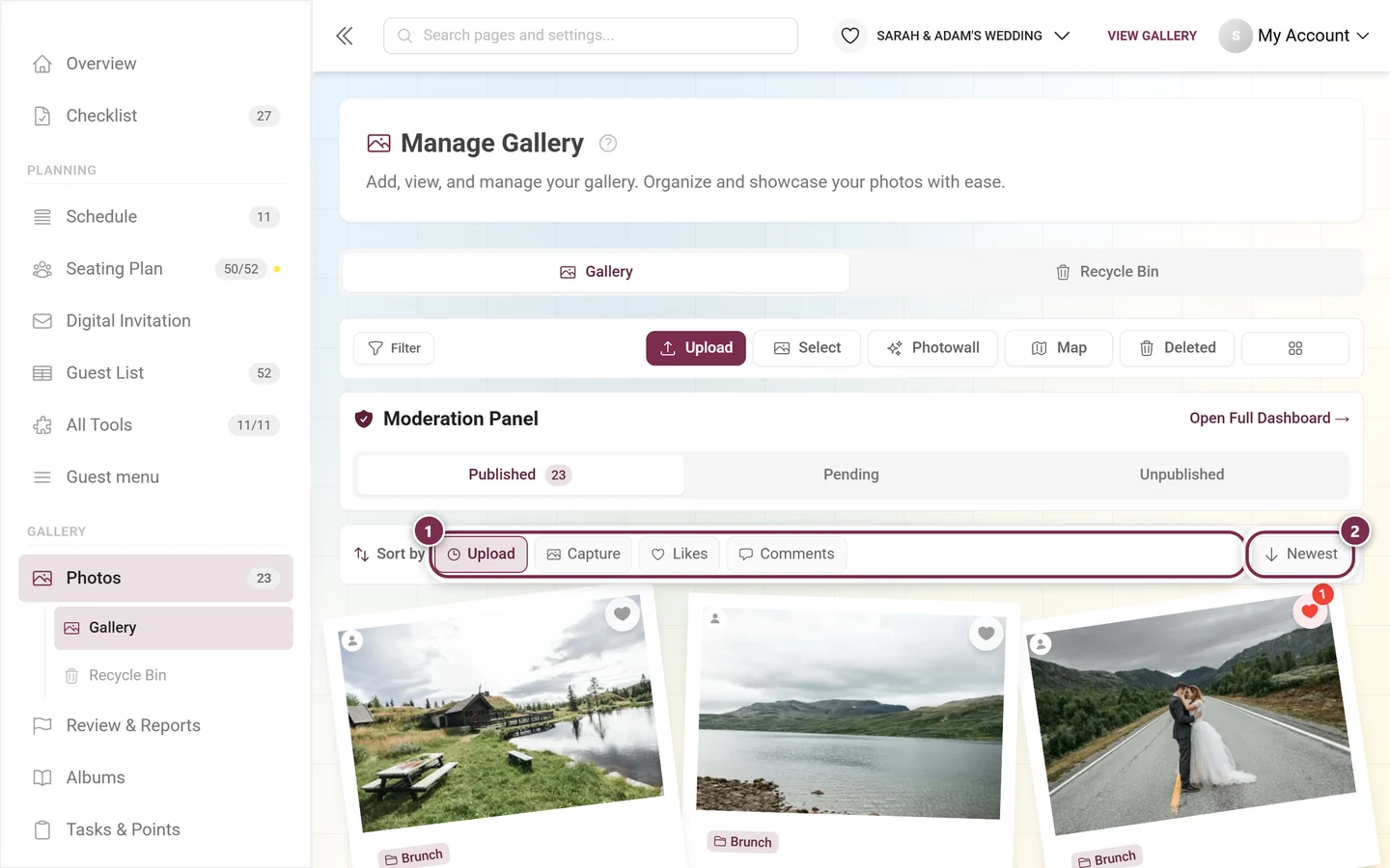
- Upload - the order things were uploaded in. This is the default.
- Capture - the date from the camera’s image data. Photos without a capture date fall back to their upload date.
- Likes and Comments - only appear when the matching feature is switched on in your event.
For Upload and Capture the button on the right reads Newest or Oldest. Sort by Likes or Comments and the label changes accordingly to Most and Least.
The “Gallery Filters” dialog
Section titled “The “Gallery Filters” dialog”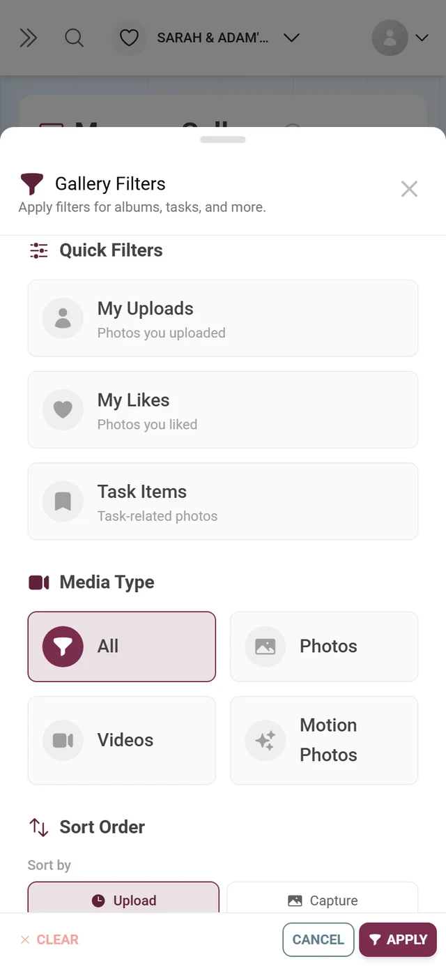
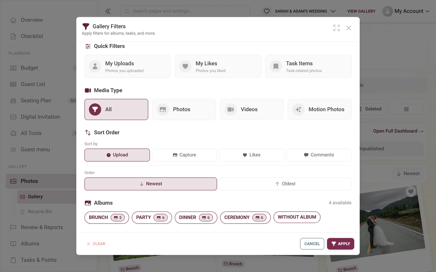
The dialog is called Gallery Filters (“Apply filters for albums, tasks, and more.”) and builds up from top to bottom out of the blocks below. Which of them you see depends on your event - a block without content isn’t shown.
Active filters
Section titled “Active filters”At the very top - and only while something is being filtered - the dialog lists the active filters as chips, with Clear All next to them. With nothing filtered, the dialog starts right at the quick filters.
Quick Filters
Section titled “Quick Filters”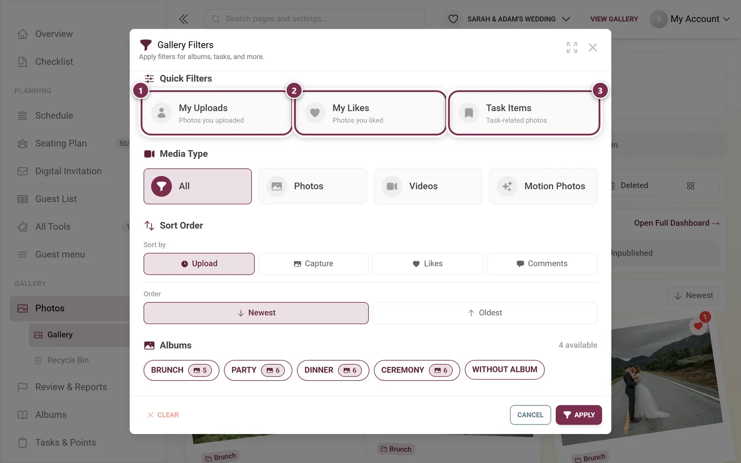
Media Type
Section titled “Media Type”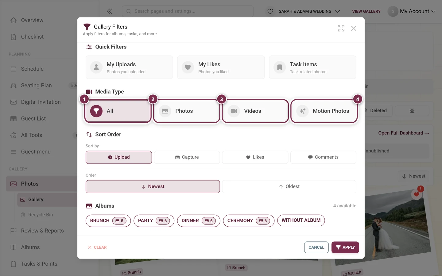
Sort Order
Section titled “Sort Order”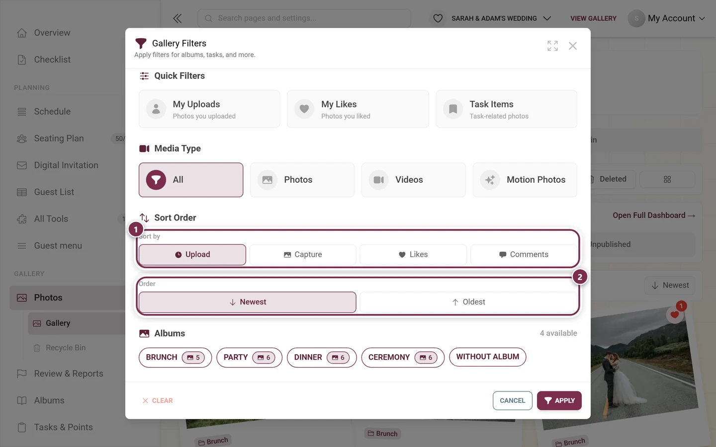
Albums
Section titled “Albums”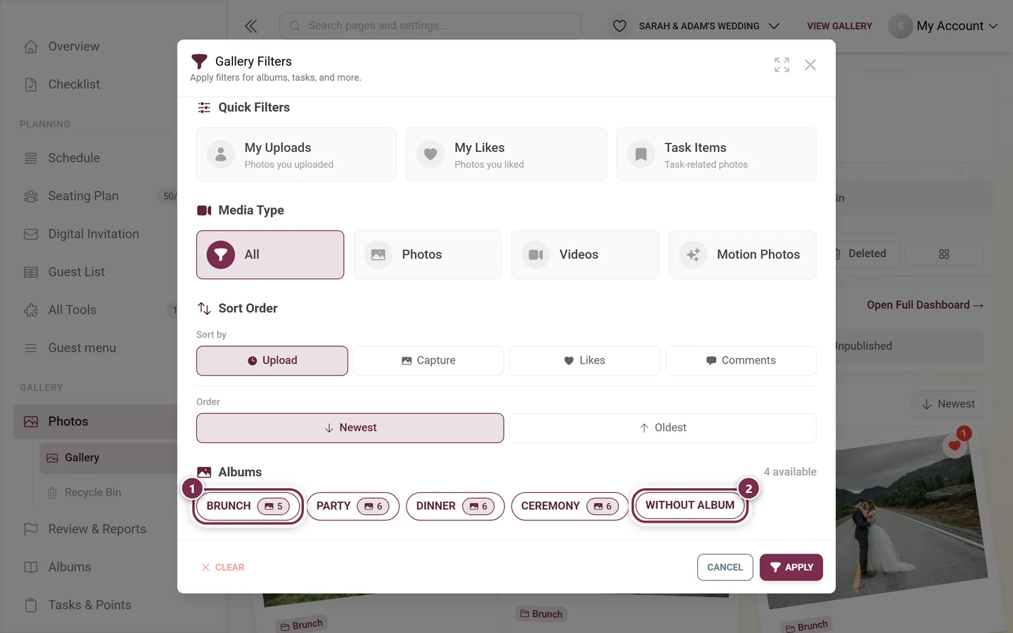
You create albums in Creating albums.
Tasks, people and likes
Section titled “Tasks, people and likes”Below the albums - depending on your event - further blocks follow:
- Tasks - every photo task with a checkbox and the number of photos solving it. The block only appears when tasks are switched on and at least one exists; you create them in Creating challenges.
- Filter by People - the people found by face recognition. Only present when face recognition is running, see Finding photos of you.
- Filter by Number of People - Minimum People and Maximum People; also requires recognized faces.
- Filter by Number of Likes - only appears when likes are switched on.
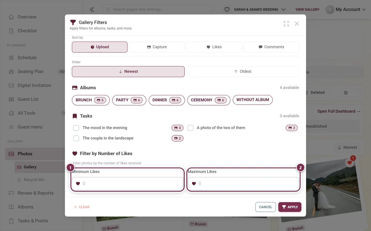
At the bottom, Clear (resets all filters), Cancel (discards your changes) and Apply close out the dialog. Only Apply changes the gallery.
Spotting active filters - and getting rid of them
Section titled “Spotting active filters - and getting rid of them”As soon as a filter takes hold, the page shows it in three places at once - so you never miss a forgotten filter:
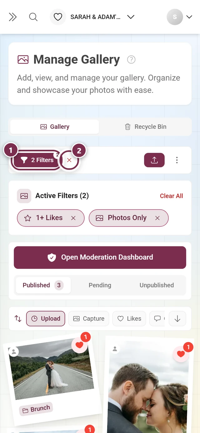
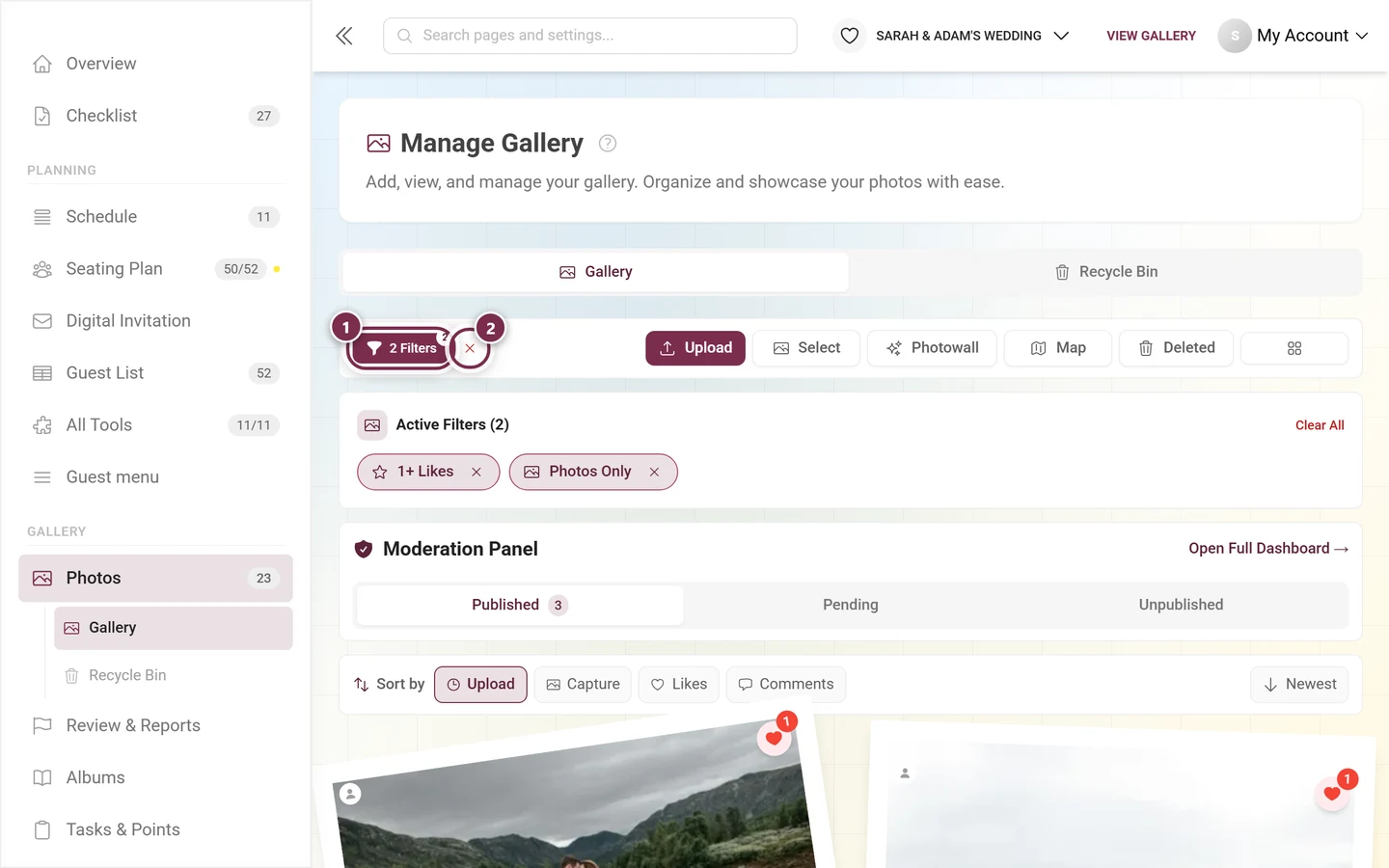
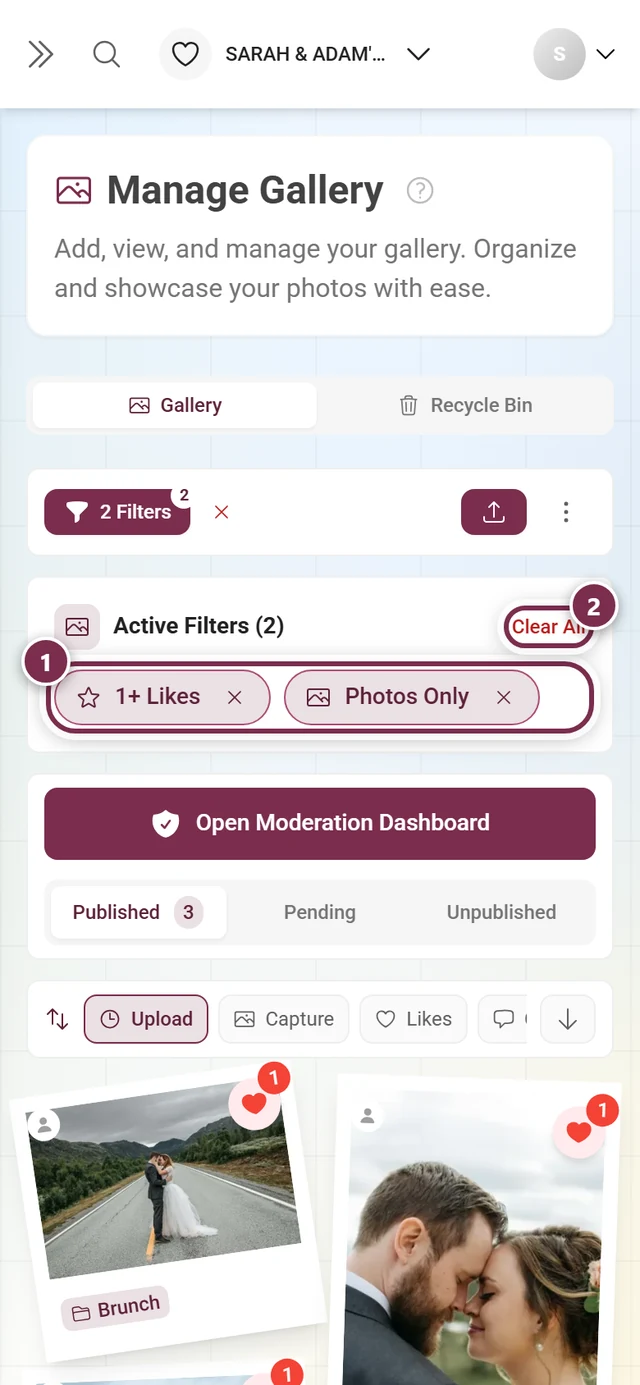
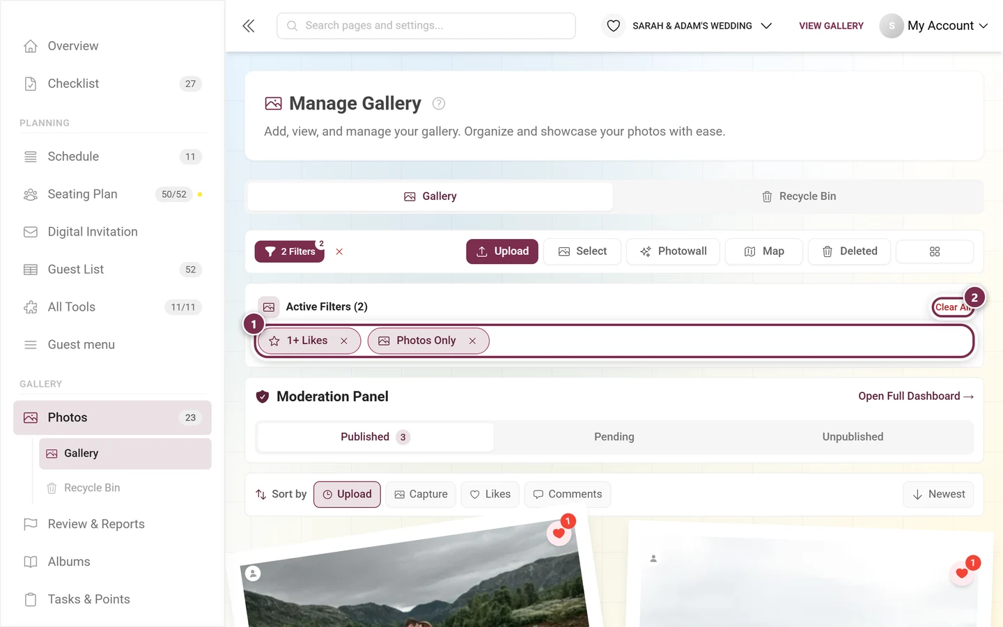
Notice how the number on the Published tab drops from 23 to 3 while doing so: the status tabs always count what’s left after the filter.
The album card
Section titled “The album card”Filter on exactly one album - and nothing else - and a context card replaces the chip bar:
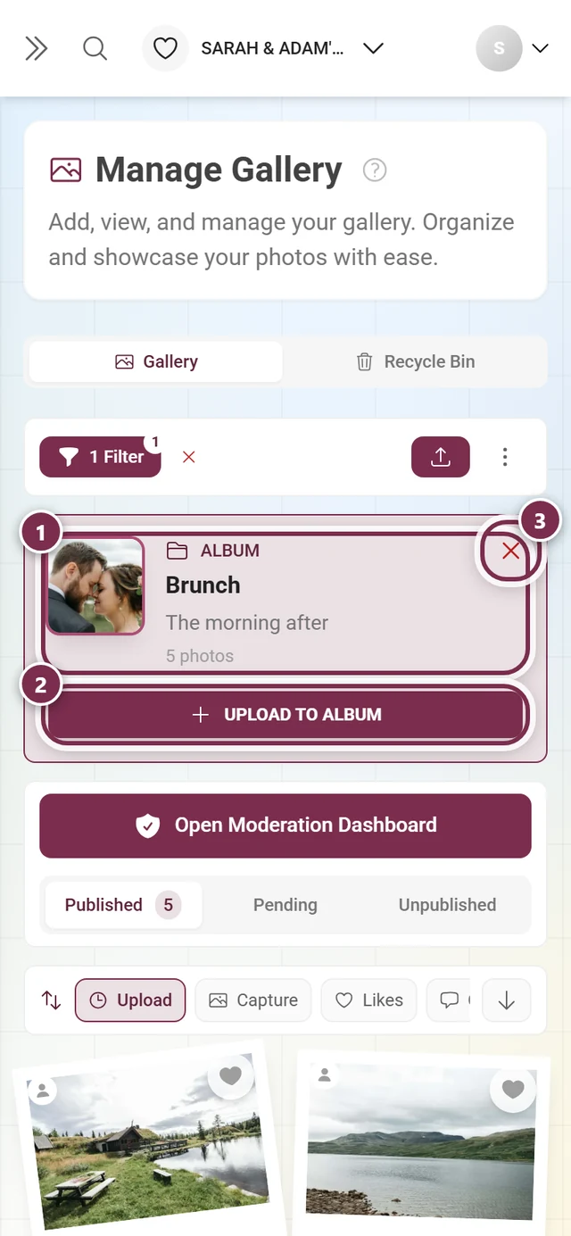
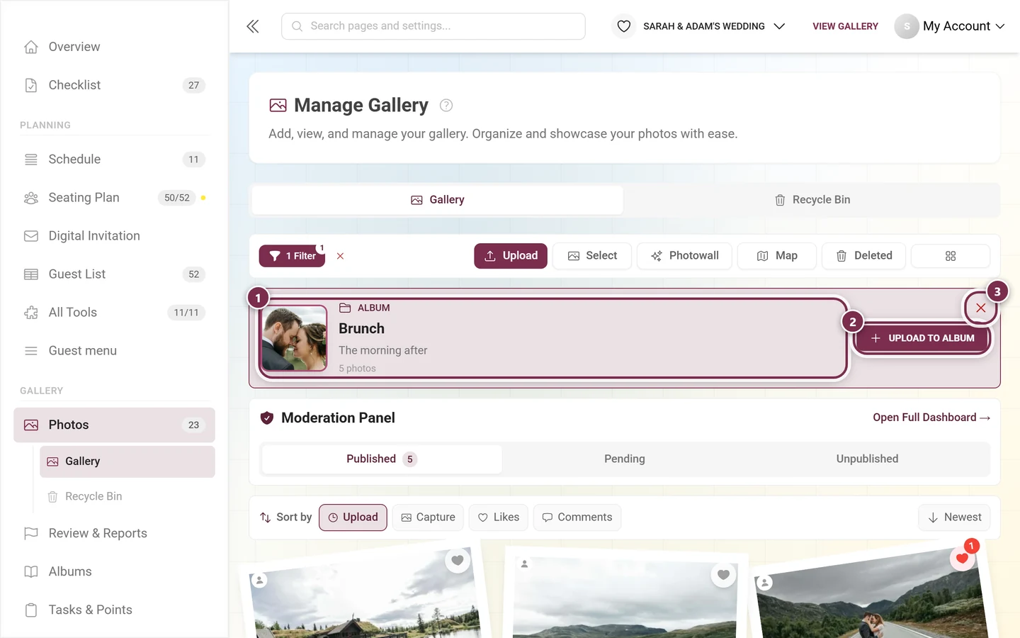
The same exists for tasks: filter on exactly one task and its card shows up there with a Solve Task button.
Select mode
Section titled “Select mode”Select turns the action bar into a selection bar:
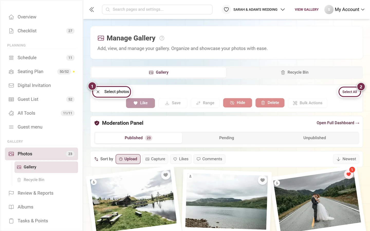
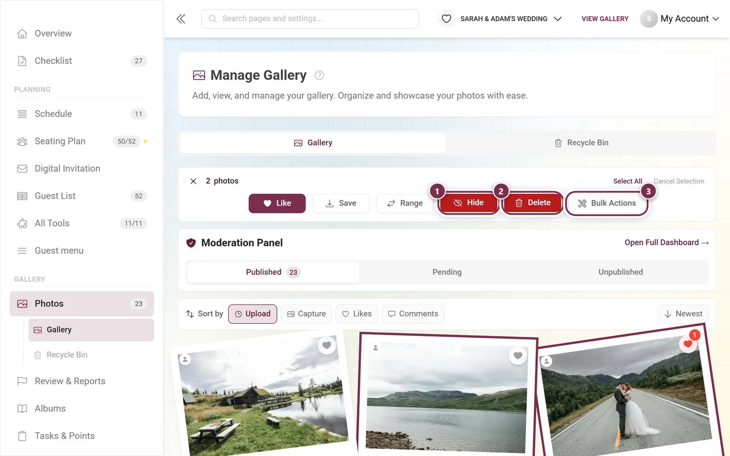
- Like and Save are open to everyone; Save opens the download dialog.
- Range marks every photo between the two you clicked last - handy for long stretches.
- Hide, Publish and Delete require a moderation permission. Which of the first two appears depends on the status tab: on Published it says Hide, on Pending and Unpublished it says Publish.
- Remove from album only joins in when you are currently filtering on exactly one album.
- Bulk Actions is tied to the admin or owner role.
Each of these buttons asks once more before it acts. The full description including downloads is in Selecting multiple photos.
What deliberately isn’t here
Section titled “What deliberately isn’t here”The page shows media - it is not a moderation view. Approving, working through reports and banning guests happens in the dedicated Review & Reports area: Approving & moderating photos. And backing up all your media doesn’t run through the selection but through Backing up all photos.
Troubleshooting
Section titled “Troubleshooting”A photo is missing from the grid. Check the status tab first - with moderation on, new uploads sit under Pending. Then the filters: an album or media type filter stays active until you clear it. The quickest way is the red ✕ next to the filter button.
I don’t see any status tabs at all. Either you lack the moderation permission, or the Show approval bar in the gallery toggle is off in Moderation & safety. The profile menu still gets you to the moderation page at any time.
The “Pending” tab stays empty. Then moderation is off. You switch it on in Moderation & safety.
The sort bar has vanished. It gets hidden while the grid is empty - for instance on the Pending tab without open approvals. It is gone for good when the Quick Sort Bar toggle in Customizing the look is off.
There is no “Recycle Bin” tab. It only appears once at least one media file has been deleted. The Deleted button in the action bar, on the other hand, always opens the recycle bin dialog.
“Select” shows no bulk actions. The Bulk Actions button is tied to the admin or owner role - see Roles & permissions.
A photo has disappeared. Check the recycle bin; deleted media stay there for the length of the grace period.
Related pages
Section titled “Related pages”- Selecting multiple photos - select mode, hiding, deleting, bulk actions.
- Approving & moderating photos - the dedicated area for approvals and reports.
- Recycle bin & restoring · Creating albums · Creating challenges
- Customizing the look · Moderation & safety · Backing up all photos