Reading your statistics
The statistics page answers five questions in five areas: Overview, Guests, Content, Planning and Moments. It is no longer just a gallery report — it knows your planning tools too, and it follows the clock: before the event the countdown leads, during it the live pulse, afterwards the tally. At the very top sits a control row with the time range, which applies to all five areas, and the “Your event in numbers” button that lets you take the figures away as an image or a table.
How to open the statistics
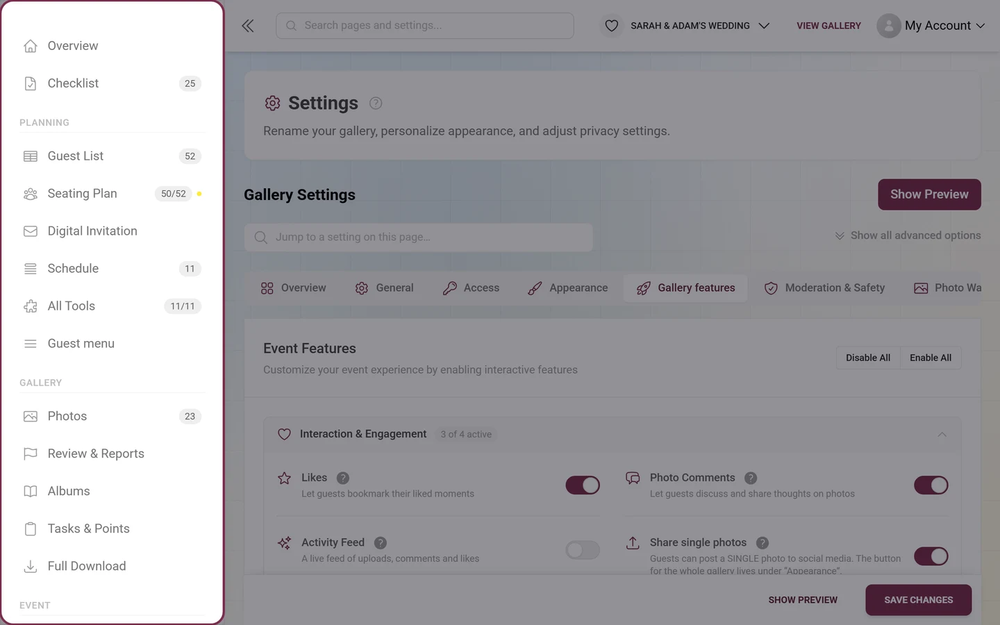
Section titled “How to open the statistics”The admin sidebar has a “Statistics” entry in the “Event” group — between “Print Templates” and “Settings”. Expand it and the five areas sit underneath as sub-entries, along with the separate follow-up page “AI Processing” (only when the NSFW filter or face recognition is part of your plan).
-
Via the sidebar (the normal route): “Event” → “Statistics”. A sub-entry takes you straight to the area you want, without a detour through the overview.
-
Via the metric band on the dashboard: below the four tiles at the top, on the right, sits the link “View all figures” — it leads here. (The detailed “Event Statistics” card on the dashboard is off by default; you can switch it on under “Set up dashboard”. Its footer button reads “View Detailed Statistics”.)
-
Via the global search: type into the search bar at the top of the admin area (magnifier icon on mobile) and search for statistics. Besides the “Event Statistics” hit you will also find every single area there, e.g. “Statistics: Guests”.
-
The address ends in
/admin/event-stats, and an area hangs off it as?tab=:?tab=overview,?tab=guests,?tab=content,?tab=planning,?tab=moments. Feel free to bookmark those.
Time range, refresh & export
Section titled “Time range, refresh & export”The control row sits at the very top, above the tab bar — the range you pick applies to all five areas and stays put when you switch between them.
-
Open the Time Range picker. You have these options:
- Auto (Nd) – the default. The range is derived from your event’s runtime; the N in brackets shows how many days are currently evaluated (e.g. “Auto (14d)”).
- 1 Day, 3 Days, 7 Days, 30 Days, 90 Days – fixed windows counting back from now.
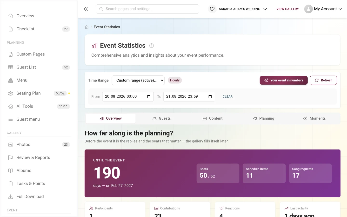
- Custom range… – for an exact from/to analysis (e.g. just the wedding evening). While it’s active the field reads “Custom range (active)”.
-
Next to it a colored badge shows the automatically chosen resolution: Hourly for short ranges, Daily for longer ones. This controls how finely the charts are split — and therefore whether you can follow an evening hour by hour.
-
If you pick “Custom range…”, a panel with From and To (date + time each) opens below inside the same card. Enter both values — as soon as both are set they override the day presets. The times count as your local time. Use “Clear” to drop the custom range again.
-
On the right of the same row are two buttons: “Your event in numbers” (sparkle icon) opens the recap export, and “Refresh” (arrow icon, tooltip “Refresh Statistics”) reloads the figures. While loading, the icon spins and the button is briefly disabled.
Overview
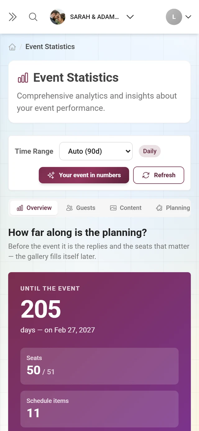
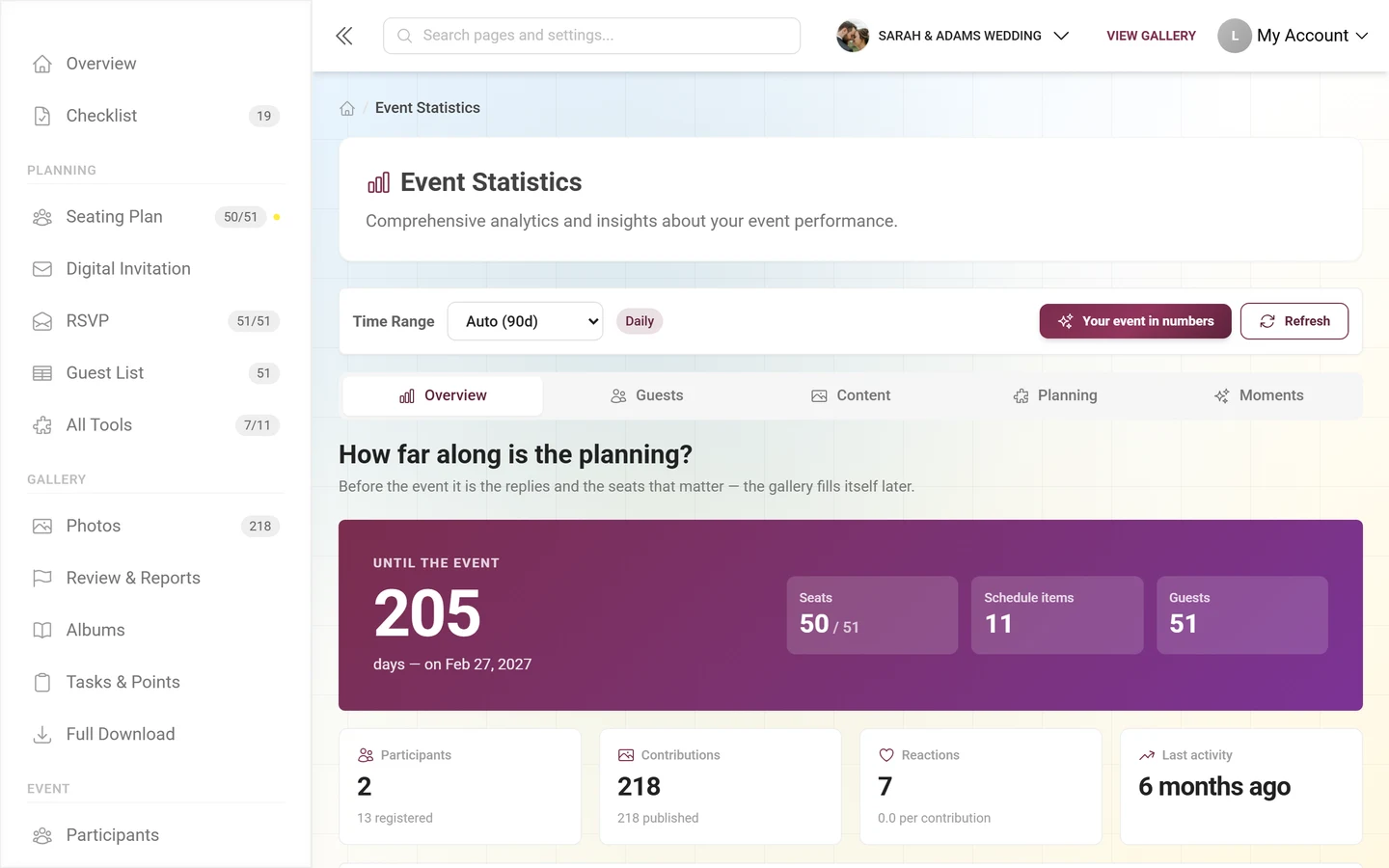
Section titled “Overview”The first area answers: is this event running — and for how much longer? The heading and the big card at the top change with the phase, which follows your event date and the latest activity:
- Before the event (“How far along is the planning?”): a purple card with the “Until the event” countdown, the number of days and the date, next to up to three clickable tiles from your active planning tools. Without a date set, it prompts you to enter one.
- During the event (“Is it running right now?”): a green “Right now” card with a pulsing dot, the contributions of the last hour and the tiles Today, Active guests and Last contribution. This phase kicks in as soon as something was uploaded in the last hour, the last upload is less than three hours old — or today is your event day.
- After the event: a light card with the total number of contributions and a small trend chart.
Below it, four tiles: Participants (with “N registered”, links to the participants), Contributions (with “N photos · N videos” or “N published”, links to the gallery), Reactions (with the average per contribution) and Last activity (e.g. “12 min ago”).
Then the chart “Uploads, registrations and reactions” — all three curves at once in a single chart with a legend. There is no metric switcher any more. If nothing happened in the range, it reads “No activity in the selected range yet”.
Next, two cards side by side:
- “What needs your attention” – open items only: contributions in moderation, plus everything your tools report as outstanding (e.g. “Seating plan: Without a seat”). Every row is a link straight there. When nothing is open it reads “Nothing open. All running.”
- “What lasts how long” – your limits with bars: photos, videos, participant slots and storage. Where a pace can be read, it says “Full in N days at the current pace”, otherwise just the share used. The “View plan” button leads to Plan & term. Unlimited allowances don’t appear here at all.
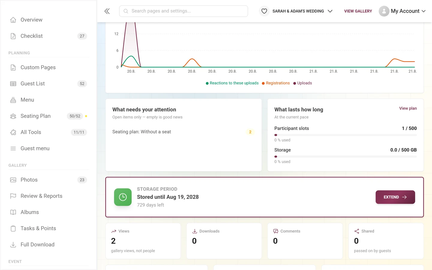
Underneath sits the storage period banner (see the next section), then four more tiles — Views (“gallery views, not people”), Downloads, Comments and Shared — and finally three small ones: Busiest day, Busiest hour and In the recycle bin.
Storage period & extending
Section titled “Storage period & extending”The color-outlined Storage period banner is your retention clock. It sits inside the “Overview” area, below the two cards — not at the top of the page any more. Depending on the state it shows:
- Not started yet, free gallery: “Begins with the first photo”.
- Not started yet, paid plan: “Not started yet — begins with the 10th photo”.
- Active: “Stored until” plus the date, with “N days left” below. From 7 days remaining the clock icon turns amber.
- Permanent: “Stored permanently”.
- Expired: “Expired — N days of download access left” – until the date shown you can still pull a ZIP backup or bring the gallery back, with a renewal, a plan, or for less in the archive.
With an active or expired storage period, an “Extend” button appears that takes you to Plan & term. If your clock hasn’t started yet, a line at the very bottom of the overview says so as well: no deadline runs until the first photos arrive.
Guests
Section titled “Guests”This area asks: who was there — and who joined in?
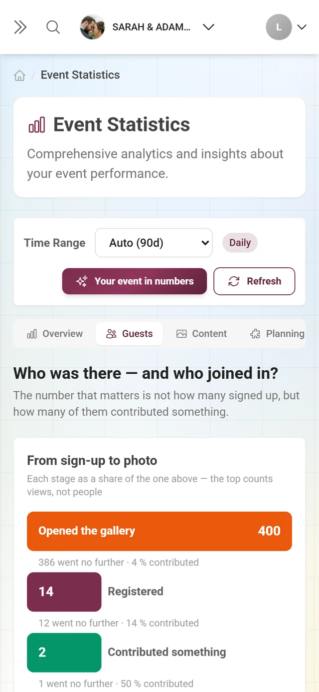
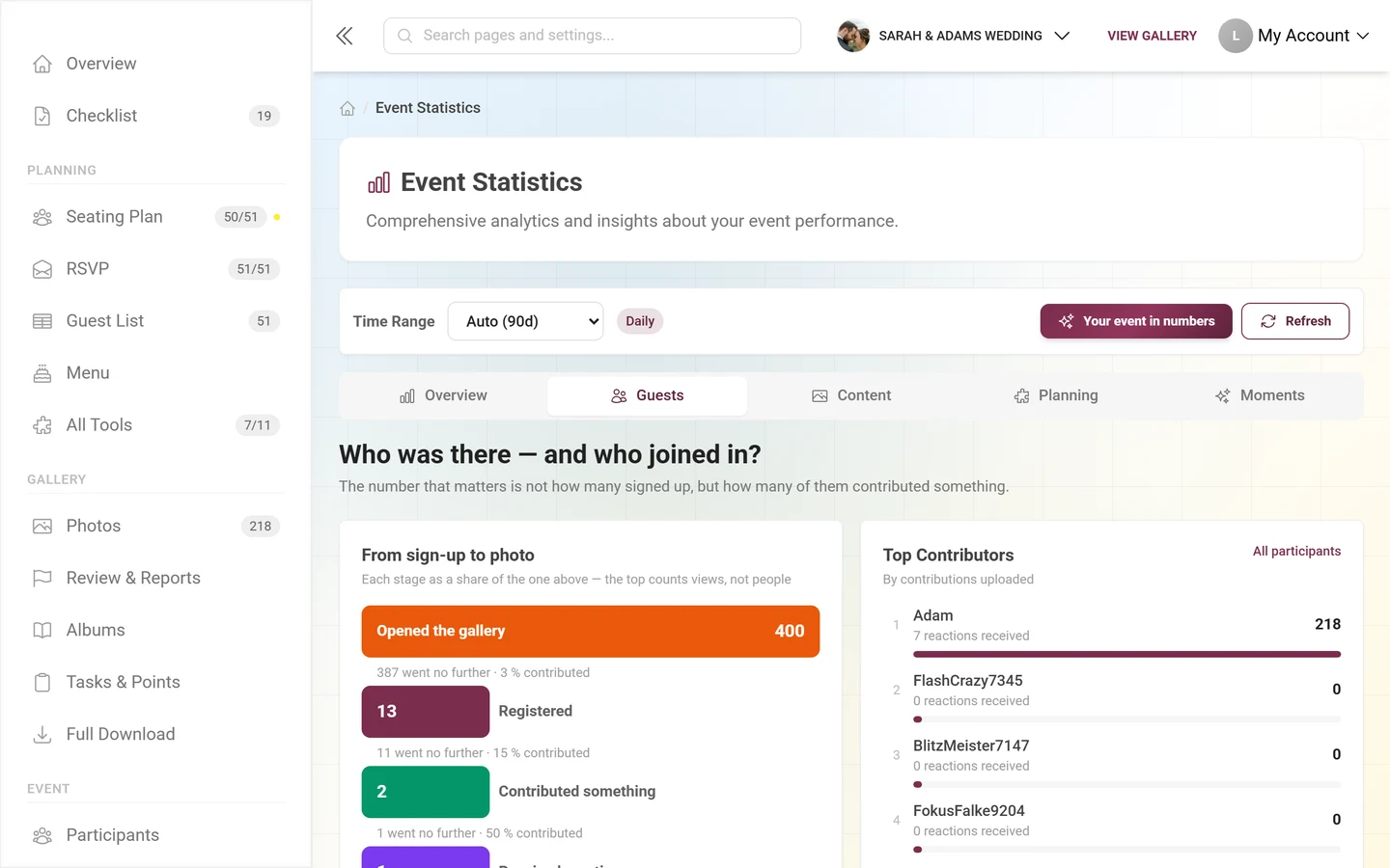
- “From sign-up to photo” – a funnel with the stages Registered → Contributed something → Received reactions. Between two stages it says how many went no further. If there are more gallery views than sign-ups, “Opened the gallery” is put on top as a first stage — that counts views, not people, and is labeled that way on purpose.
- “Top Contributors” – a bar list (not a table) with rank, nickname, the sub-line “N reactions received” and the number of uploads as its value; eight entries at most. Anyone without a nickname appears as Anonymous. The “All participants” link leads to participants.
- Three tiles: Contribution rate (share with a bar, “N of M uploaded something”), Contributions per active guest and Registered Visitors.
- Finally the area chart “Sign-ups over time”.
Content
Section titled “Content”What was uploaded — and what landed.
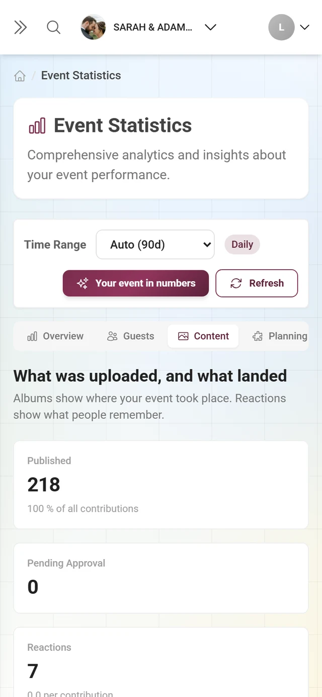
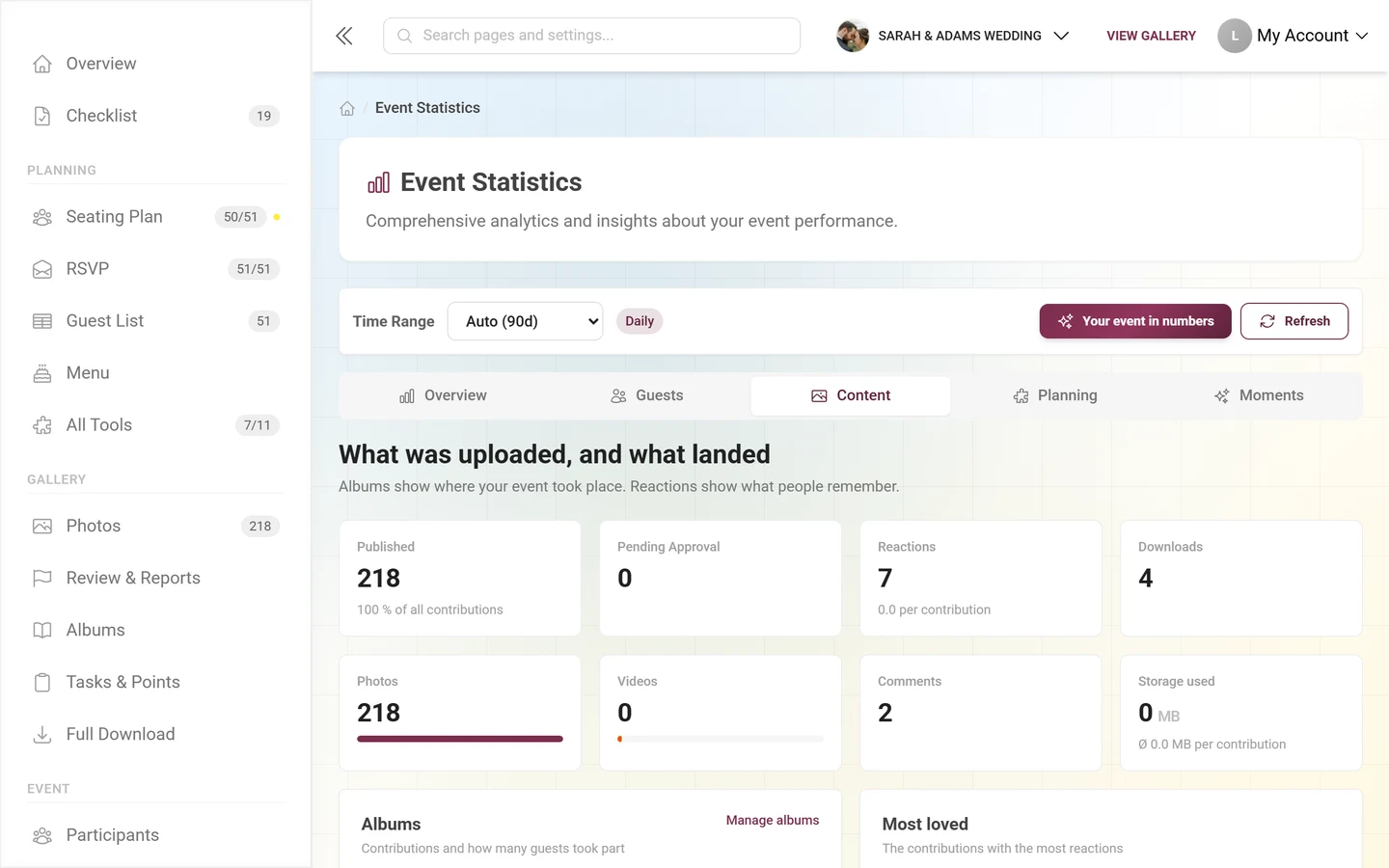
- First row of tiles: Published (with “N % of all contributions”, extended by “· N withdrawn” if you pulled anything back), Pending Approval (with “N still being processed” where applicable), Reactions and Downloads.
- Second row of tiles: Photos and Videos (each with a share bar), Comments and Storage used (below 1 GB in MB, with the average per contribution).
- “Albums” – a bar list with the album name, “N guests contributed” and the media count, eight at most. The “Manage albums” link leads to albums manager.
- “Most loved” – the five contributions with the most reactions, each with the name of whoever uploaded them.
- “Photo tasks” (tasks feature only) – a table with the columns Task, Solved and Reception. Reception is a text badge: “Very popular” from 40 %, “Well received” from 15 %, otherwise “For explorers”. Up to ten tasks are shown, including ones nobody has solved; the subtitle carries the grand total (“solved N times in total”). The “Edit tasks” link leads to tasks.
- “Achievement Stats” (achievements feature, and only with data) – a bar list: value = how often it was received, below it “N claimed”; the subtitle sums it up (“N awarded, N claimed”). The “To the rewards” link leads to reward tracking, details on the achievements themselves under achievements.
Planning
Section titled “Planning”This area is new: it shows where your planning tools stand — the half of the event the statistics used to know nothing about.
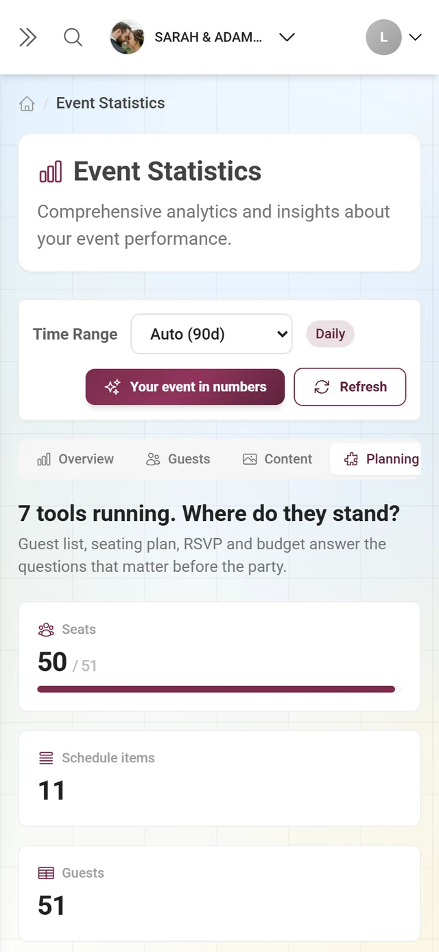
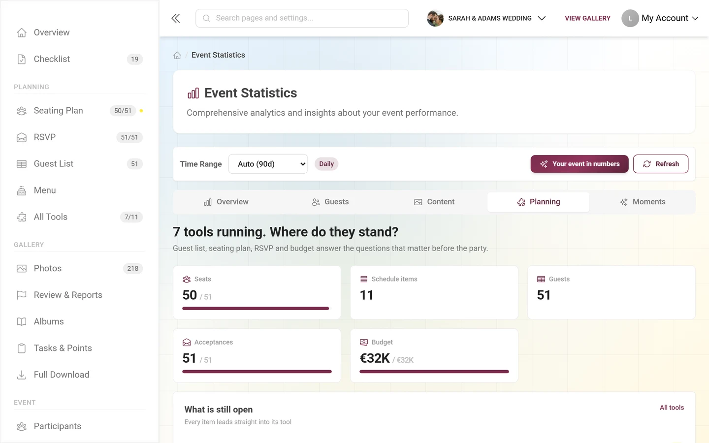
- The heading follows your data: “N tools running. Where do they stand?” or “Your planning”.
- Every active tool that reports a figure gets a tile — for instance Acceptances (RSVP), Seats (seating plan), Guests (guest list), Budget, Schedule items or Song requests. Where there is a total, it appears as “42 / 60” with a progress bar. A click leads straight into the tool.
- Everything outstanding is collected under “What is still open” — each row with the tool name and a yellow number, e.g. “RSVP: Open” or “Seating plan: Without a seat”, and each row leads into the tool.
- If no planning tool is running yet, you get a note plus the “All tools” link.
Moments
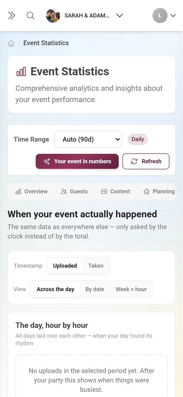
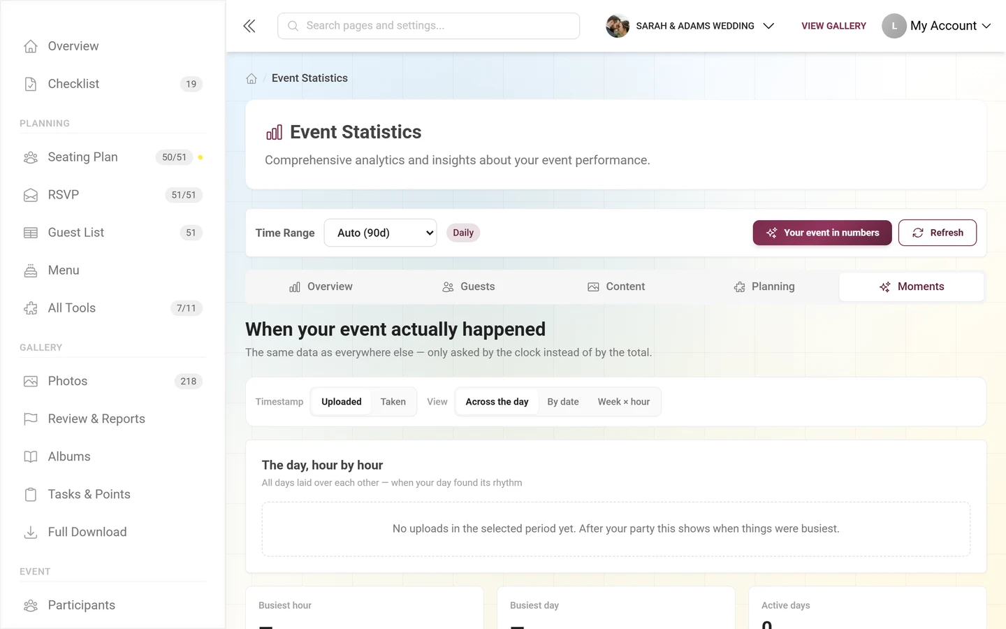
Section titled “Moments”When your event actually happened — the same data, only asked by the clock.
-
Timestamp – Uploaded or Taken. “Taken” uses the capture date inside the image file and is preselected as soon as at least half your media carries one; if none does, the button is disabled. In that view a line above the chart says how many contributions carry a capture date — screenshots and forwarded images bring none.
-
View – Across the day (all days laid over each other), By date (one bar per calendar day) or Week × hour (a table of 7 rows by 24 columns, darker means more, with a “less/more” legend). Which one opens first depends on the event type: wedding, birthday and party start on the day view, conference and festival on the calendar days, everything else on the grid.
-
Between the switches and the chart sits the colored “The peak” card — a whole sentence instead of a number: “Sat between 20 and 21 brought in N contributions.”
-
Below the chart, three tiles — Busiest hour, Busiest day, Active days — and the card “What it was shot on” with From phones, From cameras (naming the most frequent model) and No details, plus the top models as a bar list.
Your event in numbers (recap export)
Section titled “Your event in numbers (recap export)”The “Your event in numbers” button at the top right opens a dialog subtitled “To save, to share and to keep — even after the gallery expires.”
- On the left you see a portrait image card with the event name, the date, three large figures (contributions or photos, guests, reactions) and up to five extra lines — busiest hour, most active guest, favorite photo, cameras used, videos, tasks completed. Only lines that are actually true for your event appear.
- On the right sits the note “The card contains numbers only — no photos, and no names beyond what you see here.” Below it “Share card” (only where your device supports sharing files; otherwise it falls back to the download) and “Save as image” (PNG).
- Under “All figures as a table” are the Excel and CSV buttons. The export carries one sheet each for key figures, timeline, top guests, albums, photo tasks, devices and hour of day — sheets without data are left out. The CSV is a single file with
# sheet nameseparators.
Troubleshooting
Section titled “Troubleshooting”Best practices
Section titled “Best practices”Related pages
Section titled “Related pages”- The admin area – metric band and dashboard cards
- Tooling – Overview – where the figures in the “Planning” area come from
- Participants – the list behind the “Guests” area
- Plan & term – extend the storage period, archive, subscription, raise the limits
- Download & export – pull the ZIP backup
- Recycle bin – deleted media and the storage they use
- AI processing – the follow-up page under “Statistics”
- Crowning winners – turning points into prizes